C
Custom Materials and Effects
Qt 3D Studio supports custom materials and layer effects. These are arbitrary GLSL shaders, wrapped in a file format providing an artist-friendly interface for adjusting properties in Studio.
You can write your own materials and effects to use in Qt 3D Studio, this requires knowledge in OpenGL Shading Language (GLSL).
This document explains the structure of the .effect and .shader files but does not go through how to write shaders in GLSL.
Overview
The general structure of an .effect and a .shader is almost the same. The only different is the <Effect> and the <Material> elements.
Note: Some of the attributes and elements shown here are optional (and this example does not include all possible attributes).
The structure of an .effect file. As mentioned above the same structure applies to .shader files as well with the only difference that you will need to use <Material> and </Material> instead of <Effect> and </Effect>.
<Effect>
    <MetaData>
        <Property name="..."/>
        <Property name="..."/>
    </MetaData>
    <Shaders>
        <Shared>
        </Shared>
        <Shader>
            <FragmentShader>
            </FragmentShader>
        </Shader>
        <Shader>
            <VertexShader>
            </VertexShader>
        </Shader>
    </Shaders>
    <Passes>
        <Buffer name="..."/>
        <Pass>
            <DepthInput/>
        </Pass>
        <Pass>
            <BufferInput/>
        </Pass>
    </Passes>
</Effect>
Elements
<Effect>
The <Effect> element is the root element of the document. Everything in the document needs to be wrapped in the <Effect> element.
<MetaData>
The <MetaData> element can contain zero or more <Property> elements. The <MetaData> element is optional.
<Property>
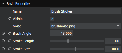
The <Property> element must be wrapped in the <MetaData> element. This element describes a property of the effect or material. Most properties are by default visible and adjustable in Studio. Below you can see an example on how properties might look in Studio.
A property element can have the following attributes:
| Attribute | Value | Default value | Description |
|---|---|---|---|
| name | Text | - | The internal name of the property (must be a unique identifier). |
| formalName | Text | The name property. | The name to display in the inspector palette. |
| description | Text | - | Tooltip to display in the inspector palette. |
| type | PropertyType | Float | The type of the property. |
| min | Float | - | Min value for numeric types. |
| max | Float | - | Max value for numeric types. |
| default | Text | 0 or "". | Default value. |
| animatable | Boolean | True | Sets possibility to animate the property. Note that all types are not animatable. |
| hidden | Boolean | False | Sets visibility in the inspector palette. |
| clamp | Text | Clamp | For Texture type only, sets texture to clamp or repeat. |
| filter | Text | For Texture type only, sets texture filter to nearest or linear. | |
| list | Text | - | Creates UI dropdown list. |
| category | Text | Use to group material properties into separate categories. Note: Required field for materials. If this is not added, the property will not be displayed in the Inspector palette. Adding category with empty string will not suffice. |
The only required attribute in the <property> element is name.
If a numeric property has both a max and a min attribute specified it will appear as a slide bar in Studio. Otherwise it will appear as a text box.
PropertyType
The PropertyType sets the property type for the element. The following property types are valid:
| PropertyType | Value | Description | Example |
|---|---|---|---|
| Boolean | True or false. | Boolean value, will show as a check box in Studio. | <Property type="Boolean" default="True"... |
| Color | RGB normalized decimal value. | RGB color, will show as a color picker tool in Studio. | <Property type="Color" default="0.5 0.5 0.5"... |
| Float | Float | Numeric value, will show as a text field in Studio. | <Property type="Float" default="0.5"... |
| Float2 | Two float values. | Two numeric values, will show as two text fields in Studio. | <Property type="Float2" default="0.5 0.75"... |
| Font | Font | Will show as font selector in Studio. | <Property type="Font" default="Arial"... |
| FontSize | Long | Size of font, will show as drop down in Studio. | <Property type="FontSize" default="36"... |
| Image2D | Image path | Image file, will show as file selector in Studio. | <Property type="Image2D" default=".\maps\bump-map.png"... |
| Texture | Image path | Image file to use as texture, will show as file selector in Studio. | <Property type="Texture" default=".\maps\bump-map.png"... |
<showifequal> and <hideifequal>
It is possible to toggle the UI visibility of properties based on the value of other properties using the <showifequal> and <hideifequal> elements.
Two attributes are required for these elements:
| Attribute | Description |
|---|---|
| property | The name of the property which value should effect the visibility. |
| value | The value of the property at which the visibility should change. |
In the example code below the color picker tool for backgroundColor property will be visible only when the opacity property value is equal to 0.
<property name="opacity" formalName="Opacity" type="Float" min="0" max="1" />
<property name="backgroundColor" formalName="Background color" type="color">
    <showifequal property="opacity" value="0" />
</property>
It is possible to use multiple <showifequal> and <hideifequal> elements within the same <property> element. In these cases the visibility will toggle once either of the conditions are met. In the example code below the color picker tool for backgroundColor property will be visible either when opacity property value is equal to 0 or when showAll property value is equal to True.
<property name="showAll" formalName="Show all" type="Boolean" />
<property name="opacity" formalName="Opacity" type="Float" min="0" max="1" />
<property name="backgroundColor" formalName="Background color" type="color">
    <showifequal property="opacity" value="0" />
    <showifequal property="showAll" value="True" />
</property>
The list attribute
It is possible to create a property that is displayed as a drop down menu in Studio. In order to do that you will need to specify the name and list attributes for the <property> element. The value for the list attribute needs to be a comma (,) or colon(:) separated text string.
In Studio this will display as a drop down menu with the four options Right, Left, Up and Down. You can specify the default value with the default attribute, if not specified it will be empty.
<property name="alignment" list="Right:Left:Up:Down" Default="Up"/>
Note that you will not need to specify type for the property.
<Shaders>
The <Shaders> element must contain at least one <Shader> element.
<Shader>
The <Shader> element must contain either one <FragmentShader> element or one <VertexShader>. The <Shader> element has one attribute, name. It is optional and should contain an identifier-like name.
<Shader name="tonemap">
<Passes>
The <Passes> element can contain <Pass> elements.
<Pass>
The <Pass> element contains different properties that are applied to the pass. More details are provided in the Effect Reference.
<Depth>
Custom materials have an additional Depth pass element not provided to effects. It determines the depth function and masking used during this pass of the custom shader.
The element attributes are:
| attribute | values | description |
|---|---|---|
| func |
| Specifies the depth function used. |
| mask | bool | Specifies if depth is written or not. With "true" depth is written, with "false" it's not. |
Things to Note
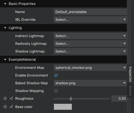
Materials
When creating a custom material with several properties, it is a good practice to use categories to separate them. If there is a need to be able to change the material for the mesh, at least one property needs to be added to Materials category. This will pull in Material Type and Shader properties into the Inspector palette.
Consider a custom material with the following metadata:
<MetaData >
<Property category="ExampleMaterial" formalName="Environment Map" name="uEnvironmentTexture" description="Environment texture for the material" type="Texture" filter="linear" minfilter="linearMipmapLinear" clamp="repeat" usage="environment" default="./maps/materials/spherical_checker.png"/>
<Property category="ExampleMaterial" formalName="Enable Environment" name="uEnvironmentMappingEnabled" description="Enable environment mapping" type="Boolean" default="True"/>
<Property category="ExampleMaterial" formalName="Baked Shadow Map" name="uBakedShadowTexture" description="Baked shadow texture for the material" type="Texture" filter="linear" minfilter="linearMipmapLinear" clamp="repeat" usage="shadow" default="./maps/materials/shadow.png"/>
<Property category="ExampleMaterial" formalName="Shadow Mapping" name="uShadowMappingEnabled" description="Enable shadow mapping" type="Boolean" default="False"/>
<Property category="ExampleMaterial" formalName="Roughness" name="roughness" type="Float" min="0.0" max="1.0" default="0.3" description="Roughness of the material.\n0 = fully specular\n1 = fully diffuse"/>
<Property category="ExampleMaterial" formalName="Base color" name="base_color" type="Color" default="0.7 0.7 0.7" description="Color of the material"/>
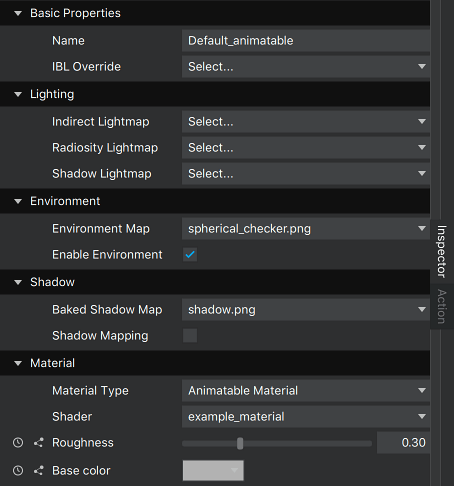
</MetaData>and the same material with sensible categories defined, including Material:
<MetaData >
    <Property category="Environment" formalName="Environment Map" name="uEnvironmentTexture" description="Environment texture for the material" type="Texture" filter="linear" minfilter="linearMipmapLinear" clamp="repeat" usage="environment" default="./maps/materials/spherical_checker.png"/>
    <Property category="Environment" formalName="Enable Environment" name="uEnvironmentMappingEnabled" description="Enable environment mapping" type="Boolean" default="True"/>
    <Property category="Shadow" formalName="Baked Shadow Map" name="uBakedShadowTexture" description="Baked shadow texture for the material" type="Texture" filter="linear" minfilter="linearMipmapLinear" clamp="repeat" usage="shadow" default="./maps/materials/shadow.png"/>
    <Property category="Shadow" formalName="Shadow Mapping" name="uShadowMappingEnabled" description="Enable shadow mapping" type="Boolean" default="False"/>
    <Property category="Material" formalName="Roughness" name="roughness" type="Float" min="0.0" max="1.0" default="0.3" description="Roughness of the material.\n0 = fully specular\n1 = fully diffuse"/>
    <Property category="Material" formalName="Base color" name="base_color" type="Color" default="0.7 0.7 0.7" description="Color of the material"/>
</MetaData>
The first option results in
and the seconds one results in
Controlling Custom Properties
When some of the properties in custom materials or effects need to be adjusted during run-time, the setAttribute API is required. The usage may differ slightly from normal usage, depending on the property being controlled, as all of the properties in custom materials and effects are handled as dynamic properties.
Note: Since 2.8 the custom property textures use images and are controlled the same way as standard material textures.
Controlling a texture in standard material
<presentation id>.setAttribute("<element path to texture>", "sourcepath", "<path to image>");For example:
myPresentation.setAttribute("Scene.Layer.Sphere.Default_animatable.diffusemap", "sourcepath", "../maps/myTexture.png");Controlling a texture in a custom material
<presentation id>.setAttribute("<element path to material>", "sourcepath", "<path to image>");With a material that has a metadata entry as follows:
<MetaData >
    ...
    <Property name="diffuseTexture" type="Texture" category="Material" formalName="Diffuse texture"/>
    ...
</MetaData>
This is the way to control it:
myPresentation.setAttribute("Scene.Layer.Sphere.MyMaterial.diffuseTexture", "sourcepath", "../maps/myTexture.png");See also Custom Material Reference and Effect Reference.
Available under certain Qt licenses.
Find out more.