Warning
This section contains snippets that were automatically translated from C++ to Python and may contain errors.
Creating Spline Charts#
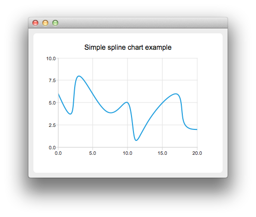
Shows how to create a simple spline chart.
To create spline charts we need to put our data into QSplineSeries . QSplineSeries automatically calculates spline segment control points that are needed to properly draw the spline.
series = QSplineSeries()
series.setName("Spline")
Now let’s add some data points to the series.
series.append(0, 6)
series.append(2, 4)
series.append(3, 8)
series.append(7, 4)
series.append(10, 5)
series << QPointF(11, 1) << QPointF(13, 3) << QPointF(17, 6) << QPointF(18, 3) << QPointF(20, 2)
The data series has been populated. To display it on a chart we create a QChart object and add the data series to it. We also set the title and the values range on the y-axis, so that our chart’s visibility is better.
chart = QChart()
chart.legend().hide()
chart.addSeries(series)
chart.setTitle("Simple Spline Chart")
chart.createDefaultAxes()
chart.axes(Qt.Vertical).first().setRange(0, 10)
Then we create a QChartView object with QChart as a parameter. This way we don’t need to create a QGraphicsView scene ourselves.
createDefaultChartView(chart)