
Popup QML Type
A popup control. More...
Properties
- activeFocus : bool
- availableHeight : real
- availableWidth : real
- background : Item
- bottomMargin : real
- bottomPadding : real
- clip : bool
- closePolicy : enumeration
- contentChildren : list<Item>
- contentData : list<Object>
- contentHeight : real
- contentItem : Item
- contentWidth : real
- data : list<Object>
- enter : Transition
- exit : Transition
- focus : bool
- height : real
- implicitHeight : real
- implicitWidth : real
- leftMargin : real
- leftPadding : real
- margins : real
- modal : bool
- opacity : real
- padding : real
- parent : Item
- rightMargin : real
- rightPadding : real
- scale : real
- topMargin : real
- topPadding : real
- transformOrigin : enumeration
- visible : bool
- width : real
- x : real
- y : real
- z : real
Methods
Detailed Description
Popup is the base type of popup-like user interface controls. It can be used with Window or ApplicationWindow.
import QtQuick.Window 2.2
import Qt.labs.controls 1.0

Window {
    id: window
    width: 400
    height: 400
    visible: true

    Button {
        text: "Open"
        onClicked: popup.open()
    }

    Popup {
        id: popup
        x: 100
        y: 100
        width: 200
        height: 300
        modal: true
        focus: true
        closePolicy: Popup.OnEscape | Popup.OnPressOutside
    }
}
In order to ensure that a popup is displayed above other items in the scene, it is recommended to use ApplicationWindow. ApplicationWindow also provides background dimming effects.
Note: Types in the Qt.labs module are not guaranteed to remain compatible in future versions.
Property Documentation
This property holds the height available after deducting vertical padding.
See also padding, topPadding, and bottomPadding.
This property holds the width available after deducting horizontal padding.
See also padding, leftPadding, and rightPadding.
background : Item |
This property holds the background item.
Note: If the background item has no explicit size specified, it automatically follows the popup's size. In most cases, there is no need to specify width or height for a background item.
This property holds the bottom padding.
See also padding, topPadding, and availableHeight.
This property determines the circumstances under which the popup closes. The flags can be combined to allow several ways of closing the popup.
The available values are:
| Constant | Description |
|---|---|
Popup.NoAutoClose | The popup will only close when manually instructed to do so. |
Popup.OnPressOutside | The popup will close when the mouse is pressed outside of it. |
Popup.OnPressOutsideParent | The popup will close when the mouse is pressed outside of its parent. |
Popup.OnReleaseOutside | The popup will close when the mouse is released outside of it. |
Popup.OnReleaseOutsideParent | The popup will close when the mouse is released outside of its parent. |
Popup.OnEscape | The popup will close when the escape key is pressed while the popup has active focus. |
The default value is Popup.OnEscape.
contentChildren : list<Item> |
This property holds the list of content children.
See also Item::children.
This property holds the list of content data.
See also Item::data.
This property holds the content height. It is used for calculating the total implicit height of the Popup.
Note: If only a single item is used within the Popup, the implicit height of its contained item is used as the content height.
contentItem : Item |
This property holds the content item of the popup.
The content item is the visual implementation of the popup. When the popup is made visible, the content item is automatically reparented to the overlay item of its application window.
This property holds the content width. It is used for calculating the total implicit width of the Popup.
Note: If only a single item is used within the Popup, the implicit width of its contained item is used as the content width.
This property holds the list of data.
See also Item::data.
enter : Transition |
This property holds the transition that is applied to the content item when the popup is opened and enters the screen.
exit : Transition |
This property holds the transition that is applied to the content item when the popup is closed and exits the screen.
This property holds the left margin around the popup.
See also margins and rightMargin.
This property holds the left padding.
See also padding, rightPadding, and availableWidth.
This property holds the default margins around the popup.
See also topMargin, leftMargin, rightMargin, and bottomMargin.
This property holds the default padding.
See also availableWidth, availableHeight, topPadding, leftPadding, rightPadding, and bottomPadding.
parent : Item |
This property holds the parent item.
This property holds the right margin around the popup.
See also margins and leftMargin.
This property holds the right padding.
See also padding, leftPadding, and availableWidth.
This property holds the top margin around the popup.
See also margins and bottomMargin.
This property holds the top padding.
See also padding, bottomPadding, and availableHeight.
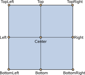
This property holds the origin point for transformations in enter and exit transitions.
Nine transform origins are available, as shown in the image below. The default transform origin is Popup.Center.
See also enter, exit, and Item::transformOrigin.
This property holds the z-value of the popup. Z-value determines the stacking order of popups. The default z-value is 0.
Method Documentation
© 2017 The Qt Company Ltd. Documentation contributions included herein are the copyrights of their respective owners. The documentation provided herein is licensed under the terms of the GNU Free Documentation License version 1.3 as published by the Free Software Foundation. Qt and respective logos are trademarks of The Qt Company Ltd. in Finland and/or other countries worldwide. All other trademarks are property of their respective owners.