
Popup QML Type
The base type of popup-like user interface controls. More...
| Import Statement: | import QtQuick.Controls 2.0 |
| Since: | Qt 5.7 |
| Inherits: | |
| Inherited By: |
Properties
- activeFocus : bool
- availableHeight : real
- availableWidth : real
- background : Item
- bottomMargin : real
- bottomPadding : real
- clip : bool
- closePolicy : enumeration
- contentChildren : list<Item>
- contentData : list<Object>
- contentHeight : real
- contentItem : Item
- contentWidth : real
- dim : bool
- enter : Transition
- exit : Transition
- focus : bool
- font : font
- height : real
- implicitHeight : real
- implicitWidth : real
- leftMargin : real
- leftPadding : real
- locale : Locale
- margins : real
- modal : bool
- opacity : real
- padding : real
- parent : Item
- rightMargin : real
- rightPadding : real
- scale : real
- topMargin : real
- topPadding : real
- transformOrigin : enumeration
- visible : bool
- width : real
- x : real
- y : real
- z : real
Signals
Methods
- void close()
- void forceActiveFocus(reason)
- void open()
Detailed Description
Popup is the base type of popup-like user interface controls. It can be used with Window or ApplicationWindow.
import QtQuick.Window 2.2
import QtQuick.Controls 2.0

Window {
    id: window
    width: 400
    height: 400
    visible: true

    Button {
        text: "Open"
        onClicked: popup.open()
    }

    Popup {
        id: popup
        x: 100
        y: 100
        width: 200
        height: 300
        modal: true
        focus: true
        closePolicy: Popup.CloseOnEscape | Popup.CloseOnPressOutsideParent
    }
}
In order to ensure that a popup is displayed above other items in the scene, it is recommended to use ApplicationWindow. ApplicationWindow also provides background dimming effects.
Popup lays out its content in a similar fashion to Control. For more information, see the Control Layout section of the documentation.
See also Popup Controls, Customizing Popup, and ApplicationWindow.
Property Documentation
This property holds whether the popup has active focus.
See also focus and Keyboard Focus in Qt Quick.
This property holds the height available to the contentItem after deducting vertical padding from the height of the popup.
See also padding, topPadding, and bottomPadding.
This property holds the width available to the contentItem after deducting horizontal padding from the width of the popup.
See also padding, leftPadding, and rightPadding.
background : Item |
This property holds the background item.
Note: If the background item has no explicit size specified, it automatically follows the popup's size. In most cases, there is no need to specify width or height for a background item.
Note: Most popups use the implicit size of the background item to calculate the implicit size of the popup itself. If you replace the background item with a custom one, you should also consider providing a sensible implicit size for it (unless it is an item like Image which has its own implicit size).
See also Customizing Popup.
This property holds the bottom padding.
The padding properties are used to control the geometry of the content item.
Popup uses the same approach to padding as Control. For a visual explanation of the padding system, see the Control Layout section of the documentation.
See also padding, topPadding, and availableHeight.
This property determines the circumstances under which the popup closes. The flags can be combined to allow several ways of closing the popup.
The available values are:
| Constant | Description |
|---|---|
Popup.NoAutoClose | The popup will only close when manually instructed to do so. |
Popup.CloseOnPressOutside | The popup will close when the mouse is pressed outside of it. |
Popup.CloseOnPressOutsideParent | The popup will close when the mouse is pressed outside of its parent. |
Popup.CloseOnReleaseOutside | The popup will close when the mouse is released outside of it. |
Popup.CloseOnReleaseOutsideParent | The popup will close when the mouse is released outside of its parent. |
Popup.CloseOnEscape | The popup will close when the escape key is pressed while the popup has active focus. |
The default value is Popup.CloseOnEscape | Popup.CloseOnPressOutside.
contentChildren : list<Item> |
This property holds the list of content children.
The list contains all items that have been declared in QML as children of the popup.
Note: Unlike contentData, contentChildren does not include non-visual QML objects.
See also Item::children and contentData.
This property holds the list of content data.
The list contains all objects that have been declared in QML as children of the popup.
Note: Unlike contentChildren, contentData does include non-visual QML objects.
See also Item::data and contentChildren.
This property holds the content height. It is used for calculating the total implicit height of the Popup.
Note: If only a single item is used within the Popup, the implicit height of its contained item is used as the content height.
contentItem : Item |
This property holds the content item of the popup.
The content item is the visual implementation of the popup. When the popup is made visible, the content item is automatically reparented to the overlay item of its application window.
Note: The content item is automatically resized to fit within the padding of the popup.
Note: Most popups use the implicit size of the content item to calculate the implicit size of the popup itself. If you replace the content item with a custom one, you should also consider providing a sensible implicit size for it (unless it is an item like Text which has its own implicit size).
See also Customizing Popup.
This property holds the content width. It is used for calculating the total implicit width of the Popup.
Note: If only a single item is used within the Popup, the implicit width of its contained item is used as the content width.
enter : Transition |
This property holds the transition that is applied to the content item when the popup is opened and enters the screen.
exit : Transition |
This property holds the transition that is applied to the content item when the popup is closed and exits the screen.
This property holds whether the popup wants focus.
When the popup actually receives focus, activeFocus will be true. For more information, see Keyboard Focus in Qt Quick.
The default value is false.
See also activeFocus.
font : font |
This property holds the font currently set for the popup.
This property holds the left margin around the popup.
A popup with a negative left margin is not pushed within the left edge of the enclosing window. The default value is -1.
See also margins and rightMargin.
This property holds the left padding.
The padding properties are used to control the geometry of the content item.
Popup uses the same approach to padding as Control. For a visual explanation of the padding system, see the Control Layout section of the documentation.
See also padding, rightPadding, and availableWidth.
locale : Locale |
This property holds the locale of the popup.
See also LayoutMirroring.
This property holds the default margins around the popup.
A popup with negative margins is not pushed within the bounds of the enclosing window. The default value is -1.
See also topMargin, leftMargin, rightMargin, and bottomMargin.
This property holds the default padding.
The padding properties are used to control the geometry of the content item.
Popup uses the same approach to padding as Control. For a visual explanation of the padding system, see the Control Layout section of the documentation.
See also availableWidth, availableHeight, topPadding, leftPadding, rightPadding, and bottomPadding.
parent : Item |
This property holds the parent item.
This property holds the right margin around the popup.
A popup with a negative right margin is not pushed within the right edge of the enclosing window. The default value is -1.
See also margins and leftMargin.
This property holds the right padding.
The padding properties are used to control the geometry of the content item.
Popup uses the same approach to padding as Control. For a visual explanation of the padding system, see the Control Layout section of the documentation.
See also padding, leftPadding, and availableWidth.
This property holds the top margin around the popup.
A popup with a negative top margin is not pushed within the top edge of the enclosing window. The default value is -1.
See also margins and bottomMargin.
This property holds the top padding.
The padding properties are used to control the geometry of the content item.
Popup uses the same approach to padding as Control. For a visual explanation of the padding system, see the Control Layout section of the documentation.
See also padding, bottomPadding, and availableHeight.
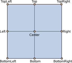
This property holds the origin point for transformations in enter and exit transitions.
Nine transform origins are available, as shown in the image below. The default transform origin is Popup.Center.
See also enter, exit, and Item::transformOrigin.
Signal Documentation
This signal is emitted when the popup is closed.
See also opened.
This signal is emitted when the popup is opened.
See also closed.
Method Documentation
Closes the popup.
See also visible.
Forces active focus on the popup with the given reason.
This method sets focus on the popup and ensures that all ancestor FocusScope objects in the object hierarchy are also given focus.
See also activeFocus and Qt::FocusReason.
Opens the popup.
See also visible.
© 2016 The Qt Company Ltd. Documentation contributions included herein are the copyrights of their respective owners. The documentation provided herein is licensed under the terms of the GNU Free Documentation License version 1.3 as published by the Free Software Foundation. Qt and respective logos are trademarks of The Qt Company Ltd. in Finland and/or other countries worldwide. All other trademarks are property of their respective owners.