
Neptune 3 UI - Application Anatomy
In Neptune 3, an application can have both the full-screen state and the (optional) widget state. The states should not be designed separately since they need to be connected, if possible, with smooth transitions.
Full-Screen
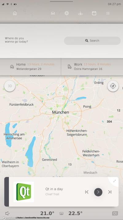
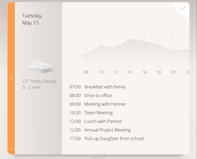
When applications are in full-screen they typically have two main content areas: top and bottom. The top area is for the most important information, or information that is graphically complex. Try having the same content and layout in the top area in full-screen vs. in a widget (see more details in the widget section below). The bottom area is for more detailed information. In most cases the content is divided into different pages, navigated between with the tool bar to the left.
Design the bottom content spacious and do not mix different kinds of content. If there are different kinds of content, please put them into different sections with sufficient space in between.
Breaking the rules
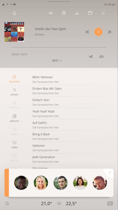
Not every application should look the same. The best explaining cases are probably Navigation and Camera apps since they include complex graphics. Both applications need to look different from the default one, but should give the same impression.
Some applications might not need to display the ToolBar, neither the top area. Use a layout that fits the content of your application.
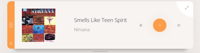
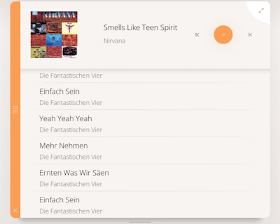
Widget
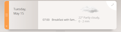
The widgets on the home screen can be resized into three sizes: 1-Row, 2-Rows and 3-Rows. Try to minimize and simplify the content of the widgets; with up to five widgets on the home screen at the same time it tends to look cluttered. Create larger widgets with more features for adding extra value for the user.
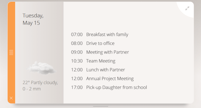
The widget content is generally designed along with the transitions between the three states and of course widget and full-screen visuals. The top in full-screen should normally look exactly like one of the widget sizes (1Row or 2Rows). The easiest way to design a nice transitions when switching between the sizes is to think of blocks ordered in a column, e.g. turn on/off blocks when the widget height changes.
To make the widgets look good together there are some recommended alignment lines. Sometimes there are reasons not to use these lines, like in the example of the circular contact image for phone widget which fits better with the rectangular album art in the Music widget when it is slightly larger than the default size.
© 2018 Pelagicore AG. Documentation contributions included herein are the copyrights of their respective owners. The documentation provided herein is licensed under the terms of the GNU Free Documentation License version 1.3 as published by the Free Software Foundation. Qt and respective logos are trademarks of The Qt Company Ltd. in Finland and/or other countries worldwide. All other trademarks are property of their respective owners.