
Neptune 3 UI - Application Architecture
Neptune 3 uses a common architecture and principles for all applications. The architecture approach is called Core UI Architecture.
General Overview
The Core UI architecture adapts the component-based architecture, in which it focuses on the decomposition of the UI into individual UI components. The primary objective of component-based architecture is to ensure component reusability. A component encapsulates functionality and behavior of a software element into a reusable unit.
Component-oriented software design has many advantages over the traditional object-oriented approaches such as:
- Reduced time in market and the development cost by reusing existing components.
- Increased reliability with the reuse of the existing components.
In general, Neptune 3 differentiates between UI primitives (e.g. rectangles and images) and controls (e.g. buttons) as individual UI types. To combine several UI types, panels or views are being used. These are specific container types to layout other containers as child UI types or controls. UI primitives are only used inside controls, as the controls have support for styling the UI. The difference between a panel and a view is that the view interfaces with the stores (the business layer of the application).
Application Architecture
An application is usually designed around a specific context, hence, it often uses a particular area of the service API and it can also depend on common services to be aware of the overall system state. The aim of the Core UI Architecture is to avoid having such service dependencies end up directly into the UI but they should be wrapped as a Store entity. The Store is the only entity that is allowed to talk to service instances. Besides being the adapter to the service interfaces, it provides the necessary business logic to achieve a clean UI. Finally, the UI should only contain visual logic and be free of any business logic.
However, the UI itself is divided into several UI elements which are allowed to have a reference to the store and those which are not allowed to. The purpose to strictly manage the dependencies is to allow these components to stay testable in a later stage of the project. Such an architecture also allows the developer to use a technique to isolate a part of the UI and work in that small part independently without being tied by some service dependencies.
Example architecture:
apps/music/
    stores/
        MusicStore.qml
    views/
        TopView.qml
        BottomView.qml
    panels/
        AlbumArtPanel.qml
        MusicBrowseList.qml
    controls/
        MusicControls.qml
        MusicProgressBar.qml
    Main.qml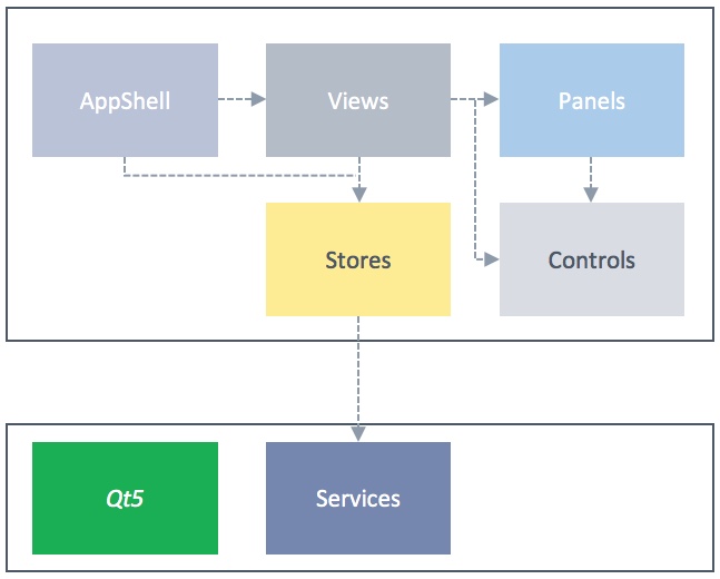
- Stores: Encapsulate the access to the service API and contain required business logic
- Views: Have a reference to a store which provides the necessary information to others
- Panels: Container for other controls and panels. A panel should not have any dependency to a store or a view
- Controls: Re-usable visual element which has no external data dependencies, besides primitives
- Helpers: Collection of some operations.
Stores
A store encapsulates the business logic inside the application. It is a pure data driven object. A store can have child stores which can be forwarded to sub-trees of the UI. A store is the only portion of the UI layer which uses the service layer. Ideally, a store should have an interface that defines the API to allow the store being tested. The views would only see this interface so that they do not depend on a concrete store. The store that inherit its interface then filled with values from the required service and feed the UI. On the other hand, the store interface also allows the developer to use it and feed the UI by using some static simulation data or automated simulation backend that runs required states to provide the desired data.
Views
A view is a container for UI panels which is the only one that depends on a store inside the application. Other UI parts need to be clear that they do not have any dependencies to any stores as views do: as mentioned before, in order to allow these components to stay testable.

The above image is an example of a simple widget view in a music application. It is a container of the music control panel and an album art panel. This view takes the information from the music store that is interfaced with the music service which provides a collection of songs to the application.
Panels
A panel is a container for other panels and controls. Normally panel is a layout of controls that have a set of functionalities to support the application, such as Music Control Panel as shown below:

Controls
A control in this context is an application specific control that is being used only by the application itself. For example the play, previous and next button that are shown in the previous image.
Helpers
A helper is an object which contains computing functions and not properties. A typical helper is a set of JS functions, which (if required) could later be moved into C++ code depending on the needs.
UI Harnesses
The above architecture gives the developer, a capability to work independently without having the dependencies to some services. Neptune 3 harnesses are located in the tests folder where they are also being used by the unit tests.
In many large-scale UI projects, it is very common that UI developers are constraint to run the whole UI just to see changes on a small UI component. The UI Harness enables developers to do UI live-reloading (e.g. QML Live) during their development that can significantly boost their productivity.
Below is an example of the UI harness for the instrument cluster that uses some static data to simulate a particular state and can be run independently using qmlscene or qmllive without the need to run the whole UI.
// tests/ClusterHarness.qml

import QtQuick 2.8
import QtQuick.Window 2.2

import views 1.0
import stores 1.0

import shared.Style 1.0
import shared.Sizes 1.0

Item {
    id: root
    width: Sizes.dp(1920)
    height: Sizes.dp(720)

    Image {
        anchors.fill: parent
        source: Style.image("instrument-cluster-bg")
        fillMode: Image.Stretch
    }

    // The Cluster View that shows large parts of the cluster
    ClusterView {
        anchors.fill: parent
        rtlMode: root.LayoutMirroring.enabled

        // A mocked cluster store to test the cluster view
        // independently from any services it normally would
        // depend on
        store: ClusterStoreInterface {
            id: dummystore
            navigationMode: false
            speed: 0.0
            speedLimit: 120
            speedCruise: 40.0
            driveTrainState: 2
            ePower: 50

            lowBeamHeadlight: true
            highBeamHeadlight: true
            fogLight: true
            stabilityControl: true
            seatBeltFasten: true
            leftTurn: true

            rightTurn: true
            absFailure: true
            parkBrake: true
            tyrePressureLow: true
            brakeFailure: true
            airbagFailure: true
        }
    }
}
© 2018 Pelagicore AG. Documentation contributions included herein are the copyrights of their respective owners. The documentation provided herein is licensed under the terms of the GNU Free Documentation License version 1.3 as published by the Free Software Foundation. Qt and respective logos are trademarks of The Qt Company Ltd. in Finland and/or other countries worldwide. All other trademarks are property of their respective owners.