Styling Gauge
As GaugeStyle's documentation adequately covers common use cases, this tutorial will cover a different scenario: one where the gauge's tickmarks cover the value bar, instead of being aligned to the left or right of it.
The Value Bar Component
The valueBar component is resized according to the gauge's value; if the value is low, the bar will be small, and vice versa.
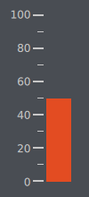
Starting from the default style, we'll change the color of the value bar to orange, and increase its width slightly:
valueBar: Rectangle {
    color: "#e34c22"
    implicitWidth: 28
}

As mentioned in the documentation for GaugeStyle, implicitWidth needs to be set when defining your own value bar.
The Foreground Component
The foreground component covers the full width and height of the value bar, even when the value bar is not at its highest. By default, the foreground component provides a "sheen". We'll choose to discard this, and leave it empty instead:
foreground: null

The Tickmark Component
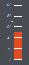
The tickmark component sits to the left or right of the value bar, depending on the control's tickmarkAlignment. In order to have the tickmarks cover the width of the value bar instead, we need to do two things:
- Remove the space the tickmarks previously assumed so that there is just enough space for margins between the tickmarks and value bar.
- Position the tickmarks according to the control's orientation and tickmark alignment.
tickmark: Item {
    implicitWidth: 8
    implicitHeight: 4

    Rectangle {
        x: control.tickmarkAlignment === Qt.AlignLeft
            || control.tickmarkAlignment === Qt.AlignTop ? parent.implicitWidth : -28
        width: 28
        height: parent.height
        color: "#ffffff"
    }
}
In this case we chose 8 pixel margins, so we set the implicitWidth of the tickmarks to that.
We account for every possible orientation and tickmark alignment, something that is not necessary if the gauge will only ever have one orientation and alignment. For example, if the gauge will always be of a vertical orientation and the tickmarks left-aligned, then it is enough to set the x property of the Rectangle to the following:
x: parent.implicitWidthThe value bar is 28 pixels wide, so we give the same width to our tickmarks so that they cover the width of it.

The Minor Tickmark Component
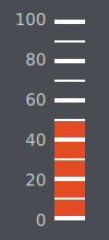
The minorTickmark component is almost identical to its larger counterpart, except that its width does not affect the layout of the gauge's components. We'll do similar adjustments to the ones in the previous section - the only difference being the height:
minorTickmark: Item {
    implicitWidth: 8
    implicitHeight: 2

    Rectangle {
        x: control.tickmarkAlignment === Qt.AlignLeft
            || control.tickmarkAlignment === Qt.AlignTop ? parent.implicitWidth : -28
        width: 28
        height: parent.height
        color: "#ffffff"
    }
}

Adjusting Font Size
Finally, we increase the font size to 15 pixels:
font.pixelSize: 15

Complete Source Code
import QtQuick 2.2
import QtQuick.Controls 1.4
import QtQuick.Controls.Styles 1.4
import QtQuick.Extras 1.4

Rectangle {
    width: 100
    height: 220
    color: "#494d53"

    Gauge {
        value: 50
        tickmarkStepSize: 20
        minorTickmarkCount: 1
        font.pixelSize: 15
        anchors.centerIn: parent
        anchors.horizontalCenterOffset: -4

        style: GaugeStyle {
            valueBar: Rectangle {
                color: "#e34c22"
                implicitWidth: 28
            }

            foreground: null

            tickmark: Item {
                implicitWidth: 8
                implicitHeight: 4

                Rectangle {
                    x: control.tickmarkAlignment === Qt.AlignLeft
                        || control.tickmarkAlignment === Qt.AlignTop ? parent.implicitWidth : -28
                    width: 28
                    height: parent.height
                    color: "#ffffff"
                }
            }

            minorTickmark: Item {
                implicitWidth: 8
                implicitHeight: 2

                Rectangle {
                    x: control.tickmarkAlignment === Qt.AlignLeft
                        || control.tickmarkAlignment === Qt.AlignTop ? parent.implicitWidth : -28
                    width: 28
                    height: parent.height
                    color: "#ffffff"
                }
            }
        }
    }
}
© 2024 The Qt Company Ltd. Documentation contributions included herein are the copyrights of their respective owners. The documentation provided herein is licensed under the terms of the GNU Free Documentation License version 1.3 as published by the Free Software Foundation. Qt and respective logos are trademarks of The Qt Company Ltd. in Finland and/or other countries worldwide. All other trademarks are property of their respective owners.

