Simple Scatter Graph
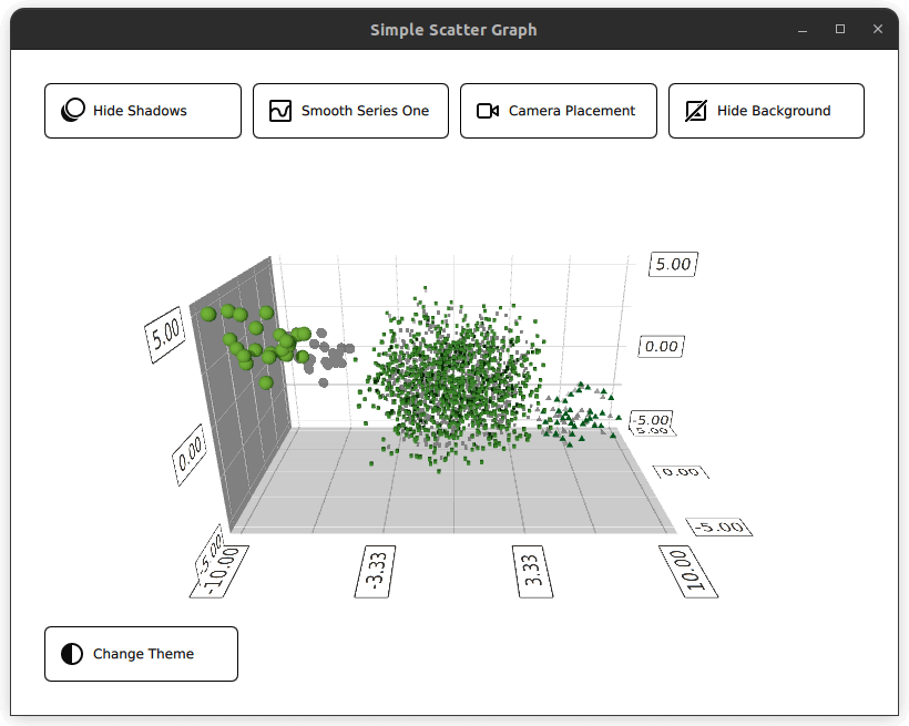
Using Scatter3D in a QML application.
Simple Scatter Graph shows how to make a simple scatter graph visualization using Scatter3D and QML.
For instructions about how to interact with the graph, see this page.
For instructions on how to create a new Qt Quick application of your own, see Qt Creator help.
Running the Example
To run the example from Qt Creator, open the Welcome mode and select the example from Examples. For more information, see Qt Creator: Tutorial: Build and run.
Setting up the Layout
Before diving into the QML code, main.cpp sets up the application. The main.qml file is read from resource (qrc:)
viewer.setSource(QUrl("qrc:/qml/scatter/main.qml"));
This main.qml file is the starting point for the application's QML code. Firstly, import all the required QML modules:
import QtQuick
import QtQuick.Controls
import QtQuick.Layouts
import QtGraphs
Then, create a Data item which will be the item that holds the data for the graph.
Data {
    id: seriesData
}
Next, create two GraphsTheme items that define two different themes for the graph, a Qt Green theme and a Qt Neon Green theme.
GraphsTheme {
    id: themeQt
    theme: GraphsTheme.Theme.QtGreen
    labelFont.pointSize: 40
}

GraphsTheme {
    id: themeQtNeonGreen
    theme: GraphsTheme.Theme.QtGreenNeon
    colorScheme: GraphsTheme.ColorScheme.Dark
}
The layout for this application is going to consist of five different buttons to toggle different visual options for the graph on and off, and of course the graph itself. There are many ways to organize these, one way is to have a GridLayout containing four buttons, the Graph, and the fifth button, all appearing in a ColumnLayout.
ColumnLayout {
    id: mainLayout
    anchors.fill: parent
    anchors.margins: margin
    spacing: spacing
The GridLayout is responsive. What this means is that the number of columns used depends on the width of the application window. This is done by assigning the columns property a ternary operator, resolving to either 1, 2 or 4, depending on the window width.
GridLayout {
    Layout.fillWidth: true
    rowSpacing: spacing
    columnSpacing: spacing

    columns: mainView.width < mainView.buttonMinWidth * 2 + mainView.spacing + mainView.margin * 2 // width of 2 buttons
             ? 1
             : (mainView.width < mainView.buttonMinWidth * 4 + mainView.spacing * 3 + mainView.margin * 2 // width of 4 buttons
                ? 2
                : 4)
In this GridLayout, four RoundButtons are instantiated. One for toggling shadows, one for mesh smoothing, one for camera position, and finally, one for changing the background of the graph. All the buttons follow the same structure. Rather than redefining this structure for all buttons, a custom component can be made.
component CustomButton : RoundButton {
    id: buttonRoot
CustomButtom extends the RoundButton type, but adds a few additions. Properties such as Layout.minimumWidth, Layout.FillWidth, radius and background are set. These define the styling and layout of the button.
property alias source: iconImage.source

Layout.minimumWidth: buttonMinWidth
Layout.fillWidth: true

radius: mainView.radius

background: Rectangle {
    radius: mainView.radius
    color: "white"
    border.color: "black"
}
Whereas the contentItem defines the content of the button, in this case a Row type containing an icon and some text. The icon is imported using an Image type, and setting the source property. The text is created using a Label type and set using its text property. Two alliases are created for these two properties at the top of the custom component, this will allow them to be set when an instance of CustomButton is created.
contentItem: Row {
    id: content
    Image {
        id: iconImage
    }
    Label {
        text: buttonRoot.text
        horizontalAlignment: Text.AlignLeft
        anchors.verticalCenter: parent.verticalCenter
    }
}
In the GridLayout, four CustomButtons are created. Three properties need to be set, the two alliases for the icon image and the text, and the signal onClicked.
CustomButton {
    id: shadowButton
    text: graph.shadowQuality === Graphs3D.ShadowQuality.None ?
              qsTr("Show Shadows") : qsTr("Hide Shadows")
    source: graph.shadowQuality === Graphs3D.ShadowQuality.None ?
                "qrc:/images/shadow.svg" : "qrc:/images/shadow_hide.svg"
    onClicked: {
        graph.shadowQuality = graph.shadowQuality === Graphs3D.ShadowQuality.None ?
                    Graphs3D.ShadowQuality.High :
                    Graphs3D.ShadowQuality.None
    }
}
For example, the shadow button sets the onClicked sign to toggle the shadow on and off.
Setting up the Graph
Next in the layout is the Graph, this is defined in its own QML file Graph.qml, and is instantiated as follows:
Graph {
    id: graph
    Layout.fillWidth: true
    Layout.fillHeight: true
}
Looking at its implementation in Graph.qml, the graph is of type Scatter3D, nested within an Item type.
Scatter3D {
    id: scatterGraph
Before defining the data sets, some of the axes properties are configured.
axisX.segmentCount: 3
axisX.subSegmentCount: 2
axisX.labelFormat: "%.2f"
axisZ.segmentCount: 2
axisZ.subSegmentCount: 2
axisZ.labelFormat: "%.2f"
axisY.segmentCount: 2
axisY.subSegmentCount: 2
axisY.labelFormat: "%.2f"
Setting up the Data
The graph shows three datasets, representing the data given in Data.qml. The datasets are stored in ListModel types
ListModel {
    id: dataModel
    ListElement{ xPos: -10.0; yPos: 5.0; zPos: -5.0 }
    ...
    ListElement{ xPos: -7.54 ; yPos: 2.8 ; zPos: -3.68 }
}

ListModel {
    id: dataModelTwo
    ListElement{ xPos: 2.25 ; yPos: 1.36 ; zPos: -1.3 }
    ...
    ListElement{ xPos: -3.4 ; yPos: 0.6 ; zPos: 0.9 }
}

ListModel {
    id: dataModelThree
    ListElement{ xPos: 8.0; yPos: -2.0; zPos: 4.0 }
    ...
    ListElement{ xPos: 5.66 ; yPos: -4.98 ; zPos: 3.72 }
}
and exposed to the other files using property aliases
property alias model: dataModel
property alias modelTwo: dataModelTwo
property alias modelThree: dataModelThree
Before these aliases are used, create a Scatter3DSeries type, containing a ItemModelScatterDataProxy item.
Scatter3DSeries {
    id: scatterSeries
    itemLabelFormat: "Series 1: X:@xLabel Y:@yLabel Z:@zLabel"

    ItemModelScatterDataProxy {
        itemModel: seriesData.model
        xPosRole: "xPos"
        yPosRole: "yPos"
        zPosRole: "zPos"
    }
}
This data proxy refers to the datasets in Data.qml using its itemModel property. The aliases mentioned above are accessed through the id of the Data type instantiated in main.qml, seriesData.
itemModel: seriesData.model
Repeat this for the remaining two datasets.
Scatter3DSeries {
    id: scatterSeriesTwo
    ...
ItemModelScatterDataProxy {
    itemModel: seriesData.modelTwo
    ...
    }
}
Scatter3DSeries {
    id: scatterSeriesThree
    ...
ItemModelScatterDataProxy {
    itemModel: seriesData.modelThree
    ...
    }
}
Great, the scatter graph is now pointing to the three datasets.
The only thing left to do is to add the remaining button, the theme button, to our ColumnLayout. The only difference with this button is it is positioned on the left-hand side of the layout. This is set by defining the Layout.alignment property to Qt.AlignLeft and Layout.fillWidth to false.
CustomButton {
    id: themeButton
    Layout.alignment: Qt.AlignLeft
    Layout.fillWidth: false
Example Contents
© 2026 The Qt Company Ltd. Documentation contributions included herein are the copyrights of their respective owners. The documentation provided herein is licensed under the terms of the GNU Free Documentation License version 1.3 as published by the Free Software Foundation. Qt and respective logos are trademarks of The Qt Company Ltd. in Finland and/or other countries worldwide. All other trademarks are property of their respective owners.
