
GridView QML Element
The GridView item provides a grid view of items provided by a model. More...
| Since: | Qt 4.7 |
| Inherits: |
Properties
- cacheBuffer : int
- cellHeight : int
- cellWidth : int
- count : int
- currentIndex : int
- currentItem : Item
- delegate : Component
- flow : enumeration
- footer : Component
- header : Component
- highlight : Component
- highlightFollowsCurrentItem : bool
- highlightItem : Item
- highlightMoveDuration : int
- highlightRangeMode : enumeration
- keyNavigationWraps : bool
- layoutDirection : enumeration
- model : model
- preferredHighlightBegin : real
- preferredHighlightEnd : real
- snapMode : enumeration
Attached Properties
- delayRemove : bool
- isCurrentItem : bool
- view : GridView
Attached Signals
Methods
- int indexAt(int x, int y)
- moveCurrentIndexDown()
- moveCurrentIndexLeft()
- moveCurrentIndexRight()
- moveCurrentIndexUp()
- positionViewAtBeginning()
- positionViewAtEnd()
- positionViewAtIndex(int index, PositionMode mode)
Detailed Description
A GridView displays data from models created from built-in QML elements like ListModel and XmlListModel, or custom model classes defined in C++ that inherit from QAbstractListModel.
A GridView has a model, which defines the data to be displayed, and a delegate, which defines how the data should be displayed. Items in a GridView are laid out horizontally or vertically. Grid views are inherently flickable as GridView inherits from Flickable.
Example Usage
The following example shows the definition of a simple list model defined in a file called ContactModel.qml:
import QtQuick 1.0

ListModel {

    ListElement {
        name: "Jim Williams"
        portrait: "pics/portrait.png"
    }
    ListElement {
        name: "John Brown"
        portrait: "pics/portrait.png"
    }
    ListElement {
        name: "Bill Smyth"
        portrait: "pics/portrait.png"
    }
    ListElement {
        name: "Sam Wise"
        portrait: "pics/portrait.png"
    }
}
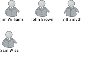
This model can be referenced as ContactModel in other QML files. See QML Modules for more information about creating reusable components like this.
Another component can display this model data in a GridView, as in the following example, which creates a ContactModel component for its model, and a Column element (containing Image and Text elements) for its delegate.
import QtQuick 1.0

GridView {
    width: 300; height: 200

    model: ContactModel {}
    delegate: Column {
        Image { source: portrait; anchors.horizontalCenter: parent.horizontalCenter }
        Text { text: name; anchors.horizontalCenter: parent.horizontalCenter }
    }
}
The view will create a new delegate for each item in the model. Note that the delegate is able to access the model's name and portrait data directly.
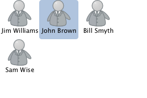
An improved grid view is shown below. The delegate is visually improved and is moved into a separate contactDelegate component.
Rectangle {
    width: 300; height: 200

    Component {
        id: contactDelegate
        Item {
            width: grid.cellWidth; height: grid.cellHeight
            Column {
                anchors.fill: parent
                Image { source: portrait; anchors.horizontalCenter: parent.horizontalCenter }
                Text { text: name; anchors.horizontalCenter: parent.horizontalCenter }
            }
        }
    }

    GridView {
        id: grid
        anchors.fill: parent
        cellWidth: 80; cellHeight: 80

        model: ContactModel {}
        delegate: contactDelegate
        highlight: Rectangle { color: "lightsteelblue"; radius: 5 }
        focus: true
    }
}
The currently selected item is highlighted with a blue Rectangle using the highlight property, and focus is set to true to enable keyboard navigation for the grid view. The grid view itself is a focus scope (see the focus documentation page for more details).
Delegates are instantiated as needed and may be destroyed at any time. State should never be stored in a delegate.
GridView attaches a number of properties to the root item of the delegate, for example GridView.isCurrentItem. In the following example, the root delegate item can access this attached property directly as GridView.isCurrentItem, while the child contactInfo object must refer to this property as wrapper.GridView.isCurrentItem.
GridView {
    width: 300; height: 200
    cellWidth: 80; cellHeight: 80

    Component {
        id: contactsDelegate
        Rectangle {
            id: wrapper
            width: 80
            height: 80
            color: GridView.isCurrentItem ? "black" : "red"
            Text {
                id: contactInfo
                text: name + ": " + number
                color: wrapper.GridView.isCurrentItem ? "red" : "black"
            }
        }
    }

    model: ContactModel {}
    delegate: contactsDelegate
    focus: true
}
Note: Views do not set the clip property automatically. If the view is not clipped by another item or the screen, it will be necessary to set this property to true in order to clip the items that are partially or fully outside the view.
See also GridView example.
Property Documentation
This property determines whether delegates are retained outside the visible area of the view.
If non-zero the view will keep as many delegates instantiated as will fit within the buffer specified. For example, if in a vertical view the delegate is 20 pixels high and cacheBuffer is set to 40, then up to 2 delegates above and 2 delegates below the visible area may be retained.
Note that cacheBuffer is not a pixel buffer - it only maintains additional instantiated delegates.
Setting this value can make scrolling the list smoother at the expense of additional memory usage. It is not a substitute for creating efficient delegates; the fewer elements in a delegate, the faster a view may be scrolled.
These properties holds the width and height of each cell in the grid.
The default cell size is 100x100.
These properties holds the width and height of each cell in the grid.
The default cell size is 100x100.
The currentIndex property holds the index of the current item, and currentItem holds the current item. Setting the currentIndex to -1 will clear the highlight and set currentItem to null.
If highlightFollowsCurrentItem is true, setting either of these properties will smoothly scroll the GridView so that the current item becomes visible.
Note that the position of the current item may only be approximate until it becomes visible in the view.
currentItem : Item |
The currentIndex property holds the index of the current item, and currentItem holds the current item. Setting the currentIndex to -1 will clear the highlight and set currentItem to null.
If highlightFollowsCurrentItem is true, setting either of these properties will smoothly scroll the GridView so that the current item becomes visible.
Note that the position of the current item may only be approximate until it becomes visible in the view.
delegate : Component |
The delegate provides a template defining each item instantiated by the view. The index is exposed as an accessible index property. Properties of the model are also available depending upon the type of Data Model.
The number of elements in the delegate has a direct effect on the flicking performance of the view. If at all possible, place functionality that is not needed for the normal display of the delegate in a Loader which can load additional elements when needed.
The GridView will layout the items based on the size of the root item in the delegate.
Note: Delegates are instantiated as needed and may be destroyed at any time. State should never be stored in a delegate.
footer : Component |
This property holds the component to use as the footer.
An instance of the footer component is created for each view. The footer is positioned at the end of the view, after any items.
See also header.
header : Component |
This property holds the component to use as the header.
An instance of the header component is created for each view. The header is positioned at the beginning of the view, before any items.
See also footer.
highlight : Component |
This property holds the component to use as the highlight.
An instance of the highlight component is created for each view. The geometry of the resulting component instance will be managed by the view so as to stay with the current item, unless the highlightFollowsCurrentItem property is false.
See also highlightItem and highlightFollowsCurrentItem.
This property sets whether the highlight is managed by the view.
If this property is true (the default value), the highlight is moved smoothly to follow the current item. Otherwise, the highlight is not moved by the view, and any movement must be implemented by the highlight.
Here is a highlight with its motion defined by a SpringAnimation item:
Component {
    id: highlight
    Rectangle {
        width: view.cellWidth; height: view.cellHeight
        color: "lightsteelblue"; radius: 5
        x: view.currentItem.x
        y: view.currentItem.y
        Behavior on x { SpringAnimation { spring: 3; damping: 0.2 } }
        Behavior on y { SpringAnimation { spring: 3; damping: 0.2 } }
    }
}

GridView {
    id: view
    width: 300; height: 200
    cellWidth: 80; cellHeight: 80

    model: ContactModel {}
    delegate: Column {
        Image { source: portrait; anchors.horizontalCenter: parent.horizontalCenter }
        Text { text: name; anchors.horizontalCenter: parent.horizontalCenter }
    }

    highlight: highlight
    highlightFollowsCurrentItem: false
    focus: true
}
highlightItem : Item |
This holds the highlight item created from the highlight component.
The highlightItem is managed by the view unless highlightFollowsCurrentItem is set to false.
See also highlight and highlightFollowsCurrentItem.
This property holds the move animation duration of the highlight delegate.
highlightFollowsCurrentItem must be true for this property to have effect.
The default value for the duration is 150ms.
See also highlightFollowsCurrentItem.
These properties define the preferred range of the highlight (for the current item) within the view. The preferredHighlightBegin value must be less than the preferredHighlightEnd value.
These properties affect the position of the current item when the view is scrolled. For example, if the currently selected item should stay in the middle of the view when it is scrolled, set the preferredHighlightBegin and preferredHighlightEnd values to the top and bottom coordinates of where the middle item would be. If the currentItem is changed programmatically, the view will automatically scroll so that the current item is in the middle of the view. Furthermore, the behavior of the current item index will occur whether or not a highlight exists.
Valid values for highlightRangeMode are:
- GridView.ApplyRange - the view attempts to maintain the highlight within the range. However, the highlight can move outside of the range at the ends of the view or due to mouse interaction.
- GridView.StrictlyEnforceRange - the highlight never moves outside of the range. The current item changes if a keyboard or mouse action would cause the highlight to move outside of the range.
- GridView.NoHighlightRange - this is the default value.
This property holds whether the grid wraps key navigation
If this is true, key navigation that would move the current item selection past one end of the view instead wraps around and moves the selection to the other end of the view.
By default, key navigation is not wrapped.
This property holds the layout direction of the grid.
Possible values:
- Qt.LeftToRight (default) - Items will be laid out starting in the top, left corner. The flow is dependent on the GridView::flow property.
- Qt.RightToLeft - Items will be laid out starting in the top, right corner. The flow is dependent on the GridView::flow property.
When using the attached property LayoutMirroring::enabled for locale layouts, the layout direction of the grid view will be mirrored. However, the actual property layoutDirection will remain unchanged. You can use the property LayoutMirroring::enabled to determine whether the direction has been mirrored.
See also LayoutMirroring.
model : model |
This property holds the model providing data for the grid.
The model provides the set of data that is used to create the items in the view. Models can be created directly in QML using ListModel, XmlListModel or VisualItemModel, or provided by C++ model classes. If a C++ model class is used, it must be a subclass of QAbstractItemModel or a simple list.
See also Data Models.
These properties define the preferred range of the highlight (for the current item) within the view. The preferredHighlightBegin value must be less than the preferredHighlightEnd value.
These properties affect the position of the current item when the view is scrolled. For example, if the currently selected item should stay in the middle of the view when it is scrolled, set the preferredHighlightBegin and preferredHighlightEnd values to the top and bottom coordinates of where the middle item would be. If the currentItem is changed programmatically, the view will automatically scroll so that the current item is in the middle of the view. Furthermore, the behavior of the current item index will occur whether or not a highlight exists.
Valid values for highlightRangeMode are:
- GridView.ApplyRange - the view attempts to maintain the highlight within the range. However, the highlight can move outside of the range at the ends of the view or due to mouse interaction.
- GridView.StrictlyEnforceRange - the highlight never moves outside of the range. The current item changes if a keyboard or mouse action would cause the highlight to move outside of the range.
- GridView.NoHighlightRange - this is the default value.
This property determines how the view scrolling will settle following a drag or flick. The possible values are:
- GridView.NoSnap (default) - the view stops anywhere within the visible area.
- GridView.SnapToRow - the view settles with a row (or column for
GridView.TopToBottomflow) aligned with the start of the view. - GridView.SnapOneRow - the view will settle no more than one row (or column for
GridView.TopToBottomflow) away from the first visible row at the time the mouse button is released. This mode is particularly useful for moving one page at a time.
Attached Property Documentation
This attached property holds whether the delegate may be destroyed.
It is attached to each instance of the delegate.
It is sometimes necessary to delay the destruction of an item until an animation completes.
The example below ensures that the animation completes before the item is removed from the grid.
Component {
    id: delegate
    Item {
        GridView.onRemove: SequentialAnimation {
            PropertyAction { target: wrapper; property: "GridView.delayRemove"; value: true }
            NumberAnimation { target: wrapper; property: "scale"; to: 0; duration: 250; easing.type: Easing.InOutQuad }
            PropertyAction { target: wrapper; property: "GridView.delayRemove"; value: false }
        }
    }
}
This attached property is true if this delegate is the current item; otherwise false.
It is attached to each instance of the delegate.
GridView.view : GridView |
This attached property holds the view that manages this delegate instance.
It is attached to each instance of the delegate.
GridView {
    width: 300; height: 200
    cellWidth: 80; cellHeight: 80

    Component {
        id: contactsDelegate
        Rectangle {
            id: wrapper
            width: 80
            height: 80
            color: GridView.isCurrentItem ? "black" : "red"
            Text {
                id: contactInfo
                text: name + ": " + number
                color: wrapper.GridView.isCurrentItem ? "red" : "black"
            }
        }
    }

    model: ContactModel {}
    delegate: contactsDelegate
    focus: true
}
Attached Signal Documentation
Method Documentation
Returns the index of the visible item containing the point x, y in content coordinates. If there is no item at the point specified, or the item is not visible -1 is returned.
If the item is outside the visible area, -1 is returned, regardless of whether an item will exist at that point when scrolled into view.
Note: methods should only be called after the Component has completed.
Move the currentIndex down one item in the view. The current index will wrap if keyNavigationWraps is true and it is currently at the end. This method has no effect if the count is zero.
Note: methods should only be called after the Component has completed.
Move the currentIndex left one item in the view. The current index will wrap if keyNavigationWraps is true and it is currently at the end. This method has no effect if the count is zero.
Note: methods should only be called after the Component has completed.
Move the currentIndex right one item in the view. The current index will wrap if keyNavigationWraps is true and it is currently at the end. This method has no effect if the count is zero.
Note: methods should only be called after the Component has completed.
Move the currentIndex up one item in the view. The current index will wrap if keyNavigationWraps is true and it is currently at the end. This method has no effect if the count is zero.
Note: methods should only be called after the Component has completed.
Positions the view at the beginning or end, taking into account any header or footer.
It is not recommended to use contentX or contentY to position the view at a particular index. This is unreliable since removing items from the start of the list does not cause all other items to be repositioned, and because the actual start of the view can vary based on the size of the delegates.
Note: methods should only be called after the Component has completed. To position the view at startup, this method should be called by Component.onCompleted. For example, to position the view at the end on startup:
Component.onCompleted: positionViewAtEnd()
This QML method was introduced in QtQuick 1.1.
Positions the view at the beginning or end, taking into account any header or footer.
It is not recommended to use contentX or contentY to position the view at a particular index. This is unreliable since removing items from the start of the list does not cause all other items to be repositioned, and because the actual start of the view can vary based on the size of the delegates.
Note: methods should only be called after the Component has completed. To position the view at startup, this method should be called by Component.onCompleted. For example, to position the view at the end on startup:
Component.onCompleted: positionViewAtEnd()This QML method was introduced in QtQuick 1.1.
Positions the view such that the index is at the position specified by mode:
- GridView.Beginning - position item at the top (or left for
GridView.TopToBottomflow) of the view. - GridView.Center - position item in the center of the view.
- GridView.End - position item at bottom (or right for horizontal orientation) of the view.
- GridView.Visible - if any part of the item is visible then take no action, otherwise bring the item into view.
- GridView.Contain - ensure the entire item is visible. If the item is larger than the view the item is positioned at the top (or left for
GridView.TopToBottomflow) of the view.
If positioning the view at the index would cause empty space to be displayed at the beginning or end of the view, the view will be positioned at the boundary.
It is not recommended to use contentX or contentY to position the view at a particular index. This is unreliable since removing items from the start of the view does not cause all other items to be repositioned. The correct way to bring an item into view is with positionViewAtIndex.
Note: methods should only be called after the Component has completed. To position the view at startup, this method should be called by Component.onCompleted. For example, to position the view at the end:
Component.onCompleted: positionViewAtIndex(count - 1, GridView.Beginning)
© 2016 The Qt Company Ltd. Documentation contributions included herein are the copyrights of their respective owners. The documentation provided herein is licensed under the terms of the GNU Free Documentation License version 1.3 as published by the Free Software Foundation. Qt and respective logos are trademarks of The Qt Company Ltd. in Finland and/or other countries worldwide. All other trademarks are property of their respective owners.