
SpinBox QML Type
Provides a spin box control. More...
| Import Statement: | import QtQuick.Controls 1.4 |
| Since: | Qt 5.1 |
| Inherits: |
Properties
- activeFocusOnPress : bool
- cursorPosition : int
- decimals : int
- font : font
- horizontalAlignment : int
- hovered : bool
- inputMethodComposing : bool
- maximumValue : real
- menu : Component
- minimumValue : real
- prefix : string
- selectByMouse : bool
- stepSize : real
- style : Component
- suffix : string
- value : real
Signals
Detailed Description
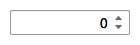
SpinBox allows the user to choose a value by clicking the up or down buttons, or by pressing up or down on the keyboard. The user can also type the value in manually.
By default the SpinBox provides discrete values in the range [0-99] with a stepSize of 1 and 0 decimals.
SpinBox {
    id: spinbox
}
Note that if you require decimal values you will need to set the decimals to a non 0 value.
SpinBox {
    id: spinbox
    decimals: 2
}
Property Documentation
This property indicates whether the Spinbox should get active focus when pressed. The default value is true.
This property holds the position of the cursor in the SpinBox.
This QML property was introduced in QtQuick.Controls 1.5.
This property indicates the amount of decimals. Note that if you enter more decimals than specified, they will be truncated to the specified amount of decimal places. The default value is 0.
This property indicates how the content is horizontally aligned within the text field.
The supported values are:
- Qt.AlignLeft
- Qt.AlignHCenter
- Qt.AlignRight
The default value is style dependent.
This QML property was introduced in QtQuick.Controls 1.1.
This property holds whether the SpinBox has partial text input from an input method.
While it is composing an input method may rely on mouse or key events from the SpinBox to edit or commit the partial text. This property can be used to determine when to disable events handlers that may interfere with the correct operation of an input method.
This QML property was introduced in QtQuick.Controls 1.3.
The maximum value of the SpinBox range. The value is clamped to this value. If maximumValue is smaller than minimumValue, minimumValue will be enforced.
The default value is 99.
menu : Component |
This property contains the edit Menu for working with text selection. Set it to null if no menu is wanted.
This QML property was introduced in QtQuick.Controls 1.3.
This property determines if the user can select the text with the mouse.
The default value is true.
This QML property was introduced in QtQuick.Controls 1.3.
The amount by which the value is incremented/decremented when a spin button is pressed.
The default value is 1.0.
style : Component |
The style Component for this control.
See also Qt Quick Controls Styles QML Types.
The value of this SpinBox, clamped to minimumValue and maximumValue.
The default value is 0.0.
Signal Documentation
This signal is emitted when the Return or Enter key is pressed or the control loses focus.
The corresponding handler is onEditingFinished.
This QML signal was introduced in QtQuick.Controls 1.1.
© 2018 The Qt Company Ltd. Documentation contributions included herein are the copyrights of their respective owners. The documentation provided herein is licensed under the terms of the GNU Free Documentation License version 1.3 as published by the Free Software Foundation. Qt and respective logos are trademarks of The Qt Company Ltd. in Finland and/or other countries worldwide. All other trademarks are property of their respective owners.