
TableView QML Type
Provides a list view with scroll bars, styling and header sections. More...
| Import Statement: | import QtQuick.Controls 1.4 |
| Since: | Qt 5.1 |
| Inherits: |
Properties
- alternatingRowColors : bool
- backgroundVisible : bool
- columnCount : int
- contentFooter : Component
- contentHeader : Component
- currentRow : int
- headerDelegate : Component
- headerVisible : bool
- itemDelegate : Component
- model : model
- rowCount : int
- rowDelegate : Component
- section
- section.property : string
- section.criteria : enumeration
- section.delegate : Component
- section.labelPositioning : enumeration
- selection : Selection
- selectionMode : int
- sortIndicatorColumn : int
- sortIndicatorOrder : int
- sortIndicatorVisible : bool
Signals
- activated(int row)
- clicked(int row)
- doubleClicked(int row)
- pressAndHold(int row)
Methods
- TableViewColumn addColumn(object column)
- TableViewColumn getColumn(int index)
- TableViewColumn insertColumn(int index, object column)
- void moveColumn(int from, int to)
- void positionViewAtRow(int row, PositionMode mode)
- void removeColumn(int index)
- void resizeColumnsToContents()
- int rowAt(int x, int y)
Detailed Description
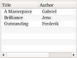
A TableView is similar to ListView, and adds scroll bars, selection, and resizable header sections. As with ListView, data for each row is provided through a model:
ListModel {
    id: libraryModel
    ListElement {
        title: "A Masterpiece"
        author: "Gabriel"
    }
    ListElement {
        title: "Brilliance"
        author: "Jens"
    }
    ListElement {
        title: "Outstanding"
        author: "Frederik"
    }
}
You provide title and size of a column header by adding a TableViewColumn as demonstrated below.
TableView {
    TableViewColumn {
        role: "title"
        title: "Title"
        width: 100
    }
    TableViewColumn {
        role: "author"
        title: "Author"
        width: 200
    }
    model: libraryModel
}
The header sections are attached to values in the model by defining the model role they attach to. Each property in the model will then be shown in their corresponding column.
You can customize the look by overriding the itemDelegate, rowDelegate, or headerDelegate properties.
The view itself does not provide sorting. This has to be done on the model itself. However you can provide sorting on the model, and enable sort indicators on headers.
- int sortIndicatorColumn - The index of the current sort column
- bool sortIndicatorVisible - Whether the sort indicator should be enabled
- enum sortIndicatorOrder - Qt.AscendingOrder or Qt.DescendingOrder depending on state
You can create a custom appearance for a TableView by assigning a TableViewStyle.
Property Documentation
This property is set to true if the view alternates the row color. The default value is true.
This property determines if the background should be filled or not.
The default value is true.
Note: The rowDelegate is not affected by this property
contentFooter : Component |
This is the content footer of the view.
contentHeader : Component |
This is the content header of the view.
The current row index of the view. The default value is -1 to indicate that no row is selected.
headerDelegate : Component |
This property defines a delegate to draw a header.
In the header delegate you have access to the following special properties:
- styleData.value - the value or text for this item
- styleData.column - the index of the column
- styleData.pressed - true when the column is being pressed
- styleData.containsMouse - true when the column is under the mouse
- styleData.textAlignment - the horizontal text alignment of the column (since QtQuickControls 1.1)
itemDelegate : Component |
This property defines a delegate to draw a specific cell.
In the item delegate you have access to the following special properties:
- styleData.selected - if the item is currently selected
- styleData.value - the value or text for this item
- styleData.textColor - the default text color for an item
- styleData.row - the index of the view row
- styleData.column - the index of the view column
- styleData.elideMode - the elide mode of the column
- styleData.textAlignment - the horizontal text alignment of the column
- styleData.pressed - true when the item is pressed (since QtQuick.Controls 1.3)
- styleData.hasActiveFocus - true when the row has focus (since QtQuick.Controls 1.3)
Example:
itemDelegate: Item {
    Text {
        anchors.verticalCenter: parent.verticalCenter
        color: styleData.textColor
        elide: styleData.elideMode
        text: styleData.value
    }
}
Note: For performance reasons, created delegates can be recycled across multiple table rows. This implies that when you make use of implicit properties such as styleData.row or model, these values can change after the delegate has been constructed. This means that you should not assume that content is fixed when Component.onCompleted is called, but instead rely on bindings to such properties.
model : model |
This property holds the model providing data for the table view.
The model provides the set of data that is used to create the items in the view. Models can be created directly in QML using ListModel, XmlListModel or VisualItemModel, or provided by C++ model classes.
Example model:
model: ListModel {
    ListElement {
        column1: "value 1"
        column2: "value 2"
    }
    ListElement {
        column1: "value 3"
        column2: "value 4"
    }
}
See also ListView::model and Data Models.
rowDelegate : Component |
This property defines a delegate to draw a row.
In the row delegate you have access to the following special properties:
- styleData.alternate - true when the row uses the alternate background color
- styleData.selected - true when the row is currently selected
- styleData.row - the index of the row
- styleData.hasActiveFocus - true when the row has focus (since QtQuick.Controls 1.3)
- styleData.pressed - true when the row is pressed (since QtQuick.Controls 1.3)
Note: For performance reasons, created delegates can be recycled across multiple table rows. This implies that when you make use of implicit properties such as styleData.row or model, these values can change after the delegate has been constructed. This means that you should not assume that content is fixed when Component.onCompleted is called, but instead rely on bindings to such properties.
section.delegate : Component |
These properties determine the section labels.
See also ListView.section.
This property contains the current row-selection of the TableView. The selection allows you to select, deselect or iterate over selected rows.
- function clear() - deselects all rows
- function selectAll() - selects all rows
- function select(from, to) - selects a range
- function deselect(from, to) - deselects a range
- function forEach(callback) - iterates over all selected rows
- function contains(index) - checks whether the selection includes the given index
- signal selectionChanged() - the current row selection changed
- readonly property int count - the number of selected rows
Example:
tableview.selection.select(0)       // select row index 0

tableview.selection.select(1, 3)    // select row indexes 1, 2 and 3

tableview.selection.deselect(0, 1)  // deselects row index 0 and 1

tableview.selection.deselect(2)     // deselects row index 2
Example: To iterate over selected indexes, you can pass a callback function. rowIndex is passed as an argument to the callback function.
tableview.selection.forEach( function(rowIndex) {console.log(rowIndex)} )
This QML property was introduced in QtQuick.Controls 1.1.
This enum indicates how the view responds to user selections:
The possible modes are:
- SelectionMode.NoSelection - Items cannot be selected.
- SelectionMode.SingleSelection - When the user selects an item, any already-selected item becomes unselected, and the user cannot unselect the selected item. (Default)
- SelectionMode.MultiSelection - When the user selects an item in the usual way, the selection status of that item is toggled and the other items are left alone.
- SelectionMode.ExtendedSelection - When the user selects an item in the usual way, the selection is cleared and the new item selected. However, if the user presses the Ctrl key when clicking on an item, the clicked item gets toggled and all other items are left untouched. If the user presses the Shift key while clicking on an item, all items between the current item and the clicked item are selected or unselected, depending on the state of the clicked item. Multiple items can be selected by dragging the mouse over them.
- SelectionMode.ContiguousSelection - When the user selects an item in the usual way, the selection is cleared and the new item selected. However, if the user presses the Shift key while clicking on an item, all items between the current item and the clicked item are selected.
This QML property was introduced in QtQuick.Controls 1.1.
This sets the sorting order of the sort indicator The allowed values are:
- Qt.AscendingOrder - the default
- Qt.DescendingOrder
This property shows or hides the sort indicator The default value is false.
Note: The view itself does not sort the data.
Signal Documentation
Emitted when the user activates an item by mouse or keyboard interaction. Mouse activation is triggered by single- or double-clicking, depending on the platform.
row int provides access to the activated row index.
Note: This signal is only emitted for mouse interaction that is not blocked in the row or item delegate.
The corresponding handler is onActivated.
Emitted when the user clicks a valid row by single clicking
row int provides access to the clicked row index.
Note: This signal is only emitted if the row or item delegate does not accept mouse events.
The corresponding handler is onClicked.
Emitted when the user double clicks a valid row.
row int provides access to the clicked row index.
Note: This signal is only emitted if the row or item delegate does not accept mouse events.
The corresponding handler is onDoubleClicked.
Emitted when the user presses and holds a valid row.
row int provides access to the pressed row index.
Note: This signal is only emitted if the row or item delegate does not accept mouse events.
The corresponding handler is onPressAndHold.
This QML signal was introduced in QtQuick.Controls 1.3.
Method Documentation
TableViewColumn addColumn(object column) |
Adds a column and returns the added column.
The column argument can be an instance of TableViewColumn, or a Component. The component has to contain a TableViewColumn. Otherwise null is returned.
TableViewColumn getColumn(int index) |
Returns the column at the given index or null if the index is invalid.
TableViewColumn insertColumn(int index, object column) |
Inserts a column at the given index and returns the inserted column.
The column argument can be an instance of TableViewColumn, or a Component. The component has to contain a TableViewColumn. Otherwise null is returned.
Positions the view such that the specified row is at the position defined by mode:
- ListView.Beginning - position item at the top of the view.
- ListView.Center - position item in the center of the view.
- ListView.End - position item at bottom of the view.
- ListView.Visible - if any part of the item is visible then take no action, otherwise bring the item into view.
- ListView.Contain - ensure the entire item is visible. If the item is larger than the view the item is positioned at the top of the view.
If positioning the row creates an empty space at the beginning or end of the view, then the view is positioned at the boundary.
For example, to position the view at the end at startup:
Component.onCompleted: table.positionViewAtRow(rowCount -1, ListView.Contain)
Depending on how the model is populated, the model may not be ready when TableView Component.onCompleted is called. In that case you may need to delay the call to positionViewAtRow by using a Timer.
Note: This method should only be called after the component has completed.
Resizes all columns to ensure that the column contents and the headers will fit.
This QML method was introduced in QtQuick.Controls 1.2.
Returns the index of the visible row at the point x, y in content coordinates. If there is no visible row at the point specified, -1 is returned.
Note: This method should only be called after the component has completed.
© 2018 The Qt Company Ltd. Documentation contributions included herein are the copyrights of their respective owners. The documentation provided herein is licensed under the terms of the GNU Free Documentation License version 1.3 as published by the Free Software Foundation. Qt and respective logos are trademarks of The Qt Company Ltd. in Finland and/or other countries worldwide. All other trademarks are property of their respective owners.