
RadioButton QML Type
A radio button with a text label. More...
| Import Statement: | import QtQuick.Controls 1.4 |
| Since: | Qt 5.1 |
| Inherits: |
Detailed Description
A RadioButton is an option button that can be switched on (checked) or off (unchecked). Radio buttons typically present the user with a "one of many" choices. In a group of radio buttons, only one radio button can be checked at a time; if the user selects another button, the previously selected button is switched off.
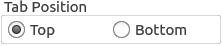
GroupBox {
    title: "Tab Position"

    RowLayout {
        ExclusiveGroup { id: tabPositionGroup }
        RadioButton {
            text: "Top"
            checked: true
            exclusiveGroup: tabPositionGroup
        }
        RadioButton {
            text: "Bottom"
            exclusiveGroup: tabPositionGroup
        }
    }
}
You can create a custom appearance for a RadioButton by assigning a RadioButtonStyle.
© 2018 The Qt Company Ltd. Documentation contributions included herein are the copyrights of their respective owners. The documentation provided herein is licensed under the terms of the GNU Free Documentation License version 1.3 as published by the Free Software Foundation. Qt and respective logos are trademarks of The Qt Company Ltd. in Finland and/or other countries worldwide. All other trademarks are property of their respective owners.