
MessageDialog QML Type
Dialog component for displaying popup messages. More...
| Import Statement: | import QtQuick.Dialogs 1.3 |
| Since: | Qt 5.2 |
Properties
- clickedButton : StandardButton
- detailedText : string
- icon : QQuickStandardIcon::Icon
- informativeText : string
- modality : Qt::WindowModality
- standardButtons : StandardButtons
- text : string
- title : string
- visible : bool
Signals
Methods
Detailed Description
The most basic use case for a MessageDialog is a popup alert. It also allows the user to respond in various ways depending on which buttons are enabled. The dialog is initially invisible. You need to set the properties as desired first, then set visible to true or call open().
Here is a minimal example to show an alert and exit after the user responds:
import QtQuick 2.2
import QtQuick.Dialogs 1.1

MessageDialog {
    id: messageDialog
    title: "May I have your attention please"
    text: "It's so cool that you are using Qt Quick."
    onAccepted: {
        console.log("And of course you could only agree.")
        Qt.quit()
    }
    Component.onCompleted: visible = true
}
There are several possible handlers depending on which standardButtons the dialog has and the ButtonRole of each. For example, the onRejected handler will be called if the user presses a Cancel, Close or Abort button.
A MessageDialog window is automatically transient for its parent window. So whether you declare the dialog inside an Item or inside a Window, the dialog will appear centered over the window containing the item, or over the Window that you declared.
The implementation of MessageDialog will be a platform message dialog if possible. If that isn't possible, then it will try to instantiate a QMessageBox. If that also isn't possible, then it will fall back to a QML implementation, DefaultMessageDialog.qml. In that case you can customize the appearance by editing this file. DefaultMessageDialog.qml contains a Rectangle to hold the dialog's contents, because certain embedded systems do not support multiple top-level windows. When the dialog becomes visible, it will automatically be wrapped in a Window if possible, or simply reparented on top of the main window if there can only be one window.
Property Documentation
This property holds the button pressed by the user. Its value is one of the flags set for the standardButtons property.
detailedText : string |
The text to be displayed in the details area, which is hidden by default. The user will then be able to press the Show Details... button to make it visible.
See also text.
The icon of the message box can be specified with one of these values:
| no icon | StandardIcon.NoIcon | For an unadorned text alert. |
 | StandardIcon.Question | For asking a question during normal operations. |
| StandardIcon.Information | For reporting information about normal operations. |
| StandardIcon.Warning | For reporting non-critical errors. |
| StandardIcon.Critical | For reporting critical errors. |


The default is StandardIcon.NoIcon.
The enum values are the same as in QMessageBox::Icon.
informativeText : string |
The informative text that provides a fuller description for the message.
Informative text can be used to supplement the text to give more information to the user. Depending on the platform, it may appear in a smaller font below the text, or simply appended to the text.
See also text.
Whether the dialog should be shown modal with respect to the window containing the dialog's parent Item, modal with respect to the whole application, or non-modal.
By default it is Qt.WindowModal.
Modality does not mean that there are any blocking calls to wait for the dialog to be accepted or rejected; it's only that the user will be prevented from interacting with the parent window and/or the application windows until the dialog is dismissed.
The MessageDialog has a row of buttons along the bottom, each of which has a ButtonRole that determines which signal will be emitted when the button is pressed. You can also find out which specific button was pressed after the fact via the clickedButton property. You can control which buttons are available by setting standardButtons to a bitwise-or combination of the following flags:
| Constant | Description |
|---|---|
StandardButton.Ok | An OK button defined with the AcceptRole. |
StandardButton.Open | An Open button defined with the AcceptRole. |
StandardButton.Save | A Save button defined with the AcceptRole. |
StandardButton.Cancel | A Cancel button defined with the RejectRole. |
StandardButton.Close | A Close button defined with the RejectRole. |
StandardButton.Discard | A Discard or Don't Save button, depending on the platform, defined with the DestructiveRole. |
StandardButton.Apply | An Apply button defined with the ApplyRole. |
StandardButton.Reset | A Reset button defined with the ResetRole. |
StandardButton.RestoreDefaults | A Restore Defaults button defined with the ResetRole. |
StandardButton.Help | A Help button defined with the HelpRole. |
StandardButton.SaveAll | A Save All button defined with the AcceptRole. |
StandardButton.Yes | A Yes button defined with the YesRole. |
StandardButton.YesToAll | A Yes to All button defined with the YesRole. |
StandardButton.No | A No button defined with the NoRole. |
StandardButton.NoToAll | A No to All button defined with the NoRole. |
StandardButton.Abort | An Abort button defined with the RejectRole. |
StandardButton.Retry | A Retry button defined with the AcceptRole. |
StandardButton.Ignore | An Ignore button defined with the AcceptRole. |
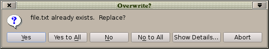
For example the following dialog will ask a question with 5 possible answers:
import QtQuick 2.2
import QtQuick.Dialogs 1.1

MessageDialog {
    title: "Overwrite?"
    icon: StandardIcon.Question
    text: "file.txt already exists.  Replace?"
    detailedText: "To replace a file means that its existing contents will be lost. " +
        "The file that you are copying now will be copied over it instead."
    standardButtons: StandardButton.Yes | StandardButton.YesToAll |
        StandardButton.No | StandardButton.NoToAll | StandardButton.Abort
    Component.onCompleted: visible = true
    onYes: console.log("copied")
    onNo: console.log("didn't copy")
    onRejected: console.log("aborted")
}
The default is StandardButton.Ok.
The enum values are the same as in QMessageBox::StandardButtons.
text : string |
The primary text to be displayed.
title : string |
The title of the dialog window.
visible : bool |
This property holds whether the dialog is visible. By default this is false.
See also modality.
Signal Documentation
This signal is emitted when the user has pressed any button which has the AcceptRole: OK, Open, Save, Save All, Retry or Ignore.
The corresponding handler is onAccepted.
This signal is emitted when the user has pressed the Apply button.
The corresponding handler is onApply.
This signal is emitted when the user has pressed the Discard button.
The corresponding handler is onDiscard.
This signal is emitted when the user has pressed the Help button. Depending on platform, the dialog may not be automatically dismissed because the help that your application provides may need to be relevant to the text shown in this dialog in order to assist the user in making a decision. However on other platforms it's not possible to show a dialog and a help window at the same time. If you want to be sure that the dialog will close, you can set visible to false in your handler.
The corresponding handler is onHelp.
This signal is emitted when the user has pressed any button which has the NoRole: No or No to All.
The corresponding handler is onNo.
This signal is emitted when the user has dismissed the dialog, by closing the dialog window, by pressing a Cancel, Close or Abort button on the dialog, or by pressing the back button or the escape key.
The corresponding handler is onRejected.
This signal is emitted when the user has pressed any button which has the ResetRole: Reset or Restore Defaults.
The corresponding handler is onReset.
This signal is emitted when the user has pressed any button which has the YesRole: Yes or Yes to All.
The corresponding handler is onYes.
Method Documentation
Shows the dialog to the user. It is equivalent to setting visible to true.
© 2018 The Qt Company Ltd. Documentation contributions included herein are the copyrights of their respective owners. The documentation provided herein is licensed under the terms of the GNU Free Documentation License version 1.3 as published by the Free Software Foundation. Qt and respective logos are trademarks of The Qt Company Ltd. in Finland and/or other countries worldwide. All other trademarks are property of their respective owners.