
Using Containers in Qt Designer
Container widgets provide high level control over groups of objects on a form. They can be used to perform a variety of functions, such as managing input widgets, providing paged and tabbed layouts, or just acting as decorative containers for other objects.
Qt Designer provides visual feedback to help you place objects inside your containers. When you drag an object from the widget box (or elsewhere) on the form, each container will be highlighted when the cursor is positioned over it. This indicates that you can drop the object inside, making it a child object of the container. This feedback is important because it is easy to place objects close to containers without actually placing them inside. Both widgets and spacers can be used inside containers.
Stacked widgets, tab widgets, and toolboxes are handled specially in Qt Designer. Normally, when adding pages (tabs, pages, compartments) to these containers in your own code, you need to supply existing widgets, either as placeholders or containing child widgets. In Qt Designer, these are automatically created for you, so you can add child objects to each page straight away.
Each container typically allows its child objects to be arranged in one or more layouts. The type of layout management provided depends on each container, although setting the layout is usually just a matter of selecting the container by clicking it, and applying a layout. The table below shows a list of available containers.
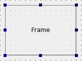 | Frames Frames are used to enclose and group widgets, as well as to provide decoration. They are used as the foundation for more complex containers, but they can also be used as placeholders in forms. The most important properties of frames are |
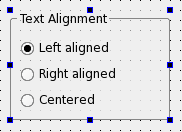 | Group Boxes Group boxes are usually used to group together collections of checkboxes and radio buttons with similar purposes. Among the significant properties of group boxes are |
 | Stacked Widgets Stacked widgets are collections of widgets in which only the topmost layer is visible. Control over the visible layer is usually managed by another widget, such as combobox, using signals and slots. Qt Designer shows arrows in the top-right corner of the stack to allow you to see all the widgets in the stack when designing it. These arrows do not appear in the preview or in the final component. To navigate between pages in the stack, select the stacked widget and use the Next Page and Previous Page entries from the context menu. The Insert Page and Delete Page context menu options allow you to add and remove pages. |
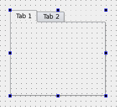 | Tab Widgets Tab widgets allow the developer to split up the contents of a widget into different labelled sections, only one of which is displayed at any given time. By default, the tab widget contains two tabs, and these can be deleted or renamed as required. You can also add additional tabs. To delete a tab:
To add a new tab:
|
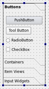 | ToolBox Widgets Toolbox widgets provide a series of pages or compartments in a toolbox. They are handled in a way similar to stacked widgets. To rename a page in a toolbox, make the toolbox your current pange and change its To add a new page, select Insert Page from the toolbox widget's context menu. You can add the page before or after the current page. To delete a page, select Delete Page from the toolbox widget's context menu. |
 | Dock Widgets Dock widgets are floating panels, often containing input widgets and more complex controls, that are either attached to the edges of the main window in "dock areas", or floated as independent tool windows. Although dock widgets can be added to any type of form, they are typically used with forms created from the main window template. |
© 2019 The Qt Company Ltd. Documentation contributions included herein are the copyrights of their respective owners. The documentation provided herein is licensed under the terms of the GNU Free Documentation License version 1.3 as published by the Free Software Foundation. Qt and respective logos are trademarks of The Qt Company Ltd. in Finland and/or other countries worldwide. All other trademarks are property of their respective owners.