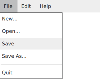
Menu Controls
Popup that can be used as a context menu or popup menu | |
Provides a window menu bar | |
Presents a drop-down menu within a MenuBar | |
Presents an item within a Menu |
Each type of menu control has its own specific target use case. The following sections offer guidelines for choosing the appropriate type of menu control, depending on the use case.
Menu Control

Menu control can be used for context menus; for example, after right-clicking. It can also be used for popup menus; for example, a menu that is shown after clicking a button.
MenuItem is an item in the Menu control. Each item in a menu:
- displays text to the user
- allows checking/unchecking
- is highlighted (for example, on keyboard navigation)
- performs some action on activation
MenuBar Control

MenuBar control can be used for window menu bars.
MenuBarItem is an item in the MenuBar control. Each item in a menu bar:
- displays text to the user
- is highlighted (for example, on keyboard navigation)
- pops up the respective menu on activation
© 2024 The Qt Company Ltd. Documentation contributions included herein are the copyrights of their respective owners. The documentation provided herein is licensed under the terms of the GNU Free Documentation License version 1.3 as published by the Free Software Foundation. Qt and respective logos are trademarks of The Qt Company Ltd. in Finland and/or other countries worldwide. All other trademarks are property of their respective owners.
