
チェックボックスのスタイル設定:手順解説
このページでは、チェックボックスがペイントイベントを受け取った瞬間から、スタイルの描画が完了するまでの流れを追います。ウィジェットがスタイルオプションを構築する方法、QCommonStyle が要素をパーツに分割する方法、そしてQProxyStyle がそれらのパーツの1つを置き換える方法を示しています。 ほとんどのウィジェットは同じ構造を採用しているため、それらに対しても同様の読み方(ウィジェットが構築するスタイルオプションを特定し、描画される要素を見つけ、それらの要素に対するQCommonStyle の実装を確認する)が有効です。
このウィジェットは、スタイルオプション
QCheckBox QStyleOptionButton を使用します。その 関数は、次のように(多少簡略化して)オプションを埋めます:initStyleOption()
    opt.initFrom(q);
    if (down)
        opt.state |= QStyle::State_Sunken;
    if (tristate && noChange)
        opt.state |= QStyle::State_NoChange;
    else
        opt.state |= checked ? QStyle::State_On : QStyle::State_Off;
    if (q->testAttribute(Qt::WA_Hover) && q->underMouse()) {
        if (hovering)
            opt.state |= QStyle::State_MouseOver;
        else
            opt.state &= ~QStyle::State_MouseOver;
    }
    opt.text = text;
    opt.icon = icon;
opt.iconSize = q->iconSize();QStyleOption::initFrom() は、すべてのウィジェットが共有する情報を設定します。その実装は、要するに以下の通りです:
    state = QStyle::State_None;
    if (widget->isEnabled())
        state |= QStyle::State_Enabled;
    if (widget->hasFocus())
        state |= QStyle::State_HasFocus;
    if (widget->window()->testAttribute(Qt::WA_KeyboardFocusChange))
        state |= QStyle::State_KeyboardFocusChange;
    if (widget->underMouse())
        state |= QStyle::State_MouseOver;
    if (widget->window()->isActiveWindow())
        state |= QStyle::State_Active;

    direction = widget->layoutDirection();
    rect = widget->rect();
    palette = widget->palette();
    fontMetrics = widget->fontMetrics();
State_Enabled ウィジェットが有効なときに `is` が設定され、フォーカスがあるときに `State_HasFocus `、ユーザーが最後にキーボードでフォーカスを切り替えたときに `State_KeyboardFocusChange `、ウィジェットのウィンドウがアクティブなウィンドウであるときに `State_Active ` が設定されます。マウスカーソルがウィジェット上にある間は `State_MouseOver ` が設定されます。状態に加えて、initFrom() はレイアウト方向、ウィジェットの矩形、パレット、およびフォントメトリクスをオプションに格納します。
QCheckBox さらに、独自の状態を追加します。State_Sunken は、チェックされているかどうかにかかわらず、ユーザーがボックスを押している間設定されます。State_NoChange は、部分的にチェックされている3状態のボックスの場合に設定されます。それ以外の場合は、State_On またはState_Off がチェック状態を反映します。このオプションには、テキスト、アイコン、およびアイコンのサイズも含まれます。QCheckBox は、ウィジェットにWA_Hover 属性がある間のみState_MouseOver を保持します。この属性は通常、polish()でスタイルによって設定されます。
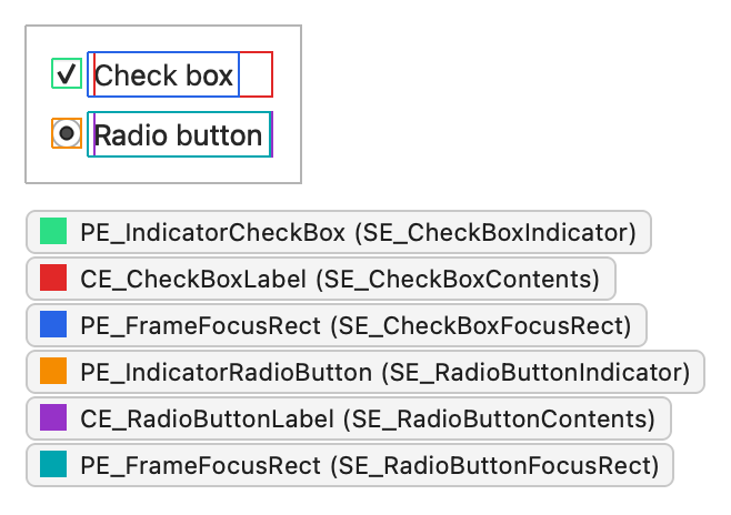
次のスクリーンショットで、フォーカスがチェックボックスにある状態で、ユーザーがマウスでそのチェックボックスをクリックしたと仮定します。このスクリーンショットにはラジオボタンも表示されていますが、これはPE_IndicatorRadioButton およびCE_RadioButtonLabel を使用した同じ構造を採用しています:
その瞬間、そのオプションには以下の状態フラグが設定されます:
| 状態フラグ | 設定済み |
|---|---|
State_Sunken | はい |
State_NoChange | いいえ |
State_On | はい |
State_Off | いいえ |
State_MouseOver | はい |
State_Enabled | はい |
State_HasFocus | はい |
State_KeyboardFocusChange | いいえ |
State_Active | はい |
このウィジェットは、スタイルに対して描画を要求します
QCheckBox paintEvent() 内で、 を使用して自身を描画します。この は、 の描画関数をラップしています:QStylePainter QStyle
    QStylePainter p;
    QStyleOptionButton opt;
    initStyleOption(&opt);
    p.drawControl(QStyle::CE_CheckBox, opt);
ウィジェットが行うのはこれだけです。それ以外の処理はすべてスタイル側で行われます。
QCommonStyleは要素を部分ごとに分割し
QCommonStyle CE_CheckBox の処理では、2つの子要素である と の矩形領域をスタイルに要求し、それぞれに要素を描画します。チェックボックスにフォーカスがある場合は、フォーカス枠も描画します:SE_CheckBoxIndicator SE_CheckBoxContents
    QStyleOptionButton subopt = *btn;
    subopt.rect = subElementRect(QStyle::SE_CheckBoxIndicator, btn, widget);
    proxy()->drawPrimitive(QStyle::PE_IndicatorCheckBox, &subopt, p, widget);
    subopt.rect = subElementRect(QStyle::SE_CheckBoxContents, btn, widget);
    proxy()->drawControl(QStyle::CE_CheckBoxLabel, &subopt, p, widget);
    if (btn->state & State_HasFocus) {
        QStyleOptionFocusRect fropt;
        fropt.QStyleOption::operator=(*btn);
        fropt.rect = subElementRect(QStyle::SE_CheckBoxFocusRect, btn, widget);
        proxy()->drawPrimitive(QStyle::PE_FrameFocusRect, &fropt, p, widget);
    }
proxy() の呼び出しに注目してください。スタイルは常にproxy()を通じて子要素を描画するため、それを囲むQProxyStyle がそれらを上書きする機会を得られます。
CE_CheckBoxLabel QCommonStyle にも実装されています:
    const QStyleOptionButton *btn = qstyleoption_cast<const QStyleOptionButton *>(opt);
    uint alignment = visualAlignment(btn->direction, Qt::AlignLeft | Qt::AlignVCenter);
    if (!proxy()->styleHint(SH_UnderlineShortcut, btn, widget))
        alignment |= Qt::TextHideMnemonic;
    QPixmap pix;
    QRect textRect = btn->rect;
    if (!btn->icon.isNull()) {
        const auto dpr = p->device()->devicePixelRatio();
        pix = btn->icon.pixmap(btn->iconSize, dpr,
                                btn->state & State_Enabled ? QIcon::Normal : QIcon::Disabled);
        proxy()->drawItemPixmap(p, btn->rect, alignment, pix);
        if (btn->direction == Qt::RightToLeft)
            textRect.setRight(textRect.right() - btn->iconSize.width() - 4);
        else
            textRect.setLeft(textRect.left() + btn->iconSize.width() + 4);
    }
    if (!btn->text.isEmpty()){
        proxy()->drawItemText(p, textRect, alignment | Qt::TextShowMnemonic,
            btn->palette, btn->state & State_Enabled, btn->text, QPalette::WindowText);
}visualAlignment()は、レイアウト方向に合わせて配置を調整します。スタイルは、アイコンがある場合はそれを描画し、それに応じて残りのテキスト矩形を縮小します。drawItemText() は、配置、レイアウト方向、およびニーモニックを考慮してテキストを描画し、パレットを使用してテキストの色を選択します。ラベルの描画には多くの詳細が関わりますが、基底クラスがそれらを適切に処理しているため、カスタムスタイルでこれを再実装する必要はほとんどありません。
プロキシスタイルはインジケータを置き換えます
インジケータ(PE_IndicatorCheckBox )はスタイルによって異なる部分であるため、置き換えるべき箇所となります。以下の `QProxyStyle ` サブクラスは、オプションのパレット色から角丸のインジケータを描画し、その他の要素はすべて基底スタイルに委譲します:
class CheckBoxStyle : public QProxyStyle
{
public:
    using QProxyStyle::QProxyStyle;

    void drawPrimitive(PrimitiveElement element, const QStyleOption *option,
                       QPainter *painter, const QWidget *widget) const override;
};
void CheckBoxStyle::drawPrimitive(PrimitiveElement element, const QStyleOption *option,
                                  QPainter *painter, const QWidget *widget) const
{
    if (element != PE_IndicatorCheckBox) {
        QProxyStyle::drawPrimitive(element, option, painter, widget);
        return;
    }

    const bool enabled = option->state & State_Enabled;
    const QPalette::ColorGroup group = !enabled ? QPalette::Disabled
                                     : option->state & State_Active ? QPalette::Active
                                                                    : QPalette::Inactive;
    const QPalette &palette = option->palette;
    const QRect rect = option->rect.adjusted(1, 1, -1, -1);

    painter->save();
    painter->setRenderHint(QPainter::Antialiasing);

    // Frame and background: highlight the frame while the mouse hovers over
    // the indicator, and darken the background while it's pressed.
    QColor frameColor = palette.color(group, QPalette::Mid);
    if (enabled && (option->state & State_MouseOver))
        frameColor = palette.color(group, QPalette::Highlight);
    const QPalette::ColorRole fillRole =
            option->state & State_Sunken ? QPalette::Mid : QPalette::Base;
    painter->setPen(frameColor);
    painter->setBrush(palette.brush(group, fillRole));
    painter->drawRoundedRect(rect, 2, 2);

    // Check mark for State_On, a filled square for the partially checked
    // State_NoChange, nothing for State_Off.
    const QRect inner = rect.adjusted(3, 3, -3, -3);
    if (option->state & State_On) {
        painter->setPen(QPen(palette.color(group, QPalette::Text), 2));
        painter->drawLine(inner.left(), inner.center().y(),
                          inner.center().x(), inner.bottom());
        painter->drawLine(inner.center().x(), inner.bottom(),
                          inner.right(), inner.top());
    } else if (option->state & State_NoChange) {
        painter->fillRect(inner, palette.brush(group, QPalette::Text));
    }

    painter->restore();
}この実装は、すべての情報をオプションから読み取ります。State_Enabled とState_Active からカラーグループを選択し、State_MouseOver が設定されている間はフレームをハイライト表示し、State_Sunken が設定されている間は背景を暗くし、State_On の場合はチェックマークを、State_NoChange の場合は塗りつぶされた四角形を描画します。すべての色がパレットから取得されるため、インジケータはアプリケーションのパレットに従い、明るいカラースキームと暗いカラースキームの両方で機能します。 また、ペインターを保存・復元するため、基底クラスは期待通りの状態のペインターを見つけることができます。
このインジケーターは、スタイルが `PE_IndicatorCheckBox` を描画する場所ならどこでも表示されます。つまり、チェックボックス、チェック可能なグループボックス、およびチェックマークとしてこれを使用するアイテムビューなどです。この再利用こそが、プリミティブ要素が存在する理由です。
このスタイルを使用するには、アプリケーションがウィジェットを作成する前にインストールしてください:
int main(int argc, char *argv[])
{
    QApplication::setStyle(new CheckBoxStyle);
    QApplication app(argc, argv);
    QCheckBox box("Send me updates");
    box.show();
    return app.exec();
}
他のウィジェットについても同様の解釈を適用してください
ウィジェットがどのように描画されるかを理解するために、コードをすべて読む必要はありません。通常、そのウィジェットがどのスタイル要素を描画するか、どの状態を設定するか、そしてそのスタイルオプションに何が含まれているかを知っていれば十分です。 ウィジェットはオプションを構築し、スタイルを1回以上呼び出します。スタイルは、ウィジェットから要求された要素を描画します。『ウィジェット・スタイル・リファレンス』には、各ウィジェットについてまさにその内容が記載されています。
「スタイルによるウィジェットの描画方法」、「ウィジェット・スタイルのリファレンス」、QProxyStyle 、およびQStyleOptionButtonも参照してください 。
© 2026 The Qt Company Ltd. Documentation contributions included herein are the copyrights of their respective owners. The documentation provided herein is licensed under the terms of the GNU Free Documentation License version 1.3 as published by the Free Software Foundation. Qt and respective logos are trademarks of The Qt Company Ltd. in Finland and/or other countries worldwide. All other trademarks are property of their respective owners.
