
简单的条形图
在 QML 应用程序中使用 Bars3D。
“简单条形图”演示了如何使用 Bars3D 和 QML 制作一个简单的 3D 条形图。
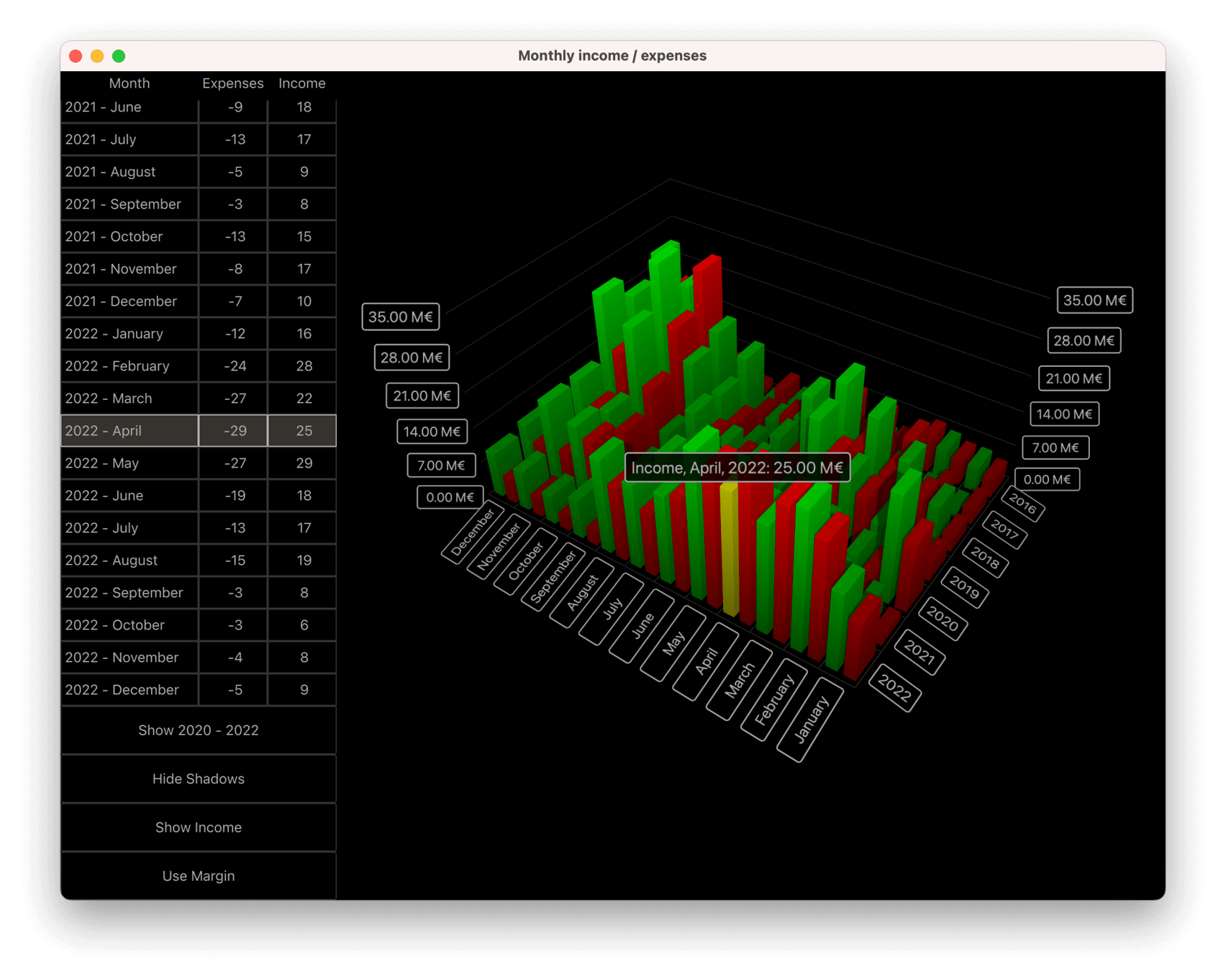
以下各节介绍了如何切换数据系列以及如何同时显示多个数据系列。有关 QML 应用程序基本功能的更多信息,请参阅《简单的散点图》。
运行示例
您可以通过以下方式运行示例:
- Qt Creator
打开Welcome 模式,并从Examples 中选择该示例。有关更多信息,请参阅Qt Creator :教程:构建和运行。
- Qt Extension for Visual Studio Code
在Command Palette 中运行Qt: Open Qt examples 命令,然后从列表中选择该示例。有关更多信息,请参阅Qt Extension for Visual Studio Code :教程:构建和运行。
数据
示例数据集是一家虚构公司数年间的月度收支情况。该数据在Data.qml 中以列表模型定义如下:
ListModel {
    id: dataModel
    ListElement{ timestamp: "2016-01"; expenses: "-4";  income: "5" }
    ListElement{ timestamp: "2016-02"; expenses: "-5";  income: "6" }
    ListElement{ timestamp: "2016-03"; expenses: "-7";  income: "4" }
...每个数据项具有三个角色:时间戳、收入和支出。时间戳的格式为:<four digit year>-<two digit month> 。通常,您会将年和月映射到条形图的行和列,但作为数值显示的只能是收入或支出其中之一。
现在,将数据添加到 Bars3D 图表中。在其中创建两个 Bar3DSeries,首先创建一个代表收入的系列:
Bar3DSeries {
    id: barSeries
    itemLabelFormat: "Income, @colLabel, @rowLabel: @valueLabel"
    baseGradient: barGradient

    ItemModelBarDataProxy {
        id: modelProxy
        itemModel: graphData.model
        rowRole: "timestamp"
        columnRole: "timestamp"
        valueRole: "income"
        rowRolePattern: /^(\d\d\d\d).*$/
        columnRolePattern: /^.*-(\d\d)$/
        rowRoleReplace: "\\1"
        columnRoleReplace: "\\1"
        multiMatchBehavior: ItemModelBarDataProxy.MMBCumulative
    }
    ...
数据绑定到系列内部 ItemModelBarDataProxy 的itemModel 属性上。对于valueRole ,请指定income 字段,因为它包含您所需的值。获取年和月则稍显复杂,因为它们都位于同一个字段中。 要提取这些值,请同时为rowRole 和columnRole 指定timestamp 字段,并为这些角色额外指定搜索模式和替换规则,以便为每个角色提取字段内容中的正确部分。搜索模式是标准的 JavaScript 正则表达式,而替换规则则指定了匹配正则表达式的字段内容将被替换为什么。 在此情况下,将整个字段内容替换为仅包含年份或月份的部分,即行和列中捕获的第一个子字符串。有关正则表达式替换功能的更多信息,请参阅QString::replace(const QRegExp &rx, constQString &after) 函数文档。
multiMatchBehavior 属性用于指定当多个项目模型项匹配同一行/列组合时应如何处理。在此情况下,将它们的值相加。在显示各月的值时,该属性无效,因为我们的项目模型中不存在重复的月份,但当您后续需要显示年度总计时,该属性便会发挥作用。
接着,再添加一个代表支出的系列:
Bar3DSeries {
    id: secondarySeries
    visible: false
    itemLabelFormat: "Expenses, @colLabel, @rowLabel: -@valueLabel"
    baseGradient: secondaryGradient

    ItemModelBarDataProxy {
        id: secondaryProxy
        itemModel: graphData.model
        rowRole: "timestamp"
        columnRole: "timestamp"
        valueRole: "expenses"
        rowRolePattern: /^(\d\d\d\d).*$/
        columnRolePattern: /^.*-(\d\d)$/
        valueRolePattern: /-/
        rowRoleReplace: "\\1"
        columnRoleReplace: "\\1"
        multiMatchBehavior: ItemModelBarDataProxy.MMBCumulative
    }
...模型中将支出以负值形式存储,但您希望将其显示为正值柱状图,以便与收入柱状图进行直观对比。为此,请使用valueRolePattern 属性去除负号。由于默认替换字符串为空字符串,因此无需指定替换字符串。
暂时使用该系列的visible 属性将第二个系列隐藏起来。
自定义坐标轴标签
Axes.qml 重新定义柱形轴的类别标签,因为数据中包含月份的数字,这些数字会使标签显得杂乱:
CategoryAxis3D {
    id: columnAxis
    labels: ["January", "February", "March", "April", "May", "June",
        "July", "August", "September", "October", "November", "December"]
    labelAutoRotation: 30
}
为了在低视角下提高轴标签的可读性,请设置自动轴标签旋转。
切换系列
在 `main.qml` 中,设置图表及各种 UI 元素。这里有三个值得关注的代码块。第一个代码块演示了如何通过简单地更改两个系列的可见性,在收入、支出以及两者同时显示之间切换可视化数据:
onClicked: {
    if (text === "Show Expenses") {
        barSeries.visible = false;
        secondarySeries.visible = true;
        barGraph.valueAxis.labelFormat = "-%.2f M\u20AC";
        secondarySeries.itemLabelFormat = "Expenses, @colLabel, @rowLabel: @valueLabel";
        text = "Show Both";
    } else if (text === "Show Both") {
        barSeries.visible = true;
        barGraph.valueAxis.labelFormat = "%.2f M\u20AC";
        secondarySeries.itemLabelFormat = "Expenses, @colLabel, @rowLabel: -@valueLabel";
        text = "Show Income";
    } else { // text === "Show Income"
        secondarySeries.visible = false;
        text = "Show Expenses";
    }
}
对坐标轴标签格式和项目选择标签格式进行了微调,以确保支出(实际上被解析为正值)的负号显示正确。
第二个值得关注的代码块是通过调整代理属性来更改可视化数据:
onClicked: {
    if (text === "Show yearly totals") {
        modelProxy.autoRowCategories = true;
        secondaryProxy.autoRowCategories = true;
        modelProxy.columnRolePattern = /^.*$/;
        secondaryProxy.columnRolePattern = /^.*$/;
        graphAxes.value.autoAdjustRange = true;
        barGraph.columnAxis = graphAxes.total;
        text = "Show all years";
    } else if (text === "Show all years") {
        modelProxy.autoRowCategories = true;
        secondaryProxy.autoRowCategories = true;
        modelProxy.columnRolePattern = /^.*-(\d\d)$/;
        secondaryProxy.columnRolePattern = /^.*-(\d\d)$/;
        graphAxes.value.min = 0;
        graphAxes.value.max = 35;
        barGraph.columnAxis = graphAxes.column;
        text = "Show 2020 - 2022";
    } else { // text === "Show 2020 - 2022"
        // Explicitly defining row categories, since we do not want to show data for
        // all years in the model, just for the selected ones.
        modelProxy.autoRowCategories = false;
        secondaryProxy.autoRowCategories = false;
        modelProxy.rowCategories = ["2020", "2021", "2022"];
        secondaryProxy.rowCategories = ["2020", "2021", "2022"];
        text = "Show yearly totals";
    }
}要显示年度总计,需将每年的十二个月合并为单个柱形。这通过指定与所有模型项目匹配的“columnRolePattern ”来实现。这样,数据代理将仅包含一列。此前为代理指定的累积“multiMatchBehavior ”此时便发挥作用,使每年十二个月的数值相加,形成单个柱形。
若要仅显示部分年份,请将 ItemModelBarDataProxy 项的autoRowCategories 设置为 false,并显式定义行类别。这样,只有指定行类别中的项目才会被可视化。
第三个值得关注的代码块演示了如何在已知行和列值的情况下,利用 ItemModelBarDataProxy 的方法rowCategoryIndex() 和columnCategoryIndex() 获取项目的行和列索引:
onCurrentRowChanged: {
    var timestamp = graphData.model.get(mainview.currentRow).timestamp;
    var pattern = /(\d\d\d\d)-(\d\d)/;
    var matches = pattern.exec(timestamp);
    var rowIndex = modelProxy.rowCategoryIndex(matches[1]);
    var colIndex;
    if (barGraph.columnAxis == graphAxes.total)
        colIndex = 0 ;// Just one column when showing yearly totals
    else
        colIndex = modelProxy.columnCategoryIndex(matches[2]);
    if (selectedSeries.visible)
        mainview.selectedSeries.selectedBar = Qt.point(rowIndex, colIndex);
    else if (barSeries.visible)
        barSeries.selectedBar = Qt.point(rowIndex, colIndex);
    else
        secondarySeries.selectedBar = Qt.point(rowIndex, colIndex);
}© 2026 The Qt Company Ltd. Documentation contributions included herein are the copyrights of their respective owners. The documentation provided herein is licensed under the terms of the GNU Free Documentation License version 1.3 as published by the Free Software Foundation. Qt and respective logos are trademarks of The Qt Company Ltd. in Finland and/or other countries worldwide. All other trademarks are property of their respective owners.
