Creating Percent Bar Charts
Note: This is part of the Charts with Widgets Gallery example.
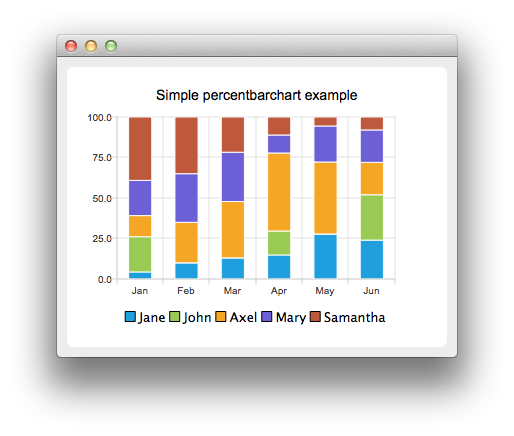
A percent bar chart shows the data in sets as a percentage of all sets per category.
Creating percent bar charts is just like creating a regular bar chart, except that for a percent bar charts, we use the QPercentBarSeries API instead of QBarSeries. Also, in the bar chart we used the nice numbers algorithm to make the y-axis numbering look better. With the percent bar chart there is no need for that, because the maximum y-axis value is always 100.
The barsets are used in same way in all barcharts. To illustrate the difference between various barcharts, we use the same data in all examples. The data visualized by the bar chart is defined by QBarSet instances. Here we create the sets and append data to them. The data is appended here with the << operator. Alternatively the append method could be used.
auto set0 = new QBarSet("Jane");
auto set1 = new QBarSet("John");
auto set2 = new QBarSet("Axel");
auto set3 = new QBarSet("Mary");
auto set4 = new QBarSet("Samantha");

*set0 << 1 << 2 << 3 << 4 << 5 << 6;
*set1 << 5 << 0 << 0 << 4 << 0 << 7;
*set2 << 3 << 5 << 8 << 13 << 8 << 5;
*set3 << 5 << 6 << 7 << 3 << 4 << 5;
*set4 << 9 << 7 << 5 << 3 << 1 << 2;
We create the series and append the barsets to it. The series takes ownership of the barsets. The series groups the data from sets to categories. The first values of each set are grouped together in the first category, the second values in the second category etc.
auto series = new QPercentBarSeries;
series->append(set0);
series->append(set1);
series->append(set2);
series->append(set3);
series->append(set4);
Here we create the chart object and add the series to it. We set the title of the chart with setTitle, and then turn on animations of the series by calling setAnimationOptions(QChart::SeriesAnimations)
auto chart = new QChart;
chart->addSeries(series);
chart->setTitle("Simple Percent Bar Chart");
chart->setAnimationOptions(QChart::SeriesAnimations);
To have the categories displayed on an axis, we need to create a QBarCategoryAxis first. Here we create a category axis with a list of categories and add it to the chart aligned to the bottom, acting as the x-axis. The chart takes ownership of the axis. For y-axis we use a value axis, aligned to the left-hand side.
QStringList categories {"Jan", "Feb", "Mar", "Apr", "May", "Jun"};
auto axisX = new QBarCategoryAxis;
axisX->append(categories);
chart->addAxis(axisX, Qt::AlignBottom);
series->attachAxis(axisX);
auto axisY = new QValueAxis;
chart->addAxis(axisY, Qt::AlignLeft);
series->attachAxis(axisY);
We also want to show the legend. To do so, we get the legend pointer from the chart and set it to visible. We also place the legend to bottom of the chart by setting its alignment to Qt::AlignBottom.
chart->legend()->setVisible(true);
chart->legend()->setAlignment(Qt::AlignBottom);
Finally we add the chart onto a view.
createDefaultChartView(chart);
The chart is ready to be shown.
© 2026 The Qt Company Ltd. Documentation contributions included herein are the copyrights of their respective owners. The documentation provided herein is licensed under the terms of the GNU Free Documentation License version 1.3 as published by the Free Software Foundation. Qt and respective logos are trademarks of The Qt Company Ltd. in Finland and/or other countries worldwide. All other trademarks are property of their respective owners.
