PySide6.QtWidgets.QCheckBox
- class QCheckBox
The
QCheckBoxwidget provides a checkbox with a text label.Details
Warning
This section contains snippets that were automatically translated from C++ to Python and may contain errors.

A
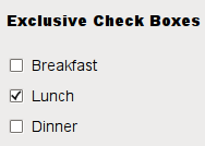
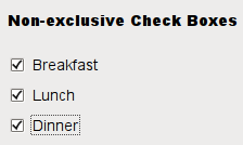
QCheckBoxis an option button that can be switched on (checked) or off (unchecked). Checkboxes are typically used to represent features in an application that can be enabled or disabled without affecting others. Different types of behavior can be implemented. For example, aQButtonGroupcan be used to group check buttons logically, allowing exclusive checkboxes. However,QButtonGroupdoes not provide any visual representation.The image below further illustrates the differences between exclusive and non-exclusive checkboxes.


Whenever a checkbox is checked or cleared, it emits the signal
checkStateChanged(). Connect to this signal if you want to trigger an action each time the checkbox changes state. You can useisChecked()to query whether or not a checkbox is checked.In addition to the usual checked and unchecked states,
QCheckBoxoptionally provides a third state to indicate “no change”. This is useful whenever you need to give the user the option of neither checking nor unchecking a checkbox. If you need this third state, enable it withsetTristate(), and usecheckState()to query the current toggle state.Just like
QPushButton, a checkbox displays text, and optionally a small icon. The icon is set withsetIcon(). The text can be set in the constructor or withsetText(). A shortcut key can be specified by preceding the preferred character with an ampersand. For example:checkbox = QCheckBox("Case sensitive", self)
In this example, the shortcut is Alt+A. See the QShortcut documentation for details. To display an actual ampersand, use ‘&&’.
See also
Synopsis
Properties
tristateᅟ- Whether the checkbox is a tri-state checkbox
Methods
def
__init__()def
checkState()def
isTristate()def
setCheckState()def
setTristate()
Virtual methods
Signals
def
stateChanged()
Note
This documentation may contain snippets that were automatically translated from C++ to Python. We always welcome contributions to the snippet translation. If you see an issue with the translation, you can also let us know by creating a ticket on https:/bugreports.qt.io/projects/PYSIDE
Note
Properties can be used directly when
from __feature__ import true_propertyis used or via accessor functions otherwise.- property tristateᅟ: bool
This property holds whether the checkbox is a tri-state checkbox.
The default is false, i.e., the checkbox has only two states.
- Access functions:
Constructs a checkbox with the given
parent, but with no text.parentis passed on to theQAbstractButtonconstructor.- __init__(text[, parent=None])
- Parameters:
text – str
parent –
QWidget
Constructs a checkbox with the given
parentandtext.parentis passed on to theQAbstractButtonconstructor.- checkState()
- Return type:
Returns the checkbox’s check state. If you do not need tristate support, you can also use
isChecked(), which returns a boolean.See also
setCheckState()CheckState- checkStateChanged(state)
- Parameters:
state –
CheckState
This signal is emitted whenever the checkbox’s state changes, i.e., whenever the user checks or unchecks it.
statecontains the checkbox’s new Qt::CheckState.- initStyleOption(option)
- Parameters:
option –
QStyleOptionButton
Initializes
optionwith the values from thisQCheckBox. This method is useful for subclasses that require aQStyleOptionButton, but do not want to fill in all the information themselves.See also
- isTristate()
- Return type:
bool
Getter of property
tristateᅟ.- setCheckState(state)
- Parameters:
state –
CheckState
Sets the checkbox’s check state to
state. If you do not need tristate support, you can also usesetChecked(), which takes a boolean.See also
checkState()CheckState- setTristate([y=true])
- Parameters:
y – bool
See also
Setter of property
tristateᅟ.- stateChanged(state)
- Parameters:
state – int
Note
This function is deprecated.
Use
checkStateChanged(Qt::CheckState) instead.This signal is emitted whenever the checkbox’s state changes, i.e., whenever the user checks or unchecks it.
statecontains the checkbox’s new Qt::CheckState.