Previous topic
Next topic
Quick search
QDialogButtonBox
The QDialogButtonBox class is a widget that presents buttons in a layout that is appropriate to the current widget style. More…
Synopsis
Functions
def
addButton(button)def
addButton(button, role)def
addButton(text, role)def
button(which)def
buttonRole(button)def
buttons()def
centerButtons()def
clear()def
orientation()def
removeButton(button)def
setCenterButtons(center)def
setOrientation(orientation)def
setStandardButtons(buttons)def
standardButton(button)def
standardButtons()
Signals
def
accepted()def
clicked(button)def
helpRequested()def
rejected()
Detailed Description
Dialogs and message boxes typically present buttons in a layout that conforms to the interface guidelines for that platform. Invariably, different platforms have different layouts for their dialogs. QDialogButtonBox allows a developer to add buttons to it and will automatically use the appropriate layout for the user’s desktop environment.
Most buttons for a dialog follow certain roles. Such roles include:
Accepting or rejecting the dialog.
Asking for help.
Performing actions on the dialog itself (such as resetting fields or applying changes).
There can also be alternate ways of dismissing the dialog which may cause destructive results.
Most dialogs have buttons that can almost be considered standard (e.g. OK and Cancel buttons). It is sometimes convenient to create these buttons in a standard way.
There are a couple ways of using QDialogButtonBox . One ways is to create the buttons (or button texts) yourself and add them to the button box, specifying their role.
findButton = QPushButton(tr("Find"))
findButton.setDefault(True)
moreButton = QPushButton(tr("More"))
moreButton.setCheckable(True)

moreButton.setAutoDefault(False)
Alternatively, QDialogButtonBox provides several standard buttons (e.g. OK, Cancel, Save) that you can use. They exist as flags so you can OR them together in the constructor.
buttonBox = QDialogButtonBox(QDialogButtonBox.Ok

                                 | QDialogButtonBox.Cancel)
connect(buttonBox, QDialogButtonBox.accepted, self, QDialog.accept)
connect(buttonBox, QDialogButtonBox.rejected, self, QDialog.reject)
You can mix and match normal buttons and standard buttons.
Currently the buttons are laid out in the following way if the button box is horizontal:
Button box laid out in horizontal
GnomeLayout
Button box laid out in horizontal
KdeLayout
Button box laid out in horizontal
MacLayout
Button box laid out in horizontal
WinLayout
The buttons are laid out the following way if the button box is vertical:
GnomeLayout
KdeLayout
MacLayout
WinLayout
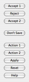
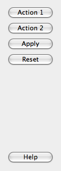
Additionally, button boxes that contain only buttons with ActionRole or HelpRole can be considered modeless and have an alternate look on macOS:
modeless horizontal
MacLayout
modeless vertical
MacLayout
When a button is clicked in the button box, the clicked() signal is emitted for the actual button is that is pressed. For convenience, if the button has an AcceptRole , RejectRole , or HelpRole , the accepted() , rejected() , or helpRequested() signals are emitted respectively.
If you want a specific button to be default you need to call setDefault() on it yourself. However, if there is no default button set and to preserve which button is the default button across platforms when using the autoDefault property, the first push button with the accept role is made the default button when the QDialogButtonBox is shown,
See also
- class PySide6.QtWidgets.QDialogButtonBox(buttons[, parent=None])
PySide6.QtWidgets.QDialogButtonBox(buttons, orientation[, parent=None])
PySide6.QtWidgets.QDialogButtonBox([parent=None])
PySide6.QtWidgets.QDialogButtonBox(orientation[, parent=None])
- Parameters
orientation –
Orientationparent –
PySide6.QtWidgets.QWidgetbuttons –
StandardButtons
Constructs a horizontal button box with the given parent, containing the standard buttons specified by buttons.
See also
Constructs a button box with the given orientation and parent, containing the standard buttons specified by buttons.
See also
Constructs an empty, horizontal button box with the given parent.
See also
Constructs an empty button box with the given orientation and parent.
See also
- PySide6.QtWidgets.QDialogButtonBox.ButtonRole
This enum describes the roles that can be used to describe buttons in the button box. Combinations of these roles are as flags used to describe different aspects of their behavior.
Constant
Description
QDialogButtonBox.InvalidRole
The button is invalid.
QDialogButtonBox.AcceptRole
Clicking the button causes the dialog to be accepted (e.g. OK).
QDialogButtonBox.RejectRole
Clicking the button causes the dialog to be rejected (e.g. Cancel).
QDialogButtonBox.DestructiveRole
Clicking the button causes a destructive change (e.g. for Discarding Changes) and closes the dialog.
QDialogButtonBox.ActionRole
Clicking the button causes changes to the elements within the dialog.
QDialogButtonBox.HelpRole
The button can be clicked to request help.
QDialogButtonBox.YesRole
The button is a “Yes”-like button.
QDialogButtonBox.NoRole
The button is a “No”-like button.
QDialogButtonBox.ApplyRole
The button applies current changes.
QDialogButtonBox.ResetRole
The button resets the dialog’s fields to default values.
See also
StandardButton
- PySide6.QtWidgets.QDialogButtonBox.StandardButton
These enums describe flags for standard buttons. Each button has a defined ButtonRole .
Constant
Description
QDialogButtonBox.Ok
An “OK” button defined with the
AcceptRole.QDialogButtonBox.Open
An “Open” button defined with the
AcceptRole.QDialogButtonBox.Save
A “Save” button defined with the
AcceptRole.QDialogButtonBox.Cancel
A “Cancel” button defined with the
RejectRole.QDialogButtonBox.Close
A “Close” button defined with the
RejectRole.QDialogButtonBox.Discard
A “Discard” or “Don’t Save” button, depending on the platform, defined with the
DestructiveRole.QDialogButtonBox.Apply
An “Apply” button defined with the
ApplyRole.QDialogButtonBox.Reset
A “Reset” button defined with the
ResetRole.QDialogButtonBox.RestoreDefaults
A “Restore Defaults” button defined with the
ResetRole.QDialogButtonBox.Help
A “Help” button defined with the
HelpRole.QDialogButtonBox.SaveAll
A “Save All” button defined with the
AcceptRole.QDialogButtonBox.Yes
A “Yes” button defined with the
YesRole.QDialogButtonBox.YesToAll
A “Yes to All” button defined with the
YesRole.QDialogButtonBox.No
A “No” button defined with the
NoRole.QDialogButtonBox.NoToAll
A “No to All” button defined with the
NoRole.QDialogButtonBox.Abort
An “Abort” button defined with the
RejectRole.QDialogButtonBox.Retry
A “Retry” button defined with the
AcceptRole.QDialogButtonBox.Ignore
An “Ignore” button defined with the
AcceptRole.QDialogButtonBox.NoButton
An invalid button.
See also
ButtonRolestandardButtons
- PySide6.QtWidgets.QDialogButtonBox.ButtonLayout
This enum describes the layout policy to be used when arranging the buttons contained in the button box.
Constant
Description
QDialogButtonBox.WinLayout
Use a policy appropriate for applications on Windows.
QDialogButtonBox.MacLayout
Use a policy appropriate for applications on macOS.
QDialogButtonBox.KdeLayout
Use a policy appropriate for applications on KDE.
QDialogButtonBox.GnomeLayout
Use a policy appropriate for applications on GNOME.
QDialogButtonBox.AndroidLayout
Use a policy appropriate for applications on Android. This enum value was added in Qt 5.10.
The button layout is specified by the current style . However, on the X11 platform, it may be influenced by the desktop environment.
- PySide6.QtWidgets.QDialogButtonBox.accepted()
- PySide6.QtWidgets.QDialogButtonBox.addButton(button, role)
- Parameters
button –
PySide6.QtWidgets.QAbstractButtonrole –
ButtonRole
Adds the given button to the button box with the specified role. If the role is invalid, the button is not added.
If the button has already been added, it is removed and added again with the new role.
- PySide6.QtWidgets.QDialogButtonBox.addButton(button)
- Parameters
button –
StandardButton- Return type
Adds a standard button to the button box if it is valid to do so, and returns a push button. If button is invalid, it is not added to the button box, and zero is returned.
See also
- PySide6.QtWidgets.QDialogButtonBox.addButton(text, role)
- Parameters
text – str
role –
ButtonRole
- Return type
Creates a push button with the given text, adds it to the button box for the specified role, and returns the corresponding push button. If role is invalid, no button is created, and zero is returned.
See also
- PySide6.QtWidgets.QDialogButtonBox.button(which)
- Parameters
which –
StandardButton- Return type
Returns the QPushButton corresponding to the standard button which, or None if the standard button doesn’t exist in this button box.
See also
- PySide6.QtWidgets.QDialogButtonBox.buttonRole(button)
- Parameters
button –
PySide6.QtWidgets.QAbstractButton- Return type
Returns the button role for the specified button. This function returns InvalidRole if button is None or has not been added to the button box.
See also
- PySide6.QtWidgets.QDialogButtonBox.buttons()
- Return type
Returns a list of all the buttons that have been added to the button box.
See also
- PySide6.QtWidgets.QDialogButtonBox.centerButtons()
- Return type
bool
This property holds whether the buttons in the button box are centered.
By default, this property is false. This behavior is appropriate for most types of dialogs. A notable exception is message boxes on most platforms (e.g. Windows), where the button box is centered horizontally.
See also
- PySide6.QtWidgets.QDialogButtonBox.clear()
Clears the button box, deleting all buttons within it.
See also
- PySide6.QtWidgets.QDialogButtonBox.clicked(button)
- Parameters
button –
PySide6.QtWidgets.QAbstractButton
- PySide6.QtWidgets.QDialogButtonBox.helpRequested()
- PySide6.QtWidgets.QDialogButtonBox.orientation()
- Return type
This property holds the orientation of the button box.
By default, the orientation is horizontal (i.e. the buttons are laid out side by side). The possible orientations are Horizontal and Vertical .
- PySide6.QtWidgets.QDialogButtonBox.rejected()
- PySide6.QtWidgets.QDialogButtonBox.removeButton(button)
- Parameters
button –
PySide6.QtWidgets.QAbstractButton
Removes button from the button box without deleting it and sets its parent to zero.
See also
- PySide6.QtWidgets.QDialogButtonBox.setCenterButtons(center)
- Parameters
center – bool
This property holds whether the buttons in the button box are centered.
By default, this property is false. This behavior is appropriate for most types of dialogs. A notable exception is message boxes on most platforms (e.g. Windows), where the button box is centered horizontally.
See also
- PySide6.QtWidgets.QDialogButtonBox.setOrientation(orientation)
- Parameters
orientation –
Orientation
This property holds the orientation of the button box.
By default, the orientation is horizontal (i.e. the buttons are laid out side by side). The possible orientations are Horizontal and Vertical .
- PySide6.QtWidgets.QDialogButtonBox.setStandardButtons(buttons)
- Parameters
buttons –
StandardButtons
This property holds collection of standard buttons in the button box.
This property controls which standard buttons are used by the button box.
See also
- PySide6.QtWidgets.QDialogButtonBox.standardButton(button)
- Parameters
button –
PySide6.QtWidgets.QAbstractButton- Return type
Returns the standard button enum value corresponding to the given button, or NoButton if the given button isn’t a standard button.
See also
- PySide6.QtWidgets.QDialogButtonBox.standardButtons()
- Return type
StandardButtons
This property holds collection of standard buttons in the button box.
This property controls which standard buttons are used by the button box.
See also
© 2022 The Qt Company Ltd. Documentation contributions included herein are the copyrights of their respective owners. The documentation provided herein is licensed under the terms of the GNU Free Documentation License version 1.3 as published by the Free Software Foundation. Qt and respective logos are trademarks of The Qt Company Ltd. in Finland and/or other countries worldwide. All other trademarks are property of their respective owners.


