
Donut Chart Breakdown Example
This example shows how to use create a donut breakdown chart using QPieSeries API.
Running the Example
To run the example from Qt Creator , open the Welcome mode and select the example from Examples. For more information, visit Building and Running an Example.
Creating Donut Breakdown Charts
Let’s start by defining some data for the chart.
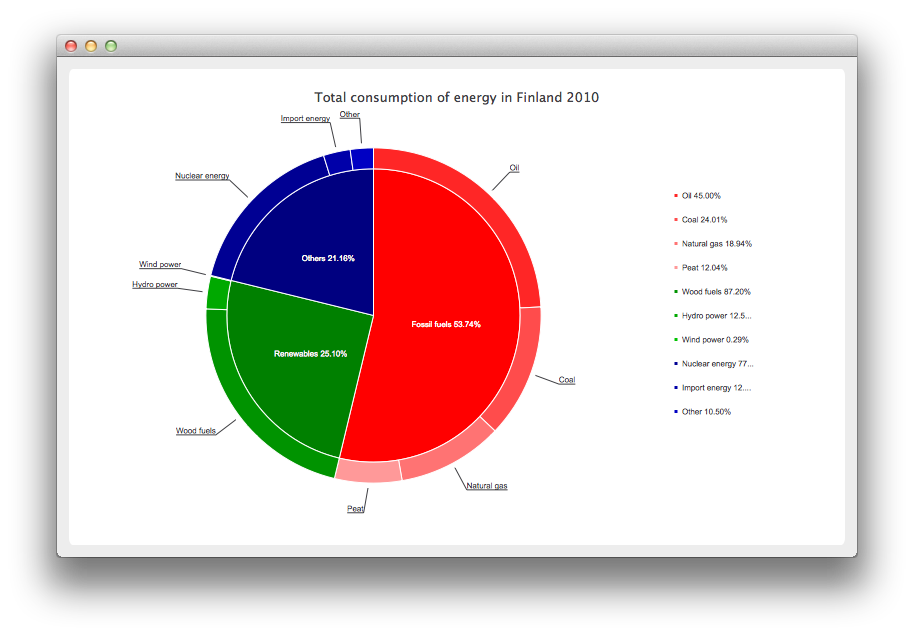
# Graph is based on data of 'Total consumption of energy increased by 10 per cent in 2010'
# Statistics Finland, 13 December 2011
# http://www.stat.fi/til/ekul/2010/ekul_2010_2011-12-13_tie_001_en.html
series1 = QPieSeries()
series1.setName("Fossil fuels")
series1.append("Oil", 353295)
series1.append("Coal", 188500)
series1.append("Natural gas", 148680)
series1.append("Peat", 94545)
series2 = QPieSeries()
series2.setName("Renewables")
series2.append("Wood fuels", 319663)
series2.append("Hydro power", 45875)
series2.append("Wind power", 1060)
series3 = QPieSeries()
series3.setName("Others")
series3.append("Nuclear energy", 238789)
series3.append("Import energy", 37802)
series3.append("Other", 32441)
Then we create a chart where we add the data. Note that this is our own chart derived from QChart .
donutBreakdown = DonutBreakdownChart()
donutBreakdown.setAnimationOptions(QChart.AllAnimations)
donutBreakdown.setTitle("Total consumption of energy in Finland 2010")
donutBreakdown.legend().setAlignment(Qt.AlignRight)
donutBreakdown.addBreakdownSeries(series1, Qt.red)
donutBreakdown.addBreakdownSeries(series2, Qt.darkGreen)
donutBreakdown.addBreakdownSeries(series3, Qt.darkBlue)
Our own chart works in such a way that we create a main series in the constructor we create a main series, which aggregates the data provided by the breakdown series. This is the piechart in the center.
DonutBreakdownChart.DonutBreakdownChart(QGraphicsItem parent, Qt.WindowFlags wFlags)
    QChart.__init__(self, .ChartTypeCartesian, parent, wFlags)

    # create the series for main center pie
    m_mainSeries = QPieSeries()
    m_mainSeries.setPieSize(0.7)
    QChart.addSeries(m_mainSeries)
When a breakdown series is added the data is used to create a slice in the main series and the breakdown series itself is used to create a segment of a donut positioned so that it is aligned with the corresponding slice in the main series.
def addBreakdownSeries(self, breakdownSeries, color):

    font = QFont("Arial", 8)
    # add breakdown series as a slice to center pie
    mainSlice = MainSlice(breakdownSeries)
    mainSlice.setName(breakdownSeries.name())
    mainSlice.setValue(breakdownSeries.sum())
    m_mainSeries.append(mainSlice)
    # customize the slice
    mainSlice.setBrush(color)
    mainSlice.setLabelVisible()
    mainSlice.setLabelColor(Qt.white)
    mainSlice.setLabelPosition(QPieSlice.LabelInsideHorizontal)
    mainSlice.setLabelFont(font)
    # position and customize the breakdown series
    breakdownSeries.setPieSize(0.8)
    breakdownSeries.setHoleSize(0.7)
    breakdownSeries.setLabelsVisible()
    slices = breakdownSeries.slices()
    for slice in slices:
        color = color.lighter(115)
        slice.setBrush(color)
        slice.setLabelFont(font)

    # add the series to the chart
    QChart.addSeries(breakdownSeries)
    # recalculate breakdown donut segments
    recalculateAngles()
    # update customize legend markers
    updateLegendMarkers()
Here’s how the start and end angles for the donut segments are calculated.
def recalculateAngles(self):

    angle = 0
    slices = m_mainSeries.slices()
    for slice in slices:
        breakdownSeries = MainSlice (slice).breakdownSeries()
        breakdownSeries.setPieStartAngle(angle)
        angle += slice.percentage() * 360.0 # full pie is 360.0
        breakdownSeries.setPieEndAngle(angle)
The legend markers are customized to show the breakdown percentage. The markers for the main level slices are hidden.
def updateLegendMarkers(self):

    # go through all markers
    allseries = series()
    for series in allseries:
        markers = legend().markers(series)
        for marker in markers:
            pieMarker = QPieLegendMarker (marker)
            if (series == m_mainSeries) {
                # hide markers from main series
                pieMarker.setVisible(False)
            else:
                # modify markers from breakdown series
                pieMarker.setLabel(QString("%1 %2%")
                                    .arg(pieMarker.slice().label())
                                    .arg(pieMarker.slice().percentage() * 100, 0, 'f', 2))
                pieMarker.setFont(QFont("Arial", 8))
Instead the main level slices show the percentage on the label.
def __init__(self, breakdownSeries, parent):
    QPieSlice.__init__(self, parent)
      m_breakdownSeries(breakdownSeries)

    connect(self, MainSlice::percentageChanged, self, MainSlice::updateLabel)        def updateLabel(self):

    self.setLabel(QString("%1 %2%").arg(m_name).arg(percentage() * 100, 0, 'f', 2))
Now that we have our chart defined, we can finally create a QChartView and show the chart.
window = QMainWindow()
chartView = QChartView(donutBreakdown)
chartView.setRenderHint(QPainter.Antialiasing)
window.setCentralWidget(chartView)
window.resize(800, 500)
window.show()
© 2022 The Qt Company Ltd. Documentation contributions included herein are the copyrights of their respective owners. The documentation provided herein is licensed under the terms of the GNU Free Documentation License version 1.3 as published by the Free Software Foundation. Qt and respective logos are trademarks of The Qt Company Ltd. in Finland and/or other countries worldwide. All other trademarks are property of their respective owners.