
HorizontalBarChart Example
The example shows how to create a horizontal bar chart.
QHorizontalBarChart shows the data in sets as separate bars, which are grouped in categories. QHorizontalBarChart works just like QBarChart, except that the bars are drawn horizontally on the chart.
Running the Example
To run the example from Qt Creator , open the Welcome mode and select the example from Examples. For more information, visit Building and Running an Example.
Creating Horizontal Bar Charts
The bar sets are used in the same way in all bar charts. To illustrate the difference between various bar charts, we use the same data in all examples. Data that bar chart visualizes, is defined by QBarSet instances. Here we create the sets and append data to them. The data is appended here with << operator. Alternatively, the append method could also be used.
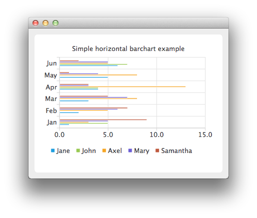
set0 = QBarSet("Jane")
set1 = QBarSet("John")
set2 = QBarSet("Axel")
set3 = QBarSet("Mary")
set4 = QBarSet("Samantha")
set0 << 1 << 2 << 3 << 4 << 5 << 6
set1 << 5 << 0 << 0 << 4 << 0 << 7
set2 << 3 << 5 << 8 << 13 << 8 << 5
set3 << 5 << 6 << 7 << 3 << 4 << 5
set4 << 9 << 7 << 5 << 3 << 1 << 2
We create the series and append the bar sets to it. The series takes ownership of the barsets. The series groups the data from sets to categories. The first values of each set are grouped together in the first category; the second values in the second category, and so on.
series = QHorizontalBarSeries()
series.append(set0)
series.append(set1)
series.append(set2)
series.append(set3)
series.append(set4)
Here we create the chart object and add the series to it. We set the title for chart with setTitle and then turn on animations of the series by calling setAnimationOptions( SeriesAnimations ).
chart = QChart()
chart.addSeries(series)
chart.setTitle("Simple horizontal barchart example")
chart.setAnimationOptions(QChart.SeriesAnimations)
To have categories displayed on axis, we need to create a QBarCategoryAxis for that. Here we create a category axis with a list of categories and set it to be aligned to the left-hand side, acting as the y-axis, and attach it to the series. The chart takes ownership of the axis. For x-axis we use a value axis, aligned to the bottom.
categories = QStringList()
categories << "Jan" << "Feb" << "Mar" << "Apr" << "May" << "Jun"
axisY = QBarCategoryAxis()
axisY.append(categories)
chart.addAxis(axisY, Qt.AlignLeft)
series.attachAxis(axisY)
axisX = QValueAxis()
chart.addAxis(axisX, Qt.AlignBottom)
series.attachAxis(axisX)
axisX.applyNiceNumbers()
We also want to show the legend. To do so, we get the legend pointer from chart and set it to visible. We also place the legend to the bottom of the chart by setting its alignment to AlignBottom .
chart.legend().setVisible(True)
chart.legend().setAlignment(Qt.AlignBottom)
Finally we add the chart onto a view. We also turn on the antialiasing for the chartView.
chartView = QChartView(chart)
chartView.setRenderHint(QPainter.Antialiasing)
The chart is ready to be shown. We set the chart to be the central widget of the window. We also set the size for the chart window and show it.
window = QMainWindow()
window.setCentralWidget(chartView)
window.resize(420, 300)
window.show()
© 2022 The Qt Company Ltd. Documentation contributions included herein are the copyrights of their respective owners. The documentation provided herein is licensed under the terms of the GNU Free Documentation License version 1.3 as published by the Free Software Foundation. Qt and respective logos are trademarks of The Qt Company Ltd. in Finland and/or other countries worldwide. All other trademarks are property of their respective owners.