
Previous topic
Next topic
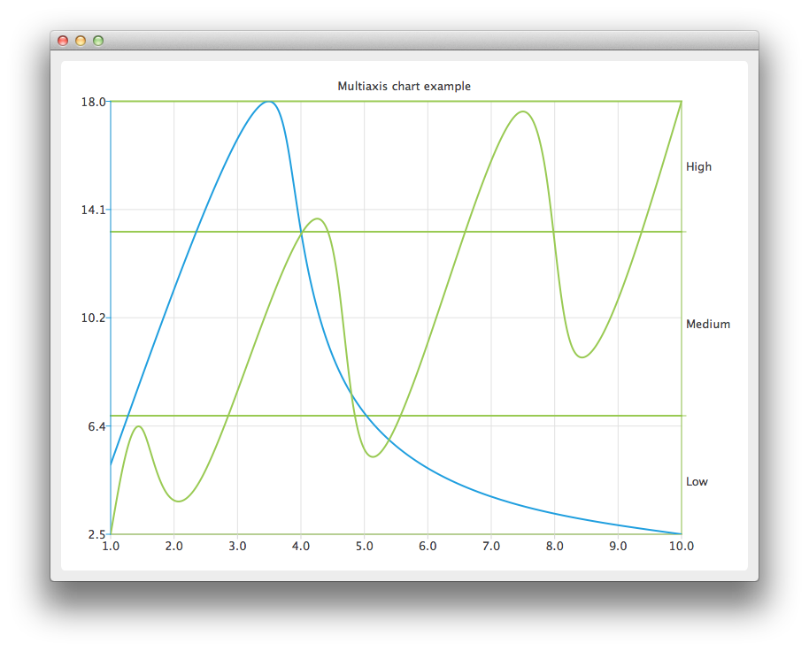
Multiple Axes Example
The example shows how to create a simple chart with two vertical axes. One for each series.
Running the Example
To run the example from Qt Creator , open the Welcome mode and select the example from Examples. For more information, visit Building and Running an Example.
Using Multiple Axes
Create the QChart instance, hide the legend of the chart, and set its title.
chart = QChart()
chart.legend().hide()
chart.setTitle("Multiaxis chart example")
Create a QValueAxis instance that will be used as a horizontal axis by both series and add it the bottom of the chart. The axis can be shared between many series, but each series can have only one vertical and horizontal axis.
axisX = QValueAxis()
axisX.setTickCount(10)
chart.addAxis(axisX, Qt.AlignBottom)
Create the first series, and add the data to it. Finally, add the series to the chart. Instantiate its own Y-axis, add it to the chart. Then attach both the common X-axis and the series specific Y-axis. In this example the color of the axis line is set to be the same as the color of the series to make it possible to distinguish which axis is attached to which series.
series = QSplineSeries()
series << QPointF(1, 5) << QPointF(3.5, 18) << QPointF(4.8, 7.5) << QPointF(10, 2.5)
chart.addSeries(series)
axisY = QValueAxis()
axisY.setLinePenColor(series.pen().color())
chart.addAxis(axisY, Qt.AlignLeft)
series.attachAxis(axisX)
series.attachAxis(axisY)
Similarly prepare another series. This time a different axis type is used. Additionally grid lines color is also set to be the same as the color of the series.
series = QSplineSeries
series << QPointF(1, 0.5) << QPointF(1.5, 4.5) << QPointF(2.4, 2.5) << QPointF(4.3, 12.5)
        << QPointF(5.2, 3.5) << QPointF(7.4, 16.5) << QPointF(8.3, 7.5) << QPointF(10, 17)
chart.addSeries(series)
axisY3 = QCategoryAxis()
axisY3.append("Low", 5)
axisY3.append("Medium", 12)
axisY3.append("High", 17)
axisY3.setLinePenColor(series.pen().color())
axisY3.setGridLinePen((series.pen()))
chart.addAxis(axisY3, Qt.AlignRight)
series.attachAxis(axisX)
series.attachAxis(axisY3)
Create a QChartView object with QChart as a parameter. Enable Antialiasing to have the rendered splines look nicer.
chartView = QChartView(chart)
chartView.setRenderHint(QPainter.Antialiasing)
The chart is ready to be shown.
window = QMainWindow()
window.setCentralWidget(chartView)
window.resize(800, 600)
window.show()
© 2022 The Qt Company Ltd. Documentation contributions included herein are the copyrights of their respective owners. The documentation provided herein is licensed under the terms of the GNU Free Documentation License version 1.3 as published by the Free Software Foundation. Qt and respective logos are trademarks of The Qt Company Ltd. in Finland and/or other countries worldwide. All other trademarks are property of their respective owners.