Item Positioners
Positioner items are container items that manage the positions of items in a declarative user interface. Positioners behave in a similar way to the layout managers used with standard Qt widgets, except that they are also containers in their own right.
Positioners make it easier to work with many items when they need to be arranged in a regular layout.
Qt Quick Layouts can also be used to arrange Qt Quick items in a user interface. They manage both the positions and the sizes of items on a declarative user interface, and are well suited for resizable user interfaces.
Positioners
A set of standard positioners are provided in the basic set of Qt Quick graphical types:
Property used to mirror layout behavior.
Provides attached properties that contain details on where an item exists in a positioner.
Positions its children in a column.
Positions its children in a row.
Positions its children in grid formation.
Positions its children side by side, wrapping as necessary.
Column Items

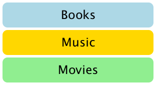
Column items are used to vertically arrange items. The following example uses a Column item to arrange three Rectangle items in an area defined by an outer Item . The spacing property is set to include a small amount of space between the rectangles.
import QtQuick 2.0

Item {
    width: 310; height: 170

    Column {
        anchors.horizontalCenter: parent.horizontalCenter
        anchors.verticalCenter: parent.verticalCenter

        spacing: 5

        Rectangle { color: "lightblue"; radius: 10.0
                    width: 300; height: 50
                    Text { anchors.centerIn: parent
                           font.pointSize: 24; text: "Books" } }
        Rectangle { color: "gold"; radius: 10.0
                    width: 300; height: 50
                    Text { anchors.centerIn: parent
                           font.pointSize: 24; text: "Music" } }
        Rectangle { color: "lightgreen"; radius: 10.0
                    width: 300; height: 50
                    Text { anchors.centerIn: parent
                           font.pointSize: 24; text: "Movies" } }
    }
}
Note that, since Column inherits directly from Item, any background color must be added to a parent Rectangle, if desired.
Row Items

Row items are used to horizontally arrange items. The following example uses a Row item to arrange three rounded Rectangle items in an area defined by an outer colored Rectangle. The spacing property is set to include a small amount of space between the rectangles.
We ensure that the parent Rectangle is large enough so that there is some space left around the edges of the horizontally centered Row item.
import QtQuick 2.0

Rectangle {
    width: 320; height: 110
    color: "#c0c0c0"

    Row {
        anchors.horizontalCenter: parent.horizontalCenter
        anchors.verticalCenter: parent.verticalCenter

        spacing: 5

        Rectangle { width: 100; height: 100; radius: 20.0
                    color: "#024c1c" }
        Rectangle { width: 100; height: 100; radius: 20.0
                    color: "#42a51c" }
        Rectangle { width: 100; height: 100; radius: 20.0
                    color: "white" }
    }
}
Grid Items

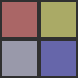
Grid items are used to place items in a grid or table arrangement. The following example uses a Grid item to place four Rectangle items in a 2-by-2 grid. As with the other positioners, the spacing between items can be specified using the spacing property.
import QtQuick 2.0

Rectangle {
    width: 112; height: 112
    color: "#303030"

    Grid {
        anchors.horizontalCenter: parent.horizontalCenter
        anchors.verticalCenter: parent.verticalCenter
        columns: 2
        spacing: 6

        Rectangle { color: "#aa6666"; width: 50; height: 50 }
        Rectangle { color: "#aaaa66"; width: 50; height: 50 }
        Rectangle { color: "#9999aa"; width: 50; height: 50 }
        Rectangle { color: "#6666aa"; width: 50; height: 50 }
    }
}
There is no difference between horizontal and vertical spacing inserted between items, so any additional space must be added within the items themselves.
Any empty cells in the grid must be created by defining placeholder items at the appropriate places in the Grid definition.
Flow Items


Flow items are used to place items like words on a page, with rows or columns of non-overlapping items.
Flow items arrange items in a similar way to Grid items, with items arranged in lines along one axis (the minor axis), and lines of items placed next to each other along another axis (the major axis). The direction of flow, as well as the spacing between items, are controlled by the flow and spacing properties.
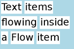
The following example shows a Flow item containing a number of Text child items. These are arranged in a similar way to those shown in the screenshots.
import QtQuick 2.0

Rectangle {
    color: "lightblue"
    width: 300; height: 200


    Flow {
        anchors.fill: parent
        anchors.margins: 4
        spacing: 10

        Text { text: "Text"; font.pixelSize: 40 }
        Text { text: "items"; font.pixelSize: 40 }
        Text { text: "flowing"; font.pixelSize: 40 }
        Text { text: "inside"; font.pixelSize: 40 }
        Text { text: "a"; font.pixelSize: 40 }
        Text { text: "Flow"; font.pixelSize: 40 }
        Text { text: "item"; font.pixelSize: 40 }
    }

}
The main differences between the Grid and Flow positioners are that items inside a Flow will wrap when they run out of space on the minor axis, and items on one line may not be aligned with items on another line if the items do not have uniform sizes. As with Grid items, there is no independent control of spacing between items and between lines of items.
Other Ways to Position Items
There are several other ways to position items in a user interface. In addition to the basic technique of specifying their coordinates directly, they can be positioned relative to other items with anchors , or used with QML Data Models such as Object Model .
© 2022 The Qt Company Ltd. Documentation contributions included herein are the copyrights of their respective owners. The documentation provided herein is licensed under the terms of the GNU Free Documentation License version 1.3 as published by the Free Software Foundation. Qt and respective logos are trademarks of The Qt Company Ltd. in Finland and/or other countries worldwide. All other trademarks are property of their respective owners.
