
Delegate Controls
Guidelines for delegate controls
Qt Quick Controls offers a selection of controls that are used as delegates in views.
Item delegate with a check indicator that can be toggled on or off.
Exclusive item delegate with a radio indicator that can be toggled on or off.
Swipable item delegate.
Item delegate with a switch indicator that can be toggled on or off.
Each type of delegate has its own specific target use case. The following sections offer guidelines for choosing the appropriate type of delegate, depending on the use case.
ItemDelegate Control
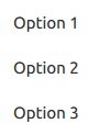
ItemDelegate presents a checkable control that can be pressed and clicked by the user.
RadioDelegate Control
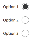
RadioDelegate presents a checkable control that can be toggled on (checked) or off (unchecked). Radio delegates are typically used to select one option from a set of options.
See also RadioButton Control .
SwipeDelegate Control

SwipeDelegate presents a view item that can be swiped left or right to expose more options or information.
SwitchDelegate Control
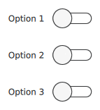
SwitchDelegate presents a switchable delegate that can be toggled on or off.
See also Switch Control .
© 2022 The Qt Company Ltd. Documentation contributions included herein are the copyrights of their respective owners. The documentation provided herein is licensed under the terms of the GNU Free Documentation License version 1.3 as published by the Free Software Foundation. Qt and respective logos are trademarks of The Qt Company Ltd. in Finland and/or other countries worldwide. All other trademarks are property of their respective owners.