
Input Controls
Guidelines for input controls
Qt Quick Controls offers a variety of input controls for both numeric and textual input.
Combined button and popup list for selecting options.
Circular dial that is rotated to set a value.
Used to select a range of values by sliding two handles along a track.
Used to select a value by sliding a handle along a track.
Multi-line text input area.
Single-line text input field.
Spinnable wheel of items that can be selected.
Each type of input control has its own specific target use case. The following sections offer guidelines for choosing the appropriate type of input control, depending on the use case.
ComboBox Control
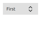
ComboBox is used to select a value from a static multiple-line drop-down list. It is not possible to add new values, and only one option can be selected.
Recommendations:
If the number of values is very large, consider applying a filter.
If the list is very limited, consider using RadioButton . This has the advantage that the user can see all options at the same time.
Select a default value, the value that will be chosen most often.
See also CheckBox Control , Tumbler Control .
Dial Control
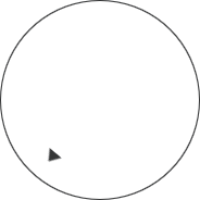
Dial is similar to a traditional dial knob that is found on devices such as stereos or industrial equipment.
The dial is rotated by clicking and dragging, with the handle indicating the value of the dial.
For applications where fast input is important, the circular input mode is useful, as clicking on the dial will move it directly to that position.
For applications where precise input is important, the horizontal and vertical input modes are recommended, as these allow small adjustments to be made relative to where the dial is clicked. These modes are also better for dials where large jumps in values could be unsafe, such as a dial that controls audio volume.
See also Tumbler Control .
TextArea Control

TextArea is a multi-line text editor.
TextField Control

TextField is a single line text editor.
See also Tumbler Control .
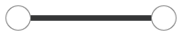
Slider Control

Slider is used to select a value by sliding a handle along a track.
RangeSlider Control
RangeSlider is used to select a range specified by two values, by sliding each handle along a track.
See also Slider Control .
Tumbler Control

Tumbler is a spinnable wheel of items that can be selected.
See also ComboBox Control .
© 2022 The Qt Company Ltd. Documentation contributions included herein are the copyrights of their respective owners. The documentation provided herein is licensed under the terms of the GNU Free Documentation License version 1.3 as published by the Free Software Foundation. Qt and respective logos are trademarks of The Qt Company Ltd. in Finland and/or other countries worldwide. All other trademarks are property of their respective owners.