Rectangle QML Type
Paints a filled rectangle with an optional border. More...
| Import Statement: | import QtQuick 2.15 |
| Inherits: |
Properties
- antialiasing : bool
- border
- border.color : color
- border.width : int
- color : color
- gradient : any
- radius : real
Detailed Description
Rectangle items are used to fill areas with solid color or gradients, and/or to provide a rectangular border.
Appearance
Each Rectangle item is painted using either a solid fill color, specified using the color property, or a gradient, defined using a Gradient type and set using the gradient property. If both a color and a gradient are specified, the gradient is used.
You can add an optional border to a rectangle with its own color and thickness by setting the border.color and border.width properties. Set the color to "transparent" to paint a border without a fill color.
You can also create rounded rectangles using the radius property. Since this introduces curved edges to the corners of a rectangle, it may be appropriate to set the Item::antialiasing property to improve its appearance.
Example Usage
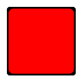
The following example shows the effects of some of the common properties on a Rectangle item, which in this case is used to create a square:
import QtQuick 2.0

Rectangle {
    width: 100
    height: 100
    color: "red"
    border.color: "black"
    border.width: 5
    radius: 10
}
Performance
Using the Item::antialiasing property improves the appearance of a rounded rectangle at the cost of rendering performance. You should consider unsetting this property for rectangles in motion, and only set it when they are stationary.
See also Image.
Property Documentation
antialiasing : bool |
Used to decide if the Rectangle should use antialiasing or not. Antialiasing provides information on the performance implications of this property.
The default is true for Rectangles with a radius, and false otherwise.
The width and color used to draw the border of the rectangle.
A width of 1 creates a thin line. For no line, use a width of 0 or a transparent color.
Note: The width of the rectangle's border does not affect the geometry of the rectangle itself or its position relative to other items if anchors are used.
The border is rendered within the rectangle's boundaries.
color : color |
This property holds the color used to fill the rectangle.
The default color is white.

The following example shows rectangles with colors specified using hexadecimal and named color notation:
Rectangle {
    color: "#00B000"
    width: 80; height: 80
}

Rectangle {
    color: "steelblue"
    y: 100; width: 80; height: 80
}
If both a gradient and a color are specified, the gradient will be used.
See also gradient.
The gradient to use to fill the rectangle.
This property allows for the construction of simple vertical or horizontal gradients. Other gradients may be formed by adding rotation to the rectangle.

Rectangle {
    y: 0; width: 80; height: 80
    color: "lightsteelblue"
}

Rectangle {
    y: 100; width: 80; height: 80
    gradient: Gradient {
        GradientStop { position: 0.0; color: "lightsteelblue" }
        GradientStop { position: 1.0; color: "blue" }
    }
}

Rectangle {
    y: 200; width: 80; height: 80
    rotation: 90
    gradient: Gradient {
        GradientStop { position: 0.0; color: "lightsteelblue" }
        GradientStop { position: 1.0; color: "blue" }
    }
}
The property also accepts gradient presets from QGradient::Preset. Note however that due to Rectangle only supporting simple vertical or horizontal gradients, any preset with an unsupported angle will revert to the closest representation.
Rectangle {
    y: 0; width: 80; height: 80
    gradient: Gradient.NightFade
}

Rectangle {
    y: 0; width: 80; height: 80
    gradient: "NightFade"
}
If both a gradient and a color are specified, the gradient will be used.
radius : real |
This property holds the corner radius used to draw a rounded rectangle.
If radius is non-zero, the rectangle will be painted as a rounded rectangle, otherwise it will be painted as a normal rectangle. The same radius is used by all 4 corners; there is currently no way to specify different radii for different corners.
© 2025 The Qt Company Ltd. Documentation contributions included herein are the copyrights of their respective owners. The documentation provided herein is licensed under the terms of the GNU Free Documentation License version 1.3 as published by the Free Software Foundation. Qt and respective logos are trademarks of The Qt Company Ltd. in Finland and/or other countries worldwide. All other trademarks are property of their respective owners.
