Qt Quick Demo - Photo Viewer
A QML photo viewer that that uses XmlListModel and XmlRole to download Flickr feeds, and Package to display the photos in different views.
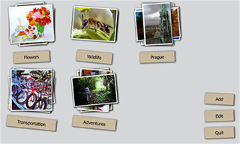
Photo Viewer demonstrates the following Qt Quick features:
- Using custom types to create screens and screen controls.
- Using Qt Quick Controls 1 to create an application window.
- Using the Package type with a DelegateModel to provide delegates with a shared context to multiple views.
- Using XML list models to download Flickr feeds.
- Using the Flipable type to create labels with different text on the front and back.
- Using the PathView, Path, PathAttribute, and PathLine types to lay out photos on a path.
- Providing feedback to users while data is loading.
- Localizing applications.
Running the Example
To run the example from Qt Creator, open the Welcome mode and select the example from Examples. For more information, visit Building and Running an Example.
Using Custom Types
In the Photo Viewer app, we use the following custom types that are each defined in a separate .qml file:
AlbumDelegate.qmlBusyIndicator.qmlButton.qmlEditableButton.qmlPhotoDelegate.qmlProgressBar.qmlRssModel.qmlTag.qml
To use the custom types, we add an import statement to the main QML file, main.qml, that imports the folder called PhotoViewerCore where the types are located:
import "PhotoViewerCore"
Creating the Main Window
In main.qml, we use the ApplicationWindow Qt Quick Control to create the app main window:
ApplicationWindow {
    id: mainWindow

    visible: true
We use a ListModel type with ListElement types to display photo albums:
    ListModel {
        id: photosModel
        ListElement { tag: "Flowers" }
        ListElement { tag: "Wildlife" }
        ListElement { tag: "Prague" }
    }
List elements are defined like other QML types except that they contain a collection of role definitions instead of properties. Roles both define how the data is accessed and include the data itself. For each list element, we use the tag role to specify the photos to download.
A DelegateModel type is used together with the Package type to provide delegates to multiple views. The model property holds the model providing data for the delegate model and the delegate property specifies the template defining each item instantiated by a view:
DelegateModel { id: albumVisualModel; model: photosModel; delegate: AlbumDelegate {} }
We use a GridView type to lay out the albums as a grid:
    GridView {
        id: albumView; width: parent.width; height: parent.height; cellWidth: 210; cellHeight: 220
        model: albumVisualModel.parts.album; visible: albumsShade.opacity != 1.0
    }
The model property references the package name album that we specify in AlbumDelegate.qml. We use the Package type to allow the photos to move between different views. The Package contains the named items browser, fullscreen, and album:
    Package {

        Item {
            Package.name: 'browser'
            GridView {
                id: photosGridView; model: visualModel.parts.grid; width: mainWindow.width; height: mainWindow.height - 21
                x: 0; y: 21; cellWidth: 160; cellHeight: 153; interactive: false
                onCurrentIndexChanged: photosListView.positionViewAtIndex(currentIndex, ListView.Contain)
            }
        }

        Item {
            Package.name: 'fullscreen'
            ListView {
                id: photosListView; model: visualModel.parts.list; orientation: Qt.Horizontal
                width: mainWindow.width; height: mainWindow.height; interactive: false
                onCurrentIndexChanged: photosGridView.positionViewAtIndex(currentIndex, GridView.Contain)
                highlightRangeMode: ListView.StrictlyEnforceRange; snapMode: ListView.SnapOneItem
            }
        }

        Item {
            Package.name: 'album'
            id: albumWrapper; width: 210; height: 220
The named items are used as the delegates by the views that reference the special DelegateModel::parts property to select the model that provides the chosen delegate.
We use a ListView type to lay out albums in other views:
    ListView { anchors.fill: parent; model: albumVisualModel.parts.browser; interactive: false }

    ListView { anchors.fill: parent; model: albumVisualModel.parts.fullscreen; interactive: false }
Displaying Photos
We use the PhotoDelegate custom type that is specified in PhotoDelegate.qml to display photos. We use a Package type to lay out the photos either in a stack, list, or a grid:
Package {
    Item { id: stackItem; Package.name: 'stack'; width: 160; height: 153; z: stackItem.PathView.z }
    Item { id: listItem; Package.name: 'list'; width: mainWindow.width + 40; height: 153 }
    Item { id: gridItem; Package.name: 'grid'; width: 160; height: 153 }
The photos are rotated at random angles by using the Math.random() JavaScript method:
    Item {
        width: 160; height: 153

        Item {
            id: photoWrapper

            property double randomAngle: Math.random() * (2 * 6 + 1) - 6
            property double randomAngle2: Math.random() * (2 * 6 + 1) - 6

            x: 0; y: 0; width: 140; height: 133
            z: stackItem.PathView.z; rotation: photoWrapper.randomAngle
We use a BorderImage type to create borders for the images:
            BorderImage {
                anchors {
                    fill: originalImage.status == Image.Ready ? border : placeHolder
                    leftMargin: -6; topMargin: -6; rightMargin: -8; bottomMargin: -8
                }
                source: 'images/box-shadow.png'
                border.left: 10; border.top: 10; border.right: 10; border.bottom: 10
            }
Downloading Flickr Feeds
In AlbumDelegate.qml, we use the DelegateModel to provide the PhotoDelegate delegate to the RssModel model:
            DelegateModel {
                id: visualModel; delegate: PhotoDelegate { }
                model: RssModel { id: rssModel; tags: tag }
            }
In RssModel.qml, we use an XmlListModel type as a data source for Package objects to download photos from the selected feeds:
import QtQuick.XmlListModel 2.0

XmlListModel {
    property string tags : ""

    function encodeTags(x) { return encodeURIComponent(x.replace(' ',',')); }
We use the tags custom property to specify which photos to download. The encodeTags custom function uses the encodeURIComponent JavaScript method to ensure that the requests to the server are correctly formatted.
We use the source property to fetch photos that have the specified tags attached from public Flickr feeds:
    source: "http://api.flickr.com/services/feeds/photos_public.gne?"+(tags ? "tags="+encodeTags(tags)+"&" : "")
    query: "/feed/entry"
    namespaceDeclarations: "declare default element namespace 'http://www.w3.org/2005/Atom';"
The query property specifies that the XmlListModel generates a model item for each feed entry.
The namespaceDeclarations property specifies that the requested document uses the namespace http://www.w3.org/2005/Atom, which is declared as the default namespace.
We use the XmlRole type to specify the model item attributes. Each model item has the title, content, and hq attributes that match the values of the corresponding feed entry:
    XmlRole { name: "title"; query: "title/string()" }
    XmlRole { name: "content"; query: "content/string()" }
    XmlRole { name: "hq"; query: "link[@rel='enclosure']/@href/string()" }
Creating Flipable Labels
When users select the Edit button, the album labels are flipped from their front side to their back side and the text on them changes from album name to Remove.
In AlbumDelegate.qml, we use the Tag custom type to specify the text to display on the front and back sides of album labels:
            Tag {
                anchors { horizontalCenter: parent.horizontalCenter; bottom: parent.bottom; bottomMargin: 10 }
                frontLabel: tag; backLabel: qsTr("Remove"); flipped: mainWindow.editMode
                onTagChanged: rssModel.tags = tag
                onBackClicked: if (mainWindow.editMode) photosModel.remove(index);
            }
The onTagChanged signal handler is used to change the tag based on which the model is populated. The onBackClicked signal handler is used to remove the album.
In Tag.qml, we use a Flipable type with custom properties and signals to create the labels:
Flipable {
    id: flipable

    property alias frontLabel: frontButton.label
    property alias backLabel: backButton.label

    property int angle: 0
    property int randomAngle: Math.random() * (2 * 6 + 1) - 6
    property bool flipped: false

    signal frontClicked
    signal backClicked
    signal tagChanged(string tag)
The front property holds the EditableButton custom type that enables users to edit the label text:
    front: EditableButton {
        id: frontButton; rotation: flipable.randomAngle
        anchors { centerIn: parent; verticalCenterOffset: -20 }
        onClicked: flipable.frontClicked()
        onLabelChanged: flipable.tagChanged(label)
    }
The back property holds the Button custom type that is used to remove the album:
    back: Button {
        id: backButton; tint: "red"; rotation: flipable.randomAngle
        anchors { centerIn: parent; verticalCenterOffset: -20 }
        onClicked: flipable.backClicked()
    }
Laying Out Photos on a Path
In AlbumDelegate.qml, we use a PathView type to lay out the photos provided by the visualModel.parts.stack model on a path that has the form of a stack:
            PathView {
                id: photosPathView; model: visualModel.parts.stack; pathItemCount: 5
                visible: !busyIndicator.visible
                anchors.centerIn: parent; anchors.verticalCenterOffset: -30
                path: Path {
                    PathAttribute { name: 'z'; value: 9999.0 }
                    PathLine { x: 1; y: 1 }
                    PathAttribute { name: 'z'; value: 0.0 }
                }
            }
The path property holds the Path type that defines the path used by the PathView. The PathAttribute types are used to set a range of 0 to 9999 for the z attribute. This way, the path creates a stack of album photos. Because each PhotoDelegate is slightly rotated at a random angle, this results in a realistic-looking stack of photos.
Providing Feedback to Users
We use a busy indicator and a progress bar to indicate activity while Flickr feeds and photos are being loaded.
In AlbumDelegate.qml, we use the BusyIndicator custom type and the on custom property to display a rotating image while the Flickr feed is being loaded:
            BusyIndicator {
                id: busyIndicator
                anchors { centerIn: parent; verticalCenterOffset: -20 }
                on: rssModel.status != XmlListModel.Ready
            }
In PhotoDelegate.qml, we use them to indicate activity while a photo is being loaded:
BusyIndicator { anchors.centerIn: parent; on: originalImage.status != Image.Ready }
We define the BusyIndicator type in BusyIndicator.qml. We use an Image type to display an image and apply a NumberAnimation to its rotation property to rotate the image in an infinite loop:
Image {
    id: container
    property bool on: false

    source: "images/busy.png"; visible: container.on
    NumberAnimation on rotation { running: container.on; from: 0; to: 360; loops: Animation.Infinite; duration: 1200 }
}
In your apps, you can also use the BusyIndicator type from the Qt Quick Controls module.
In main.qml, we use the ProgressBar custom type to indicate progress while a high quality version of a photo is being opened on full screen:
    ProgressBar {
        progress: mainWindow.downloadProgress; width: parent.width; height: 4
        anchors.bottom: parent.bottom; opacity: mainWindow.imageLoading; visible: opacity != 0.0
    }
We define the ProgressBar type in ProgressBar.qml. We use a Rectangle type to create the progress bar and apply a NumberAnimation to its opacity property to change the color of the bar from black to white as data loading proceeds:
Item {
    id: container

    property real progress: 0

    Behavior on opacity { NumberAnimation { duration: 600 } }

    Rectangle { anchors.fill: parent; color: "black"; opacity: 0.5 }

    Rectangle {
        id: fill; color: "white"; height: container.height
        width: container.width * container.progress
    }
}
In your apps, you can also use the ProgressBar type from the Qt Quick Controls module.
Localizing Applications
The example application is translated into German and French. The translated strings are loaded at runtime according to the current locale.
We use a Column type in main.qml to position buttons for adding and editing albums and exiting the application:
    Column {
        spacing: 20; anchors { bottom: parent.bottom; right: parent.right; rightMargin: 20; bottomMargin: 20 }
        Button {
            id: newButton; label: qsTr("Add"); rotation: 3
            anchors.horizontalCenter: parent.horizontalCenter
            onClicked: {
                mainWindow.editMode = false
                photosModel.append( { tag: "" } )
                albumView.positionViewAtIndex(albumView.count - 1, GridView.Contain)
            }
        }
        Button {
            id: deleteButton; label: qsTr("Edit"); rotation: -2;
            onClicked: mainWindow.editMode = !mainWindow.editMode
            anchors.horizontalCenter: parent.horizontalCenter
        }
        Button {
            id: quitButton; label: qsTr("Quit"); rotation: -2;
            onClicked: Qt.quit()
            anchors.horizontalCenter: parent.horizontalCenter
        }
    }
We use the qsTr() command to mark the button labels translatable.
We use the lupdate() tool to generate the translation source files and the lrelease() tool to convert the translated strings to the QM files used by the application at runtime. These files are stored in the i18n directory.
To make the application aware of the translations, we add code to the main() function in the main.cpp file. The code creates a QTranslator object, loads a translation according to the current locale at runtime, and installs the translator object into the application:
int main(int argc, char *argv[])
{
    QGuiApplication app(argc, argv);

    QTranslator qtTranslator;
    qtTranslator.load(QLocale(), "qml", "_", ":/i18n/");
    app.installTranslator(&qtTranslator);
Files:
- demos/photoviewer/PhotoViewerCore/AlbumDelegate.qml
- demos/photoviewer/PhotoViewerCore/BusyIndicator.qml
- demos/photoviewer/PhotoViewerCore/Button.qml
- demos/photoviewer/PhotoViewerCore/EditableButton.qml
- demos/photoviewer/PhotoViewerCore/PhotoDelegate.qml
- demos/photoviewer/PhotoViewerCore/ProgressBar.qml
- demos/photoviewer/PhotoViewerCore/RssModel.qml
- demos/photoviewer/PhotoViewerCore/Tag.qml
- demos/photoviewer/main.cpp
- demos/photoviewer/main.qml
- demos/photoviewer/photoviewer.pro
Images:
See also QML Applications.
© 2024 The Qt Company Ltd. Documentation contributions included herein are the copyrights of their respective owners. The documentation provided herein is licensed under the terms of the GNU Free Documentation License version 1.3 as published by the Free Software Foundation. Qt and respective logos are trademarks of The Qt Company Ltd. in Finland and/or other countries worldwide. All other trademarks are property of their respective owners.


