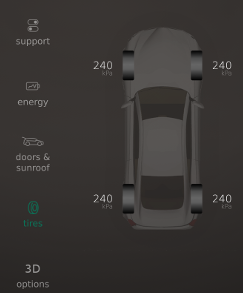
ToolsColumn QML Type
The tools column component for Neptune 3 UI applications. More...
| Since: | Qt 5.11 |
| Inherits: |
Properties
- currentText : string
- iconFillMode : int
- iconRectHeight : real
- iconRectWidth : real
- translationContext : string
Signals
- clicked()
Detailed Description
The ToolsColumn provides a custom column of tool buttons for Neptune 3 UI Applications to follow the specification where only one of them can be selected at any given time.

See Neptune 3 UI Components and Interfaces to see more available components in Neptune 3 UI.
The ToolsColumn inherits its API from AbstractButton to display icons for the items. To use icons from theme (icon.name property of a button) add icon role to the model items. To define icon by source URL (icon.source property of a button) add sourceOn and sourceOff roles to the model items for the selected and deselected states. Please refer to Icons in Qt Quick Controls 2 for how to use icon themes and icon URLs.
Example Usage
The following example uses ToolsColumn with icons defined by theme:
import QtQuick 2.10
import shared.controls 1.0

Item {
    id: root

    ToolsColumn {
        translationContext: "MyToolsColumn"
        model: ListModel {
            ListElement { icon: "ic-foo"; text: QT_TRANSLATE_NOOP("MyToolsColumn", "foo") }
            ListElement { icon: "ic-bar"; text: QT_TRANSLATE_NOOP("MyToolsColumn", "bar") }
        }
    }
}
The following example uses ToolsColumn with icons defined by source URL:
import QtQuick 2.10
import shared.controls 1.0

Item {
    id: root
    ToolsColumn {
        translationContext: "MyToolsColumn"
        model: ListModel {
            ListElement {
                sourceOn: "ic-logo_ON.png"; sourceOff: "ic-logo_OFF.png";
                text: QT_TRANSLATE_NOOP("MyToolsColumn", "foo")
            }
        }
    }
}
Property Documentation
[read-only] currentText : string |
This property holds the current selected text of the tools column.
iconFillMode : int |
Set this property to define what happens when the item's icon image has a different size than the item. Please refer to Image::fillMode for possible values. For values other than Image.Pad ToolsColumn::iconRectWidth and ToolsColumn::iconRectHeight should be defined.
iconRectHeight : real |
\qmlproperyreal ToolsColumn::iconRectHeight
Set this property to define height of rectangle area for icon when ToolsColumn::iconfillMode has other value than Image.Pad.
iconRectWidth : real |
\qmlproperyreal ToolsColumn::iconRectWidth
Set this property to define width of rectangle area for icon when ToolsColumn::iconfillMode has other value than Image.Pad.
[read-only] translationContext : string |
This property holds the translation context of the tools column.
This property's default is 0.
Signal Documentation
This signal is emitted when one of the tool is clicked by the user.
Note: The corresponding handler is onClicked.
© 2019 Luxoft Sweden AB.
Documentation contributions included herein are the copyrights of
their respective owners.
The documentation provided herein is licensed under the terms of the GNU Free Documentation License version 1.3 as published by the Free Software Foundation.
Qt and respective logos are trademarks of The Qt Company Ltd. in Finland and/or other countries worldwide. All other trademarks are property
of their respective owners.
