Qt Quick Controls 1 Styles
Warning: The Qt Quick Controls 1 module is deprecated since Qt 5.12. Use the latest Qt Quick Controls module instead.
The Qt Quick Controls Styles submodule allows custom styling for Qt Quick Controls 1.
The submodule was introduced in Qt 5.1.
Getting started
The QML types can be imported into your application using the following import statement in your .qml file.
import QtQuick.Controls.Styles 1.4
Styles
Base Style
The Base Style is the default style used when none is specified. It is also used as a fallback when the specified style cannot be found.

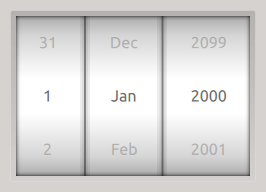
The Base Style Tumbler.
Flat Style
The Flat Style is designed for touch devices.

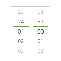
The Flat Style Tumbler.
Selecting Styles
You can apply a different style to the controls by setting the QT_QUICK_CONTROLS_1_STYLE environment variable to the name of the style. For example, to use the Flat style, you can do the following:
QT_QUICK_CONTROLS_1_STYLE=Flat ./app
This can also be done in C++, using qputenv():
qputenv("QT_QUICK_CONTROLS_1_STYLE", "Flat");
Styling Views
Provides custom styling for ScrollView | |
Provides custom styling for TabView | |
Provides custom styling for TableView | |
Provides custom styling for TreeView |
Styling Controls
Provides custom styling for ApplicationWindow | |
Provides custom styling for BusyIndicatorStyle | |
Provides custom styling for Button | |
Provides custom styling for Calendar | |
Provides custom styling for CheckBox | |
Provides custom styling for CircularGauge | |
Provides custom styling for ComboBox | |
Provides custom styling for DelayButton | |
Provides custom styling for Dial | |
Provides custom styling for Gauge | |
Provides custom styling for MenuBar | |
Provides custom styling for Menu | |
Provides custom styling for PieMenu | |
Provides custom styling for ProgressBar | |
Provides custom styling for RadioButton | |
Provides custom styling for ScrollView | |
Provides custom styling for Slider | |
Provides custom styling for SpinBox | |
Provides custom styling for StatusBar | |
Provides custom styling for StatusIndicatorStyle | |
Provides custom styling for Switch | |
Provides custom styling for TabView | |
Provides custom styling for TableView | |
Provides custom styling for TextArea | |
Provides custom styling for TextField | |
Provides custom styling for ToggleButton | |
Provides custom styling for ToolBar | |
Provides custom styling for TreeView | |
Provides custom styling for Tumbler |
Styling Tutorials
Tutorial for styling CircularGauge. | |
Tutorial for styling the Gauge control. |
Related information
© 2024 The Qt Company Ltd. Documentation contributions included herein are the copyrights of their respective owners. The documentation provided herein is licensed under the terms of the GNU Free Documentation License version 1.3 as published by the Free Software Foundation. Qt and respective logos are trademarks of The Qt Company Ltd. in Finland and/or other countries worldwide. All other trademarks are property of their respective owners.

