C
Control QML Type
Abstract base type providing functionality common to all controls. More...
| Import Statement: | import QtQuick.Controls |
| Since: | Qt Quick Ultralite 1.0 |
| Inherits: | |
| Inherited By: | AbstractButton, Dial, ProgressBar, Slider, and SwipeView |
Properties
- availableHeight : real
- availableWidth : real
- background : Item
- bottomInset : real
- bottomPadding : real
- contentItem : Item
- font : font
- leftInset : real
- leftPadding : real
- padding : real
- rightInset : real
- rightPadding : real
- spacing : real
- topInset : real
- topPadding : real
Detailed Description
Control is the base type of user interface controls. It receives input events from the window system, and paints a representation of itself on the screen.
Control Layout
The following diagram illustrates the layout of a typical control:
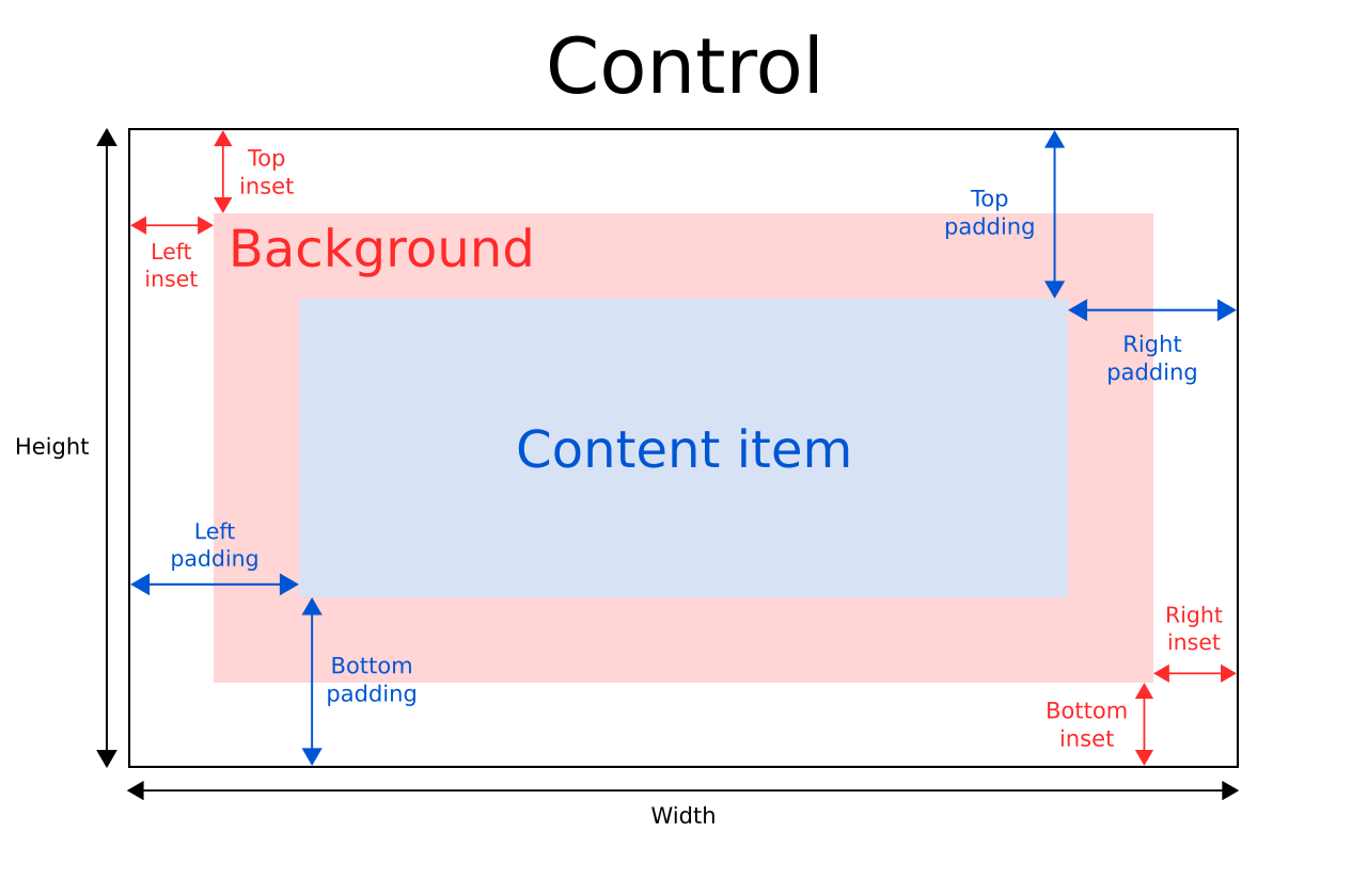
The implicitWidth and implicitHeight of a control are typically based on the implicit sizes of the background and the content item plus any insets and paddings. These properties determine how large the control will be when no explicit width or height is provided.
The geometry of the contentItem is determined by the padding. The following example reserves 10px padding between the boundaries of the control and its content:
Control {
    padding: 10

    contentItem: Text {
        text: "Content"
    }
}
The background item fills the entire width and height of the control, unless insets or an explicit size is provided. Background insets are useful for extending the touchable/interactive area of a control without affecting its visual size. This is often used on touch devices to ensure that a control is not too small to be interacted with by the user. Insets affect the size of the control, and hence affect how much space they take up in a layout, for example.
Negative insets can be used to make the background larger than the control. The following example uses negative insets to place a shadow outside the control's boundaries:
Control {
    topInset: -2
    leftInset: -2
    rightInset: -6
    bottomInset: -6

    background: BorderImage {
        source: ":/images/shadowed-background.png"
    }
}
Event Handling
All controls, except non-interactive indicators, do not let clicks and touches through to items below them. For example, the console.log() call in the example below will never be executed when clicking on the CheckBox, because the MouseArea is below it in the scene:
MouseArea {
    anchors.fill: parent
    onClicked: console.log("MouseArea was clicked")

    CheckBox {
        anchors.fill: parent
    }
}
See also Controls Styling.
Property Documentation
[read-only] availableHeight : real |
This property holds the height available to the contentItem after deducting vertical padding from the height of the control.
See also Control Layout, padding, topPadding, and bottomPadding.
[read-only] availableWidth : real |
This property holds the width available to the contentItem after deducting horizontal paddings from the width of the control.
See also Control Layout, padding, leftPadding, and rightPadding.
background : Item |
This property holds the background item.
Button {
    id: control
    text: qsTr("Button")
    background: Rectangle {
        implicitWidth: 100
        implicitHeight: 40
        opacity: enabled ? 1 : 0.3
        color: control.down ? "#d0d0d0" : "#e0e0e0"
    }
}
Note: If the background item has no explicit size specified, it automatically follows the control's size. In most cases, there is no need to specify width or height for a background item.
Note: Most controls use the implicit size of the background item to calculate the implicit size of the control itself. If you replace the background item with a custom one, you should also consider providing a sensible implicit size for it (unless it is an item like Image which has its own implicit size).
See also Control Layout.
bottomInset : real |
This property holds the bottom inset for the background.
See also Control Layout and topInset.
bottomPadding : real |
This property holds the bottom padding.
See also Control Layout, padding, topPadding, and availableHeight.
contentItem : Item |
This property holds the visual content item.
Button {
    id: control
    text: qsTr("Button")
    contentItem: Text {
        text: control.text
        verticalAlignment: Text.AlignVCenter
    }
}
Note: The content item is automatically positioned and resized to fit within the padding of the control. Bindings to the x, y, width, and height properties of the contentItem are not respected.
Note: Most controls use the implicit size of the content item to calculate the implicit size of the control itself. If you replace the content item with a custom one, you should also consider providing a sensible implicit size for it (unless it is an item like Text which has its own implicit size).
See also Control Layout and padding.
font : font |
This property holds the control's current font.
This property describes the control's requested font. The font is used by the control's style when rendering standard components. It's common that different platforms, or different styles, define different fonts for an application.
The default font family, if not overridden by the controls style, depends on QUL_DEFAULT_FONT_FAMILY. There may also be special font defaults for certain types of controls.
Note: Contrary to Qt Quick Controls, the font property does not propagate to the control's children.
For the full list of available font properties, see the Text type documentation.
See also Text Rendering and Fonts and Text.
leftInset : real |
This property holds the left inset for the background.
See also Control Layout and rightInset.
leftPadding : real |
This property holds the left padding.
See also Control Layout, padding, rightPadding, and availableWidth.
padding : real |
This property holds the default padding.
Padding adds a space between each edge of the content item and the background item, effectively controlling the size of the content item. To specify a padding value for a specific edge of the control, set its relevant property:
Note: Different styles may specify the default padding for certain controls in different ways, and these ways may change over time as the design guidelines that the style is based on evolve. To ensure that these changes don't affect the padding values you have specified, it is best to use the most specific properties available. For example, rather than setting the padding property:
padding: 0set each specific property instead:
leftPadding: 0
rightPadding: 0
topPadding: 0
bottomPadding: 0
See also Control Layout, availableWidth, availableHeight, topPadding, leftPadding, rightPadding, and bottomPadding.
rightInset : real |
This property holds the right inset for the background.
See also Control Layout and leftInset.
rightPadding : real |
This property holds the right padding.
See also Control Layout, padding, leftPadding, and availableWidth.
spacing : real |
This property holds the spacing.
Spacing is useful for controls that have multiple or repetitive building blocks. For example, some styles use spacing to determine the distance between the text and indicator of CheckBox. Spacing is not enforced by Control, so each style may interpret it differently, and some may ignore it altogether.
topInset : real |
This property holds the top inset for the background.
See also Control Layout and bottomInset.
topPadding : real |
This property holds the top padding.
See also Control Layout, padding, bottomPadding, and availableHeight.
Available under certain Qt licenses.
Find out more.