ScrollView QML Type
Provides a scrolling view within another Item. More...
| Import Statement: | import QtQuick.Controls 1.4 |
| Since: | Qt 5.1 |
| Inherits: | |
| Inherited By: |
Properties
- contentItem : Item
- flickableItem : Item
- frameVisible : bool
- highlightOnFocus : bool
- horizontalScrollBarPolicy : enumeration
- style : Component
- verticalScrollBarPolicy : enumeration
- viewport : Item
Detailed Description

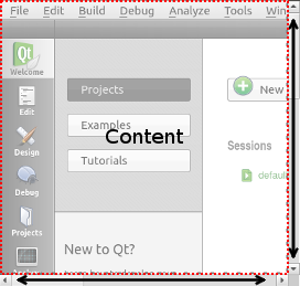
A ScrollView can be used either to replace a Flickable or decorate an existing Flickable. Depending on the platform, it will add scroll bars and a content frame.
Only one Item can be a direct child of the ScrollView and the child is implicitly anchored to fill the scroll view.
Example:
ScrollView {
    Image { source: "largeImage.png" }
}
In the previous example the Image item will implicitly get scroll behavior as if it was used within a Flickable. The width and height of the child item will be used to define the size of the content area.
Example:
ScrollView {
    ListView {
        ...
    }
}
In this case the content size of the ScrollView will simply mirror that of its contained flickableItem.
You can create a custom appearance for a ScrollView by assigning a ScrollViewStyle.
Property Documentation
[default] contentItem : Item |
The contentItem of the ScrollView. This is set by the user.
Note that the definition of contentItem is somewhat different to that of a Flickable, where the contentItem is implicitly created.
[read-only] flickableItem : Item |
The flickableItem of the ScrollView. If the contentItem provided to the ScrollView is a Flickable, it will be the contentItem.
frameVisible : bool |
This property tells the ScrollView if it should render a frame around its content.
The default value is false.
highlightOnFocus : bool |
This property controls if there should be a highlight around the frame when the ScrollView has input focus.
The default value is false.
Note: This property is only applicable on some platforms, such as Mac OS.
horizontalScrollBarPolicy : enumeration |
This property holds the policy for showing the horizontal scrollbar. It can be any of the following values:
- Qt.ScrollBarAsNeeded
- Qt.ScrollBarAlwaysOff
- Qt.ScrollBarAlwaysOn
The default policy is Qt.ScrollBarAsNeeded.
This property was introduced in QtQuick.Controls 1.3.
style : Component |
The style Component for this control.
See also Qt Quick Controls 1 Styles QML Types.
verticalScrollBarPolicy : enumeration |
This property holds the policy for showing the vertical scrollbar. It can be any of the following values:
- Qt.ScrollBarAsNeeded
- Qt.ScrollBarAlwaysOff
- Qt.ScrollBarAlwaysOn
The default policy is Qt.ScrollBarAsNeeded.
This property was introduced in QtQuick.Controls 1.3.
viewport : Item |
The viewport determines the current "window" on the contentItem. In other words, it clips it and the size of the viewport tells you how much of the content area is visible.
© 2020 The Qt Company Ltd. Documentation contributions included herein are the copyrights of their respective owners. The documentation provided herein is licensed under the terms of the GNU Free Documentation License version 1.3 as published by the Free Software Foundation. Qt and respective logos are trademarks of The Qt Company Ltd. in Finland and/or other countries worldwide. All other trademarks are property of their respective owners.
