Models and Views in Qt Quick
Simply put, applications need to form data and display the data. Qt Quick has the notion of models, views, and delegates to display data. They modularize the visualization of data in order to give the developer or designer control over the different aspects of the data. A developer can swap a list view with a grid view with little changes to the data. Similarly, encapsulating an instance of the data in a delegate allows the developer to dictate how to present or handle the data.
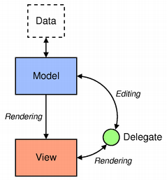
- Model - contains the data and its structure. There are several QML types for creating models.
- View - a container that displays the data. The view might display the data in a list or a grid.
- Delegate - dictates how the data should appear in the view. The delegate takes each data in the model and encapsulates it. The data is accessible through the delegate. The delegate can also write data back into editable models (e.g. in a TextField's onAccepted Handler).
To visualize data, bind the view's model property to a model and the delegate property to a component or another compatible type.
Displaying Data with Views
Views are containers for collections of items. They are feature-rich and can be customizable to meet style or behavior requirements.
A set of standard views are provided in the basic set of Qt Quick graphical types:
- ListView - arranges items in a horizontal or vertical list
- GridView - arranges items in a grid within the available space
- PathView - arranges items on a path
These types have properties and behaviors exclusive to each type. Visit their respective documentation for more information.
Decorating Views
Views allow visual customization through decoration properties such as the header, footer, and section properties. By binding an object, usually another visual object, to these properties, the views are decoratable. A footer may include a Rectangle type showcasing borders or a header that displays a logo on top of the list.
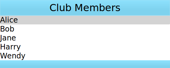
Suppose that a specific club wants to decorate its members list with its brand colors. A member list is in a model and the delegate will display the model's content.
ListModel {
    id: nameModel
    ListElement { name: "Alice" }
    ListElement { name: "Bob" }
    ListElement { name: "Jane" }
    ListElement { name: "Harry" }
    ListElement { name: "Wendy" }
}
Component {
    id: nameDelegate
    Text {
        text: name;
        font.pixelSize: 24
    }
}
The club may decorate the members list by binding visual objects to the header and footer properties. The visual object may be defined inline, in another file, or in a Component type.
ListView {
    anchors.fill: parent
    clip: true
    model: nameModel
    delegate: nameDelegate
    header: bannercomponent
    footer: Rectangle {
        width: parent.width; height: 30;
        gradient: clubcolors
    }
    highlight: Rectangle {
        width: parent.width
        color: "lightgray"
    }
}

Component {     //instantiated when header is processed
    id: bannercomponent
    Rectangle {
        id: banner
        width: parent.width; height: 50
        gradient: clubcolors
        border {color: "#9EDDF2"; width: 2}
        Text {
            anchors.centerIn: parent
            text: "Club Members"
            font.pixelSize: 32
        }
    }
}
Gradient {
    id: clubcolors
    GradientStop { position: 0.0; color: "#8EE2FE"}
    GradientStop { position: 0.66; color: "#7ED2EE"}
}
Mouse and Touch Handling
The views handle dragging and flicking of their content, however they do not handle touch interaction with the individual delegates. In order for the delegates to react to touch input, e.g. to set the currentIndex, a MouseArea with the appropriate touch handling logic must be provided by the delegate.
Note that if highlightRangeMode is set to StrictlyEnforceRange the currentIndex will be affected by dragging/flicking the view, since the view will always ensure that the currentIndex is within the highlight range specified.
ListView Sections
ListView contents may be grouped into sections, where related list items are labeled according to their sections. Further, the sections may be decorated with delegates.
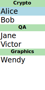
A list may contain a list indicating people's names and the team on which team the person belongs.
ListModel {
    id: nameModel
    ListElement { name: "Alice"; team: "Crypto" }
    ListElement { name: "Bob"; team: "Crypto" }
    ListElement { name: "Jane"; team: "QA" }
    ListElement { name: "Victor"; team: "QA" }
    ListElement { name: "Wendy"; team: "Graphics" }
}
Component {
    id: nameDelegate
    Text {
        text: name;
        font.pixelSize: 24
        anchors.left: parent.left
        anchors.leftMargin: 2
    }
}
The ListView type has the section attached property that can combine adjacent and related types into a section. The section.property determines which list type property to use as sections. The section.criteria can dictate how the section names are displayed and the section.delegate is similar to the views' delegate property.
ListView {
    anchors.fill: parent
    model: nameModel
    delegate: nameDelegate
    focus: true
    highlight: Rectangle {
        color: "lightblue"
        width: parent.width
    }
    section {
        property: "team"
        criteria: ViewSection.FullString
        delegate: Rectangle {
            color: "#b0dfb0"
            width: parent.width
            height: childrenRect.height + 4
            Text { anchors.horizontalCenter: parent.horizontalCenter
                font.pixelSize: 16
                font.bold: true
                text: section
            }
        }
    }
}
View Delegates
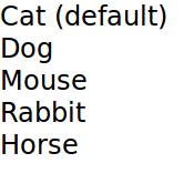
Views need a delegate to visually represent an item in a list. A view will visualize each item list according to the template defined by the delegate. Items in a model are accessible through the index property as well as the item's properties.
Component {
    id: petdelegate
    Text {
        id: label
        font.pixelSize: 24
        text: index === 0 ? type + " (default)" : type

        required property int index
        required property string type
    }
}
Accessing Views and Models from Delegates
The list view to which the delegate is bound is accessible from the delegate through the ListView.view property. Likewise, the GridView GridView.view is available to delegates. The corresponding model and its properties, therefore, are available through ListView.view.model. In addition, any defined signals or methods in the model are also accessible.
This mechanism is useful when you want to use the same delegate for a number of views, for example, but you want decorations or other features to be different for each view, and you would like these different settings to be properties of each of the views. Similarly, it might be of interest to access or show some properties of the model.
In the following example, the delegate shows the property language of the model, and the color of one of the fields depends on the property fruit_color of the view.
Rectangle {
     width: 200; height: 200

    ListModel {
        id: fruitModel
        property string language: "en"
        ListElement {
            name: "Apple"
            cost: 2.45
        }
        ListElement {
            name: "Orange"
            cost: 3.25
        }
        ListElement {
            name: "Banana"
            cost: 1.95
        }
    }

    Component {
        id: fruitDelegate
        Row {
                id: fruit
                Text { text: " Fruit: " + name; color: fruit.ListView.view.fruit_color }
                Text { text: " Cost: $" + cost }
                Text { text: " Language: " + fruit.ListView.view.model.language }
        }
    }

    ListView {
        property color fruit_color: "green"
        model: fruitModel
        delegate: fruitDelegate
        anchors.fill: parent
    }
}
Models
Data is provided to the delegate via named data roles which the delegate may bind to. Here is a ListModel with two roles, type and age, and a ListView with a delegate that binds to these roles to display their values:
import QtQuick 2.0

Item {
    width: 200; height: 250

    ListModel {
        id: myModel
        ListElement { type: "Dog"; age: 8 }
        ListElement { type: "Cat"; age: 5 }
    }

    Component {
        id: myDelegate
        Text { text: type + ", " + age }
    }

    ListView {
        anchors.fill: parent
        model: myModel
        delegate: myDelegate
    }
}
To get finer control over which roles are accessible, and to make delegates more self-contained and usable outside of views,
{Required Properties}{required properties} can be used. If a delegate contains required properties, the named roles are not provided. Instead, the QML engine will check if the name of a required property matches that of a model role. If so, that property will be bound to the corresponding value from the model.
import QtQuick 2.0

Item {
    width: 200
    height: 250

    ListModel {
        id: myModel
        ListElement { type: "Dog"; age: 8; noise: "meow" }
        ListElement { type: "Cat"; age: 5; noise: "woof" }
    }

    component MyDelegate : Text {
        required property string type
        required property int age
        text: type + ", " + age
        // WRONG: Component.onCompleted: () => console.log(noise)
        // The above line would cause a ReferenceError
        // as there is no required property noise,
        // and the presence of the required properties prevents
        // noise from being injected into the scope
    }

    ListView {
        anchors.fill: parent
        model: myModel
        delegate: MyDelegate {}
    }
}
If there is a naming clash between the model's properties and the delegate's properties, the roles can be accessed with the qualified model name instead. For example, if a Text type had type or age properties, the text in the above example would display those property values instead of the type and age values from the model item. In this case, the properties could have been referenced as model.type and model.age instead to ensure the delegate displays the property values from the model item.
A special index role containing the index of the item in the model is also available to the delegate. Note this index is set to -1 if the item is removed from the model. If you bind to the index role, be sure that the logic accounts for the possibility of index being -1, i.e. that the item is no longer valid. (Usually the item will shortly be destroyed, but it is possible to delay delegate destruction in some views via a delayRemove attached property.)
Models that do not have named roles (such as the ListModel shown below) will have the data provided via the modelData role. The modelData role is also provided for models that have only one role. In this case the modelData role contains the same data as the named role.
Note: model, index, and modelData roles are not accessible if the delegate contains required properties, unless it has also required properties with matching names.
QML provides several types of data models among the built-in set of QML types. In addition, models can be created with Qt C++ and then made available to QQmlEngine for use by QML components. For information about creating these models, visit the Using C++ Models with Qt Quick Views and creating QML types articles.
Positioning of items from a model can be achieved using a Repeater.
List Model
ListModel is a simple hierarchy of types specified in QML. The available roles are specified by the ListElement properties.
ListModel {
    id: fruitModel

    ListElement {
        name: "Apple"
        cost: 2.45
    }
    ListElement {
        name: "Orange"
        cost: 3.25
    }
    ListElement {
        name: "Banana"
        cost: 1.95
    }
}
The above model has two roles, name and cost. These can be bound to by a ListView delegate, for example:
ListView {
    anchors.fill: parent
    model: fruitModel
    delegate: Row {
        Text { text: "Fruit: " + name }
        Text { text: "Cost: $" + cost }
    }
}
ListModel provides methods to manipulate the ListModel directly via JavaScript. In this case, the first item inserted determines the roles available to any views that are using the model. For example, if an empty ListModel is created and populated via JavaScript, the roles provided by the first insertion are the only roles that will be shown in the view:
ListModel { id: fruitModel }
    ...
MouseArea {
    anchors.fill: parent
    onClicked: fruitModel.append({"cost": 5.95, "name":"Pizza"})
}
When the MouseArea is clicked, fruitModel will have two roles, cost and name. Even if subsequent roles are added, only the first two will be handled by views using the model. To reset the roles available in the model, call ListModel::clear().
XML Model
XmlListModel allows construction of a model from an XML data source. The roles are specified via the XmlRole type. The type needs to be imported.
import QtQuick.XmlListModel 2.0
The following model has three roles, title, link and description:
XmlListModel {
     id: feedModel
     source: "http://rss.news.yahoo.com/rss/oceania"
     query: "/rss/channel/item"
     XmlRole { name: "title"; query: "title/string()" }
     XmlRole { name: "link"; query: "link/string()" }
     XmlRole { name: "description"; query: "description/string()" }
}
The query property specifies that the XmlListModel generates a model item for each <item> in the XML document.
The RSS News demo shows how XmlListModel can be used to display an RSS feed.
Object Model
ObjectModel contains the visual items to be used in a view. When an ObjectModel is used in a view, the view does not require a delegate because the ObjectModel already contains the visual delegate (items).
The example below places three colored rectangles in a ListView.
import QtQuick 2.0
import QtQml.Models 2.1

Rectangle {
    ObjectModel {
        id: itemModel
        Rectangle { height: 30; width: 80; color: "red" }
        Rectangle { height: 30; width: 80; color: "green" }
        Rectangle { height: 30; width: 80; color: "blue" }
    }

    ListView {
        anchors.fill: parent
        model: itemModel
    }
}
Integers as Models
An integer can be used as a model that contains a certain number of types. In this case, the model does not have any data roles.
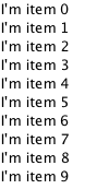
The following example creates a ListView with five elements:
Item {
    width: 200; height: 250

    Component {
        id: itemDelegate
        Text { text: "I am item number: " + index }
    }

    ListView {
        anchors.fill: parent
        model: 5
        delegate: itemDelegate
    }

}
Note: The limit on the number of items in an integer model is 100,000,000.
Object Instances as Models
An object instance can be used to specify a model with a single object type. The properties of the object are provided as roles.
The example below creates a list with one item, showing the color of the myText text. Note the use of the fully qualified model.color property to avoid clashing with color property of the Text type in the delegate.
Rectangle {
    width: 200; height: 250

    Text {
        id: myText
        text: "Hello"
        color: "#dd44ee"
    }

    Component {
        id: myDelegate
        Text { text: model.color }
    }

    ListView {
        anchors.fill: parent
        anchors.topMargin: 30
        model: myText
        delegate: myDelegate
    }
}
C++ Data Models
Models can be defined in C++ and then made available to QML. This mechanism is useful for exposing existing C++ data models or otherwise complex datasets to QML.
For information, visit the Using C++ Models with Qt Quick Views article.
Repeaters
Repeaters create items from a template for use with positioners, using data from a model. Combining repeaters and positioners is an easy way to lay out lots of items. A Repeater item is placed inside a positioner, and generates items that the enclosing positioner arranges.
Each Repeater creates a number of items by combining each element of data from a model, specified using the model property, with the template item, defined as a child item within the Repeater. The total number of items is determined by the amount of data in the model.
The following example shows a repeater used with a Grid item to arrange a set of Rectangle items. The Repeater item creates a series of 24 rectangles for the Grid item to position in a 5 by 5 arrangement.
import QtQuick 2.0

Rectangle {
    width: 400; height: 400; color: "black"

    Grid {
        x: 5; y: 5
        rows: 5; columns: 5; spacing: 10

        Repeater { model: 24
                   Rectangle { width: 70; height: 70
                               color: "lightgreen"

                               Text { text: index
                                      font.pointSize: 30
                                      anchors.centerIn: parent } }
        }
    }
}
The number of items created by a Repeater is held by its count property. It is not possible to set this property to determine the number of items to be created. Instead, as in the above example, we use an integer as the model.
For more details, see the QML Data Models document.
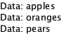
If the model is a string list, the delegate is also exposed to a read-only modelData property that holds the string. For example:
It is also possible to use a delegate as the template for the items created by a Repeater. This is specified using the delegate property.
Changing Model Data
To change model data, you can assign updated values to the model properties. The QML ListModel is editable by default whereas C++ models must implement setData() to become editable. Integer and JavaScript array models are read-only.
Supposed a QAbstractItemModel based C++ model that implements the setData method is registered as a QML type named EditableModel. Data could then be written to the model like this:
ListView {
    anchors.fill: parent
    model: EditableModel {}
    delegate: TextEdit {
        width: ListView.view.width
        height: 30
        text: model.edit
        Keys.onReturnPressed: model.edit = text
    }
}
Note: The edit role is equal to Qt::EditRole. See roleNames() for the built-in role names. However, real life models would usually register custom roles.
\nodeIf a model role is bound to a
{Required Property}{required property}, assigning to that property will not modify the model. It will instead break the binding to the model (just like assigning to any other property breaks existing bindings). If you want to use required properties and change the model data, make model also a required property and assign to model.propertyName.
For more information, visit the Using C++ Models with Qt Quick Views article.
Using Transitions
Transitions can be used to animate items that are added to, moved within, or removed from a positioner.
Transitions for adding items apply to items that are created as part of a positioner, as well as those that are reparented to become children of a positioner.
Transitions for removing items apply to items within a positioner that are deleted, as well as those that are removed from a positioner and given new parents in a document.
Note: Changing the opacity of items to zero will not cause them to disappear from the positioner. They can be removed and re-added by changing the visible property.
© 2025 The Qt Company Ltd. Documentation contributions included herein are the copyrights of their respective owners. The documentation provided herein is licensed under the terms of the GNU Free Documentation License version 1.3 as published by the Free Software Foundation. Qt and respective logos are trademarks of The Qt Company Ltd. in Finland and/or other countries worldwide. All other trademarks are property of their respective owners.
