Customizing Qt Widgets Using Style Sheets
When using style sheets, every widget is treated as a box with four concentric rectangles: the margin rectangle, the border rectangle, the padding rectangle, and the content rectangle. The box model describes this in further detail.
The Box Model
The four concentric rectangles appear conceptually as below:
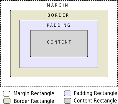
- The margin falls outside the border.
- The border is drawn between the margin and the padding.
- The padding falls inside the border, between the border and the actual contents.
- The content is what is left from the original widget or subcontrol once we have removed the margin, the border, and the padding.
The margin, border-width, and padding properties all default to zero. In that case, all four rectangles (margin, border, padding, and content) coincide exactly.
You can specify a background for the widget using the background-image property. By default, the background-image is drawn only for the area inside the border. This can be changed using the background-clip property. You can use background-repeat and background-origin to control the repetition and origin of the background image.
A background-image does not scale with the size of the widget. To provide a "skin" or background that scales along with the widget size, one must use border-image. Since the border-image property provides an alternate background, it is not required to specify a background-image when border-image is specified. In the case, when both of them are specified, the border-image draws over the background-image.
In addition, the image property may be used to draw an image over the border-image. The image specified does not tile or stretch and when its size does not match the size of the widget, its alignment is specified using the image-position property. Unlike background-image and border-image, one may specify a SVG in the image property, in which case the image is scaled automatically according to the widget size.
The steps to render a rule are as follows:
- Set clip for entire rendering operation (border-radius)
- Draw the background (background-image)
- Draw the border (border-image, border)
- Draw overlay image (image)
Sub-controls
A widget is considered as a hierarchy (tree) of subcontrols drawn on top of each other. For example, the QComboBox draws the drop-down sub-control followed by the down-arrow sub-control. A QComboBox is thus rendered as follows:
- Render the QComboBox { } rule
- Render the QComboBox::drop-down { } rule
- Render the QComboBox::down-arrow { } rule
Sub-controls share a parent-child relationship. In the case of QComboBox, the parent of down-arrow is the drop-down and the parent of drop-down is the widget itself. Sub-controls are positioned within their parent using the subcontrol-position and subcontrol-origin properties.
Once positioned, sub-controls can be styled using the box model.
Note: With complex widgets such as QComboBox and QScrollBar, if one property or sub-control is customized, all the other properties or sub-controls must be customized as well.
© 2025 The Qt Company Ltd. Documentation contributions included herein are the copyrights of their respective owners. The documentation provided herein is licensed under the terms of the GNU Free Documentation License version 1.3 as published by the Free Software Foundation. Qt and respective logos are trademarks of The Qt Company Ltd. in Finland and/or other countries worldwide. All other trademarks are property of their respective owners.
