Qt Quick Diseños - Ejemplo de diseño adaptable
Demuestra cómo utilizar LayoutItemProxy para crear una interfaz de usuario adaptable.
Este ejemplo muestra cómo utilizar LayoutProxyItems en combinación con layouts para crear layouts responsivos.
Ejecución del ejemplo
Para ejecutar el ejemplo desde Qt Creatorabra el modo Welcome y seleccione el ejemplo de Examples. Para más información, consulta Qt Creator: Tutorial: Construir y ejecutar.
Creación de elementos
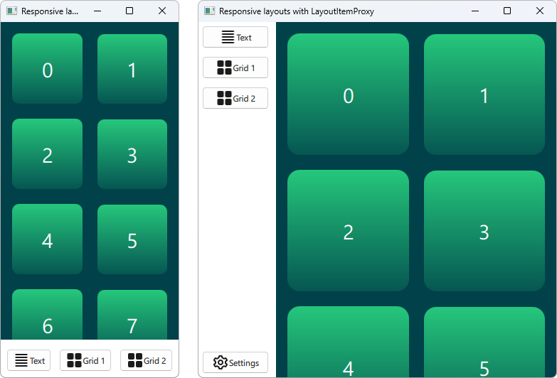
El tipo LayoutItemProxy permite utilizar el mismo elemento en diferentes disposiciones, aunque sólo una disposición puede ser visible al mismo tiempo. Esto puede usarse para crear diseños responsivos que se adapten al tamaño de la ventana o de la pantalla.
En primer lugar tenemos que definir todos los elementos que deben aparecer en o UI en algún momento. Usamos un AnnotatedRect, que es un simple Rectángulo con algo de texto añadido.
Rectangle {
    id: contentItem
    Layout.fillWidth: true
    implicitHeight: grid.implicitHeight
    implicitWidth: grid.implicitWidth
    color: "#00414A"

    GridLayout {
        id: grid
        anchors {
            fill: parent
            margins: 8
        }
        columns: Math.max(1, Math.min(Math.round(width / 130), 6))
        Repeater {
            model: 60
            delegate: Rectangle {
                required property int index
                Layout.fillWidth: true
                Layout.margins: 8
                implicitWidth: 200
                implicitHeight: width
                radius: width / 10
                gradient: Gradient {
                    GradientStop { position: -0.2; color: "#2CDE85" }
                    GradientStop { position: 1.2; color: "#00414A" }
                }
                Text {
                    color: "#ffffff"
                    font.pointSize: 22
                    anchors.centerIn: parent
                    text: parent.index + 1
                }
            }
        }
    }
}

Button {
    id: a
    text: "Text"
    icon.source: "./icons/text.svg"
    Layout.fillWidth: true
    Layout.margins: 3
}

Button {
    id: b
    text: "Grid 1"
    icon.source: "./icons/grid.svg"
    Layout.fillWidth: true
    Layout.margins: 3
}

Button {
    id: c
    text: "Grid 2"
    icon.source: "./icons/grid.svg"
    Layout.fillWidth: true
    Layout.margins: 3
}

Button {
    id: d
    text: "Settings"
    icon.source: "./icons/settings.svg"
    Layout.fillWidth: true
    Layout.margins: 3
}
Creación de diseños
Ahora podemos declarar varios layouts usando LayoutItemProxies, apuntando a los ítems previamente declarados. Un único diseño puede definirse de la siguiente manera.
ColumnLayout {
    id: smallLayout
    anchors.fill: parent

    Flickable {
        Layout.fillHeight: true
        Layout.fillWidth: true
        contentWidth: width
        contentHeight: gl.implicitHeight
        clip: true
        ScrollIndicator.vertical: ScrollIndicator { }
        LayoutItemProxy {
            id: gl
            width: parent.width
            height: implicitHeight
            target: contentItem
        }
    }

    RowLayout {
        Layout.fillHeight: false
        Layout.fillWidth: true
        Layout.margins: 5
        LayoutItemProxy{ target: a; }
        LayoutItemProxy{ target: b; }
        LayoutItemProxy{ target: c; }
    }
}
Este fragmento de código muestra varias formas de utilizar LayoutItemProxy. El método más sencillo es añadir LayoutItemProxies a un diseño como RowLayout. Además establecemos una propiedad adicional Layout adjunta al LayoutProxyItem que afectará al elemento de destino sólo en este layout en particular. Además, vemos que el elemento d no se utiliza en el primer layout. Entonces es automáticamente ocultado por LayoutItemProxy en el segundo diseño. Otra forma de utilizarlo se muestra estableciendo un LayoutItemProxy como contenido de un Flickable.
A continuación se declara otra presentación.
RowLayout {
    id: largeLayout
    anchors.fill: parent
    ColumnLayout {
        Layout.minimumWidth: 100
        Layout.fillWidth: true
        Layout.margins: 2
        LayoutItemProxy{ target: a }
        LayoutItemProxy{ target: b }
        LayoutItemProxy{ target: c }
        Item { Layout.fillHeight: true }
        LayoutItemProxy{ target: d }
    }

    LayoutItemProxy {
        Layout.fillHeight: true
        Layout.fillWidth: true
        target: contentItem
    }
}
Aquí mostramos que LayoutItemProxies puede utilizarse junto con Items real en el mismo nivel jerárquico. En general, LayoutItemProxy es flexible y permite estructuras anidadas de elementos y disposiciones.
Configuración de la presentación
Una vez definidos los dos layouts, smallLayout y largeLayout, podemos continuar con la configuración del layout que se ajuste al tamaño actual de la aplicación. Definimos una nueva función para este código que llamamos cuando se inicializa la ventana y cada vez que cambia la anchura:
function setFittingLayout() {
    if (width < 450) {
        smallLayout.visible = true
        largeLayout.visible = false
    } else {
        smallLayout.visible = false
        largeLayout.visible = true
    }
}
onWidthChanged: setFittingLayout()
Component.onCompleted: setFittingLayout()
Alternativamente a llamar a esta función después de la inicialización podemos ocultar todo excepto el layout correcto para el tamaño inicial en el código declarativo.
© 2026 The Qt Company Ltd. Documentation contributions included herein are the copyrights of their respective owners. The documentation provided herein is licensed under the terms of the GNU Free Documentation License version 1.3 as published by the Free Software Foundation. Qt and respective logos are trademarks of The Qt Company Ltd. in Finland and/or other countries worldwide. All other trademarks are property of their respective owners.
