Qt Quick Ejemplos - Vistas
Esta es una colección de ejemplos QML modelo-vista.
Vistas es una colección de pequeños ejemplos QML relacionados con la funcionalidad de modelos y vistas. Demuestran cómo mostrar datos de un modelo utilizando los tipos de vista de Qt Quick. Para más información, visite la página Modelos y Vistas en Qt Quick.
Ejecución del ejemplo
Para ejecutar el ejemplo desde Qt Creatorabra el modo Welcome y seleccione el ejemplo de Examples. Para más información, consulte Qt Creator: Tutorial: Construir y ejecutar.
Utilizando GridView y PathView
GridView y PathView demuestran el uso de estos tipos para mostrar vistas.
    GridView {
        anchors.fill: parent
        cellWidth: 100
        cellHeight: 100
        focus: true
        model: appModel

        highlight: Rectangle {
            width: 80
            height: 80
            color: "lightsteelblue"
        }

        delegate: Item {
            required property string icon
            required property string name
            required property int index

            width: 100
            height: 100

            Image {
                id: myIcon
                y: 20
                anchors.horizontalCenter: parent.horizontalCenter
                source: parent.icon
            }
            Text {
                anchors {
                    top: myIcon.bottom
                    horizontalCenter: parent.horizontalCenter
                }
                text: parent.name
            }
            MouseArea {
                anchors.fill: parent
                onClicked: parent.GridView.view.currentIndex = parent.index
            }
        }
    }
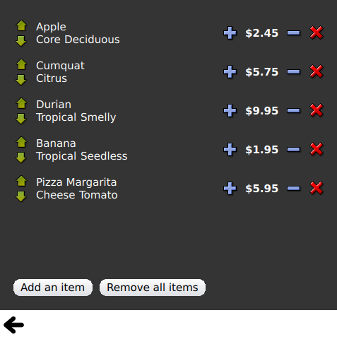
Uso de Dynamic List
Dynamic List muestra la animación de adiciones y eliminaciones en tiempo de ejecución en ListView.
El manejador de señal ListView.onAdd ejecuta una animación cuando se añaden nuevos elementos a la vista, y el ListView.onRemove otra cuando se eliminan.
        Item {
            SequentialAnimation {
                id: addAnimation
                PropertyAction {
                    target: delegateItem
                    property: "height"
                    value: 0
                }
                NumberAnimation {
                    target: delegateItem
                    property: "height"
                    to: 80
                    duration: 250
                    easing.type: Easing.InOutQuad
                }
            }
            ListView.onAdd: addAnimation.start()

            SequentialAnimation {
                id: removeAnimation
                PropertyAction {
                    target: delegateItem
                    property: "ListView.delayRemove"
                    value: true
                }
                NumberAnimation {
                    target: delegateItem
                    property: "height"
                    to: 0
                    duration: 250
                    easing.type: Easing.InOutQuad
                }

                // Make sure delayRemove is set back to false so that the item can be destroyed
                PropertyAction {
                    target: delegateItem
                    property: "ListView.delayRemove"
                    value: false
                }
            }
            ListView.onRemove: removeAnimation.start()
        }
Expansión de delegados
Expanding Delegates muestra delegados que se expanden cuando se activan.
Tiene un delegado complejo cuyo tamaño y apariencia pueden cambiar, desplazando otros elementos de la vista.
        Item {
            id: recipe

            required property string title
            required property string picture
            required property string ingredients
            required property string method

            // Create a property to contain the visibility of the details.
            // We can bind multiple element's opacity to this one property,
            // rather than having a "PropertyChanges" line for each element we
            // want to fade.
            property real detailsOpacity : 0
            MouseArea {
                anchors.fill: parent
                onClicked: recipe.state = 'Details';
            }

            // Lay out the page: picture, title and ingredients at the top, and method at the
            // bottom.  Note that elements that should not be visible in the list
            // mode have their opacity set to recipe.detailsOpacity.

            Row {
                id: topLayout
                x: 10
                y: 10
                height: recipeImage.height
                width: parent.width
                spacing: 10

                Image {
                    id: recipeImage
                    width: 50
                    height: 50
                    source: recipe.picture
                }
            Item {
                id: details
                x: 10
                width: parent.width - 20

                anchors {
                    top: topLayout.bottom
                    topMargin: 10
                    bottom: parent.bottom
                    bottomMargin: 10
                }
                opacity: recipe.detailsOpacity
            }

            // A button to close the detailed view, i.e. set the state back to default ('').
            TextButton {
                y: 10
                anchors {
                    right: background.right
                    rightMargin: 10
                }
                opacity: recipe.detailsOpacity
                text: qsTr("Close")

                onClicked: recipe.state = '';
            }

            states: State {
                name: "Details"

                PropertyChanges {
                    background.color: "white"
                    recipeImage {
                         // Make picture bigger
                        width: 130
                        height: 130
                    }
                    recipe {
                        // Make details visible
                        detailsOpacity: 1
                        x: 0

                        // Fill the entire list area with the detailed view
                        height: listView.height
                    }
                }

                // Move the list so that this item is at the top.
                PropertyChanges {
                    recipe.ListView.view.contentY: recipe.y
                    explicit: true;
                }

                // Disallow flicking while we're in detailed view
                PropertyChanges {
                    recipe.ListView.view.interactive: false
                }
            }

            transitions: Transition {
                // Make the state changes smooth
                ParallelAnimation {
                    ColorAnimation {
                        property: "color"
                        duration: 500
                    }
                    NumberAnimation {
                        duration: 300
                        properties: "detailsOpacity,x,contentY,height,width"
                    }
                }
            }
        }
Resaltado
Highlight muestra cómo añadir un resalte personalizado a ListView.
    // Define a highlight with customized movement between items.
    component HighlightBar : Rectangle {
        width: 200
        height: 50
        color: "#FFFF88"
        y: ListView.view.currentItem.y
        Behavior on y {
            SpringAnimation {
                spring: 2
                damping: 0.1
            }
        }
    }

    ListView {
        id: listView
        width: 200
        height: parent.height
        x: 30

        model: PetsModel { }
        delegate: PetDelegate { }
        focus: true

        // Set the highlight delegate. Note we must also set highlightFollowsCurrentItem
        // to false so the highlight delegate can control how the highlight is moved.
        highlight: HighlightBar { }
        highlightFollowsCurrentItem: false
    }
Uso de los rangos de resaltado
Highlight Ranges muestra los tres modos diferentes de rango de resaltado de ListView.
Rectangle {
    id: root
    property int current: 0
    property bool increasing: true
    // Example index automation for convenience, disabled on click or tap
    SequentialAnimation {
        id: anim
        loops: -1
        running: true
        ScriptAction {
            script: if (root.increasing) {
                        root.current++;
                        if (root.current >= aModel.count -1) {
                            root.current = aModel.count - 1;
                            root.increasing = !root.increasing;
                        }
                    } else {
                        root.current--;
                        if (root.current <= 0) {
                            root.current = 0;
                            root.increasing = !root.increasing;
                        }
                    }
        }

        PauseAnimation {
            duration: 500
        }
    }
    ListView {
        id: list1
        height: 50
        width: parent.width
        model: PetsModel {
            id: aModel
        }
        delegate: petDelegate
        orientation: ListView.Horizontal
        highlight: Rectangle {
            color: "lightsteelblue"
        }
        currentIndex: root.current
        onCurrentIndexChanged: root.current = currentIndex
        focus: true
    }

    ListView {
        id: list2
        y: 160
        height: 50
        width: parent.width
        model: PetsModel { }
        delegate: petDelegate
        orientation: ListView.Horizontal
        highlight: Rectangle {
            color: "yellow"
        }
        currentIndex: root.current
        preferredHighlightBegin: 80
        preferredHighlightEnd: 220
        highlightRangeMode: ListView.ApplyRange
    }

    ListView {
        id: list3
        y: 320
        height: 50
        width: parent.width
        model: PetsModel {}
        delegate: petDelegate
        orientation: ListView.Horizontal
        highlight: Rectangle { color: "yellow" }
        currentIndex: root.current
        onCurrentIndexChanged: root.current = currentIndex
        preferredHighlightBegin: 125
        preferredHighlightEnd: 125
        highlightRangeMode: ListView.StrictlyEnforceRange
    }
}
Secciones
Sections muestra los distintos encabezados y pies de sección disponibles en ListView.
    // The delegate for each section header
    Component {
        id: sectionHeading
        Rectangle {
            width: ListView.view.width
            height: childrenRect.height
            color: "lightsteelblue"

            required property string section

            Text {
                text: parent.section
                font.bold: true
                font.pixelSize: 20
            }
        }
    }

    ListView {
        id: view
        anchors.top: parent.top
        anchors.bottom: buttonBar.top
        width: parent.width
        model: animalsModel
        delegate: Text {
            required property string name

            text: name
            font.pixelSize: 18
        }

        section.property: "size"
        section.criteria: ViewSection.FullString
        section.delegate: sectionHeading
    }
Uso de paquetes
Los paquetes utilizan el tipo Package para la transición de delegados entre dos vistas.
Dispone de un objeto Package que define elementos de delegado para cada vista y un elemento que puede transferirse entre delegados.
Package {
    id: delegate

    required property int upTo
    required property int index
    required property string display

    Text {
        id: listDelegate
        width: parent.width
        height: 25
        text: 'Empty'
        Package.name: 'list'
    }

    Text {
        id: gridDelegate
        width: parent.width / 2
        height: 50
        text: 'Empty'
        Package.name: 'grid'
    }

    Rectangle {
        id: wrapper
        width: parent?.width ?? 0
        height: 25
        color: 'lightsteelblue'

        Text {
            text: delegate.display
            anchors.centerIn: parent
        }
        state: delegate.upTo > delegate.index ? 'inGrid' : 'inList'
        states: [
            State {
                name: 'inList'
                ParentChange {
                    target: wrapper
                    parent: listDelegate
                }
            },
            State {
                name: 'inGrid'
                ParentChange {
                    target: wrapper
                    parent: gridDelegate
                    x: 0
                    y: 0
                    width: gridDelegate.width
                    height: gridDelegate.height
                }
            }
        ]

        transitions: [
            Transition {
                ParentAnimation {
                    NumberAnimation {
                        properties: 'x,y,width,height'
                        duration: 300
                    }
                }
            }
        ]
    }
}
Un DelegateModel permite a las vistas individuales acceder a sus elementos específicos desde el delegado de paquete compartido.
DelegateModel {
    id: visualModel
    delegate: Delegate {
        upTo: root.upTo
    }
    model: myModel
}

ListView {
    id: lv
    height: parent.height / 2
    width: parent.width

    model: visualModel.parts.list
}
GridView {
    y: parent.height / 2
    height: parent.height / 2
    width: parent.width
    cellWidth: width / 2
    cellHeight: 50
    model: visualModel.parts.grid
}
Draggable Selections demuestra el uso de Package para agrupar múltiples delegados seleccionados para arrastrar y soltar dentro de una vista de elemento.
        Package {
            id: packageRoot

            required property var modelData

            MouseArea {
                id: visibleContainer
                Package.name: "visible"

                width: 64
                height: 64
                enabled: packageRoot.DelegateModel.inSelected

                drag.target: draggable

                Item {
                    id: draggable

                    Drag.active: visibleContainer.drag.active
Uso de ObjectModel
ObjectModel utiliza un ObjectModel para el modelo en lugar de un ListModel.
    ObjectModel {
        id: itemModel

        Rectangle {
            width: view.width
            height: view.height
            color: "#FFFEF0"

            Text {
                anchors.centerIn: parent
                text: qsTr("Page 1")
                font.bold: true
            }

            Component.onDestruction: if (root.printDestruction) print("destroyed 1")
        }
        Rectangle {
            width: view.width
            height: view.height
            color: "#F0FFF7"

            Text {
                anchors.centerIn: parent
                text: qsTr("Page 2")
                font.bold: true
            }

            Component.onDestruction: if (root.printDestruction) print("destroyed 2")
        }
        Rectangle {
            width: view.width
            height: view.height
            color: "#F4F0FF"

            Text {
                anchors.centerIn: parent
                text: qsTr("Page 3")
                font.bold: true
            }

            Component.onDestruction: if (root.printDestruction) print("destroyed 3")
        }
    }

    ListView {
        id: view
        anchors {
            fill: parent
            bottomMargin: 30
        }
        model: itemModel
        preferredHighlightBegin: 0
        preferredHighlightEnd: 0
        highlightRangeMode: ListView.StrictlyEnforceRange
        orientation: ListView.Horizontal
        snapMode: ListView.SnapOneItem
        flickDeceleration: 2000
        cacheBuffer: 200
    }
Uso de Display Margins
Display Margins utiliza delegados para mostrar elementos e implementa componentes simples de encabezado y pie de página.
© 2026 The Qt Company Ltd. Documentation contributions included herein are the copyrights of their respective owners. The documentation provided herein is licensed under the terms of the GNU Free Documentation License version 1.3 as published by the Free Software Foundation. Qt and respective logos are trademarks of The Qt Company Ltd. in Finland and/or other countries worldwide. All other trademarks are property of their respective owners.
