Qt Quick Exemples - Vues
Il s'agit d'une collection d'exemples QML de modèles et de vues.
Views est une collection de petits exemples QML relatifs à la fonctionnalité des modèles et des vues. Ils montrent comment afficher les données d'un modèle à l'aide des types de vues Qt Quick. Pour plus d'informations, consultez la page Modèles et vues sur Qt Quick.
Exécution de l'exemple
Pour exécuter l'exemple à partir de Qt CreatorOuvrez le mode Welcome et sélectionnez l'exemple à partir de Examples. Pour plus d'informations, voir Qt Creator: Tutoriel : Construire et exécuter.
Utilisation de GridView et PathView
GridView et PathView démontrent l'utilisation de ces types pour afficher des vues.
    GridView {
        anchors.fill: parent
        cellWidth: 100
        cellHeight: 100
        focus: true
        model: appModel

        highlight: Rectangle {
            width: 80
            height: 80
            color: "lightsteelblue"
        }

        delegate: Item {
            required property string icon
            required property string name
            required property int index

            width: 100
            height: 100

            Image {
                id: myIcon
                y: 20
                anchors.horizontalCenter: parent.horizontalCenter
                source: parent.icon
            }
            Text {
                anchors {
                    top: myIcon.bottom
                    horizontalCenter: parent.horizontalCenter
                }
                text: parent.name
            }
            MouseArea {
                anchors.fill: parent
                onClicked: parent.GridView.view.currentIndex = parent.index
            }
        }
    }
Utilisation de Dynamic List
Dynamic List présente l'animation des ajouts et des suppressions effectués au cours de l'exécution dans une liste ListView.
Le gestionnaire de signal ListView.onAdd exécute une animation lorsque de nouveaux éléments sont ajoutés à la vue, et le gestionnaire ListView.onRemove en exécute une autre lorsqu'ils sont supprimés.
        Item {
            SequentialAnimation {
                id: addAnimation
                PropertyAction {
                    target: delegateItem
                    property: "height"
                    value: 0
                }
                NumberAnimation {
                    target: delegateItem
                    property: "height"
                    to: 80
                    duration: 250
                    easing.type: Easing.InOutQuad
                }
            }
            ListView.onAdd: addAnimation.start()

            SequentialAnimation {
                id: removeAnimation
                PropertyAction {
                    target: delegateItem
                    property: "ListView.delayRemove"
                    value: true
                }
                NumberAnimation {
                    target: delegateItem
                    property: "height"
                    to: 0
                    duration: 250
                    easing.type: Easing.InOutQuad
                }

                // Make sure delayRemove is set back to false so that the item can be destroyed
                PropertyAction {
                    target: delegateItem
                    property: "ListView.delayRemove"
                    value: false
                }
            }
            ListView.onRemove: removeAnimation.start()
        }
Délégués en expansion
Expanding Deleg ates présente des délégués qui s'étendent lorsqu'ils sont activés.
Il s'agit d'un délégué complexe dont la taille et l'apparence peuvent changer, déplaçant d'autres éléments dans la vue.
        Item {
            id: recipe

            required property string title
            required property string picture
            required property string ingredients
            required property string method

            // Create a property to contain the visibility of the details.
            // We can bind multiple element's opacity to this one property,
            // rather than having a "PropertyChanges" line for each element we
            // want to fade.
            property real detailsOpacity : 0
            MouseArea {
                anchors.fill: parent
                onClicked: recipe.state = 'Details';
            }

            // Lay out the page: picture, title and ingredients at the top, and method at the
            // bottom.  Note that elements that should not be visible in the list
            // mode have their opacity set to recipe.detailsOpacity.

            Row {
                id: topLayout
                x: 10
                y: 10
                height: recipeImage.height
                width: parent.width
                spacing: 10

                Image {
                    id: recipeImage
                    width: 50
                    height: 50
                    source: recipe.picture
                }
            Item {
                id: details
                x: 10
                width: parent.width - 20

                anchors {
                    top: topLayout.bottom
                    topMargin: 10
                    bottom: parent.bottom
                    bottomMargin: 10
                }
                opacity: recipe.detailsOpacity
            }

            // A button to close the detailed view, i.e. set the state back to default ('').
            TextButton {
                y: 10
                anchors {
                    right: background.right
                    rightMargin: 10
                }
                opacity: recipe.detailsOpacity
                text: qsTr("Close")

                onClicked: recipe.state = '';
            }

            states: State {
                name: "Details"

                PropertyChanges {
                    background.color: "white"
                    recipeImage {
                         // Make picture bigger
                        width: 130
                        height: 130
                    }
                    recipe {
                        // Make details visible
                        detailsOpacity: 1
                        x: 0

                        // Fill the entire list area with the detailed view
                        height: listView.height
                    }
                }

                // Move the list so that this item is at the top.
                PropertyChanges {
                    recipe.ListView.view.contentY: recipe.y
                    explicit: true;
                }

                // Disallow flicking while we're in detailed view
                PropertyChanges {
                    recipe.ListView.view.interactive: false
                }
            }

            transitions: Transition {
                // Make the state changes smooth
                ParallelAnimation {
                    ColorAnimation {
                        property: "color"
                        duration: 500
                    }
                    NumberAnimation {
                        duration: 300
                        properties: "detailsOpacity,x,contentY,height,width"
                    }
                }
            }
        }
Utilisation de la mise en évidence
Lafonction de mise en évidence permet d'ajouter une mise en évidence personnalisée à une page ListView.
    // Define a highlight with customized movement between items.
    component HighlightBar : Rectangle {
        width: 200
        height: 50
        color: "#FFFF88"
        y: ListView.view.currentItem.y
        Behavior on y {
            SpringAnimation {
                spring: 2
                damping: 0.1
            }
        }
    }

    ListView {
        id: listView
        width: 200
        height: parent.height
        x: 30

        model: PetsModel { }
        delegate: PetDelegate { }
        focus: true

        // Set the highlight delegate. Note we must also set highlightFollowsCurrentItem
        // to false so the highlight delegate can control how the highlight is moved.
        highlight: HighlightBar { }
        highlightFollowsCurrentItem: false
    }
Utilisation des plages de mise en évidence
Highlight Ranges présente les trois différents modes de plage de mise en évidence de ListView.
Rectangle {
    id: root
    property int current: 0
    property bool increasing: true
    // Example index automation for convenience, disabled on click or tap
    SequentialAnimation {
        id: anim
        loops: -1
        running: true
        ScriptAction {
            script: if (root.increasing) {
                        root.current++;
                        if (root.current >= aModel.count -1) {
                            root.current = aModel.count - 1;
                            root.increasing = !root.increasing;
                        }
                    } else {
                        root.current--;
                        if (root.current <= 0) {
                            root.current = 0;
                            root.increasing = !root.increasing;
                        }
                    }
        }

        PauseAnimation {
            duration: 500
        }
    }
    ListView {
        id: list1
        height: 50
        width: parent.width
        model: PetsModel {
            id: aModel
        }
        delegate: petDelegate
        orientation: ListView.Horizontal
        highlight: Rectangle {
            color: "lightsteelblue"
        }
        currentIndex: root.current
        onCurrentIndexChanged: root.current = currentIndex
        focus: true
    }

    ListView {
        id: list2
        y: 160
        height: 50
        width: parent.width
        model: PetsModel { }
        delegate: petDelegate
        orientation: ListView.Horizontal
        highlight: Rectangle {
            color: "yellow"
        }
        currentIndex: root.current
        preferredHighlightBegin: 80
        preferredHighlightEnd: 220
        highlightRangeMode: ListView.ApplyRange
    }

    ListView {
        id: list3
        y: 320
        height: 50
        width: parent.width
        model: PetsModel {}
        delegate: petDelegate
        orientation: ListView.Horizontal
        highlight: Rectangle { color: "yellow" }
        currentIndex: root.current
        onCurrentIndexChanged: root.current = currentIndex
        preferredHighlightBegin: 125
        preferredHighlightEnd: 125
        highlightRangeMode: ListView.StrictlyEnforceRange
    }
}
Utilisation des sections
Sections présente les différents en-têtes et pieds de page de section disponibles sur ListView.
    // The delegate for each section header
    Component {
        id: sectionHeading
        Rectangle {
            width: ListView.view.width
            height: childrenRect.height
            color: "lightsteelblue"

            required property string section

            Text {
                text: parent.section
                font.bold: true
                font.pixelSize: 20
            }
        }
    }

    ListView {
        id: view
        anchors.top: parent.top
        anchors.bottom: buttonBar.top
        width: parent.width
        model: animalsModel
        delegate: Text {
            required property string name

            text: name
            font.pixelSize: 18
        }

        section.property: "size"
        section.criteria: ViewSection.FullString
        section.delegate: sectionHeading
    }
Utilisation des paquets
Packages utilise le type Package pour assurer la transition des délégués entre deux vues.
Il possède un objet Package qui définit les éléments délégués pour chaque vue et un élément qui peut être transféré entre les délégués.
Package {
    id: delegate

    required property int upTo
    required property int index
    required property string display

    Text {
        id: listDelegate
        width: parent.width
        height: 25
        text: 'Empty'
        Package.name: 'list'
    }

    Text {
        id: gridDelegate
        width: parent.width / 2
        height: 50
        text: 'Empty'
        Package.name: 'grid'
    }

    Rectangle {
        id: wrapper
        width: parent?.width ?? 0
        height: 25
        color: 'lightsteelblue'

        Text {
            text: delegate.display
            anchors.centerIn: parent
        }
        state: delegate.upTo > delegate.index ? 'inGrid' : 'inList'
        states: [
            State {
                name: 'inList'
                ParentChange {
                    target: wrapper
                    parent: listDelegate
                }
            },
            State {
                name: 'inGrid'
                ParentChange {
                    target: wrapper
                    parent: gridDelegate
                    x: 0
                    y: 0
                    width: gridDelegate.width
                    height: gridDelegate.height
                }
            }
        ]

        transitions: [
            Transition {
                ParentAnimation {
                    NumberAnimation {
                        properties: 'x,y,width,height'
                        duration: 300
                    }
                }
            }
        ]
    }
}
Une adresse DelegateModel permet aux vues individuelles d'accéder à leurs éléments spécifiques à partir du délégué du paquet partagé.
DelegateModel {
    id: visualModel
    delegate: Delegate {
        upTo: root.upTo
    }
    model: myModel
}

ListView {
    id: lv
    height: parent.height / 2
    width: parent.width

    model: visualModel.parts.list
}
GridView {
    y: parent.height / 2
    height: parent.height / 2
    width: parent.width
    cellWidth: width / 2
    cellHeight: 50
    model: visualModel.parts.grid
}
L'exemple dessélections glissantes montre l'utilisation d'un paquet pour regrouper plusieurs délégués sélectionnés afin de les faire glisser et de les déposer dans une vue d'élément.
        Package {
            id: packageRoot

            required property var modelData

            MouseArea {
                id: visibleContainer
                Package.name: "visible"

                width: 64
                height: 64
                enabled: packageRoot.DelegateModel.inSelected

                drag.target: draggable

                Item {
                    id: draggable

                    Drag.active: visibleContainer.drag.active
Utilisation d'ObjectModel
ObjectModel utilise un ObjectModel pour le modèle au lieu d'un ListModel.
    ObjectModel {
        id: itemModel

        Rectangle {
            width: view.width
            height: view.height
            color: "#FFFEF0"

            Text {
                anchors.centerIn: parent
                text: qsTr("Page 1")
                font.bold: true
            }

            Component.onDestruction: if (root.printDestruction) print("destroyed 1")
        }
        Rectangle {
            width: view.width
            height: view.height
            color: "#F0FFF7"

            Text {
                anchors.centerIn: parent
                text: qsTr("Page 2")
                font.bold: true
            }

            Component.onDestruction: if (root.printDestruction) print("destroyed 2")
        }
        Rectangle {
            width: view.width
            height: view.height
            color: "#F4F0FF"

            Text {
                anchors.centerIn: parent
                text: qsTr("Page 3")
                font.bold: true
            }

            Component.onDestruction: if (root.printDestruction) print("destroyed 3")
        }
    }

    ListView {
        id: view
        anchors {
            fill: parent
            bottomMargin: 30
        }
        model: itemModel
        preferredHighlightBegin: 0
        preferredHighlightEnd: 0
        highlightRangeMode: ListView.StrictlyEnforceRange
        orientation: ListView.Horizontal
        snapMode: ListView.SnapOneItem
        flickDeceleration: 2000
        cacheBuffer: 200
    }
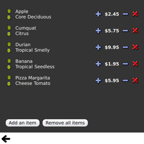
Utilisation de marges d'affichage
Display Margins utilise des délégués pour afficher les éléments et met en œuvre des composants d'en-tête et de pied de page simples.
© 2026 The Qt Company Ltd. Documentation contributions included herein are the copyrights of their respective owners. The documentation provided herein is licensed under the terms of the GNU Free Documentation License version 1.3 as published by the Free Software Foundation. Qt and respective logos are trademarks of The Qt Company Ltd. in Finland and/or other countries worldwide. All other trademarks are property of their respective owners.
