
체크박스 스타일 지정: 단계별 안내
이 페이지에서는 체크박스가 페인트 이벤트를 수신하는 순간부터 스타일이 완전히 그려지는 순간까지의 과정을 단계별로 살펴봅니다. 위젯이 스타일 옵션을 구성하는 방식, ` QCommonStyle `가 요소를 여러 부분으로 분할하는 방식, 그리고 ` QProxyStyle `가 그 중 한 부분을 대체하는 방식을 보여줍니다. 대부분의 위젯은 동일한 구조를 따르므로, 동일한 분석 방식을 적용할 수 있습니다. 즉, 위젯이 생성하는 스타일 옵션을 확인하고, 위젯이 그리는 요소를 파악한 다음, 해당 요소에 대한 ` QCommonStyle ` 구현을 분석하면 됩니다.
위젯은 스타일 옵션을 생성합니다
QCheckBox QStyleOptionButton 를 사용합니다. 위젯의 ` ` 함수는 다음과 같이(약간 단순화하여) 옵션을 채웁니다: initStyleOption()
    opt.initFrom(q);
    if (down)
        opt.state |= QStyle::State_Sunken;
    if (tristate && noChange)
        opt.state |= QStyle::State_NoChange;
    else
        opt.state |= checked ? QStyle::State_On : QStyle::State_Off;
    if (q->testAttribute(Qt::WA_Hover) && q->underMouse()) {
        if (hovering)
            opt.state |= QStyle::State_MouseOver;
        else
            opt.state &= ~QStyle::State_MouseOver;
    }
    opt.text = text;
    opt.icon = icon;
opt.iconSize = q->iconSize();QStyleOption::initFrom()는 모든 위젯이 공유하는 정보를 설정합니다. 그 구현은 다음과 같습니다:
    state = QStyle::State_None;
    if (widget->isEnabled())
        state |= QStyle::State_Enabled;
    if (widget->hasFocus())
        state |= QStyle::State_HasFocus;
    if (widget->window()->testAttribute(Qt::WA_KeyboardFocusChange))
        state |= QStyle::State_KeyboardFocusChange;
    if (widget->underMouse())
        state |= QStyle::State_MouseOver;
    if (widget->window()->isActiveWindow())
        state |= QStyle::State_Active;

    direction = widget->layoutDirection();
    rect = widget->rect();
    palette = widget->palette();
    fontMetrics = widget->fontMetrics();
State_Enabled 위젯이 활성화되면 `is`가 설정되고, 포커스가 있을 때는 ` State_HasFocus `, 사용자가 키보드로 마지막으로 포커스를 변경했을 때는 ` State_KeyboardFocusChange `, 위젯의 창이 활성 창일 때는 ` State_Active `가 설정됩니다. 마우스 커서가 위젯 위에 있을 때는 ` State_MouseOver `가 설정됩니다. 상태에 더해, ` initFrom() `는 레이아웃 방향, 위젯의 사각형, 팔레트 및 글꼴 메트릭을 옵션에 저장합니다.
QCheckBox 그런 다음 자체 상태를 추가합니다. 사용자가 상자를 누르고 있는 동안에는 체크 여부와 관계없이 ` State_Sunken `가 설정됩니다. 부분적으로 체크된 3단계 상자의 경우 ` State_NoChange `가 설정되며, 그렇지 않은 경우 ` State_On ` 또는 ` State_Off `가 체크 상태를 반영합니다. 이 옵션에는 텍스트, 아이콘 및 아이콘 크기도 포함됩니다. ` QCheckBox `는 위젯에 ` WA_Hover ` 속성이 설정되어 있는 동안에만 ` State_MouseOver `를 유지하며, 이 속성은 일반적으로 ` polish()`에서 스타일을 통해 설정됩니다.
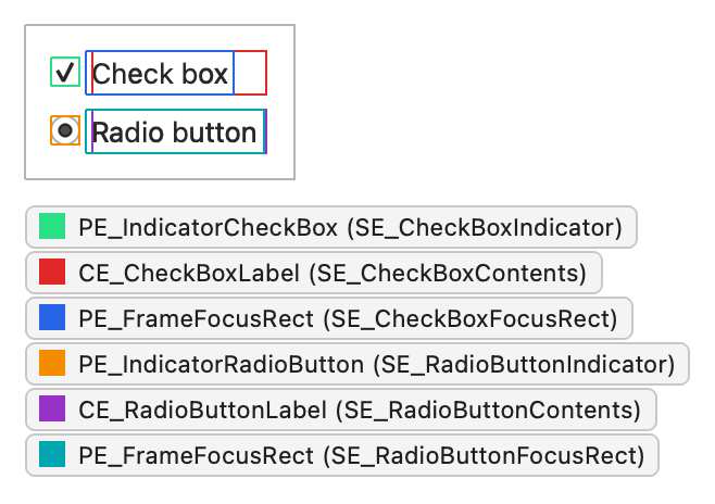
다음 스크린샷에서 사용자가 포커스가 설정된 체크박스를 마우스로 클릭한다고 가정해 봅시다. 이 스크린샷에는 PE_IndicatorRadioButton 및 CE_RadioButtonLabel 와 동일한 구조를 사용하는 라디오 버튼도 표시되어 있습니다:
이때 해당 옵션에는 다음과 같은 상태 플래그가 설정됩니다:
| 상태 플래그 | 설정됨 |
|---|---|
State_Sunken | 예 |
State_NoChange | 아니요 |
State_On | 예 |
State_Off | 아니요 |
State_MouseOver | 예 |
State_Enabled | 예 |
State_HasFocus | 예 |
State_KeyboardFocusChange | 아니요 |
State_Active | 예 |
위젯은 스타일에게 그리기를 요청합니다
QCheckBox paintEvent() 내에서 를 사용하여 자체적으로 페인팅하며, 이 함수는 의 그리기 함수를 감싸고 있습니다: QStylePainter QStyle
    QStylePainter p;
    QStyleOptionButton opt;
    initStyleOption(&opt);
    p.drawControl(QStyle::CE_CheckBox, opt);
위젯이 하는 일은 이것뿐입니다. 그 외의 모든 작업은 스타일에서 이루어집니다.
QCommonStyle은 요소를 여러 부분으로 나눕니다.
QCommonStyle CE_CheckBox 을 처리할 때 두 하위 요소인 와 의 사각형 영역을 요청한 뒤, 각 영역에 요소를 그립니다. 체크박스에 포커스가 있으면 포커스 프레임도 함께 그립니다: SE_CheckBoxIndicator SE_CheckBoxContents
    QStyleOptionButton subopt = *btn;
    subopt.rect = subElementRect(QStyle::SE_CheckBoxIndicator, btn, widget);
    proxy()->drawPrimitive(QStyle::PE_IndicatorCheckBox, &subopt, p, widget);
    subopt.rect = subElementRect(QStyle::SE_CheckBoxContents, btn, widget);
    proxy()->drawControl(QStyle::CE_CheckBoxLabel, &subopt, p, widget);
    if (btn->state & State_HasFocus) {
        QStyleOptionFocusRect fropt;
        fropt.QStyleOption::operator=(*btn);
        fropt.rect = subElementRect(QStyle::SE_CheckBoxFocusRect, btn, widget);
        proxy()->drawPrimitive(QStyle::PE_FrameFocusRect, &fropt, p, widget);
    }
proxy() 호출에 주목하십시오. 스타일은 항상 proxy()을 통해 자식 요소를 그립니다. 이렇게 하면 해당 요소를 감싸고 있는 QProxyStyle 가 이를 재정의할 기회를 얻게 됩니다.
CE_CheckBoxLabel QCommonStyle 에서도 다음과 같이 구현되어 있습니다:
    const QStyleOptionButton *btn = qstyleoption_cast<const QStyleOptionButton *>(opt);
    uint alignment = visualAlignment(btn->direction, Qt::AlignLeft | Qt::AlignVCenter);
    if (!proxy()->styleHint(SH_UnderlineShortcut, btn, widget))
        alignment |= Qt::TextHideMnemonic;
    QPixmap pix;
    QRect textRect = btn->rect;
    if (!btn->icon.isNull()) {
        const auto dpr = p->device()->devicePixelRatio();
        pix = btn->icon.pixmap(btn->iconSize, dpr,
                                btn->state & State_Enabled ? QIcon::Normal : QIcon::Disabled);
        proxy()->drawItemPixmap(p, btn->rect, alignment, pix);
        if (btn->direction == Qt::RightToLeft)
            textRect.setRight(textRect.right() - btn->iconSize.width() - 4);
        else
            textRect.setLeft(textRect.left() + btn->iconSize.width() + 4);
    }
    if (!btn->text.isEmpty()){
        proxy()->drawItemText(p, textRect, alignment | Qt::TextShowMnemonic,
            btn->palette, btn->state & State_Enabled, btn->text, QPalette::WindowText);
}visualAlignment()는 레이아웃 방향에 따라 정렬을 조정합니다. 스타일은 아이콘이 있는 경우 이를 그리고, 그에 따라 나머지 텍스트 사각형을 축소합니다. drawItemText()는 정렬, 레이아웃 방향 및 니모닉을 고려하여 텍스트를 그리며, 팔레트를 사용하여 텍스트 색상을 선택합니다. 레이블 그리기에는 많은 세부 사항이 포함되며, 기본 클래스가 이를 잘 처리하므로 사용자 정의 스타일에서 이를 재구현할 필요는 거의 없습니다.
프록시 스타일은 인디케이터를 대체합니다
표시기( PE_IndicatorCheckBox)는 스타일마다 차이가 나는 부분이기 때문에, 이를 대체해야 합니다. 다음의 ` QProxyStyle ` 하위 클래스는 옵션에 지정된 팔레트 색상을 사용하여 둥근 모서리의 표시기를 그리며, 그 외의 모든 요소는 기본 스타일에 전달합니다:
class CheckBoxStyle : public QProxyStyle
{
public:
    using QProxyStyle::QProxyStyle;

    void drawPrimitive(PrimitiveElement element, const QStyleOption *option,
                       QPainter *painter, const QWidget *widget) const override;
};
void CheckBoxStyle::drawPrimitive(PrimitiveElement element, const QStyleOption *option,
                                  QPainter *painter, const QWidget *widget) const
{
    if (element != PE_IndicatorCheckBox) {
        QProxyStyle::drawPrimitive(element, option, painter, widget);
        return;
    }

    const bool enabled = option->state & State_Enabled;
    const QPalette::ColorGroup group = !enabled ? QPalette::Disabled
                                     : option->state & State_Active ? QPalette::Active
                                                                    : QPalette::Inactive;
    const QPalette &palette = option->palette;
    const QRect rect = option->rect.adjusted(1, 1, -1, -1);

    painter->save();
    painter->setRenderHint(QPainter::Antialiasing);

    // Frame and background: highlight the frame while the mouse hovers over
    // the indicator, and darken the background while it's pressed.
    QColor frameColor = palette.color(group, QPalette::Mid);
    if (enabled && (option->state & State_MouseOver))
        frameColor = palette.color(group, QPalette::Highlight);
    const QPalette::ColorRole fillRole =
            option->state & State_Sunken ? QPalette::Mid : QPalette::Base;
    painter->setPen(frameColor);
    painter->setBrush(palette.brush(group, fillRole));
    painter->drawRoundedRect(rect, 2, 2);

    // Check mark for State_On, a filled square for the partially checked
    // State_NoChange, nothing for State_Off.
    const QRect inner = rect.adjusted(3, 3, -3, -3);
    if (option->state & State_On) {
        painter->setPen(QPen(palette.color(group, QPalette::Text), 2));
        painter->drawLine(inner.left(), inner.center().y(),
                          inner.center().x(), inner.bottom());
        painter->drawLine(inner.center().x(), inner.bottom(),
                          inner.right(), inner.top());
    } else if (option->state & State_NoChange) {
        painter->fillRect(inner, palette.brush(group, QPalette::Text));
    }

    painter->restore();
}
이 구현은 모든 정보를 옵션에서 읽어옵니다. State_Enabled 및 State_Active 에서 색상 그룹을 선택하고, State_MouseOver 가 설정된 동안에는 프레임을 강조 표시하며, State_Sunken 가 설정된 동안에는 배경을 어둡게 하고, State_On 인 경우 체크 표시를, State_NoChange 인 경우 채워진 사각형을 그립니다. 모든 색상이 팔레트에서 가져오기 때문에, 이 표시기는 애플리케이션 팔레트를 따르며 밝은 색상 구성과 어두운 색상 구성 모두에서 정상적으로 작동합니다. 또한 페인터를 저장하고 복원하므로, 기본 클래스는 예상한 상태 그대로 페인터를 찾을 수 있습니다.
이 스타일은 PE_IndicatorCheckBox 를 그리는 모든 곳, 즉 체크박스, 체크 가능한 그룹 박스, 그리고 체크 표시로 이를 사용하는 항목 뷰에 동일한 표시기가 나타납니다. 이러한 재사용이 바로 기본 요소가 존재하는 이유입니다.
이 스타일을 사용하려면, 애플리케이션이 위젯을 생성하기 전에 설치하십시오:
int main(int argc, char *argv[])
{
    QApplication::setStyle(new CheckBoxStyle);
    QApplication app(argc, argv);
    QCheckBox box("Send me updates");
    box.show();
    return app.exec();
}
다른 위젯에도 동일한 접근 방식을 적용하세요
위젯이 어떻게 그려지는지 알아보려면 코드를 전부 읽을 필요는 없습니다. 일반적으로 위젯이 어떤 스타일 요소를 그리는지, 어떤 상태를 설정하는지, 그리고 스타일 옵션에 무엇이 포함되어 있는지 알면 충분합니다. 위젯은 옵션을 생성하고 스타일을 한 번 이상 호출하며, 스타일은 위젯이 요청한 요소를 그립니다. 『위젯 스타일 참조 』에는 각 위젯에 대해 정확히 이러한 내용이 나열되어 있습니다.
‘스타일이 위젯을 그리는 방법’, ‘위젯 스타일 참조’, QProxyStyle 및 QStyleOptionButton도 참조하십시오 .
© 2026 The Qt Company Ltd. Documentation contributions included herein are the copyrights of their respective owners. The documentation provided herein is licensed under the terms of the GNU Free Documentation License version 1.3 as published by the Free Software Foundation. Qt and respective logos are trademarks of The Qt Company Ltd. in Finland and/or other countries worldwide. All other trademarks are property of their respective owners.
