SelectionRectangle QML Type
Used to select table cells inside a TableView. More...
| Import Statement: | import QtQuick.Controls |
| Since: | Qt 6.2 |
| Inherits: |
Properties
- active : bool
- bottomRightHandle : Component
- dragging : bool
- selectionMode : enumeration
- target : Item
- topLeftHandle : Component
Attached Properties
Detailed Description
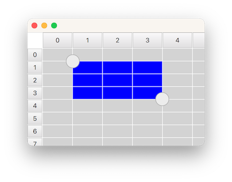
SelectionRectangle is used for selecting table cells in a TableView. It lets the user start a selection by doing a pointer drag inside the viewport, or by doing a long press on top of a cell.
For a SelectionRectangle to be able to select cells, TableView must have an ItemSelectionModel assigned. The ItemSelectionModel will store any selections done on the model, and can be used for querying which cells that the user has selected.
The following example shows how you can make a SelectionRectangle target a TableView:
    TableView {
        id: tableView
        anchors.fill: parent
        clip: true
        acceptedButtons: Qt.NoButton // mouse-drag changes selection

        model: TableModel {
            TableModelColumn { display: "name" }
            TableModelColumn { display: "age" }
            rows: [ { "name": "Harry", "age": "11" },
                    { "name": "Hedwig", "age": "8" } ]
        }

        selectionModel: ItemSelectionModel {
            model: tableView.model
        }

        delegate: TableViewDelegate { padding: 2 }
    }

    SelectionRectangle {
        target: tableView
    }
Note: A SelectionRectangle itself is not shown as part of a selection. Only the delegates (like topLeftHandle and bottomRightHandle) are used. You should also consider rendering the TableView delegate as selected.
See also TableView, TableView::selectionModel, and ItemSelectionModel.
Property Documentation
active : bool [read-only]
This property is true while the user is performing a selection. The selection will be active from the time the the user starts to select, and until the selection is removed again, for example from tapping inside the viewport.
bottomRightHandle : Component
This property holds the delegate that will be shown on the center of the top-left corner of the selection rectangle. When a handle is provided, the user can drag it to adjust the selection.
The handle is not hidden by default when a selection is removed. Instead, this is the responsibility of the delegate, to open up for custom fade-out animations. The easiest way to ensure that the handle ends up hidden, is to simply bind visible to the active state of the SelectionRectangle:
SelectionRectangle {
    bottomRightHandle: Rectangle {
        width: 20
        height: 20
        visible: SelectionRectangle.control.active
    }
}
Set this property to null if you don't want a selection handle on the bottom-right.
See also topLeftHandle.
dragging : bool [read-only]
This property is true whenever the user is doing a pointer drag or a handle drag to adjust the selection rectangle.
selectionMode : enumeration
This property holds when a selection should start.
| Constant | Description |
|---|---|
SelectionRectangle.Drag | A selection will start by doing a pointer drag inside the viewport |
SelectionRectangle.PressAndHold | A selection will start by doing a press and hold on top of a cell |
SelectionRectangle.Auto | SelectionRectangle will choose which mode to use based on the target and the input device in use. This normally means Drag when using a mouse, and PressAndHold on a touchscreen. However, Drag will only be used if it doesn't conflict with flicking. One way to avoid conflict is to disable mouse-drag flicking by setting acceptedButtons to Qt.NoButton. In that case, the mouse wheel or touchpad scrolling gesture continues to work, touchscreen flicking continues to work, and touchscreen selection can be started by press-and-hold. Another way is to set interactive to false, which disables flicking and scrolling altogether (perhaps this should be done only temporarily, in some mode in your UI). Yet another way is to place the TableView inside a ScrollView (where flicking, by default, is off for mouse events). |
The default value is Auto.
target : Item
This property holds the TableView on which the SelectionRectangle should act.
topLeftHandle : Component
This property holds the delegate that will be shown on the center of the top-left corner of the selection rectangle. When a handle is provided, the user can drag it to adjust the selection.
The handle is not hidden by default when a selection is removed. Instead, this is the responsibility of the delegate, to open up for custom fade-out animations. The easiest way to ensure that the handle ends up hidden, is to simply bind visible to the active state of the SelectionRectangle:
SelectionRectangle {
    topLeftHandle: Rectangle {
        width: 20
        height: 20
        visible: SelectionRectangle.control.active
    }
}
Set this property to null if you don't want a selection handle on the top-left.
See also bottomRightHandle.
Attached Property Documentation
SelectionRectangle.control : SelectionRectangle
This attached property holds the SelectionRectangle that manages the delegate instance. It is attached to each handle instance.
SelectionRectangle.dragging : bool
This attached property will be true if the user is dragging on the handle. It is attached to each handle instance.
© 2026 The Qt Company Ltd. Documentation contributions included herein are the copyrights of their respective owners. The documentation provided herein is licensed under the terms of the GNU Free Documentation License version 1.3 as published by the Free Software Foundation. Qt and respective logos are trademarks of The Qt Company Ltd. in Finland and/or other countries worldwide. All other trademarks are property of their respective owners.
