
简单的散点图
在 QML 应用程序中使用Scatter3D 。
“简单散点图”演示了如何使用Scatter3D 和QML制作简单的散点图可视化效果。
有关如何与图表交互的说明,请参阅此页面。
有关如何创建自己的新Qt Quick 应用程序的说明,请参阅Qt Creator 帮助文档。
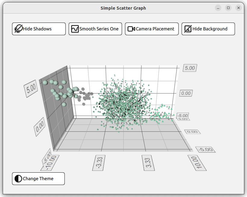
运行示例
您可以通过以下方式运行示例:
- Qt Creator
打开Welcome 模式,并从Examples 中选择该示例。如需更多信息,请参阅Qt Creator :教程:构建与运行。
- Qt Extension for Visual Studio Code
在Command Palette 中执行Qt: Open Qt examples 命令,并从列表中选择该示例。有关更多信息,请参阅Qt Extension for Visual Studio Code :教程:构建和运行。
设置布局
在深入研究 QML 代码之前,main.cpp 会先配置应用程序。它会从资源(qrc: )中读取main.qml 文件
viewer.setSource(QUrl("qrc:/qml/scatter/main.qml"));该main.qml 文件是应用程序 QML 代码的起点。首先,导入所有必需的 QML 模块:
import QtQuick
import QtQuick.Controls
import QtQuick.Layouts
import QtGraphs然后,创建一个Data 项,该项将用于存储图表的数据。
Data {
    id: seriesData
}接下来,创建两个GraphsTheme 项,分别定义图表的两种不同主题:Qt Green主题和Qt Neon Green主题。
GraphsTheme {
    id: themeQt
    theme: GraphsTheme.Theme.QtGreen
    labelFont.pointSize: 40
}

GraphsTheme {
    id: themeQtNeonGreen
    theme: GraphsTheme.Theme.QtGreenNeon
    colorScheme: GraphsTheme.ColorScheme.Dark
}该应用程序的布局将由五个不同的按钮组成,用于打开或关闭图表的不同视觉选项,当然还包括图表本身。组织这些元素的方法有很多,其中一种方式是让一个GridLayout 包含四个按钮、Graph 以及第五个按钮,所有这些都显示在一个ColumnLayout 中。
ColumnLayout {
    id: mainLayout
    anchors.fill: parent
    anchors.margins: margin
spacing: spacing该GridLayout 具有响应式布局。这意味着所使用的列数取决于应用程序窗口的宽度。这是通过将columns 属性赋值为三元运算式来实现的,该运算式会根据窗口宽度解析为1、2或4。
GridLayout {
    Layout.fillWidth: true
    rowSpacing: spacing
    columnSpacing: spacing

    columns: mainView.width < mainView.buttonMinWidth * 2 + mainView.spacing + mainView.margin * 2 // width of 2 buttons
             ? 1
             : (mainView.width < mainView.buttonMinWidth * 4 + mainView.spacing * 3 + mainView.margin * 2 // width of 4 buttons
                ? 2
: 4)在此GridLayout 中,实例化了四个RoundButton。一个用于切换阴影效果,一个用于网格平滑处理,一个用于调整摄像机位置,最后一个用于更改图表背景。所有按钮都遵循相同的结构。与其为所有按钮重新定义该结构,不如创建一个自定义组件。
component CustomButton : RoundButton {
    id: buttonRoot
CustomButtom 该组件继承自RoundButton 类型,但添加了若干扩展属性。设置了Layout.minimumWidth 、Layout.FillWidth 、radius 和background 等属性,这些属性定义了按钮的样式和布局。
property alias source: iconImage.source

Layout.minimumWidth: buttonMinWidth
Layout.fillWidth: true

radius: mainView.radius

background: Rectangle {
    radius: mainView.radius
    color: "white"
    border.color: "black"
}而contentItem 则定义了按钮的内容,在本例中,它是一个Row 类型,其中包含一个图标和一些文本。 图标通过Image 类型导入,并通过设置source 属性来呈现。文本则使用Label 类型创建,并通过其text 属性进行设置。在自定义组件的顶部为这两个属性创建了两个别名,这使得在创建CustomButton 实例时能够设置它们。
contentItem: Row {
    id: content
    Image {
        id: iconImage
    }
    Label {
        text: buttonRoot.text
        horizontalAlignment: Text.AlignLeft
        anchors.verticalCenter: parent.verticalCenter
    }
}在GridLayout 中,创建了四个CustomButton。需要设置三个属性:图标图像和文本的两个别名,以及信号onClicked 。
CustomButton {
    id: shadowButton
    text: graph.shadowQuality === Graphs3D.ShadowQuality.None ?
              qsTr("Show Shadows") : qsTr("Hide Shadows")
    source: graph.shadowQuality === Graphs3D.ShadowQuality.None ?
                "qrc:/images/shadow.svg" : "qrc:/images/shadow_hide.svg"
    onClicked: {
        graph.shadowQuality = graph.shadowQuality === Graphs3D.ShadowQuality.None ?
                    Graphs3D.ShadowQuality.High :
                    Graphs3D.ShadowQuality.None
    }
}例如,阴影按钮将onClicked 的标记设置为“toggle”,以切换阴影的开启与关闭。
设置图形
布局中的下一个元素是Graph ,它在独立的QML文件Graph.qml 中定义,并按以下方式实例化:
Graph {
    id: graph
    Layout.fillWidth: true
    Layout.fillHeight: true
}查看Graph.qml 中的实现,该图表类型为Scatter3D ,嵌套在Item 类型中。
Scatter3D {
    id: scatterGraph
在定义数据集之前,需先配置部分坐标轴属性。
axisX.segmentCount: 3
axisX.subSegmentCount: 2
axisX.labelFormat: "%.2f"
axisZ.segmentCount: 2
axisZ.subSegmentCount: 2
axisZ.labelFormat: "%.2f"
axisY.segmentCount: 2
axisY.subSegmentCount: 2
axisY.labelFormat: "%.2f"
设置数据
该图表展示了三个数据集,对应Data.qml 中给出的数据。这些数据集存储在ListModel 类型中
ListModel {
    id: dataModel
    ListElement{ xPos: -10.0; yPos: 5.0; zPos: -5.0 }
    ...
    ListElement{ xPos: -7.54 ; yPos: 2.8 ; zPos: -3.68 }
}

ListModel {
    id: dataModelTwo
    ListElement{ xPos: 2.25 ; yPos: 1.36 ; zPos: -1.3 }
    ...
    ListElement{ xPos: -3.4 ; yPos: 0.6 ; zPos: 0.9 }
}

ListModel {
    id: dataModelThree
    ListElement{ xPos: 8.0; yPos: -2.0; zPos: 4.0 }
    ...
    ListElement{ xPos: 5.66 ; yPos: -4.98 ; zPos: 3.72 }
},并通过property alias向其他文件公开
property alias model: dataModel
property alias modelTwo: dataModelTwo
property alias modelThree: dataModelThree在使用这些别名之前,请创建一个Scatter3DSeries 类型,其中包含一个ItemModelScatterDataProxy 项。
Scatter3DSeries {
    id: scatterSeries
    itemLabelFormat: "Series 1: X:@xLabel Y:@yLabel Z:@zLabel"

    ItemModelScatterDataProxy {
        itemModel: seriesData.model
        xPosRole: "xPos"
        yPosRole: "yPos"
        zPosRole: "zPos"
    }
}该数据代理通过其itemModel 属性引用Data.qml 中的数据集。可通过在main.qml 、seriesData 中实例化的Data 类型的id 访问上述别名。
itemModel: seriesData.model对剩下的两个数据集重复此操作。
Scatter3DSeries {
    id: scatterSeriesTwo
    ...
ItemModelScatterDataProxy {
    itemModel: seriesData.modelTwo
    ...
    }
}
Scatter3DSeries {
    id: scatterSeriesThree
    ...
ItemModelScatterDataProxy {
    itemModel: seriesData.modelThree
    ...
    }
}
太好了,散点图现在已指向这三个数据集。
唯一剩下的工作是将剩余的按钮——theme button ——添加到我们的ColumnLayout 中。该按钮的唯一区别在于它位于布局的左侧。这是通过将Layout.alignment 属性设置为Qt.AlignLeft ,并将Layout.fillWidth 设置为false 来实现的。
CustomButton {
    id: themeButton
    Layout.alignment: Qt.AlignLeft
    Layout.fillWidth: false
示例内容
© 2026 The Qt Company Ltd. Documentation contributions included herein are the copyrights of their respective owners. The documentation provided herein is licensed under the terms of the GNU Free Documentation License version 1.3 as published by the Free Software Foundation. Qt and respective logos are trademarks of The Qt Company Ltd. in Finland and/or other countries worldwide. All other trademarks are property of their respective owners.
