
复选框样式设置:分步指南
本页将追踪复选框从接收绘制事件到样式绘制完成的整个过程。它展示了控件如何构建其样式选项,QCommonStyle 如何将元素分解为各个部分,以及QProxyStyle 如何替换其中一个部分。 大多数控件都遵循相同的结构,因此相同的阅读策略同样适用于它们:找出控件构建的样式选项,找出它绘制的元素,并阅读这些元素的QCommonStyle 实现。
该控件构建了一个样式选项
QCheckBox 使用 `QStyleOptionButton`。其 `initStyleOption() ` 函数会按如下方式(略作简化)填充该选项:
    opt.initFrom(q);
    if (down)
        opt.state |= QStyle::State_Sunken;
    if (tristate && noChange)
        opt.state |= QStyle::State_NoChange;
    else
        opt.state |= checked ? QStyle::State_On : QStyle::State_Off;
    if (q->testAttribute(Qt::WA_Hover) && q->underMouse()) {
        if (hovering)
            opt.state |= QStyle::State_MouseOver;
        else
            opt.state &= ~QStyle::State_MouseOver;
    }
    opt.text = text;
    opt.icon = icon;
opt.iconSize = q->iconSize();QStyleOption::initFrom() 设置所有小部件共有的信息。其实现大致如下:
    state = QStyle::State_None;
    if (widget->isEnabled())
        state |= QStyle::State_Enabled;
    if (widget->hasFocus())
        state |= QStyle::State_HasFocus;
    if (widget->window()->testAttribute(Qt::WA_KeyboardFocusChange))
        state |= QStyle::State_KeyboardFocusChange;
    if (widget->underMouse())
        state |= QStyle::State_MouseOver;
    if (widget->window()->isActiveWindow())
        state |= QStyle::State_Active;

    direction = widget->layoutDirection();
    rect = widget->rect();
    palette = widget->palette();
    fontMetrics = widget->fontMetrics();
State_Enabled 当控件启用时设置 `is`,获得焦点时设置 `State_HasFocus `,用户上次通过键盘切换焦点时设置 `State_KeyboardFocusChange `,控件所在窗口为活动窗口时设置 `State_Active `。当鼠标光标悬停在控件上时,会设置 `State_MouseOver `。除了状态外,initFrom() 还会在选项中存储布局方向、控件的矩形、配色方案及其字体度量值。
QCheckBox 随后添加其自身的状态。当用户点击该复选框时(无论是否已选中),都会设置State_Sunken 。对于部分选中的三态复选框,会设置State_NoChange ;否则,State_On 或State_Off 将反映选中状态。该选项还包含文本、图标及其大小。QCheckBox 仅在小部件具有WA_Hover 属性时才保存State_MouseOver ,该属性通常由样式通过polish()设置。
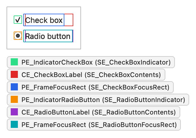
假设用户在以下屏幕截图中,当复选框处于焦点状态时,用鼠标点击了已选中的复选框。该屏幕截图还显示了一个单选按钮,其结构与PE_IndicatorRadioButton 和CE_RadioButtonLabel 相同:
此时,其选项具有以下状态标志:
| 状态标志 | 已设置 |
|---|---|
State_Sunken | 是 |
State_NoChange | 否 |
State_On | 是 |
State_Off | 否 |
State_MouseOver | 是 |
State_Enabled | 是 |
State_HasFocus | 是 |
State_KeyboardFocusChange | 否 |
State_Active | 是 |
该控件要求样式通过
QCheckBox 在paintEvent()中通过QStylePainter 绘制自身,该函数封装了QStyle 的绘制函数:
    QStylePainter p;
    QStyleOptionButton opt;
    initStyleOption(&opt);
    p.drawControl(QStyle::CE_CheckBox, opt);
这就是该小部件所做的全部。其余所有操作都在样式中完成。
QCommonStyle将元素拆分为若干部分
QCommonStyle 通过请求其两个子元素(SE_CheckBoxIndicator 和SE_CheckBoxContents )的矩形区域来处理 `CE_CheckBox ` 方法,并在每个区域内绘制一个元素。如果复选框处于焦点状态,它还会绘制焦点框:
    QStyleOptionButton subopt = *btn;
    subopt.rect = subElementRect(QStyle::SE_CheckBoxIndicator, btn, widget);
    proxy()->drawPrimitive(QStyle::PE_IndicatorCheckBox, &subopt, p, widget);
    subopt.rect = subElementRect(QStyle::SE_CheckBoxContents, btn, widget);
    proxy()->drawControl(QStyle::CE_CheckBoxLabel, &subopt, p, widget);
    if (btn->state & State_HasFocus) {
        QStyleOptionFocusRect fropt;
        fropt.QStyleOption::operator=(*btn);
        fropt.rect = subElementRect(QStyle::SE_CheckBoxFocusRect, btn, widget);
        proxy()->drawPrimitive(QStyle::PE_FrameFocusRect, &fropt, p, widget);
    }
请注意对 `proxy() ` 的调用。样式总是通过 `proxy()` 绘制其子元素,以便包裹在其中的 `QProxyStyle ` 有机会覆盖这些绘制操作。
CE_CheckBoxLabel QCommonStyle 中还实现了:
    const QStyleOptionButton *btn = qstyleoption_cast<const QStyleOptionButton *>(opt);
    uint alignment = visualAlignment(btn->direction, Qt::AlignLeft | Qt::AlignVCenter);
    if (!proxy()->styleHint(SH_UnderlineShortcut, btn, widget))
        alignment |= Qt::TextHideMnemonic;
    QPixmap pix;
    QRect textRect = btn->rect;
    if (!btn->icon.isNull()) {
        const auto dpr = p->device()->devicePixelRatio();
        pix = btn->icon.pixmap(btn->iconSize, dpr,
                                btn->state & State_Enabled ? QIcon::Normal : QIcon::Disabled);
        proxy()->drawItemPixmap(p, btn->rect, alignment, pix);
        if (btn->direction == Qt::RightToLeft)
            textRect.setRight(textRect.right() - btn->iconSize.width() - 4);
        else
            textRect.setLeft(textRect.left() + btn->iconSize.width() + 4);
    }
    if (!btn->text.isEmpty()){
        proxy()->drawItemText(p, textRect, alignment | Qt::TextShowMnemonic,
            btn->palette, btn->state & State_Enabled, btn->text, QPalette::WindowText);
}visualAlignment() 根据布局方向调整对齐方式。该样式会绘制图标(若存在),并相应地缩小剩余的文本矩形。drawItemText() 会综合考虑对齐方式、布局方向和助记符来绘制文本,并使用调色板选择文本颜色。绘制标签涉及许多细节,而基类已对此处理得当,因此自定义样式很少需要重新实现该方法。
代理样式替换指示器
指示器(PE_IndicatorCheckBox )是样式之间存在差异的地方,因此需要替换的部分正是它。以下QProxyStyle 的子类会根据选项中的调色板颜色绘制一个圆角指示器,并将其他所有元素转发给基类样式:
class CheckBoxStyle : public QProxyStyle
{
public:
    using QProxyStyle::QProxyStyle;

    void drawPrimitive(PrimitiveElement element, const QStyleOption *option,
                       QPainter *painter, const QWidget *widget) const override;
};
void CheckBoxStyle::drawPrimitive(PrimitiveElement element, const QStyleOption *option,
                                  QPainter *painter, const QWidget *widget) const
{
    if (element != PE_IndicatorCheckBox) {
        QProxyStyle::drawPrimitive(element, option, painter, widget);
        return;
    }

    const bool enabled = option->state & State_Enabled;
    const QPalette::ColorGroup group = !enabled ? QPalette::Disabled
                                     : option->state & State_Active ? QPalette::Active
                                                                    : QPalette::Inactive;
    const QPalette &palette = option->palette;
    const QRect rect = option->rect.adjusted(1, 1, -1, -1);

    painter->save();
    painter->setRenderHint(QPainter::Antialiasing);

    // Frame and background: highlight the frame while the mouse hovers over
    // the indicator, and darken the background while it's pressed.
    QColor frameColor = palette.color(group, QPalette::Mid);
    if (enabled && (option->state & State_MouseOver))
        frameColor = palette.color(group, QPalette::Highlight);
    const QPalette::ColorRole fillRole =
            option->state & State_Sunken ? QPalette::Mid : QPalette::Base;
    painter->setPen(frameColor);
    painter->setBrush(palette.brush(group, fillRole));
    painter->drawRoundedRect(rect, 2, 2);

    // Check mark for State_On, a filled square for the partially checked
    // State_NoChange, nothing for State_Off.
    const QRect inner = rect.adjusted(3, 3, -3, -3);
    if (option->state & State_On) {
        painter->setPen(QPen(palette.color(group, QPalette::Text), 2));
        painter->drawLine(inner.left(), inner.center().y(),
                          inner.center().x(), inner.bottom());
        painter->drawLine(inner.center().x(), inner.bottom(),
                          inner.right(), inner.top());
    } else if (option->state & State_NoChange) {
        painter->fillRect(inner, palette.brush(group, QPalette::Text));
    }

    painter->restore();
}该实现从选项中读取所有信息。它从State_Enabled 和State_Active 中选择颜色组,在State_MouseOver 被设置时高亮显示边框,在State_Sunken 被设置时加深背景色,并在State_On 被设置时绘制复选标记,或在State_NoChange 被设置时绘制实心正方形。由于所有颜色均来自调色板,该指示器遵循应用程序调色板,并在浅色和深色配色方案中均可正常工作。 它还会保存并恢复绘图器,因此基类能以预期的状态找到该绘图器。
无论样式在何处绘制PE_IndicatorCheckBox ,都会显示相同的指示器:在复选框中、在可选中组框中,以及在将其用作勾号的项目视图中。这种复用正是基本元素存在的理由。
要使用该样式,请在应用程序创建控件之前将其安装:
int main(int argc, char *argv[])
{
    QApplication::setStyle(new CheckBoxStyle);
    QApplication app(argc, argv);
    QCheckBox box("Send me updates");
    box.show();
    return app.exec();
}
将同样的分析方法应用于其他控件
要了解小部件的绘制方式,无需阅读全部代码。通常只需知道该小部件绘制哪些样式元素、设置哪些状态,以及其样式选项包含什么内容即可。 控件会构建一个选项,并调用样式一次或多次;样式则会绘制控件所请求的元素。《控件样式参考》针对每个控件都详细列出了这些内容。
另请参阅 《样式如何绘制小部件》、《小部件样式参考》、QProxyStyle 以及QStyleOptionButton 。
© 2026 The Qt Company Ltd. Documentation contributions included herein are the copyrights of their respective owners. The documentation provided herein is licensed under the terms of the GNU Free Documentation License version 1.3 as published by the Free Software Foundation. Qt and respective logos are trademarks of The Qt Company Ltd. in Finland and/or other countries worldwide. All other trademarks are property of their respective owners.
