ListView QML Type
Provides a list view of items provided by a model. More...
| Import Statement: | import QtQuick |
| Inherits: |
Properties
- add : Transition
- addDisplaced : Transition
- cacheBuffer : int
- count : int
- currentIndex : int
- currentItem : Item
- currentSection : string
- delegate : Component
- delegateModelAccess : enumeration
(since 6.10) - displaced : Transition
- displayMarginBeginning : int
(since QtQuick 2.3) - displayMarginEnd : int
(since QtQuick 2.3) - effectiveLayoutDirection : enumeration
- footer : Component
- footerItem : Item
- footerPositioning : enumeration
(since Qt 5.4) - header : Component
- headerItem : Item
- headerPositioning : enumeration
(since Qt 5.4) - highlight : Component
- highlightFollowsCurrentItem : bool
- highlightItem : Item
- highlightMoveDuration : int
- highlightMoveVelocity : real
- highlightRangeMode : enumeration
- highlightResizeDuration : int
- highlightResizeVelocity : real
- keyNavigationEnabled : bool
- keyNavigationWraps : bool
- layoutDirection : enumeration
- model : model
- move : Transition
- moveDisplaced : Transition
- orientation : enumeration
- populate : Transition
- preferredHighlightBegin : real
- preferredHighlightEnd : real
- remove : Transition
- removeDisplaced : Transition
- reuseItems : bool
- section
- section.criteria : enumeration
- section.delegate : Component
- section.labelPositioning : enumeration
- section.property : string
- snapMode : enumeration
- spacing : real
- verticalLayoutDirection : enumeration
Attached Properties
- delayRemove : bool
- isCurrentItem : bool
- nextSection : string
- previousSection : string
- section : string
- view : ListView
Attached Signals
Methods
- void decrementCurrentIndex()
- void forceLayout()
- void incrementCurrentIndex()
- int indexAt(real x, real y)
- Item itemAt(real x, real y)
- Item itemAtIndex(int index)
- void positionViewAtBeginning()
- void positionViewAtEnd()
- void positionViewAtIndex(int index, PositionMode mode)
Detailed Description
A ListView displays data from models created from built-in QML types like ListModel and XmlListModel, or custom model classes defined in C++ that inherit from QAbstractItemModel or QAbstractListModel.
A ListView has a model, which defines the data to be displayed, and a delegate, which defines how the data should be displayed. Items in a ListView are laid out horizontally or vertically. List views are inherently flickable because ListView inherits from Flickable.
Note: ListView will only load as many delegate items as needed to fill up the view. Items outside of the view will not be loaded unless a sufficient cacheBuffer has been set. Hence, a ListView with zero width or height might not load any delegate items at all.
Example Usage
The following example shows the definition of a simple list model defined in a file called ContactModel.qml:
import QtQuick

ListModel {
    ListElement {
        name: "Bill Smith"
        number: "555 3264"
    }
    ListElement {
        name: "John Brown"
        number: "555 8426"
    }
    ListElement {
        name: "Sam Wise"
        number: "555 0473"
    }
}
Another component can display this model data in a ListView, like this:
import QtQuick

ListView {
    width: 180; height: 200

    model: ContactModel {}
    delegate: Text {
        required property string name
        required property string number
        text: name + ": " + number
    }
}
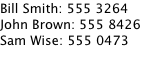
Here, the ListView creates a ContactModel component for its model, and a Text item for its delegate. The view will create a new Text component for each item in the model. Notice the delegate is able to access the model's name and number data directly.
An improved list view is shown below. The delegate is visually improved and is moved into a separate contactDelegate component.
Rectangle {
    width: 180; height: 200

    Component {
        id: contactDelegate
        Item {
            id: myItem
            required property string name
            required property string number
            width: 180; height: 40
            Column {
                Text { text: '<b>Name:</b> ' + myItem.name }
                Text { text: '<b>Number:</b> ' + myItem.number }
            }
        }
    }

    ListView {
        anchors.fill: parent
        model: ContactModel {}
        delegate: contactDelegate
        highlight: Rectangle { color: "lightsteelblue"; radius: 5 }
        focus: true
    }
}
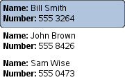
The currently selected item is highlighted with a blue Rectangle using the highlight property, and focus is set to true to enable keyboard navigation for the list view. The list view itself is a focus scope (see Keyboard Focus in Qt Quick for more details).
Delegates are instantiated as needed and may be destroyed at any time. As such, state should never be stored in a delegate. Delegates are usually parented to ListView's contentItem, but typically depending on whether it's visible in the view or not, the parent can change, and sometimes be null. Because of that, binding to the parent's properties from within the delegate is not recommended. If you want the delegate to fill out the width of the ListView, consider using one of the following approaches instead:
ListView {
    id: listView
    // ...

    delegate: Item {
        // Incorrect.
        width: parent.width

        // Correct.
        width: listView.width
        width: ListView.view.width
        // ...
    }
}
ListView attaches a number of properties to the root item of the delegate, for example ListView.isCurrentItem. In the following example, the root delegate item can access this attached property directly as ListView.isCurrentItem, while the child contactInfo object must refer to this property as wrapper.ListView.isCurrentItem.
ListView {
    width: 180; height: 200

    Component {
        id: contactsDelegate
        Rectangle {
            id: wrapper
            width: 180
            height: contactInfo.height
            color: ListView.isCurrentItem ? "black" : "red"
            Text {
                id: contactInfo
                text: name + ": " + number
                color: wrapper.ListView.isCurrentItem ? "red" : "black"
            }
        }
    }

    model: ContactModel {}
    delegate: contactsDelegate
    focus: true
}
Note: Views do not enable clip automatically. If the view is not clipped by another item or the screen, it will be necessary to set clip: true in order to have the out of view items clipped nicely.
ListView Layouts
The layout of the items in a ListView can be controlled by these properties:
- orientation - controls whether items flow horizontally or vertically. This value can be either Qt.Horizontal or Qt.Vertical.
- layoutDirection - controls the horizontal layout direction for a horizontally-oriented view: that is, whether items are laid out from the left side of the view to the right, or vice-versa. This value can be either Qt.LeftToRight or Qt.RightToLeft.
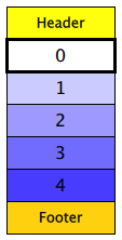
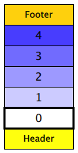
- verticalLayoutDirection - controls the vertical layout direction for a vertically-oriented view: that is, whether items are laid out from the top of the view down towards the bottom of the view, or vice-versa. This value can be either ListView.TopToBottom or ListView.BottomToTop.
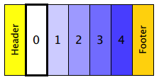
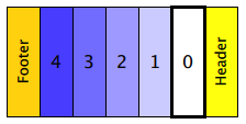
By default, a ListView has a vertical orientation, and items are laid out from top to bottom. The table below shows the different layouts that a ListView can have, depending on the values of the properties listed above.
| ListViews with Qt.Vertical orientation | |
|---|---|
| Top to bottom
| Bottom to top
|
| ListViews with Qt.Horizontal orientation | |
| Left to right
| Right to left
|
Flickable Direction
By default, a vertical ListView sets flickableDirection to Flickable.Vertical, and a horizontal ListView sets it to Flickable.Horizontal. Furthermore, a vertical ListView only calculates (estimates) the contentHeight, and a horizontal ListView only calculates the contentWidth. The other dimension is set to -1.
Since Qt 5.9 (Qt Quick 2.9), it is possible to make a ListView that can be flicked to both directions. In order to do this, the flickableDirection can be set to Flickable.AutoFlickDirection or Flickable.AutoFlickIfNeeded, and the desired contentWidth or contentHeight must be provided.
ListView {
    width: 180; height: 200

    contentWidth: 320
    flickableDirection: Flickable.AutoFlickDirection

    model: ContactModel {}
    delegate: Row {
        Text { text: '<b>Name:</b> ' + name; width: 160 }
        Text { text: '<b>Number:</b> ' + number; width: 160 }
    }
}
Stacking Order in ListView
The Z value of items determines whether they are rendered above or below other items. ListView uses several different default Z values, depending on what type of item is being created:
| Property | Default Z value |
|---|---|
| delegate | 1 |
| footer | 1 |
| header | 1 |
| highlight | 0 |
| section.delegate | 2 |
These default values are set if the Z value of the item is 0, so setting the Z value of these items to 0 has no effect. Note that the Z value is of type real, so it is possible to set fractional values like 0.1.
Reusing Items
Since 5.15, ListView can be configured to recycle items instead of instantiating from the delegate whenever new rows are flicked into view. This approach improves performance, depending on the complexity of the delegate. Reusing items is off by default (for backwards compatibility reasons), but can be switched on by setting the reuseItems property to true.
When an item is flicked out, it moves to the reuse pool, which is an internal cache of unused items. When this happens, the ListView::pooled signal is emitted to inform the item about it. Likewise, when the item is moved back from the pool, the ListView::reused signal is emitted.
Any item properties that come from the model are updated when the item is reused. This includes index and row, but also any model roles.
Note: Avoid storing any state inside a delegate. If you do, reset it manually on receiving the ListView::reused signal.
If an item has timers or animations, consider pausing them on receiving the ListView::pooled signal. That way you avoid using the CPU resources for items that are not visible. Likewise, if an item has resources that cannot be reused, they could be freed up.
Note: While an item is in the pool, it might still be alive and respond to connected signals and bindings.
Note: For an item to be pooled, it needs to be completely flicked out of the bounds of the view, including the extra margins set with cacheBuffer. Some items will also never be pooled or reused, such as currentItem.
The following example shows a delegate that animates a spinning rectangle. When it is pooled, the animation is temporarily paused:
Component {
    id: listViewDelegate
    Rectangle {
        width: 100
        height: 50

        ListView.onPooled: rotationAnimation.pause()
        ListView.onReused: rotationAnimation.resume()

        Rectangle {
            id: rect
            anchors.centerIn: parent
            width: 40
            height: 5
            color: "green"

            RotationAnimation {
                id: rotationAnimation
                target: rect
                duration: (Math.random() * 2000) + 200
                from: 0
                to: 359
                running: true
                loops: Animation.Infinite
            }
        }
    }
}
Variable Delegate Size and Section Labels
Variable delegate sizes might lead to resizing and skipping of any attached ScrollBar. This is because ListView estimates its content size from allocated items (usually only the visible items, the rest are assumed to be of similar size), and variable delegate sizes prevent an accurate estimation. To reduce this effect, cacheBuffer can be set to higher values, effectively creating more items and improving the size estimate of unallocated items, at the expense of additional memory usage. Sections have the same effect because they attach and elongate the section label to the first item within the section.
Avoid Storing State in Delegates
ListView's delegates are instantiated as needed and may be destroyed when out of view. For an illustration of this, run the following example:
ListView {
    anchors.fill: parent
    model: 3
    delegate: CheckDelegate {
        text: qsTr("Channel %1").arg(index + 1)

        required property int index
        property bool channelActivated

        onClicked: channelActivated = checked
    }
}
When an item is clicked, channelActivated is set to true. However, because delegates can be reused and destroyed, all state is lost when the view is moved far enough. When the delegate becomes visible again, it will have its default, unmodified state (or, in the case of an item that was reused, old state from a previous item).
To avoid this, state should be stored in the model:
ListView {
    anchors.fill: parent
    model: ListModel {
        ListElement {
            channelActivated: true
        }
        // ...
    }
    delegate: CheckDelegate {
        text: qsTr("Channel %1").arg(index + 1)
        checked: model.channelActivated

        required property int index
        required property var model

        onClicked: model.channelActivated = checked
    }
}
Hiding Delegates
Setting a delegate's visible property to false will hide that item, but the space it occupied in the view will remain. It is possible to set the item's height to 0 (for a vertical ListView):
ListView {
    anchors.fill: parent
    model: ListModel {
        ListElement { hidden: false }
        ListElement { hidden: false }
        ListElement { hidden: false }
        // ...
    }
    delegate: ItemDelegate {
        text: qsTr("Item %1").arg(index)
        visible: !model.hidden
        height: visible ? implicitHeight : 0

        required property int index
        required property var model

        onClicked: model.hidden = true
    }
}
Note that the hidden state is stored in the model, following the advice of the Avoid Storing State in Delegates section.
However, if spacing is non-zero, there will be uneven gaps between delegates.
A better option is to filter your model so that items that should not be visible are not loaded by the view at all. This can be achieved with QSortFilterProxyModel.
Another option is to disable the delegate instead of hiding it.
See also QML Data Models, GridView, PathView, and Qt Quick Examples - Views.
Property Documentation
add : Transition
This property holds the transition to apply to items that are added to the view.
For example, here is a view that specifies such a transition:
ListView {
    ...
    add: Transition {
        NumberAnimation { properties: "x,y"; from: 100; duration: 1000 }
    }
}
Whenever an item is added to the above view, the item will be animated from the position (100,100) to its final x,y position within the view, over one second. The transition only applies to the new items that are added to the view; it does not apply to the items below that are displaced by the addition of the new items. To animate the displaced items, set the displaced or addDisplaced properties.
For more details and examples on how to use view transitions, see the ViewTransition documentation.
Note: This transition is not applied to the items that are created when the view is initially populated, or when the view's model changes. (In those cases, the populate transition is applied instead.) Additionally, this transition should not animate the height of the new item; doing so will cause any items beneath the new item to be laid out at the wrong position. Instead, the height can be animated within the onAdd handler in the delegate.
See also addDisplaced, populate, and ViewTransition.
addDisplaced : Transition
This property holds the transition to apply to items within the view that are displaced by the addition of other items to the view.
For example, here is a view that specifies such a transition:
ListView {
    ...
    addDisplaced: Transition {
        NumberAnimation { properties: "x,y"; duration: 1000 }
    }
}
Whenever an item is added to the above view, all items beneath the new item are displaced, causing them to move down (or sideways, if horizontally orientated) within the view. As this displacement occurs, the items' movement to their new x,y positions within the view will be animated by a NumberAnimation over one second, as specified. This transition is not applied to the new item that has been added to the view; to animate the added items, set the add property.
If an item is displaced by multiple types of operations at the same time, it is not defined as to whether the addDisplaced, moveDisplaced or removeDisplaced transition will be applied. Additionally, if it is not necessary to specify different transitions depending on whether an item is displaced by an add, move or remove operation, consider setting the displaced property instead.
For more details and examples on how to use view transitions, see the ViewTransition documentation.
Note: This transition is not applied to the items that are created when the view is initially populated, or when the view's model changes. In those cases, the populate transition is applied instead.
See also displaced, add, populate, and ViewTransition.
cacheBuffer : int
This property determines whether delegates are retained outside the visible area of the view.
If this value is greater than zero, the view may keep as many delegates instantiated as it can fit within the buffer specified. For example, if in a vertical view the delegate is 20 pixels high and cacheBuffer is set to 40, then up to 2 delegates above and 2 delegates below the visible area may be created/retained. The buffered delegates are created asynchronously, allowing creation to occur across multiple frames and reducing the likelihood of skipping frames. In order to improve painting performance delegates outside the visible area are not painted.
The default value of this property is platform dependent, but will usually be a value greater than zero. Negative values are ignored.
Note that cacheBuffer is not a pixel buffer - it only maintains additional instantiated delegates.
Note: Setting this property is not a replacement for creating efficient delegates. It can improve the smoothness of scrolling behavior at the expense of additional memory usage. The fewer objects and bindings in a delegate, the faster a view can be scrolled. It is important to realize that setting a cacheBuffer will only postpone issues caused by slow-loading delegates, it is not a solution for this scenario.
The cacheBuffer operates outside of any display margins specified by displayMarginBeginning or displayMarginEnd.
count : int [read-only]
The property reflects the number of items in the ListView's model, regardless of whether they are visible or instantiated as Item of a delegate component.
The currentIndex property holds the index of the current item, and currentItem holds the current item. Setting the currentIndex to -1 will clear the highlight and set currentItem to null.
If highlightFollowsCurrentItem is true, setting either of these properties will smoothly scroll the ListView so that the current item becomes visible.
Note that the position of the current item may only be approximate until it becomes visible in the view.
As currentItem needs to work with any delegate, its type is Item. Often, a ListView is however used with exactly one type of delegate. In that case, casting currentItem to the delegate's type can help tooling and lead to more efficient code:
component Message : Item {
    required property string sender
    required property string text
}
ListView {
    id: messageView
    delegate: Message {}
    model: messageModel
}
Button {
    text: "Reply to %1".arg((messageView.currentItem) as Message).sender
}
currentSection : string [read-only]
This property holds the section that is currently at the beginning of the view.
delegate : Component
The delegate provides a template defining each item instantiated by the view. The index is exposed as an accessible index property. Properties of the model are also available depending upon the type of Data Model.
The number of objects and bindings in the delegate has a direct effect on the flicking performance of the view. If at all possible, place functionality that is not needed for the normal display of the delegate in a Loader which can load additional components when needed.
The ListView will lay out the items based on the size of the root item in the delegate.
It is recommended that the delegate's size be a whole number to avoid sub-pixel alignment of items.
The default stacking order of delegate instances is 1.
Note: Delegates are instantiated as needed and may be destroyed at any time. They are parented to ListView's contentItem, not to the view itself. State should never be stored in a delegate.
See also Stacking Order in ListView.
delegateModelAccess : enumeration [since 6.10]
This property determines how delegates can access the model.
| Constant | Description |
|---|---|
DelegateModel.ReadOnly | Prohibit delegates from writing the model via either context properties, the model object, or required properties. |
DelegateModel.ReadWrite | Allow delegates to write the model via either context properties, the model object, or required properties. |
DelegateModel.Qt5ReadWrite | Allow delegates to write the model via the model object and context properties but not via required properties. |
The default is DelegateModel.Qt5ReadWrite.
This property was introduced in Qt 6.10.
See also Models and Views in Qt Quick#Changing Model Data.
displaced : Transition
This property holds the generic transition to apply to items that have been displaced by any model operation that affects the view.
This is a convenience for specifying the generic transition to be applied to any items that are displaced by an add, move or remove operation, without having to specify the individual addDisplaced, moveDisplaced and removeDisplaced properties. For example, here is a view that specifies a displaced transition:
ListView {
    ...
    displaced: Transition {
        NumberAnimation { properties: "x,y"; duration: 1000 }
    }
}
When any item is added, moved or removed within the above view, the items below it are displaced, causing them to move down (or sideways, if horizontally orientated) within the view. As this displacement occurs, the items' movement to their new x,y positions within the view will be animated by a NumberAnimation over one second, as specified.
If a view specifies this generic displaced transition as well as a specific addDisplaced, moveDisplaced or removeDisplaced transition, the more specific transition will be used instead of the generic displaced transition when the relevant operation occurs, providing that the more specific transition has not been disabled (by setting enabled to false). If it has indeed been disabled, the generic displaced transition is applied instead.
For more details and examples on how to use view transitions, see the ViewTransition documentation.
See also addDisplaced, moveDisplaced, removeDisplaced, and ViewTransition.
This property allows delegates to be displayed outside of the view geometry.
If this value is non-zero, the view will create extra delegates before the start of the view, or after the end. The view will create as many delegates as it can fit into the pixel size specified.
For example, if in a vertical view the delegate is 20 pixels high and displayMarginBeginning and displayMarginEnd are both set to 40, then 2 delegates above and 2 delegates below will be created and shown.
The default value is 0.
This property is meant for allowing certain UI configurations, and not as a performance optimization. If you wish to create delegates outside of the view geometry for performance reasons, you probably want to use the cacheBuffer property instead.
These properties were introduced in QtQuick 2.3.
effectiveLayoutDirection : enumeration [read-only]
This property holds the effective layout direction of a horizontally-oriented list.
When using the attached property LayoutMirroring::enabled for locale layouts, the visual layout direction of the horizontal list will be mirrored. However, the property layoutDirection will remain unchanged.
See also ListView::layoutDirection and LayoutMirroring.
footer : Component
This property holds the component to use as the footer.
An instance of the footer component is created for each view. The footer is positioned at the end of the view, after any items. The default stacking order of the footer is 1.
See also header, footerItem, and Stacking Order in ListView.
footerItem : Item [read-only]
This holds the footer item created from the footer component.
An instance of the footer component is created for each view. The footer is positioned at the end of the view, after any items. The default stacking order of the footer is 1.
See also footer, headerItem, and Stacking Order in ListView.
footerPositioning : enumeration [since Qt 5.4]
This property determines the positioning of the footer item.
| Constant | Description |
|---|---|
ListView.InlineFooter | (default) The footer is positioned at the end of the content and moves together with the content like an ordinary item. |
ListView.OverlayFooter | The footer is positioned at the end of the view. |
ListView.PullBackFooter | The footer is positioned at the end of the view. The footer can be pushed away by moving the content backwards, and pulled back by moving the content forwards. Note: This property has no effect on the stacking order of the footer. For example, if the footer should be shown above the delegate items when using Note: If |
This property was introduced in Qt 5.4.
header : Component
This property holds the component to use as the header.
An instance of the header component is created for each view. The header is positioned at the beginning of the view, before any items. The default stacking order of the header is 1.
See also footer, headerItem, and Stacking Order in ListView.
headerItem : Item [read-only]
This holds the header item created from the header component.
An instance of the header component is created for each view. The header is positioned at the beginning of the view, before any items. The default stacking order of the header is 1.
See also header, footerItem, and Stacking Order in ListView.
headerPositioning : enumeration [since Qt 5.4]
This property determines the positioning of the header item.
| Constant | Description |
|---|---|
ListView.InlineHeader | (default) The header is positioned at the beginning of the content and moves together with the content like an ordinary item. |
ListView.OverlayHeader | The header is positioned at the beginning of the view. |
ListView.PullBackHeader | The header is positioned at the beginning of the view. The header can be pushed away by moving the content forwards, and pulled back by moving the content backwards. Note: This property has no effect on the stacking order of the header. For example, if the header should be shown above the delegate items when using Note: If |
This property was introduced in Qt 5.4.
highlight : Component
This property holds the component to use as the highlight.
An instance of the highlight component is created for each list. The geometry of the resulting component instance is managed by the list so as to stay with the current item, unless the highlightFollowsCurrentItem property is false. The default stacking order of the highlight item is 0.
See also highlightItem, highlightFollowsCurrentItem, ListView Highlight Example, and Stacking Order in ListView.
highlightFollowsCurrentItem : bool
This property holds whether the highlight is managed by the view.
If this property is true (the default value), the highlight is moved smoothly to follow the current item. Otherwise, the highlight is not moved by the view, and any movement must be implemented by the highlight.
Here is a highlight with its motion defined by a SpringAnimation item:
Component {
    id: highlight
    Rectangle {
        width: 180; height: 40
        color: "lightsteelblue"; radius: 5
        y: list.currentItem.y
        Behavior on y {
            SpringAnimation {
                spring: 3
                damping: 0.2
            }
        }
    }
}

ListView {
    id: list
    width: 180; height: 200
    model: ContactModel {}
    delegate: Text { text: name }

    highlight: highlight
    highlightFollowsCurrentItem: false
    focus: true
}
Note that the highlight animation also affects the way that the view is scrolled. This is because the view moves to maintain the highlight within the preferred highlight range (or visible viewport).
See also highlight and highlightMoveVelocity.
highlightItem : Item [read-only]
This holds the highlight item created from the highlight component.
The highlightItem is managed by the view unless highlightFollowsCurrentItem is set to false. The default stacking order of the highlight item is 0.
See also highlight, highlightFollowsCurrentItem, and Stacking Order in ListView.
highlightMoveDuration : int
highlightMoveVelocity : real
highlightResizeDuration : int
highlightResizeVelocity : real
These properties control the speed of the move and resize animations for the highlight delegate.
highlightFollowsCurrentItem must be true for these properties to have effect.
The default value for the velocity properties is 400 pixels/second. The default value for the duration properties is -1, i.e. the highlight will take as much time as necessary to move at the set speed.
These properties have the same characteristics as a SmoothedAnimation: if both the velocity and duration are set, the animation will use whichever gives the shorter duration.
The move velocity and duration properties are used to control movement due to index changes; for example, when incrementCurrentIndex() is called. When the user flicks a ListView, the velocity from the flick is used to control the movement instead.
To set only one property, the other can be set to -1. For example, if you only want to animate the duration and not velocity, use the following code:
highlightMoveDuration: 1000
highlightMoveVelocity: -1
See also highlightFollowsCurrentItem.
These properties define the preferred range of the highlight (for the current item) within the view. The preferredHighlightBegin value must be less than the preferredHighlightEnd value.
These properties affect the position of the current item when the list is scrolled. For example, if the currently selected item should stay in the middle of the list when the view is scrolled, set the preferredHighlightBegin and preferredHighlightEnd values to the top and bottom coordinates of where the middle item would be. If the currentItem is changed programmatically, the list will automatically scroll so that the current item is in the middle of the view. Furthermore, the behavior of the current item index will occur whether or not a highlight exists.
Valid values for highlightRangeMode are:
| Constant | Description |
|---|---|
ListView.ApplyRange | the view attempts to maintain the highlight within the range. However, the highlight can move outside of the range at the ends of the list or due to mouse interaction. |
ListView.StrictlyEnforceRange | the highlight never moves outside of the range. The current item changes if a keyboard or mouse action would cause the highlight to move outside of the range. |
ListView.NoHighlightRange | this is the default value. |
keyNavigationEnabled : bool
This property holds whether the key navigation of the list is enabled.
If this is true, the user can navigate the view with a keyboard. It is useful for applications that need to selectively enable or disable mouse and keyboard interaction.
By default, the value of this property is bound to interactive to ensure behavior compatibility for existing applications. When explicitly set, it will cease to be bound to the interactive property.
See also interactive.
keyNavigationWraps : bool
This property holds whether the list wraps key navigation.
If this is true, key navigation that would move the current item selection past the end of the list instead wraps around and moves the selection to the start of the list, and vice-versa.
By default, key navigation is not wrapped.
layoutDirection : enumeration
This property holds the layout direction of a horizontally-oriented list.
Possible values:
| Constant | Description |
|---|---|
Qt.LeftToRight | (default) Items will be laid out from left to right. |
Qt.RightToLeft | Items will be laid out from right to left. |
Setting this property has no effect if the orientation is Qt.Vertical.
See also ListView::effectiveLayoutDirection and ListView::verticalLayoutDirection.
model : model
This property holds the model providing data for the list.
The model provides the set of data that is used to create the items in the view. Models can be created directly in QML using ListModel, ObjectModel, or provided by C++ model classes. If a C++ model class is used, it must be a subclass of QAbstractItemModel or a simple list.
See also Data Models.
move : Transition
This property holds the transition to apply to items in the view that are being moved due to a move operation in the view's model.
For example, here is a view that specifies such a transition:
ListView {
    ...
    move: Transition {
        NumberAnimation { properties: "x,y"; duration: 1000 }
    }
}
Whenever the model performs a move operation to move a particular set of indexes, the respective items in the view will be animated to their new positions in the view over one second. The transition only applies to the items that are the subject of the move operation in the model; it does not apply to items below them that are displaced by the move operation. To animate the displaced items, set the displaced or moveDisplaced properties.
For more details and examples on how to use view transitions, see the ViewTransition documentation.
See also moveDisplaced and ViewTransition.
moveDisplaced : Transition
This property holds the transition to apply to items that are displaced by a move operation in the view's model.
For example, here is a view that specifies such a transition:
ListView {
    ...
    moveDisplaced: Transition {
        NumberAnimation { properties: "x,y"; duration: 1000 }
    }
}
Whenever the model performs a move operation to move a particular set of indexes, the items between the source and destination indexes of the move operation are displaced, causing them to move upwards or downwards (or sideways, if horizontally orientated) within the view. As this displacement occurs, the items' movement to their new x,y positions within the view will be animated by a NumberAnimation over one second, as specified. This transition is not applied to the items that are the actual subjects of the move operation; to animate the moved items, set the move property.
If an item is displaced by multiple types of operations at the same time, it is not defined as to whether the addDisplaced, moveDisplaced or removeDisplaced transition will be applied. Additionally, if it is not necessary to specify different transitions depending on whether an item is displaced by an add, move or remove operation, consider setting the displaced property instead.
For more details and examples on how to use view transitions, see the ViewTransition documentation.
See also displaced, move, and ViewTransition.
orientation : enumeration
This property holds the orientation of the list.
Possible values:
| Constant | Description |
|---|---|
ListView.Horizontal | Items are laid out horizontally  |
ListView.Vertical | (default) Items are laid out vertically |
See also Flickable Direction.
populate : Transition
This property holds the transition to apply to the items that are initially created for a view.
It is applied to all items that are created when:
- The view is first created
- The view's model changes in such a way that the visible delegates are completely replaced
- The view's model is reset, if the model is a QAbstractItemModel subclass
For example, here is a view that specifies such a transition:
ListView {
    ...
    populate: Transition {
        NumberAnimation { properties: "x,y"; duration: 1000 }
    }
}
When the view is initialized, the view will create all the necessary items for the view, then animate them to their correct positions within the view over one second.
However when scrolling the view later, the populate transition does not run, even though delegates are being instantiated as they become visible. When the model changes in a way that new delegates become visible, the add transition is the one that runs. So you should not depend on the populate transition to initialize properties in the delegate, because it does not apply to every delegate. If your animation sets the to value of a property, the property should initially have the to value, and the animation should set the from value in case it is animated:
ListView {
    ...
    delegate: Rectangle {
        opacity: 1 // not necessary because it's the default
    }
    populate: Transition {
        NumberAnimation { property: "opacity"; from: 0; to: 1; duration: 1000 }
    }
}
For more details and examples on how to use view transitions, see the ViewTransition documentation.
See also add and ViewTransition.
remove : Transition
This property holds the transition to apply to items that are removed from the view.
For example, here is a view that specifies such a transition:
ListView {
    ...
    remove: Transition {
        ParallelAnimation {
            NumberAnimation { property: "opacity"; to: 0; duration: 1000 }
            NumberAnimation { properties: "x,y"; to: 100; duration: 1000 }
        }
    }
}
Whenever an item is removed from the above view, the item will be animated to the position (100,100) over one second, and in parallel will also change its opacity to 0. The transition only applies to the items that are removed from the view; it does not apply to the items below them that are displaced by the removal of the items. To animate the displaced items, set the displaced or removeDisplaced properties.
Note that by the time the transition is applied, the item has already been removed from the model; any references to the model data for the removed index will not be valid.
Additionally, if the delayRemove attached property has been set for a delegate item, the remove transition will not be applied until delayRemove becomes false again.
For more details and examples on how to use view transitions, see the ViewTransition documentation.
See also removeDisplaced and ViewTransition.
removeDisplaced : Transition
This property holds the transition to apply to items in the view that are displaced by the removal of other items in the view.
For example, here is a view that specifies such a transition:
ListView {
    ...
    removeDisplaced: Transition {
        NumberAnimation { properties: "x,y"; duration: 1000 }
    }
}
Whenever an item is removed from the above view, all items beneath it are displaced, causing them to move upwards (or sideways, if horizontally orientated) within the view. As this displacement occurs, the items' movement to their new x,y positions within the view will be animated by a NumberAnimation over one second, as specified. This transition is not applied to the item that has actually been removed from the view; to animate the removed items, set the remove property.
If an item is displaced by multiple types of operations at the same time, it is not defined as to whether the addDisplaced, moveDisplaced or removeDisplaced transition will be applied. Additionally, if it is not necessary to specify different transitions depending on whether an item is displaced by an add, move or remove operation, consider setting the displaced property instead.
For more details and examples on how to use view transitions, see the ViewTransition documentation.
See also displaced, remove, and ViewTransition.
reuseItems : bool
This property enables you to reuse items that are instantiated from the delegate. If set to false, any currently pooled items are destroyed.
This property is false by default.
See also Reusing items, pooled(), and reused().
section group
section.criteria : enumeration
section.delegate : Component
section.labelPositioning : enumeration
section.property : string
These properties determine the expression to be evaluated and appearance of the section labels.
section.property holds the name of the property that is the basis of each section.
section.criteria holds the criteria for forming each section based on section.property. This value can be one of:
| Constant | Description |
|---|---|
ViewSection.FullString | (default) sections are created based on the section.property value. |
ViewSection.FirstCharacter | sections are created based on the first character of the section.property value (for example, 'A', 'B', 'C' ... sections for an address book.) |
A case insensitive comparison is used when determining section boundaries.
section.delegate holds the delegate component for each section. The default stacking order of section delegate instances is 2. If you declare a required property named "section" in it, that property will contain the section's title.
section.labelPositioning determines whether the current and/or next section labels stick to the start/end of the view, and whether the labels are shown inline. This value can be a combination of:
| Constant | Description |
|---|---|
ViewSection.InlineLabels | (default) section labels are shown inline between the item delegates separating sections. |
ViewSection.CurrentLabelAtStart | the current section label sticks to the start of the view as it is moved. |
ViewSection.NextLabelAtEnd | the next section label (beyond all visible sections) sticks to the end of the view as it is moved. Note: Enabling |
Each item in the list has attached properties named ListView.section, ListView.previousSection and ListView.nextSection.
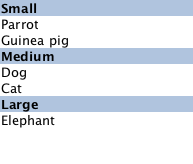
For example, here is a ListView that displays a list of animals, separated into sections. Each item in the ListView is placed in a different section depending on the "size" property of the model item. The sectionHeading delegate component provides the light blue bar that marks the beginning of each section.
    // The delegate for each section header
    Component {
        id: sectionHeading
        Rectangle {
            width: ListView.view.width
            height: childrenRect.height
            color: "lightsteelblue"

            required property string section

            Text {
                text: parent.section
                font.bold: true
                font.pixelSize: 20
            }
        }
    }

    ListView {
        id: view
        anchors.top: parent.top
        anchors.bottom: buttonBar.top
        width: parent.width
        model: animalsModel
        delegate: Text {
            required property string name

            text: name
            font.pixelSize: 18
        }

        section.property: "size"
        section.criteria: ViewSection.FullString
        section.delegate: sectionHeading
    }
Note: Adding sections to a ListView does not automatically re-order the list items by the section criteria. If the model is not ordered by section, then it is possible that the sections created will not be unique; each boundary between differing sections will result in a section header being created even if that section exists elsewhere.
See also ListView examples and Stacking Order in ListView.
snapMode : enumeration
This property determines how the view scrolling will settle following a drag or flick. The possible values are:
| Constant | Description |
|---|---|
ListView.NoSnap | (default) the view stops anywhere within the visible area. |
ListView.SnapToItem | the view settles with an item aligned with the start of the view. |
ListView.SnapOneItem | the view settles no more than one item away from the first visible item at the time the mouse button is released. This mode is particularly useful for moving one page at a time. When SnapOneItem is enabled, the ListView will show a stronger affinity to neighboring items when movement occurs. For example, a short drag that snaps back to the current item with SnapToItem might snap to a neighboring item with SnapOneItem. |
snapMode does not affect the currentIndex. To update the currentIndex as the list is moved, set highlightRangeMode to ListView.StrictlyEnforceRange.
See also highlightRangeMode.
spacing : real
This property holds the spacing between items.
The default value is 0.
verticalLayoutDirection : enumeration
This property holds the layout direction of a vertically-oriented list.
Possible values:
| Constant | Description |
|---|---|
ListView.TopToBottom | (default) Items are laid out from the top of the view down to the bottom of the view. |
ListView.BottomToTop | Items are laid out from the bottom of the view up to the top of the view. |
Setting this property has no effect if the orientation is Qt.Horizontal.
See also ListView::layoutDirection.
Attached Property Documentation
ListView.delayRemove : bool
This attached property holds whether the delegate may be destroyed. It is attached to each instance of the delegate. The default value is false.
It is sometimes necessary to delay the destruction of an item until an animation completes. The example delegate below ensures that the animation completes before the item is removed from the list.
Component {
    id: delegate
    Item {
        SequentialAnimation {
            id: removeAnimation
            PropertyAction { target: wrapper; property: "ListView.delayRemove"; value: true }
            NumberAnimation { target: wrapper; property: "scale"; to: 0; duration: 250; easing.type: Easing.InOutQuad }
            PropertyAction { target: wrapper; property: "ListView.delayRemove"; value: false }
        }
        ListView.onRemove: removeAnimation.start()
    }
}
If a remove transition has been specified, it will not be applied until delayRemove is returned to false.
ListView.isCurrentItem : bool [read-only]
This attached property is true if this delegate is the current item; otherwise false.
It is attached to each instance of the delegate.
This property may be used to adjust the appearance of the current item, for example:
ListView {
    width: 180; height: 200

    Component {
        id: contactsDelegate
        Rectangle {
            id: wrapper
            width: 180
            height: contactInfo.height
            color: ListView.isCurrentItem ? "black" : "red"
            Text {
                id: contactInfo
                text: name + ": " + number
                color: wrapper.ListView.isCurrentItem ? "red" : "black"
            }
        }
    }

    model: ContactModel {}
    delegate: contactsDelegate
    focus: true
}
ListView.nextSection : string [read-only]
This attached property holds the section of the next element.
It is attached to each instance of the delegate.
The section is evaluated using the section properties.
ListView.previousSection : string [read-only]
This attached property holds the section of the previous element.
It is attached to each instance of the delegate.
The section is evaluated using the section properties.
ListView.section : string [read-only]
This attached property holds the section of this element.
It is attached to each instance of the delegate.
The section is evaluated using the section properties.
ListView.view : ListView [read-only]
This attached property holds the view that manages this delegate instance.
It is attached to each instance of the delegate and also to the header, the footer, the section and the highlight delegates.
Attached Signal Documentation
add()
This attached signal is emitted immediately after an item is added to the view.
If an add transition is specified, it is applied immediately after this signal is handled.
Note: The corresponding handler is onAdd.
pooled()
This signal is emitted after an item has been added to the reuse pool. You can use it to pause ongoing timers or animations inside the item, or free up resources that cannot be reused.
This signal is emitted only if the reuseItems property is true.
Note: The corresponding handler is onPooled.
See also Reusing items, reuseItems, and reused().
remove()
This attached signal is emitted immediately before an item is removed from the view.
If a remove transition has been specified, it is applied after this signal is handled, providing that delayRemove is false.
Note: The corresponding handler is onRemove.
reused()
This signal is emitted after an item has been reused. At this point, the item has been taken out of the pool and placed inside the content view, and the model properties such as index and row have been updated.
Other properties that are not provided by the model does not change when an item is reused. You should avoid storing any state inside a delegate, but if you do, manually reset that state on receiving this signal.
This signal is emitted when the item is reused, and not the first time the item is created.
This signal is emitted only if the reuseItems property is true.
Note: The corresponding handler is onReused.
See also Reusing items, reuseItems, and pooled().
Method Documentation
void decrementCurrentIndex()
Decrements the current index. The current index will wrap if keyNavigationWraps is true and it is currently at the beginning. This method has no effect if the count is zero.
Note: methods should only be called after the Component has completed.
void forceLayout()
Responding to changes in the model is usually batched to happen only once per frame. This means that inside script blocks it is possible for the underlying model to have changed, but the ListView has not caught up yet.
This method forces the ListView to immediately respond to any outstanding changes in the model.
Note: methods should only be called after the Component has completed.
void incrementCurrentIndex()
Increments the current index. The current index will wrap if keyNavigationWraps is true and it is currently at the end. This method has no effect if the count is zero.
Note: methods should only be called after the Component has completed.
int indexAt(real x, real y)
Returns the index of the visible item containing the point x, y in content coordinates. If there is no item at the point specified, or the item is not visible -1 is returned.
If the item is outside the visible area, -1 is returned, regardless of whether an item will exist at that point when scrolled into view.
Note: methods should only be called after the Component has completed.
Item itemAt(real x, real y)
Returns the visible item containing the point x, y in content coordinates. If there is no item at the point specified, or the item is not visible null is returned.
If the item is outside the visible area, null is returned, regardless of whether an item will exist at that point when scrolled into view.
Note: methods should only be called after the Component has completed.
Item itemAtIndex(int index)
Returns the item for index. If there is no item for that index, for example because it has not been created yet, or because it has been panned out of the visible area and removed from the cache, null is returned.
Note: this method should only be called after the Component has completed. The returned value should also not be stored since it can turn to null as soon as control goes out of the calling scope, if the view releases that item.
Positions the view at the beginning or end, taking into account any header or footer.
It is not recommended to use contentX or contentY to position the view at a particular index. This is unreliable since removing items from the start of the list does not cause all other items to be repositioned, and because the actual start of the view can vary based on the size of the delegates.
Note: methods should only be called after the Component has completed. To position the view at startup, this method should be called by Component.onCompleted. For example, to position the view at the end on startup:
Component.onCompleted: positionViewAtEnd()void positionViewAtIndex(int index, PositionMode mode)
Positions the view such that the index is at the position specified by mode:
| Constant | Description |
|---|---|
ListView.Beginning | position item at the top (or left for horizontal orientation) of the view. |
ListView.Center | position item in the center of the view. |
ListView.End | position item at bottom (or right for horizontal orientation) of the view. |
ListView.Visible | if any part of the item is visible then take no action, otherwise bring the item into view. |
ListView.Contain | ensure the entire item is visible. If the item is larger than the view, the item is positioned at the top (or left for horizontal orientation) of the view. |
ListView.SnapPosition | position the item at preferredHighlightBegin. This mode is only valid if highlightRangeMode is StrictlyEnforceRange or snapping is enabled via snapMode. |
If positioning the view at index would cause empty space to be displayed at the beginning or end of the view, the view will be positioned at the boundary.
It is not recommended to use contentX or contentY to position the view at a particular index. This is unreliable since removing items from the start of the list does not cause all other items to be repositioned, and because the actual start of the view can vary based on the size of the delegates. The correct way to bring an item into view is with positionViewAtIndex.
Note: methods should only be called after the Component has completed. To position the view at startup, this method should be called by Component.onCompleted. For example, to position the view at the end:
Component.onCompleted: positionViewAtIndex(count - 1, ListView.Beginning)
© 2026 The Qt Company Ltd. Documentation contributions included herein are the copyrights of their respective owners. The documentation provided herein is licensed under the terms of the GNU Free Documentation License version 1.3 as published by the Free Software Foundation. Qt and respective logos are trademarks of The Qt Company Ltd. in Finland and/or other countries worldwide. All other trademarks are property of their respective owners.
