QML Tutorial 2 - QML Components
In this chapter, you are going to add a color picker to change the color of the text.
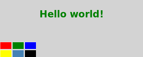
The color picker is made of six cells with different colors.
To avoid writing the same code multiple times for each cell, create a new Cell component.
A component provides a way of defining a new type that you can re-use in other QML files.
A QML component is like a black-box that interacts with the outside world through its properties, signals,
and functions, and is generally defined in its own QML file.
The component’s filename must always start with a capital letter.
Here is the QML code for Cell:
import QtQuick 2.0

Item {
    id: container
    property alias cellColor: rectangle.color
    signal clicked(color cellColor)

    width: 40; height: 25

    Rectangle {
        id: rectangle
        border.color: "white"
        anchors.fill: parent
    }

    MouseArea {
        anchors.fill: parent
        onClicked: container.clicked(container.cellColor)
    }
}
Walkthrough
The Cell Component
Item {
    id: container
    property alias cellColor: rectangle.color
    signal clicked(color cellColor)

    width: 40; height: 25
The root element of the component is an Item with the id, container.
An Item is the most basic visual element in QML and is often used as a container for other elements.
property alias cellColor: rectangle.color
Its cellColor property is accessible from outside the component, allowing you
to instantiate cells with different colors. It is an alias to the existing color property of the rectangle
that composes the cell.
signal clicked(color cellColor)
The Cell has a signal called clicked with the cellColor parameter of type color. You need this signal to change the color of the text in the main QML file later.
    Rectangle {
        id: rectangle
        border.color: "white"
        anchors.fill: parent
    }
The cell component is basically a colored rectangle with the id, rectangle.
Its anchors.fill property is a convenient way to set the size of an element.
In this case the rectangle will have the same size as its parent.
    MouseArea {
        anchors.fill: parent
        onClicked: container.clicked(container.cellColor)
    }
In order to change the color of the text when the cell is clicked, a MouseArea element with the same size as its parent is used.
A MouseArea enables you to react to mouse events such as clicked, hover, and so on. In this case, when the MouseArea clicked signal is reported, the Cell’s clicked signal is emitted.
The main QML file
In the main QML file, use the Cell component to create the color picker:
import QtQuick 2.0

Rectangle {
    id: page
    width: 500; height: 200
    color: "lightgray"

    Text {
        id: helloText
        text: "Hello world!"
        y: 30
        anchors.horizontalCenter: page.horizontalCenter
        font.pointSize: 24; font.bold: true
    }

    Grid {
        id: colorPicker
        x: 4; anchors.bottom: page.bottom; anchors.bottomMargin: 4
        rows: 2; columns: 3; spacing: 3

        Cell { cellColor: "red"; onClicked: helloText.color = cellColor }
        Cell { cellColor: "green"; onClicked: helloText.color = cellColor }
        Cell { cellColor: "blue"; onClicked: helloText.color = cellColor }
        Cell { cellColor: "yellow"; onClicked: helloText.color = cellColor }
        Cell { cellColor: "steelblue"; onClicked: helloText.color = cellColor }
        Cell { cellColor: "black"; onClicked: helloText.color = cellColor }
    }
}
Create the color picker by putting 6 cells with different colors in a grid.
Cell { cellColor: "red"; onClicked: helloText.color = cellColor }
When the clicked signal of a cell is triggered, set the color of the text to the cellColor passed as a parameter. You can react to a signal of a component through a handler of the name, ‘onSignalName’.
[Previous QML Tutorial 1 - Basic Types][Next QML Tutorial 3 - States and Transitions]
© 2018 The Qt Company Ltd. Documentation contributions included herein are the copyrights of their respective owners. The documentation provided herein is licensed under the terms of the GNU Free Documentation License version 1.3 as published by the Free Software Foundation. Qt and respective logos are trademarks of The Qt Company Ltd. in Finland and/or other countries worldwide. All other trademarks are property of their respective owners.