
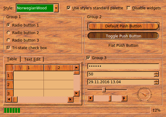
Styles Example
The Styles example illustrates how to create custom widget drawing styles using Qt, and demonstrates Qt’s predefined styles.
A style in Qt is a subclass of
QStyleor of one of its subclasses. Styles perform drawing on behalf of widgets. Qt provides a whole range of predefined styles, either built into the Qt Widgets module or found in plugins. Styles are usually customized by subclassingQProxyStyleand reimplementing a few virtual functions. WhileQProxyStyleprovides a transparent way to customize either a specific style or the appropriate platform’s default style, Qt also providesQCommonStyleas a convenient base for full custom style implementations.In this example, the custom style is called
NorwegianWoodStyleand derives fromQProxyStyle. Its main features are the wooden textures used for filling most of the widgets and its round buttons and comboboxes.To implement the style, we use some advanced features provided by
QPainter, such asantialiasing(to obtain smoother button edges),alpha blending(to make the buttons appeared raised or sunken), andpainter paths(to fill the buttons and draw the outline). We also use many features ofQBrushandQPalette.The example consists of the following classes:
NorwegianWoodStyleinherits fromQProxyStyleand implements the Norwegian Wood style.
WidgetGalleryis aQDialogsubclass that shows the most common widgets and allows the user to switch style dynamically.
NorwegianWoodStyle Class Definition
Here’s the definition of the
NorwegianWoodStyleclass:class NorwegianWoodStyle : public QProxyStyle { Q_OBJECT public: NorwegianWoodStyle(); QPalette standardPalette() const override; void polish(QWidget *widget) override; void unpolish(QWidget *widget) override; int pixelMetric(PixelMetric metric, const QStyleOption *option, const QWidget *widget) const override; int styleHint(StyleHint hint, const QStyleOption *option, const QWidget *widget, QStyleHintReturn *returnData) const override; void drawPrimitive(PrimitiveElement element, const QStyleOption *option, QPainter *painter, const QWidget *widget) const override; void drawControl(ControlElement control, const QStyleOption *option, QPainter *painter, const QWidget *widget) const override; private: static void setTexture(QPalette &palette, QPalette::ColorRole role, const QImage &image); static QPainterPath roundRectPath(const QRect &rect); mutable QPalette m_standardPalette; };The public functions are all declared in
QStyle(QProxyStyle‘s grandparent class) and reimplemented here to override the Windows look and feel. The private functions are helper functions.
NorwegianWoodStyle Class Implementation
We will now review the implementation of the
NorwegianWoodStyleclass.QPalette NorwegianWoodStyle::standardPalette() const { if (!m_standardPalette.isBrushSet(QPalette::Disabled, QPalette::Mid)) { QColor brown(212, 140, 95); QColor beige(236, 182, 120); QColor slightlyOpaqueBlack(0, 0, 0, 63); QImage backgroundImage(":/images/woodbackground.png"); QImage buttonImage(":/images/woodbutton.png"); QImage midImage = buttonImage.convertToFormat(QImage::Format_RGB32); QPainter painter; painter.begin(&midImage); painter.setPen(Qt::NoPen); painter.fillRect(midImage.rect(), slightlyOpaqueBlack); painter.end();The
standardPalette()function is reimplemented fromQStyle. It returns aQPalettewith the style’s preferred colors and textures. Most styles don’t need to reimplement that function. The Norwegian Wood style reimplements it to set a “wooden” palette.We start by defining a few
QColors that we’ll need. Then we load two PNG images. The:prefix in the file path indicates that the PNG files are embedded resources .
woodbackground.png
This texture is used as the background of most widgets. The wood pattern is horizontal.
woodbutton.png
This texture is used for filling push buttons and comboboxes. The wood pattern is vertical and more reddish than the texture used for the background.
The
midImagevariable is initialized to be the same asbuttonImage, but then we use aQPainterand fill it with a 25% opaque black color (a black with analpha channelof 63). The result is a somewhat darker image thanbuttonImage. This image will be used for filling buttons that the user is holding down.QPalette palette(brown); palette.setBrush(QPalette::BrightText, Qt::white); palette.setBrush(QPalette::Base, beige); palette.setBrush(QPalette::Highlight, Qt::darkGreen); setTexture(palette, QPalette::Button, buttonImage); setTexture(palette, QPalette::Mid, midImage); setTexture(palette, QPalette::Window, backgroundImage); QBrush brush = palette.window(); brush.setColor(brush.color().darker()); palette.setBrush(QPalette::Disabled, QPalette::WindowText, brush); palette.setBrush(QPalette::Disabled, QPalette::Text, brush); palette.setBrush(QPalette::Disabled, QPalette::ButtonText, brush); palette.setBrush(QPalette::Disabled, QPalette::Base, brush); palette.setBrush(QPalette::Disabled, QPalette::Button, brush); palette.setBrush(QPalette::Disabled, QPalette::Mid, brush); m_standardPalette = palette; } return m_standardPalette; }We initialize the palette. Palettes have various
color roles, such asBase(used for filling text editors, item views, etc.),Text(used for foreground text), andBackground(used for the background of most widgets). Each role has its ownQBrush, which usually is a plain color but can also be a brush pattern or even a texture (aQPixmap).In addition to the roles, palettes have several
color groups: active, disabled, and inactive. The active color group is used for painting widgets in the active window. The disabled group is used for disabled widgets. The inactive group is used for all other widgets. Most palettes have identical active and inactive groups, while the disabled group uses darker shades.We initialize the
QPaletteobject with a brown color. Qt automatically derivates all color roles for all color groups from that single color. We then override some of the default values. For example, we usedarkGreeninstead of the default (darkBlue) for theHighlightrole. ThesetBrush()overload that we use here sets the same color or brush for all three color groups.The
setTexture()function is a private function that sets the texture for a certain color role, while preserving the existing color in theQBrush. AQBrushcan hold both a solid color and a texture at the same time. The solid color is used for drawing text and other graphical elements where textures don’t look good.At the end, we set the brush for the disabled color group of the palette. We use
woodbackground.pngas the texture for all disabled widgets, including buttons, and use a darker color to accompany the texture.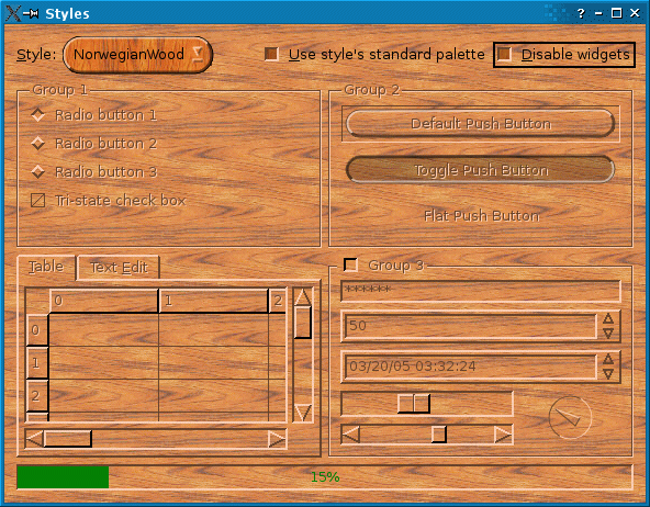
Let’s move on to the other functions reimplemented from
QProxyStyle:void NorwegianWoodStyle::polish(QWidget *widget) { if (qobject_cast<QPushButton *>(widget) || qobject_cast<QComboBox *>(widget)) widget->setAttribute(Qt::WA_Hover, true); }This
polish()overload is called once on every widget drawn using the style. We reimplement it to set theWA_Hoverattribute onQPushButtons andQComboBoxes. When this attribute is set, Qt generates paint events when the mouse pointer enters or leaves the widget. This makes it possible to render push buttons and comboboxes differently when the mouse pointer is over them.void NorwegianWoodStyle::unpolish(QWidget *widget) { if (qobject_cast<QPushButton *>(widget) || qobject_cast<QComboBox *>(widget)) widget->setAttribute(Qt::WA_Hover, false); }This
unpolish()overload is called to undo any modification done to the widget inpolish(). For simplicity, we assume that the flag wasn’t set beforepolish()was called. In an ideal world, we would remember the original state for each widgets (e.g., using aQMap<QWidget*, bool>) and restore it inunpolish().int NorwegianWoodStyle::pixelMetric(PixelMetric metric, const QStyleOption *option, const QWidget *widget) const { switch (metric) { case PM_ComboBoxFrameWidth: return 8; case PM_ScrollBarExtent: return QProxyStyle::pixelMetric(metric, option, widget) + 4; default: return QProxyStyle::pixelMetric(metric, option, widget); } }The
pixelMetric()function returns the size in pixels for a certain user interface element. By reimplementing this function, we can affect the way certain widgets are drawn and their size hint. Here, we return 8 as the width around a shown in aQComboBox, ensuring that there is enough place around the text and the arrow for the Norwegian Wood round corners. The default value for this setting in the Windows style is 2.We also change the extent of
QScrollBars, i.e., the height for a horizontal scroll bar and the width for a vertical scroll bar, to be 4 pixels more than in the Windows style. This makes the style a bit more distinctive.For all other
PixelMetricelements, we use the Windows settings.int NorwegianWoodStyle::styleHint(StyleHint hint, const QStyleOption *option, const QWidget *widget, QStyleHintReturn *returnData) const { switch (hint) { case SH_DitherDisabledText: return int(false); case SH_EtchDisabledText: return int(true); default: return QProxyStyle::styleHint(hint, option, widget, returnData); } }The
styleHint()function returns some hints to widgets or to the base style (in our caseQProxyStyle) about how to draw the widgets. The Windows style returnstruefor theSH_DitherDisabledTexthint, resulting in a most unpleasing visual effect. We override this behavior and returnfalseinstead. We also returntruefor theSH_EtchDisabledTexthint, meaning that disabled text is rendered with an embossed look.void NorwegianWoodStyle::drawPrimitive(PrimitiveElement element, const QStyleOption *option, QPainter *painter, const QWidget *widget) const { switch (element) { case PE_PanelButtonCommand: { int delta = (option->state & State_MouseOver) ? 64 : 0; QColor slightlyOpaqueBlack(0, 0, 0, 63); QColor semiTransparentWhite(255, 255, 255, 127 + delta); QColor semiTransparentBlack(0, 0, 0, 127 - delta); int x, y, width, height; option->rect.getRect(&x, &y, &width, &height);The
drawPrimitive()function is called by Qt widgets to draw various fundamental graphical elements. Here we reimplement it to drawQPushButtonandQComboBoxwith round corners. The button part of these widgets is drawn using thePE_PanelButtonCommandprimitive element.The
optionparameter, of typeQStyleOption, contains everything we need to know about the widget we want to draw on. In particular,option->rectgives the rectangle within which to draw the primitive element. Thepainterparameter is aQPainterobject that we can use to draw on the widget.The
widgetparameter is the widget itself. Normally, all the information we need is available inoptionandpainter, so we don’t needwidget. We can use it to perform special effects; for example, QMacStyle uses it to animate default buttons. If you use it, be aware that the caller is allowed to pass a null pointer.We start by defining three
QColors that we’ll need later on. We also put the x, y, width, and height components of the widget’s rectangle in local variables. The value used for thesemiTransparentWhiteand for thesemiTransparentBlackcolor’s alpha channel depends on whether the mouse cursor is over the widget or not. Since we set theWA_Hoverattribute onQPushButtons andQComboBoxes, we can rely on theState_MouseOverflag to be set when the mouse is over the widget.QPainterPath roundRect = roundRectPath(option->rect); int radius = qMin(width, height) / 2;The
roundRectvariable is aQPainterPath. AQPainterPathis is a vectorial specification of a shape. Any shape (rectangle, ellipse, spline, etc.) or combination of shapes can be expressed as a path. We will useroundRectboth for filling the button background with a wooden texture and for drawing the outline. TheroundRectPath()function is a private function; we will come back to it later.QBrush brush; bool darker; const QStyleOptionButton *buttonOption = qstyleoption_cast<const QStyleOptionButton *>(option); if (buttonOption && (buttonOption->features & QStyleOptionButton::Flat)) { brush = option->palette.window(); darker = (option->state & (State_Sunken | State_On)); } else { if (option->state & (State_Sunken | State_On)) { brush = option->palette.mid(); darker = !(option->state & State_Sunken); } else { brush = option->palette.button(); darker = false; } }We define two variables,
brushanddarker, and initialize them based on the state of the button:
If the button is a
flat button, we use theBackgroundbrush. We setdarkertotrueif the button isdownorchecked.If the button is currently held down by the user or in the
checkedstate, we use theMidcomponent of the palette. We setdarkertotrueif the button ischecked.Otherwise, we use the
Buttoncomponent of the palette.The screenshot below illustrates how
QPushButtons are rendered based on their state: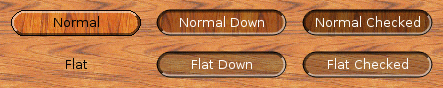
To discover whether the button is flat or not, we need to cast the
optionparameter toQStyleOptionButtonand check if the features member specifies theFlatflag. Theqstyleoption_cast()function performs a dynamic cast; ifoptionis not aQStyleOptionButton,qstyleoption_cast()returns a null pointer.painter->save(); painter->setRenderHint(QPainter::Antialiasing, true); painter->fillPath(roundRect, brush); if (darker) painter->fillPath(roundRect, slightlyOpaqueBlack);We turn on antialiasing on
QPainter. Antialiasing is a technique that reduces the visual distortion that occurs when the edges of a shape are converted into pixels. For the Norwegian Wood style, we use it to obtain smoother edges for the round buttons.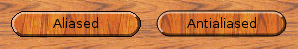
The first call to
fillPath()draws the background of the button with a wooden texture. The second call tofillPath()paints the same area with a semi-transparent black color (a black color with an alpha channel of 63) to make the area darker ifdarkeris true.int penWidth; if (radius < 10) penWidth = 3; else if (radius < 20) penWidth = 5; else penWidth = 7; QPen topPen(semiTransparentWhite, penWidth); QPen bottomPen(semiTransparentBlack, penWidth); if (option->state & (State_Sunken | State_On)) qSwap(topPen, bottomPen);Next, we draw the outline. The top-left half of the outline and the bottom-right half of the outline are drawn using different
QPens to produce a 3D effect. Normally, the top-left half of the outline is drawn lighter whereas the bottom-right half is drawn darker, but if the button isdownorchecked, we invert the twoQPens to give a sunken look to the button.int x1 = x; int x2 = x + radius; int x3 = x + width - radius; int x4 = x + width; if (option->direction == Qt::RightToLeft) { qSwap(x1, x4); qSwap(x2, x3); } QPolygon topHalf; topHalf << QPoint(x1, y) << QPoint(x4, y) << QPoint(x3, y + radius) << QPoint(x2, y + height - radius) << QPoint(x1, y + height); painter->setClipPath(roundRect); painter->setClipRegion(topHalf, Qt::IntersectClip); painter->setPen(topPen); painter->drawPath(roundRect);We draw the top-left part of the outline by calling
drawPath()with an appropriateclip region. If the layout direction is right-to-left instead of left-to-right, we swap thex1,x2,x3, andx4variables to obtain correct results. On right-to-left desktop, the “light” comes from the top-right corner of the screen instead of the top-left corner; raised and sunken widgets must be drawn accordingly.The diagram below illustrates how 3D effects are drawn according to the layout direction. The area in red on the diagram corresponds to the
topHalfpolygon: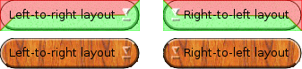
An easy way to test how a style looks in right-to-left mode is to pass the
-reversecommand-line option to the application. This option is recognized by theQApplicationconstructor.QPolygon bottomHalf = topHalf; bottomHalf[0] = QPoint(x4, y + height); painter->setClipPath(roundRect); painter->setClipRegion(bottomHalf, Qt::IntersectClip); painter->setPen(bottomPen); painter->drawPath(roundRect); painter->setPen(option->palette.windowText().color()); painter->setClipping(false); painter->drawPath(roundRect); painter->restore(); } break; default: QProxyStyle::drawPrimitive(element, option, painter, widget); } }The bottom-right part of the outline is drawn in a similar fashion. Then we draw a one-pixel wide outline around the entire button, using the
Foregroundcomponent of theQPalette.This completes the
PE_PanelButtonCommandcase of theswitchstatement. Other primitive elements are handled by the base style. Let’s now turn to the otherNorwegianWoodStylemember functions:void NorwegianWoodStyle::drawControl(ControlElement element, const QStyleOption *option, QPainter *painter, const QWidget *widget) const { switch (element) { case CE_PushButtonLabel: { QStyleOptionButton myButtonOption; const QStyleOptionButton *buttonOption = qstyleoption_cast<const QStyleOptionButton *>(option); if (buttonOption) { myButtonOption = *buttonOption; if (myButtonOption.palette.currentColorGroup() != QPalette::Disabled) { if (myButtonOption.state & (State_Sunken | State_On)) { myButtonOption.palette.setBrush(QPalette::ButtonText, myButtonOption.palette.brightText()); } } } QProxyStyle::drawControl(element, &myButtonOption, painter, widget); } break; default: QProxyStyle::drawControl(element, option, painter, widget); } }We reimplement
drawControl()to draw the text on aQPushButtonin a bright color when the button isdownorchecked.If the
optionparameter points to aQStyleOptionButtonobject (it normally should), we take a copy of the object and modify its palette member to make theButtonTextbe the same as theBrightTextcomponent (unless the widget is disabled).void NorwegianWoodStyle::setTexture(QPalette &palette, QPalette::ColorRole role, const QImage &image) { for (int i = 0; i < QPalette::NColorGroups; ++i) { QBrush brush(image); brush.setColor(palette.brush(QPalette::ColorGroup(i), role).color()); palette.setBrush(QPalette::ColorGroup(i), role, brush); } }The
setTexture()function is a private function that sets thetexturecomponent of theQBrushes for a certaincolor role, for all threecolor groups(active, disabled, inactive). We used it to initialize the Norwegian Wood palette instandardPalette.QPainterPath NorwegianWoodStyle::roundRectPath(const QRect &rect) { int radius = qMin(rect.width(), rect.height()) / 2; int diam = 2 * radius; int x1, y1, x2, y2; rect.getCoords(&x1, &y1, &x2, &y2); QPainterPath path; path.moveTo(x2, y1 + radius); path.arcTo(QRect(x2 - diam, y1, diam, diam), 0.0, +90.0); path.lineTo(x1 + radius, y1); path.arcTo(QRect(x1, y1, diam, diam), 90.0, +90.0); path.lineTo(x1, y2 - radius); path.arcTo(QRect(x1, y2 - diam, diam, diam), 180.0, +90.0); path.lineTo(x1 + radius, y2); path.arcTo(QRect(x2 - diam, y2 - diam, diam, diam), 270.0, +90.0); path.closeSubpath(); return path; }The
roundRectPath()function is a private function that constructs aQPainterPathobject for round buttons. The path consists of eight segments: four arc segments for the corners and four lines for the sides.With around 250 lines of code, we have a fully functional custom style based on one of the predefined styles. Custom styles can be used to provide a distinct look to an application or family of applications.


WidgetGallery Class
For completeness, we will quickly review the
WidgetGalleryclass, which contains the most common Qt widgets and allows the user to change style dynamically. Here’s the class definition:class WidgetGallery : public QDialog { Q_OBJECT public: WidgetGallery(QWidget *parent = nullptr); protected: void changeEvent(QEvent *) override; private slots: void changeStyle(const QString &styleName); void styleChanged(); void changePalette(); void advanceProgressBar(); private: void createTopLeftGroupBox(); void createTopRightGroupBox(); void createBottomLeftTabWidget(); void createBottomRightGroupBox(); void createProgressBar(); QLabel *styleLabel; QComboBox *styleComboBox; QCheckBox *useStylePaletteCheckBox; QCheckBox *disableWidgetsCheckBox; ... };Here’s the
WidgetGalleryconstructor:WidgetGallery::WidgetGallery(QWidget *parent) : QDialog(parent) { styleComboBox = new QComboBox; const QString defaultStyleName = QApplication::style()->objectName(); QStringList styleNames = QStyleFactory::keys(); styleNames.append("NorwegianWood"); for (int i = 1, size = styleNames.size(); i < size; ++i) { if (defaultStyleName.compare(styleNames.at(i), Qt::CaseInsensitive) == 0) { styleNames.swapItemsAt(0, i); break; } } styleComboBox->addItems(styleNames); styleLabel = new QLabel(tr("&Style:")); styleLabel->setBuddy(styleComboBox); useStylePaletteCheckBox = new QCheckBox(tr("&Use style's standard palette")); useStylePaletteCheckBox->setChecked(true); disableWidgetsCheckBox = new QCheckBox(tr("&Disable widgets")); createTopLeftGroupBox(); createTopRightGroupBox(); createBottomLeftTabWidget(); createBottomRightGroupBox(); createProgressBar();We start by creating child widgets. The Style combobox is initialized with all the styles known to
QStyleFactory, in addition toNorwegianWood. Thecreate...()functions are private functions that set up the various parts of theWidgetGallery.connect(styleComboBox, &QComboBox::textActivated, this, &WidgetGallery::changeStyle); connect(useStylePaletteCheckBox, &QCheckBox::toggled, this, &WidgetGallery::changePalette); connect(disableWidgetsCheckBox, &QCheckBox::toggled, topLeftGroupBox, &QGroupBox::setDisabled); connect(disableWidgetsCheckBox, &QCheckBox::toggled, topRightGroupBox, &QGroupBox::setDisabled); connect(disableWidgetsCheckBox, &QCheckBox::toggled, bottomLeftTabWidget, &QGroupBox::setDisabled); connect(disableWidgetsCheckBox, &QCheckBox::toggled, bottomRightGroupBox, &QGroupBox::setDisabled);We connect the Style combobox to the
changeStyle()private slot, the Use style’s standard palette check box to thechangePalette()slot, and the Disable widgets check box to the child widgets’setDisabled()slot.QHBoxLayout *topLayout = new QHBoxLayout; topLayout->addWidget(styleLabel); topLayout->addWidget(styleComboBox); topLayout->addStretch(1); topLayout->addWidget(useStylePaletteCheckBox); topLayout->addWidget(disableWidgetsCheckBox); QGridLayout *mainLayout = new QGridLayout; mainLayout->addLayout(topLayout, 0, 0, 1, 2); mainLayout->addWidget(topLeftGroupBox, 1, 0); mainLayout->addWidget(topRightGroupBox, 1, 1); mainLayout->addWidget(bottomLeftTabWidget, 2, 0); mainLayout->addWidget(bottomRightGroupBox, 2, 1); mainLayout->addWidget(progressBar, 3, 0, 1, 2); mainLayout->setRowStretch(1, 1); mainLayout->setRowStretch(2, 1); mainLayout->setColumnStretch(0, 1); mainLayout->setColumnStretch(1, 1); setLayout(mainLayout); setWindowTitle(tr("Styles")); styleChanged(); }Finally, we put the child widgets in layouts.
void WidgetGallery::changeStyle(const QString &styleName)
{
    if (styleName == "NorwegianWood")
        QApplication::setStyle(new NorwegianWoodStyle);
    else
        QApplication::setStyle(QStyleFactory::create(styleName));
}
When the user changes the style in the combobox, we call
setStyle()to dynamically change the style of the application.void WidgetGallery::changePalette() { QApplication::setPalette(useStylePaletteCheckBox->isChecked() ? QApplication::style()->standardPalette() : QPalette()); }If the user turns the Use style’s standard palette on, the current style’s
standard paletteis used; otherwise, the system’s default palette is honored.void WidgetGallery::advanceProgressBar() { int curVal = progressBar->value(); int maxVal = progressBar->maximum(); progressBar->setValue(curVal + (maxVal - curVal) / 100); }The
advanceProgressBar()slot is called at regular intervals to advance the progress bar. Since we don’t know how long the user will keep the Styles application running, we use a logarithmic formula: The closer the progress bar gets to 100%, the slower it advances.We will review
createProgressBar()in a moment.void WidgetGallery::createTopLeftGroupBox() { topLeftGroupBox = new QGroupBox(tr("Group 1")); radioButton1 = new QRadioButton(tr("Radio button 1")); radioButton2 = new QRadioButton(tr("Radio button 2")); radioButton3 = new QRadioButton(tr("Radio button 3")); radioButton1->setChecked(true); checkBox = new QCheckBox(tr("Tri-state check box")); checkBox->setTristate(true); checkBox->setCheckState(Qt::PartiallyChecked); QVBoxLayout *layout = new QVBoxLayout; layout->addWidget(radioButton1); layout->addWidget(radioButton2); layout->addWidget(radioButton3); layout->addWidget(checkBox); layout->addStretch(1); topLeftGroupBox->setLayout(layout); }The
createTopLeftGroupBox()function creates theQGroupBoxthat occupies the top-left corner of theWidgetGallery. We skip thecreateTopRightGroupBox(),createBottomLeftTabWidget(), andcreateBottomRightGroupBox()functions, which are very similar.void WidgetGallery::createProgressBar() { progressBar = new QProgressBar; progressBar->setRange(0, 10000); progressBar->setValue(0); QTimer *timer = new QTimer(this); connect(timer, &QTimer::timeout, this, &WidgetGallery::advanceProgressBar); timer->start(1000); }In
createProgressBar(), we create aQProgressBarat the bottom of theWidgetGalleryand connect itstimeout()signal to theadvanceProgressBar()slot.
© 2022 The Qt Company Ltd. Documentation contributions included herein are the copyrights of their respective owners. The documentation provided herein is licensed under the terms of the GNU Free Documentation License version 1.3 as published by the Free Software Foundation. Qt and respective logos are trademarks of The Qt Company Ltd. in Finland and/or other countries worldwide. All other trademarks are property of their respective owners.