
Chart Themes Example
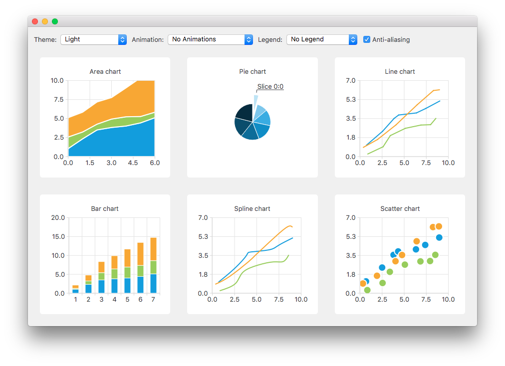
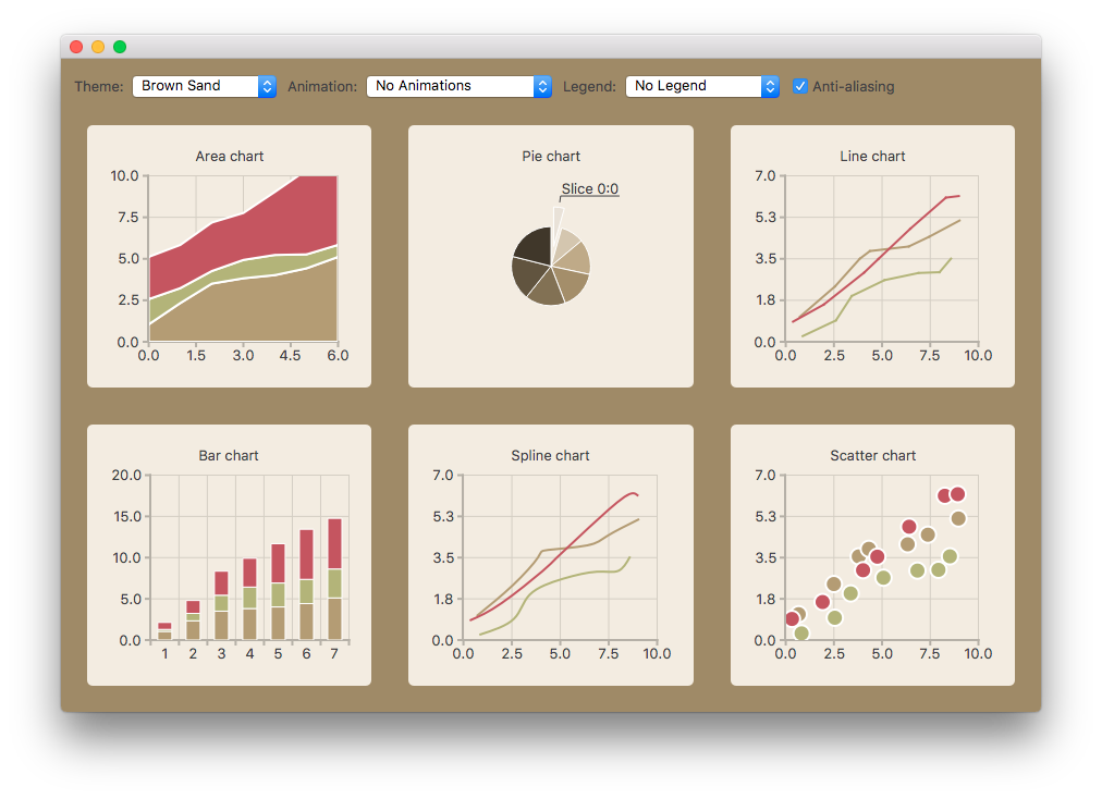
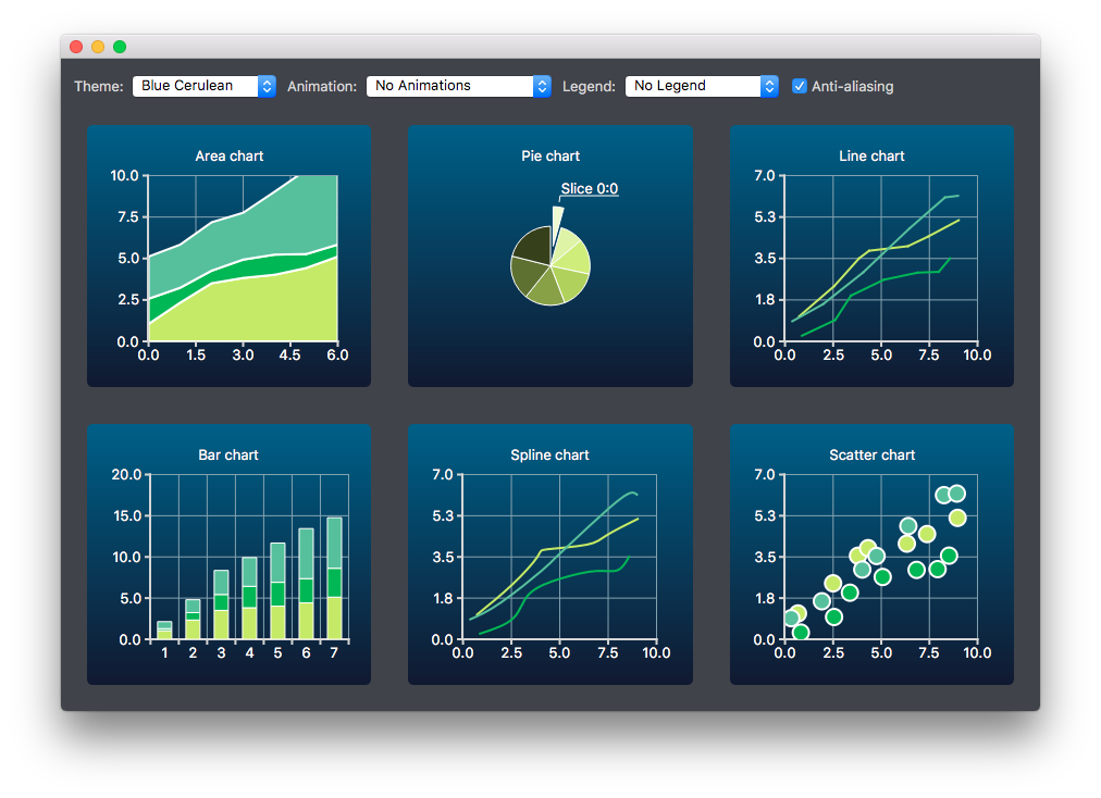
The example shows the look and feel of the different built-in themes.
This example shows the look and feel of the different built-in themes for some of the supported chart types.
Running the Example
To run the example from Qt Creator , open the Welcome mode and select the example from Examples. For more information, visit Building and Running an Example.
Creating Charts
The charts of different types are generated and added to the layout separately. For example, the line chart is created as follows. The creation of other chart types is similar.
First a chart is created.
chart = QChart()
chart.setTitle("Line chart")
A common set of random data is generated and placed in a list. This list is used in each chart type to add data to the series of the chart. For the line series, QLineSeries instances are created and added to the chart.
name = QString("Series ")
nameIndex = 0
for list in m_dataTable:
    series = QLineSeries(chart)
    for data in list:
        series.append(data.first)
    series.setName(name + QString.number(nameIndex))
    nameIndex = nameIndex + 1
    chart.addSeries(series)
Default axes are created for the line series. We also specify ranges for the axes based on the range of the data used for the series.
chart.createDefaultAxes()
chart.axes(Qt.Horizontal).first().setRange(0, m_valueMax)
chart.axes(Qt.Vertical).first().setRange(0, m_valueCount)
We also want to add more space between the labels and the y-axes. For this we specify a label format that adds space characters to the labels.
# Add space to label to add space between labels and axis
axisY = QValueAxis(chart.axes(Qt.Vertical).first())
Q_ASSERT(axisY)
axisY.setLabelFormat("%.1f ")
Finally the line chart is added to the grid layout.
chartView = QChartView(createLineChart())
m_ui.gridLayout.addWidget(chartView, 1, 2)
Changing Theme
The user can select a built-in theme to be used in the example. This theme is then applied to all charts in the layout.
QChart.ChartTheme theme = static_cast<QChart.ChartTheme>(
            m_ui.themeComboBox.itemData(m_ui.themeComboBox.currentIndex()).toInt())        chartView.chart().setTheme(theme)
In order to give the result a more harmonious look, the background palette of the application is customized to match the selected theme. The Window and WindowText roles are set based on the selected theme.
pal = window().palette()
if (theme == QChart.ChartThemeLight) {
    pal.setColor(QPalette.Window, QRgb(0xf0f0f0))
    pal.setColor(QPalette.WindowText, QRgb(0x404044))
Changing Animation, Legend and Anti-Aliasing
In this example, it is also possible to see how changing animation, legend and anti-aliasing affects the appearance of the chart.
Based on the user’s selection, the used animation type is set on each chart. It is possible to have no animations in the chart, or have animations for grid axis or series, or both.
QChart.AnimationOptions options(
            m_ui.animatedComboBox.itemData(m_ui.animatedComboBox.currentIndex()).toInt())
if (not m_charts.isEmpty() and m_charts.at(0).chart().animationOptions() not = options) {
    for chartView in charts:
        chartView.chart().setAnimationOptions(options)
The chart can be shown with a legend. The legend can be aligned to different sides of the chart.
Qt.Alignment alignment(
            m_ui.legendComboBox.itemData(m_ui.legendComboBox.currentIndex()).toInt())
if (not alignment) {
    for chartView in charts:
        chartView.chart().legend().hide()
else:
    for chartView in charts:
        chartView.chart().legend().setAlignment(alignment)
        chartView.chart().legend().show()
The user can also see how changing anti-aliasing option changes the appearance of the chart. Anti-aliasing is updated based on the user’s selection.
checked = m_ui.antialiasCheckBox.isChecked()
for chart in charts:
    chart.setRenderHint(QPainter.Antialiasing, checked)
© 2022 The Qt Company Ltd. Documentation contributions included herein are the copyrights of their respective owners. The documentation provided herein is licensed under the terms of the GNU Free Documentation License version 1.3 as published by the Free Software Foundation. Qt and respective logos are trademarks of The Qt Company Ltd. in Finland and/or other countries worldwide. All other trademarks are property of their respective owners.