
Previous topic
Next topic
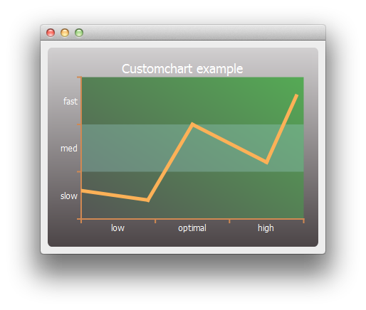
Custom Chart Example
This example shows how to customize the appearance of the different elements on a chart.
Running the Example
To run the example from Qt Creator , open the Welcome mode and select the example from Examples. For more information, visit Building and Running an Example.
Customizing Charts
We begin by creating a simple line series and a chart object.
series = QLineSeries()
series << QPointF(0, 6) << QPointF(9, 4) << QPointF(15, 20) << QPointF(25, 12) << QPointF(29, 26)
chart = QChart()
chart.legend().hide()
chart.addSeries(series)
First we customize the series and the chart’s title and background.
# Customize series
pen = QPen(QRgb(0xfdb157))
pen.setWidth(5)
series.setPen(pen)
# Customize chart title
font = QFont()
font.setPixelSize(18)
chart.setTitleFont(font)
chart.setTitleBrush(QBrush(Qt.white))
chart.setTitle("Customchart example")
# Customize chart background
backgroundGradient = QLinearGradient()
backgroundGradient.setStart(QPointF(0, 0))
backgroundGradient.setFinalStop(QPointF(0, 1))
backgroundGradient.setColorAt(0.0, QRgb(0xd2d0d1))
backgroundGradient.setColorAt(1.0, QRgb(0x4c4547))
backgroundGradient.setCoordinateMode(QGradient.ObjectBoundingMode)
chart.setBackgroundBrush(backgroundGradient)
# Customize plot area background
plotAreaGradient = QLinearGradient()
plotAreaGradient.setStart(QPointF(0, 1))
plotAreaGradient.setFinalStop(QPointF(1, 0))
plotAreaGradient.setColorAt(0.0, QRgb(0x555555))
plotAreaGradient.setColorAt(1.0, QRgb(0x55aa55))
plotAreaGradient.setCoordinateMode(QGradient.ObjectBoundingMode)
chart.setPlotAreaBackgroundBrush(plotAreaGradient)
chart.setPlotAreaBackgroundVisible(True)
Then we customize the axes.
axisX = QCategoryAxis()
axisY = QCategoryAxis()
# Customize axis label font
labelsFont = QFont()
labelsFont.setPixelSize(12)
axisX.setLabelsFont(labelsFont)
axisY.setLabelsFont(labelsFont)
# Customize axis colors
axisPen = QPen(QRgb(0xd18952))
axisPen.setWidth(2)
axisX.setLinePen(axisPen)
axisY.setLinePen(axisPen)
# Customize axis label colors
axisBrush = QBrush(Qt.white)
axisX.setLabelsBrush(axisBrush)
axisY.setLabelsBrush(axisBrush)
# Customize grid lines and shades
axisX.setGridLineVisible(False)
axisY.setGridLineVisible(False)
axisY.setShadesPen(Qt.NoPen)
axisY.setShadesBrush(QBrush(QColor(0x99, 0xcc, 0xcc, 0x55)))
axisY.setShadesVisible(True)
Then the axis label values and ranges. Once the axes are ready, we set them to be used by the chart.
axisX.append("low", 10)
axisX.append("optimal", 20)
axisX.append("high", 30)
axisX.setRange(0, 30)
axisY.append("slow", 10)
axisY.append("med", 20)
axisY.append("fast", 30)
axisY.setRange(0, 30)
chart.addAxis(axisX, Qt.AlignBottom)
chart.addAxis(axisY, Qt.AlignLeft)
series.attachAxis(axisX)
series.attachAxis(axisY)
Finally, we create a view containing the chart.
chartView = QChartView(chart)
chartView.setRenderHint(QPainter.Antialiasing)
Now we are ready to show the chart on a main window.
window = QMainWindow()
window.setCentralWidget(chartView)
window.resize(400, 300)
window.show()
© 2022 The Qt Company Ltd. Documentation contributions included herein are the copyrights of their respective owners. The documentation provided herein is licensed under the terms of the GNU Free Documentation License version 1.3 as published by the Free Software Foundation. Qt and respective logos are trademarks of The Qt Company Ltd. in Finland and/or other countries worldwide. All other trademarks are property of their respective owners.