
Previous topic
Next topic
Qml Polar Chart
This is a demonstration on how to use a polar chart in your QML application.
Running the Example
To run the example from Qt Creator , open the Welcome mode and select the example from Examples. For more information, visit Building and Running an Example.
Using Polar Charts in Qt Quick Applications
We begin with a chart that has a spline series and a scatter series with random data. Both series use the same axes.
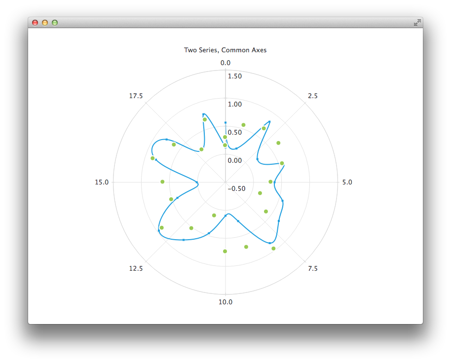 PolarChartView { title: "Two Series, Common Axes" anchors.fill: parent legend.visible: false antialiasing: true ValueAxis { id: axisAngular min: 0 max: 20 tickCount: 9 } ValueAxis { id: axisRadial min: -0.5 max: 1.5 } SplineSeries { id: series1 axisAngular: axisAngular axisRadial: axisRadial pointsVisible: true } ScatterSeries { id: series2 axisAngular: axisAngular axisRadial: axisRadial markerSize: 10 } } // Add data dynamically to the series Component.onCompleted: { for (var i = 0; i <= 20; i++) { series1.append(i, Math.random()); series2.append(i, Math.random()); } }
The next example shows a chart with some accurate historical data for which we need to use a DateTimeAxis and a AreaSeries .
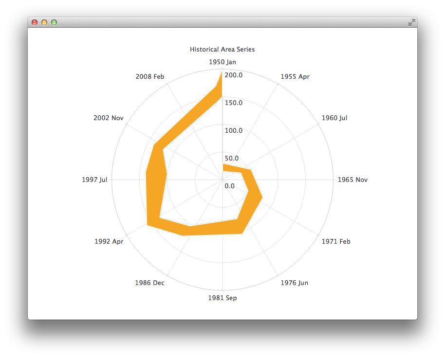 PolarChartView { title: "Historical Area Series" anchors.fill: parent legend.visible: false antialiasing: true DateTimeAxis { id: axis1 format: "yyyy MMM" tickCount: 13 } ValueAxis { id: axis2 } LineSeries { id: lowerLine axisAngular: axis1 axisRadial: axis2 // Please note that month in JavaScript months are zero based, so 2 means March XYPoint { x: toMsecsSinceEpoch(new Date(1950, 0, 1)); y: 15 } XYPoint { x: toMsecsSinceEpoch(new Date(1962, 4, 1)); y: 35 } XYPoint { x: toMsecsSinceEpoch(new Date(1970, 0, 1)); y: 50 } XYPoint { x: toMsecsSinceEpoch(new Date(1978, 2, 1)); y: 75 } XYPoint { x: toMsecsSinceEpoch(new Date(1987, 11, 1)); y: 102 } XYPoint { x: toMsecsSinceEpoch(new Date(1992, 1, 1)); y: 132 } XYPoint { x: toMsecsSinceEpoch(new Date(1998, 7, 1)); y: 100 } XYPoint { x: toMsecsSinceEpoch(new Date(2002, 4, 1)); y: 120 } XYPoint { x: toMsecsSinceEpoch(new Date(2012, 8, 1)); y: 140 } XYPoint { x: toMsecsSinceEpoch(new Date(2013, 5, 1)); y: 150 } } LineSeries { id: upperLine axisAngular: axis1 axisRadial: axis2 // Please note that month in JavaScript months are zero based, so 2 means March XYPoint { x: toMsecsSinceEpoch(new Date(1950, 0, 1)); y: 30 } XYPoint { x: toMsecsSinceEpoch(new Date(1962, 4, 1)); y: 55 } XYPoint { x: toMsecsSinceEpoch(new Date(1970, 0, 1)); y: 80 } XYPoint { x: toMsecsSinceEpoch(new Date(1978, 2, 1)); y: 105 } XYPoint { x: toMsecsSinceEpoch(new Date(1987, 11, 1)); y: 125 } XYPoint { x: toMsecsSinceEpoch(new Date(1992, 1, 1)); y: 160 } XYPoint { x: toMsecsSinceEpoch(new Date(1998, 7, 1)); y: 140 } XYPoint { x: toMsecsSinceEpoch(new Date(2002, 4, 1)); y: 140 } XYPoint { x: toMsecsSinceEpoch(new Date(2012, 8, 1)); y: 170 } XYPoint { x: toMsecsSinceEpoch(new Date(2013, 5, 1)); y: 200 } } AreaSeries { axisAngular: axis1 axisRadial: axis2 lowerSeries: lowerLine upperSeries: upperLine } } // DateTimeAxis is based on QDateTimes so we must convert our JavaScript dates to // milliseconds since epoch to make them match the DateTimeAxis values function toMsecsSinceEpoch(date) { var msecs = date.getTime(); return msecs; }
And the final example with a chart that uses a CategoryAxis to make the data easier to understand.
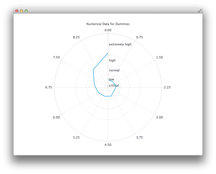 PolarChartView { title: "Numerical Data for Dummies" anchors.fill: parent legend.visible: false antialiasing: true LineSeries { axisRadial: CategoryAxis { min: 0 max: 30 CategoryRange { label: "critical" endValue: 2 } CategoryRange { label: "low" endValue: 7 } CategoryRange { label: "normal" endValue: 12 } CategoryRange { label: "high" endValue: 18 } CategoryRange { label: "extremely high" endValue: 30 } } axisAngular: ValueAxis { tickCount: 13 } XYPoint { x: 0; y: 4.3 } XYPoint { x: 1; y: 4.1 } XYPoint { x: 2; y: 4.7 } XYPoint { x: 3; y: 3.9 } XYPoint { x: 4; y: 5.2 } XYPoint { x: 5; y: 5.3 } XYPoint { x: 6; y: 6.1 } XYPoint { x: 7; y: 7.7 } XYPoint { x: 8; y: 12.9 } XYPoint { x: 9; y: 19.2 } } }
© 2022 The Qt Company Ltd. Documentation contributions included herein are the copyrights of their respective owners. The documentation provided herein is licensed under the terms of the GNU Free Documentation License version 1.3 as published by the Free Software Foundation. Qt and respective logos are trademarks of The Qt Company Ltd. in Finland and/or other countries worldwide. All other trademarks are property of their respective owners.