Imagine Style
The Imagine Style is based on configurable image assets. More…
Attached Properties
path :ref:` <Imagine-Style>` : string
Detailed Description
The Imagine style is based on image assets. The style comes with a default set of images, but the images can be easily changed by providing a directory with images using a predefined naming convention.
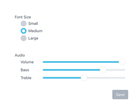
The Imagine style with the default images
To run an application with the Imagine style, see Using Styles in Qt Quick Controls .
File Names
The image files are named using the following convention:
<control>-<element>-<states>
The <control> and <element> sections are mandatory, but the <states> section is optional. For example, if a single file named "button-background.9.png" is provided for Button , it will be used for every state that Button supports. It is up to the developer to decide the set of states that they will provide images for. However, it is recommended to provide images for the most common control states where possible, such as disabled, pressed, etc. This will ensure that interactive controls visually behave as the end user would expect them to.
Element Reference
The following table lists which elements are supported for each control, along with the possible states for that element, and the file extension that it expects. An element is an image that represents a certain visual part of the control. For example, Button's "background" element represents its background .
Control
Element
States
Extension
background
active
.9.png (or .png)
animation
disabled, running, mirrored, hovered
.webp
background
same as above
.webp
background
disabled, pressed, checked, checkable, focused, highlighted, flat, mirrored, hovered
.9.png
background
disabled, pressed, checked, partially-checked, focused, mirrored, hovered
.9.png (or .png)
indicator
same as above
.png
background
disabled, pressed, checked, partially-checked, focused, highlighted, mirrored, hovered
.9.png (or .png)
indicator
same as above
.png
background
disabled, pressed, editable, open, focused, mirrored, hovered, flat
.9.png (or .png)
indicator
same as above
.png
popup
same as above
.9.png (or .png)
background
disabled, pressed, checked, checkable, focused, mirrored, hovered
.9.png (or .png)
progress
same as above
.9.png (or .png)
mask
same as above
.9.png (or .png)
background 1
disabled, pressed, focused, mirrored, hovered
.9.png (or .png)
handle
same as above
.9.png (or .png)
background
modal, dim
.9.png (or .png)
title
same as above
.9.png (or .png)
overlay
modal
.9.png (or .png)
background
disabled, mirrored
.9.png (or .png)
background
modal, dim, top, left, right, bottom
.9.png (or .png)
overlay
modal
.9.png (or .png)
background
disabled, mirrored
.9.png (or .png)
background
disabled, mirrored
.9.png (or .png)
title
same as above
.9.png (or .png)
background
disabled, pressed, focused, highlighted, mirrored, hovered
.9.png (or .png)
background
disabled, mirrored, hovered
.9.png (or .png)
background
modal, dim
.9.png (or .png)
overlay
modal
.9.png (or .png)
arrow
disabled, pressed, checked, focused, highlighted, mirrored, hovered
.png
background
same as above
.9.png (or .png)
indicator
same as above
.png
background
disabled, mirrored
.9.png (or .png)
separator
same as above
.9.png (or .png)
background
disabled, mirrored
.9.png (or .png)
background
disabled, mirrored, hovered
.9.png (or .png)
delegate
disabled, pressed, current, mirrored, hovered
.png
background
disabled, mirrored
.9.png (or .png)
background
modal, dim
.9.png (or .png)
overlay
modal
.9.png (or .png)
animation
disabled, mirrored, hovered
.png
background
disabled, indeterminate, mirrored, hovered
.9.png (or .png)
mask
same as above
.9.png (or .png)
progress
same as above
.9.png (or .png)
background
disabled, pressed, checked, focused, mirrored, hovered
.9.png (or .png)
indicator
same as above
.png
background
disabled, pressed, checked, focused, highlighted, mirrored, hovered
.9.png (or .png)
indicator
same as above
.png
background
vertical, horizontal, disabled, focused, mirrored, hovered
.9.png (or .png)
progress
same as above
.9.png (or .png)
handle
first, second, vertical, horizontal, disabled, pressed, focused, mirrored, hovered
.png
background
disabled, pressed, checked, checkable, focused, highlighted, flat, mirrored, hovered
.9.png (or .png)
background
vertical, horizontal, disabled, interactive, pressed, mirrored, hovered
.9.png (or .png)
handle
same as above
.9.png (or .png)
background
vertical, horizontal, disabled, mirrored, hovered
.9.png (or .png)
handle
same as above
.9.png (or .png)
background
disabled, mirrored
.9.png (or .png)
background
vertical, horizontal, disabled, pressed, focused, mirrored, hovered
.9.png (or .png)
handle
same as above
.9.png (or .png)
progress
same as above
.9.png (or .png)
background
disabled, editable, focused, mirrored, hovered
.9.png (or .png)
editor
disabled, focused, mirrored, hovered
.9.png (or .png)
indicator
up, down, disabled, editable, pressed, focused, mirrored, hovered
.9.png (or .png)
background
disabled, mirrored
.9.png (or .png)
background
disabled, pressed, focused, highlighted, mirrored, hovered
.9.png (or .png)
background
vertical, horizontal, disabled, interactive, focused, mirrored
.9.png (or .png)
background
disabled, pressed, checked, focused, mirrored, hovered
.9.png (or .png)
handle
same as above
.9.png (or .png)
indicator
same as above
.9.png (or .png)
background
disabled, pressed, checked, focused, highlighted, mirrored, hovered
.9.png (or .png)
handle
same as above
.9.png (or .png)
indicator
same as above
.9.png (or .png)
background
disabled, header, footer, mirrored
.9.png (or .png)
background
disabled, pressed, checked, focused, mirrored, hovered
.9.png (or .png)
background
disabled, focused, mirrored, hovered
.9.png (or .png)
background
disabled, focused, mirrored, hovered
.9.png (or .png)
background
disabled, header, footer, mirrored
.9.png (or .png)
background
disabled, pressed, checked, checkable, focused, highlighted, flat, mirrored, hovered
.9.png (or .png)
background
vertical, horizontal, disabled, mirrored
.9.png (or .png)
separator
same as above
.9.png (or .png)
background
.9.png (or .png)
background
disabled, focused, mirrored, hovered
.9.png (or .png)
Note
1) The Imagine style Dial does not yet support the startAngle and endAngle properties that were introduced in Qt 6.6, and instead uses a fixed background image.
Asset Examples
The following table lists examples of assets (taken from the default Imagine style assets ) for all controls. The list is not exhaustive, as not all elements need assets, but it can be used as a guide when creating your own assets.
The template that these assets were exported from is available as a Sketch project .
Control
Element
States
Asset
Notes
background

overlay

overlay
modal

background

background
disabled

background
focused

background
pressed

background
checked

background
checked, disabled

background
checked, focused

background
checked, hovered

background
highlighted

background
highlighted, disabled

background
highlighted, focused

background
highlighted, hovered

background
highlighted, pressed

background
highlighted, checked

background
hovered

background
flat

background
flat, disabled

background
flat, hovered

background
flat, pressed

background
flat, checked

indicator

indicator
disabled

indicator
pressed

indicator
checked

indicator
checked, pressed

indicator
checked, hovered

indicator
checked, focused

indicator
partially, checked

indicator
partially, checked, pressed

indicator
partially, checked, focused

indicator
partially, checked, hovered

indicator
focused

indicator
hovered

background

background
disabled

background
pressed

background
focused

background
hovered

indicator

indicator
disabled

indicator
pressed

indicator
checked

indicator
checked, pressed

indicator
checked, focused

indicator
checked, hovered

indicator
focused

indicator
hovered

indicator
partially, checked

indicator
partially, checked, pressed

indicator
partially, checked, focused

indicator
partially, checked, hovered

indicator
hovered

background

background
disabled

background
focused

background
hovered

background
pressed

background
open

background
editable

background
editable, focused

background
editable, disabled

indicator

indicator
disabled

indicator
editable

indicator
editable, disabled

indicator
editable, mirrored

indicator
editable, mirrored, disabled

popup

background

background
disabled

background
disabled, checked

background
focused

background
pressed

background
checked

background
checked, focused

background
checked, hovered

background
hovered

progress

progress
disabled

mask

background

background
disabled

background
focused

handle

handle
disabled

handle
focused

handle
focused, pressed

handle
focused, hovered

handle
pressed

handle
hovered

background

overlay

overlay
modal

background

background
left

background
right

background
top

background
bottom

overlay

overlay
modal

background

background

title

background

background
disabled

background
pressed

background
focused

background
hovered

background
highlighted

background

background

background
highlighted

arrow

arrow
mirrored

arrow
disabled

arrow
mirrored, disabled

indicator

indicator
disabled

indicator
pressed

indicator
checked

indicator
checked, pressed

indicator
checked, focused

indicator
checked, hovered

indicator
focused

indicator
hovered

separator

background

delegate

delegate
disabled

delegate
disabled, current

delegate
pressed

delegate
current

background

background

overlay

overlay
modal

background

progress

mask

indicator

indicator
disabled

indicator
pressed

indicator
checked

indicator
checked, focused

indicator
checked, hovered

indicator
checked, pressed

indicator
focused

indicator
hovered

background

background
disabled

background
pressed

background
focused

background
hovered

indicator

indicator
disabled

indicator
pressed

indicator
checked

indicator
checked, focused

indicator
checked, hovered

indicator
checked, pressed

indicator
focused

indicator
hovered

background
vertical

background
horizontal

progress
vertical

progress
vertical, disabled

progress
horizontal

progress
horizontal, disabled

handle

handle
disabled

handle
focused

handle
focused, hovered

handle
focused, pressed

handle
hovered

handle
pressed

background

background
disabled

background
disabled, checked

background
focused

background
pressed

background
checked

background
checked, focused

background
checked, hovered

background
highlighted

background
highlighted, pressed

background
highlighted, focused

background
highlighted, hovered

background
hovered

handle

handle
disabled

handle
interactive

handle
interactive, disabled

handle
interactive, pressed

handle
interactive, hovered

handle

background
vertical

background
horizontal

progress
vertical

progress
vertical, disabled

progress
horizontal

progress
horizontal, disabled

handle

handle
disabled

handle
focused

handle
focused, hovered

handle
focused, pressed

handle
hovered

handle
pressed

background

background
disabled

background
focused

background
editable

indicator
up

indicator
up, disabled

indicator
up, pressed

indicator
up, focused

indicator
up, mirrored

indicator
up, hovered

indicator
up, editable

indicator
up, editable, pressed

indicator
up, editable, focused

indicator
up, editable, mirrored

indicator
up, editable, hovered

indicator
down

indicator
down, disabled

indicator
down, pressed

indicator
down, focused

indicator
down, mirrored

indicator
down, hovered

indicator
down, editable

indicator
down, editable, pressed

indicator
down, editable, focused

indicator
down, editable, mirrored

indicator
down, editable, hovered

background

background
disabled

background
pressed

background
focused

background
hovered

indicator

indicator
disabled

indicator
pressed

indicator
checked

indicator
checked, focused

indicator
checked, hovered

indicator
checked, pressed

indicator
focused

indicator
hovered

handle

handle
disabled

handle
pressed

background

background
disabled

background
pressed

background
focused

background
hovered

indicator

indicator
disabled

indicator
pressed

indicator
checked

indicator
checked, focused

indicator
checked, hovered

indicator
checked, pressed

indicator
focused

indicator
hovered

handle

handle
disabled

background

background

background
disabled

background
pressed

background
checked

background
hovered

background
disabled, checked

background

background
disabled

background
focused

background

background
disabled

background
focused

background

background

background
disabled, checked

background
focused

background
pressed

background
checked

background
checked, focused

background
checked, hovered

background
hovered

separator
horizontal

separator
vertical

background

1 A 1x1 image containing one color, stretched to fill the control.
9-Patch Images
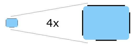
The Imagine style uses 9-patch images in order to give designers control over how a particular element responds to being resized. Here is an example of a 9-patch image that represents a Button ‘s background , alongside a magnified version (to make it easier to see the 9-patch lines):
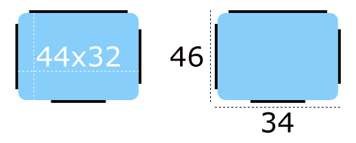
The content of the image is 44 pixels wide by 32 pixels high. Every 9-patch image needs a one pixel thick line (collectively referred to as “9-patch lines”) around every side, so the actual size of the image becomes 46 pixels wide by 34 pixels high. Note that the 9-patch lines must be one pixel thick regardless of the target DPI of the image. For example, the 9-patch lines for button-background.9.png and button-background@2x.9.png must both be one pixel thick.
The 9-patch lines must be black, and the remaining areas must be transparent or white:
Stretchable Areas
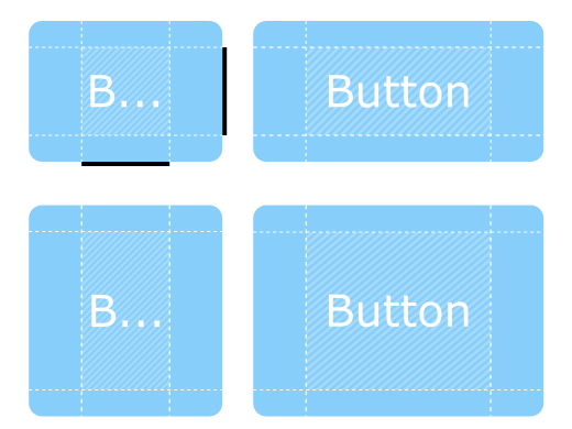
The 9-patch lines on the top and left edges determine which parts of the image are stretched when it is resized.
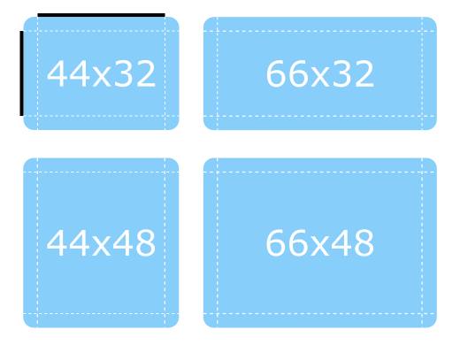
Below are examples of the 9-patch image being resized to one and a half times its original size in various dimensions:
Notice how the the rounded corners keep their original size, as they are outside the range of the lines.
Padding Areas
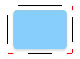
The 9-patch lines on the right and bottom edges determine how much space is available for the control’s contentItem , which means it can also be thought of as controlling the padding . For a diagram that illustrates padding, see Control Layout .
Below are more examples of the 9-patch image being resized, but this time demonstrating how the padding 9-patch lines work.
The contentItem can take up as much space as it needs within the shaded areas. If the padding lines are left out, the contentItem will take as much space as it needs without exceeding the stretchable areas.
Inset Areas
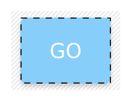
In some cases it is necessary for a control to have a drop shadow, for example. However, if we were to add a drop shadow to the button above, it would affect its size, which presents problems for both layouting and mouse/touch input boundaries.
Inset areas accounts for this by telling the control that a certain area of the 9-patch image should go outside of the control:
In the image below, the dashed line represents the button’s clickable area, as well as the space that it will take up in a layout. The shadow is marked by the striped area behind it:
Exporting 9-Patch Images
Various vector and bitmap editors can be used to create 9-patch images suitable for use with the Imagine style. The following sections briefly explain the export process for each editor, and the last section explains how to ensure the exported images are 9-patch-conformant.
Affinity Designer
See Affinity’s Export Settings documentation.
Adobe Illustrator
See Adobe’s Asset Export panel documentation.
Adobe Photoshop
See Adobe’s Generate image assets from layers documentation.
Inkscape
The Inkscape 9-Patch Export Extension can be used to export assets with Inkscape.
Sketch
See Sketch’s Exporting documentation.
Qt Quick Controls also provides a plugin for Sketch that automatically fixes the thickness of the 9-patch lines after the assets are exported. To install this file, double-click on it. Once Sketch has confirmed that the 9-patch export plugin has been installed, the plugin will automatically process images when they are exported.
Fixing 9-Patch Lines
When exporting 9-patch images in several DPI variants (@2x, @3x, etc.), the 9-patch lines will typically be scaled up along with the image. There are several ways to fix this, but perhaps the simplest approach is to use ImageMagick’s mogrify tool. The tool has a -shave feature that can be used to crop the image to reduce the thickness of the 9-patch lines:
mogrify -shave 1x1 -path path/to/images *@2x.9.png
mogrify -shave 2x2 -path path/to/images *@3x.9.png
mogrify -shave 3x3 -path path/to/images *@4x.9.png
Regular DPI images (those without the @Nx prefix) are not affected, so it is only necessary to run the command on images intended for high DPI displays.
Animated Images
The WebP and GIF animated image formats are supported by the Imagine style.
Customization
Path
The Imagine style allows customizing the path that is used to do the image asset selection. The path can be specified for any window or item, and it automatically propagates to children in the same manner as fonts . In the following example, the window and all three radio buttons appear with dark image assets (files that are located in “qrc:/themes/dark”).
++——————————————————————–+ || .. image:: images/qtquickcontrols-imagine-customization-dark.png| ++——————————————————————–+
In addition to specifying the path in QML, it is also possible to specify it via an environment variable or in a configuration file . Attributes specified in QML take precedence over all other methods.
Configuration File
Variable
Description
PathSpecifies the path to the directory that contains the Imagine style assets. If not specified, the built-in assets are used.
For example, to specify a path to a directory stored in the resource system:
[Imagine]
Path=:/imagine-assets
To specify a relative path to a local directory:
[Imagine]
Path=imagine-assets
Note
Due to a technical limitation, the path should not be named “imagine” if it is relative to the
qtquickcontrols2.conffile.
See Qt Quick Controls Configuration File for more details about the configuration file.
Environment Variables
Variable
Description
QT_QUICK_CONTROLS_IMAGINE_PATHSpecifies the path to the directory that contains the Imagine style assets. If not specified, the built-in assets are used.
For example, to specify a path to a directory stored in the resource system:
QT_QUICK_CONTROLS_IMAGINE_PATH=:/imagine-assetsTo specify a relative path to a local directory:
QT_QUICK_CONTROLS_IMAGINE_PATH=imagine-assetsNote
Due to a technical limitation, the path should not be named “imagine” if it is relative to the
qtquickcontrols2.conffile.
QT_QUICK_CONTROLS_IMAGINE_SMOOTHSet to
1to enable smooth scaling for 9-patch images. This environment variable was added in Qt 6.5.
See Supported Environment Variables in Qt Quick Controls for the full list of supported environment variables.
Palette
The Imagine style supports palette customization via the palette property and the qtquickcontrols2.conf file. As with other styles, the exact palette roles that the Imagine style uses are style-dependent. However, as most of the visual appearance of controls (for example: backgrounds) are managed through image assets, only the roles that are typically used for text will have an effect.
Font
Custom fonts can be set via the font property and the configuration file.
Dependency
The Imagine style must be separately imported to gain access to the attributes that are specific to the Imagine style. It should be noted that regardless of the references to the Imagine style, the same application code runs with any other style. Imagine-specific attributes only have an effect when the application is run with the Imagine style.
If the Imagine style is imported in a QML file that is always loaded, the Imagine style must be deployed with the application in order to be able to run the application regardless of which style the application is run with. By using file selectors , style-specific tweaks can be applied without creating a hard dependency to a style.
See also Styling Qt Quick Controls
Attached Property Documentation
This attached property holds the path to the image assets…
Button {
    Imagine.path: "qrc:/themes/dark"
}
