
Item QML Element
The Item is the most basic of all visual items in QML. More...
| Since: | Qt 4.7 |
| Instantiates: | QDeclarativeItem |
| Inherited By: | BorderImage, Column, Flickable, Flipable, Flow, FocusPanel, FocusScope, GestureArea, Grid, Image, Loader, MouseArea, Particles, PathView, PinchArea, Rectangle, Repeater, Row, ShaderEffectItem, Text, TextEdit, TextInput, and WebView |
Properties
- activeFocus : bool
- anchors
- anchors.top : AnchorLine
- anchors.bottom : AnchorLine
- anchors.left : AnchorLine
- anchors.right : AnchorLine
- anchors.horizontalCenter : AnchorLine
- anchors.verticalCenter : AnchorLine
- anchors.baseline : AnchorLine
- anchors.fill : Item
- anchors.centerIn : Item
- anchors.margins : real
- anchors.topMargin : real
- anchors.bottomMargin : real
- anchors.leftMargin : real
- anchors.rightMargin : real
- anchors.horizontalCenterOffset : real
- anchors.verticalCenterOffset : real
- anchors.baselineOffset : real
- anchors.mirrored : bool
- children : list<Item>
- childrenRect
- childrenRect.x : real
- childrenRect.y : real
- childrenRect.width : real
- childrenRect.height : real
- clip : bool
- data : list<Object>
- focus : bool
- height : real
- implicitHeight : real
- implicitWidth : real
- opacity : real
- parent : Item
- resources : list<Object>
- rotation : real
- scale : real
- state : string
- states : list<State>
- transform : list<Transform>
- transformOrigin : enumeration
- transitions : list<Transition>
- visible : bool
- width : real
- x : real
- y : real
- z : real
Methods
- childAt(real x, real y)
- forceActiveFocus()
- object mapFromItem(Item item, real x, real y)
- object mapToItem(Item item, real x, real y)
Detailed Description
All visual items in Qt Declarative inherit from Item. Although Item has no visual appearance, it defines all the properties that are common across visual items - such as the x and y position, the width and height, anchoring and key handling.
Item is also useful for grouping items together.
Item {
    Image {
        source: "tile.png"
    }
    Image {
        x: 80
        width: 100
        height: 100
        source: "tile.png"
    }
    Image {
        x: 190
        width: 100
        height: 100
        fillMode: Image.Tile
        source: "tile.png"
    }
}
Key Handling
Key handling is available to all Item-based visual elements via the Keys attached property. The Keys attached property provides basic handlers such as onPressed and onReleased, as well as handlers for specific keys, such as onCancelPressed. The example below assigns focus to the item and handles the Left key via the general onPressed handler and the Select key via the onSelectPressed handler:
Item {
    focus: true
    Keys.onPressed: {
        if (event.key == Qt.Key_Left) {
            console.log("move left");
            event.accepted = true;
        }
    }
    Keys.onSelectPressed: console.log("Selected");
}
See the Keys attached property for detailed documentation.
Layout Mirroring
Item layouts can be mirrored using the LayoutMirroring attached property.
Property Documentation
This property indicates whether the item has active focus.
An item with active focus will receive keyboard input, or is a FocusScope ancestor of the item that will receive keyboard input.
Usually, activeFocus is gained by setting focus on an item and its enclosing FocusScopes. In the following example input will have activeFocus.
Rectangle {
    FocusScope {
        focus: true
        TextInput {
            id: input
            focus: true
        }
    }
}
See also focus and Keyboard Focus.
Anchors provide a way to position an item by specifying its relationship with other items.
Margins apply to top, bottom, left, right, and fill anchors. The anchors.margins property can be used to set all of the various margins at once, to the same value. Note that margins are anchor-specific and are not applied if an item does not use anchors.
Offsets apply for horizontal center, vertical center, and baseline anchors.
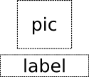
| Text anchored to Image, horizontally centered and vertically below, with a margin.Item { Image { id: pic // ... } Text { id: label anchors.horizontalCenter: pic.horizontalCenter anchors.top: pic.bottom anchors.topMargin: 5 // ... } } |
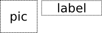
| Left of Text anchored to right of Image, with a margin. The y property of both defaults to 0.Item { Image { id: pic // ... } Text { id: label anchors.left: pic.right anchors.leftMargin: 5 // ... } } |
anchors.fill provides a convenient way for one item to have the same geometry as another item, and is equivalent to connecting all four directional anchors.
To clear an anchor value, set it to undefined.
anchors.mirrored returns true it the layout has been mirrored.
Note: You can only anchor an item to siblings or a parent.
For more information see Anchor Layouts.
children : list<Item> |
The children property contains the list of visual children of this item. The resources property contains non-visual resources that you want to reference by name.
Generally you can rely on Item's default property to handle all this for you, but it can come in handy in some cases.
The childrenRect properties allow an item access to the geometry of its children. This property is useful if you have an item that needs to be sized to fit its children.
This property holds whether clipping is enabled. The default clip value is false.
If clipping is enabled, an item will clip its own painting, as well as the painting of its children, to its bounding rectangle.
Non-rectangular clipping regions are not supported for performance reasons.
The data property allows you to freely mix visual children and resources in an item. If you assign a visual item to the data list it becomes a child and if you assign any other object type, it is added as a resource.
So you can write:
instead of:
data is a behind-the-scenes property: you should never need to explicitly specify it.
This property indicates whether the item has focus within the enclosing focus scope. If true, this item will gain active focus when the enclosing focus scope gains active focus. In the following example, input will be given active focus when scope gains active focus.
Rectangle {
    FocusScope {
        id: scope
        TextInput {
            id: input
            focus: true
        }
    }
}
For the purposes of this property, the scene as a whole is assumed to act like a focus scope. On a practical level, that means the following QML will give active focus to input on startup.
See also activeFocus and Keyboard Focus.
Defines the item's position and size relative to its parent.
Item { x: 100; y: 100; width: 100; height: 100 }
Defines the natural width or height of the Item if no width or height is specified.
The default implicit size for most items is 0x0, however some elements have an inherent implicit size which cannot be overridden, e.g. Image, Text.
Setting the implicit size is useful for defining components that have a preferred size based on their content, for example:
// Label.qml
import QtQuick 1.1

Item {
    property alias icon: image.source
    property alias label: text.text
    implicitWidth: text.implicitWidth + image.implicitWidth
    implicitHeight: Math.max(text.implicitHeight, image.implicitHeight)
    Image { id: image }
    Text {
        id: text
        wrapMode: Text.Wrap
        anchors.left: image.right; anchors.right: parent.right
        anchors.verticalCenter: parent.verticalCenter
    }
}
Note: using implicitWidth of Text or TextEdit and setting the width explicitly incurs a performance penalty as the text must be laid out twice.
This QML property was introduced in QtQuick 1.1.
This property holds the opacity of the item. Opacity is specified as a number between 0 (fully transparent) and 1 (fully opaque). The default is 1.
When this property is set, the specified opacity is also applied individually to child items. In almost all cases this is what you want, but in some cases it may produce undesired results. For example in the second set of rectangles below, the red rectangle has specified an opacity of 0.5, which affects the opacity of its blue child rectangle even though the child has not specified an opacity.
| Item { Rectangle { color: "red" width: 100; height: 100 Rectangle { color: "blue" x: 50; y: 50; width: 100; height: 100 } } } |
| Item { Rectangle { opacity: 0.5 color: "red" width: 100; height: 100 Rectangle { color: "blue" x: 50; y: 50; width: 100; height: 100 } } } |


If an item's opacity is set to 0, the item will no longer receive mouse events, but will continue to receive key events and will retain the keyboard focus if it has been set. (In contrast, setting the visible property to false stops both mouse and keyboard events, and also removes focus from the item.)
parent : Item |
This property holds the parent of the item.
The children property contains the list of visual children of this item. The resources property contains non-visual resources that you want to reference by name.
Generally you can rely on Item's default property to handle all this for you, but it can come in handy in some cases.
This property holds the rotation of the item in degrees clockwise.
This specifies how many degrees to rotate the item around its transformOrigin. The default rotation is 0 degrees (i.e. not rotated at all).
This property holds the scale of the item.
A scale of less than 1 means the item will be displayed smaller than normal, and a scale of greater than 1 means the item will be displayed larger than normal. A negative scale means the item will be mirrored.
By default, items are displayed at a scale of 1 (i.e. at their normal size).
Scaling is from the item's transformOrigin.
This property holds the name of the current state of the item.
This property is often used in scripts to change between states. For example:
function toggle() {
    if (button.state == 'On')
        button.state = 'Off';
    else
        button.state = 'On';
}
If the item is in its base state (i.e. no explicit state has been set), state will be a blank string. Likewise, you can return an item to its base state by setting its current state to ''.
See also States.
states : list<State> |
transform : list<Transform> |
This property holds the list of transformations to apply.
For more information see Transform.
This property holds the origin point around which scale and rotation transform.
Nine transform origins are available, as shown in the image below.
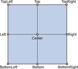
This example rotates an image around its bottom-right corner.
Image {
    source: "myimage.png"
    transformOrigin: Item.BottomRight
    rotation: 45
}
The default transform origin is Item.Center.
To set an arbitrary transform origin point use the Scale or Rotation transform elements.
transitions : list<Transition> |
This property holds a list of transitions defined by the item.
Item {
    transitions: [
        Transition {
            // ...
        },
        Transition {
            // ...
        }
        // ...
    ]
}
See also Transitions.
This property holds whether the item is visible. By default this is true.
Setting this property directly affects the visible value of child items. When set to false, the visible values of all child items also become false. When set to true, the visible values of child items are returned to true, unless they have explicitly been set to false.
(Because of this flow-on behavior, using the visible property may not have the intended effect if a property binding should only respond to explicit property changes. In such cases it may be better to use the opacity property instead.)
Setting this property to false automatically causes focus to be set to false, and this item will longer receive mouse and keyboard events. (In contrast, setting the opacity to 0 does not affect the focus property and the receiving of key events.)
Note: This property's value is only affected by changes to this property or the parent's visible property. It does not change, for example, if this item moves off-screen, or if the opacity changes to 0.
Defines the item's position and size relative to its parent.
Item { x: 100; y: 100; width: 100; height: 100 }
Defines the item's position and size relative to its parent.
Item { x: 100; y: 100; width: 100; height: 100 }
Defines the item's position and size relative to its parent.
Item { x: 100; y: 100; width: 100; height: 100 }
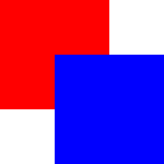
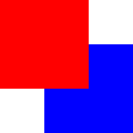
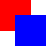
Sets the stacking order of sibling items. By default the stacking order is 0.
Items with a higher stacking value are drawn on top of siblings with a lower stacking order. Items with the same stacking value are drawn bottom up in the order they appear. Items with a negative stacking value are drawn under their parent's content.
The following example shows the various effects of stacking order.
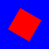
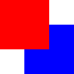
| Same z - later children above earlier children:Item { Rectangle { color: "red" width: 100; height: 100 } Rectangle { color: "blue" x: 50; y: 50; width: 100; height: 100 } } |
| Higher z on top:Item { Rectangle { z: 1 color: "red" width: 100; height: 100 } Rectangle { color: "blue" x: 50; y: 50; width: 100; height: 100 } } |
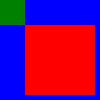
| Same z - children above parents:Item { Rectangle { color: "red" width: 100; height: 100 Rectangle { color: "blue" x: 50; y: 50; width: 100; height: 100 } } } |
| Lower z below:Item { Rectangle { color: "red" width: 100; height: 100 Rectangle { z: -1 color: "blue" x: 50; y: 50; width: 100; height: 100 } } } |
Method Documentation
Returns the visible child item at point (x, y), which is in this item's coordinate system, or null if there is no such item.
Forces active focus on the item.
This method sets focus on the item and makes sure that all the focus scopes higher in the object hierarchy are also given the focus.
object mapFromItem(Item item, real x, real y) |
Maps the point (x, y), which is in item's coordinate system, to this item's coordinate system, and returns an object with x and y properties matching the mapped cooordinate.
If item is a null value, this maps the point from the coordinate system of the root QML view.
object mapToItem(Item item, real x, real y) |
Maps the point (x, y), which is in this item's coordinate system, to item's coordinate system, and returns an object with x and y properties matching the mapped cooordinate.
If item is a null value, this maps x and y to the coordinate system of the root QML view.
© 2016 The Qt Company Ltd. Documentation contributions included herein are the copyrights of their respective owners. The documentation provided herein is licensed under the terms of the GNU Free Documentation License version 1.3 as published by the Free Software Foundation. Qt and respective logos are trademarks of The Qt Company Ltd. in Finland and/or other countries worldwide. All other trademarks are property of their respective owners.