C
Text QML Type
Specifies how to add text to a scene. More...
| Import Statement: | import QtQuick |
| Since: | Qt Quick Ultralite 1.0 |
| Inherits: |
Properties
- baselineOffset : int
- bottomPadding : real
- color : color
- elide : enumeration
- font : font
- horizontalAlignment : enumeration
- leftPadding : real
- padding : real
- rightPadding : real
- rotation : real
- scale : real
- text : string
- topPadding : real
- transform : list<Transform>
- transformOrigin : enumeration
- verticalAlignment : enumeration
Detailed Description
Text items can display plain text. For example, red text with a specific font configuration can be defined like this:
Text {
    text: "Hello World!"
    font.family: "Helvetica"
    font.pointSize: 24
    color: "red"
}
If height and width are not explicitly set, Text will attempt to determine how much room is needed and set it accordingly. It will always prefer width to height (all text will be placed on a single line).
The Text element supports dynamically changing the text property. Prefer StaticText for cases where the displayed text is fixed and known at compile-time.
See also Text Rendering and Fonts, Text QML Type, StaticText, Managing Resources, and Internationalization and Localization with Qt Quick Ultralite.
Property Documentation
These properties hold the padding around the text.
This QML property was introduced in Qt Quick Ultralite 1.1.
horizontalAlignment : enumeration |
verticalAlignment : enumeration |
Sets the horizontal and vertical alignment of the text within the Text items width and height. By default, the text is vertically aligned to the top and horizontally aligned to the left.
The valid values for horizontalAlignment are Text.AlignLeft, Text.AlignRight, and Text.AlignHCenter. The valid values for verticalAlignment are Text.AlignTop, Text.AlignBottom, and Text.AlignVCenter.
Note that for a single line of text, the size of the text is the area of the text. In this common case, all alignments are equivalent. If you want the text to be, say, centered in its parent, then you will need to either modify the Item::anchors, or set horizontalAlignment to Text.AlignHCenter and bind the width to that of the parent.
baselineOffset : int |
Specifies the position of the item's baseline in local coordinates.
The baseline is the imaginary line on which the text sits.
color : color |
elide : enumeration |
Set this property to elide parts of the text to fit the Text item's size.
Use one of the following values to elide text:
| Constant | Description |
|---|---|
Text.ElideNone | The default |
Text.ElideLeft | Elides beginning of the text |
Text.ElideMiddle | Elides middle of the text |
Text.ElideRight | Elides end of the text |
Text items must have their width defined explicitly for eliding text. If a text item contains multi-line text, it must have both width and height defined explicitly. Multi-line text supports Text.ElideRight only.
The elide mark follows the text's direction. For example:
 - Left-to-right (LTR) text direction.
 - The same text in Arabic has Right-to-left (RTL) text direction.
When elide mode is Text.ElideRight, the ellipsis glyph appear on the right side for LTR text and left side for RTL text.
Note: This property currently is not supported by StaticText item.
font : font |
The font used for displaying the text.
[since Qt Quick Ultralite 1.3] rotation : real |
This property holds the rotation of the item in degrees clockwise around its transformOrigin.
The default value is 0 degrees (that is, no rotation).
Rectangle {
    color: "blue"
    width: 100; height: 100
    Text {
        text: "Rotated Text"
        color: "red"
        x: 25; y: 25
        rotation: 30
    }
}
Note: This property is only generated when it has a binding. See Qt Quick Ultralite vs Qt Quick.
This property was introduced in Qt Quick Ultralite 1.3.
[since Qt Quick Ultralite 1.3] scale : real |
This property holds the scale factor for this item.
A scale of less than 1.0 renders the item smaller, whereas a scale greater than 1.0 renders the item larger. A negative scale causes the item to be mirrored when rendered.
The default value is 1.0.
Scaling is applied from the transformOrigin.
import QtQuick 2.15

Rectangle {
    color: "blue"
    width: 100; height: 100

    Rectangle {
        color: "green"
        width: 25; height: 25
    }

    Text {
        text: "Scaled Text"
        color: "red"
        x: 25; y: 25
        scale: 1.4
        transformOrigin: Item.TopLeft
    }
}
Note: This property is only generated when it has a binding. See Qt Quick Ultralite vs Qt Quick.
This property was introduced in Qt Quick Ultralite 1.3.
text : string |
The text to display. Rich text (html) is not supported.
transform : list<Transform> |
This property holds the list of transformations to apply.
For more information see Transform.
[since Qt Quick Ultralite 1.3] transformOrigin : enumeration |
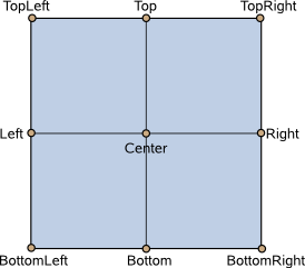
This property holds the origin point around which scale and rotation transform.
Nine transform origins are available, as shown in the image below. The default transform origin is Item.Center.

This example rotates a text around its bottom-right corner.
Text {
    text: "Hello"
    transformOrigin: Item.BottomRight
    rotation: 45
}
To set an arbitrary transform origin point use the Scale or Rotation transform types with transform.
Note: This property is only generated when it has a binding. See Qt Quick Ultralite vs Qt Quick.
This property was introduced in Qt Quick Ultralite 1.3.
Available under certain Qt licenses.
Find out more.